Benvenuto nelle Font Più Popolari — dove popolarità e qualità si incontrano. Qui trovi i font più scaricati e usati dell'anno. Se cerchi scelte sicure per logo, web o social, inizia da qui.
Ogni font top si distingue per equilibrio, leggibilità e versatilità. Troverai sans serif moderne, script eleganti, serif vintage e display minimalisti.
-
( Fonts by Vunira Design - Personal-use only. For commercial use please contact owner. )
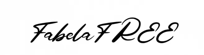
A bold, flowing script font with elegant cursive letterforms and medium contrast.
 Scaricare 62 Downloads@WebFont
 -
( Fonts by Kong Font - fontkong.com - Personal-use only. For commercial use please contact owner. )
A graceful and flowing script font with elegant, fluid strokes.
![Amora font caratteri gratis]() Scaricare 62 Downloads@WebFont
Scaricare 62 Downloads@WebFont -
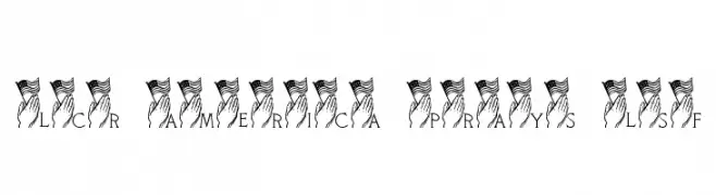
( LeChefRene - members.aol.com/lcrfonts/ )
A serif font with patriotic and spiritual imagery of flags and praying hands.
![LCR America Prays LSF font caratteri gratis]() Scaricare 62 Downloads@WebFont
Scaricare 62 Downloads@WebFont -
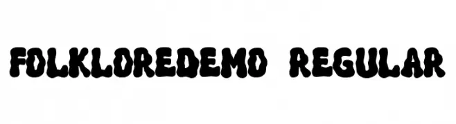
( Fonts by Dharmas Studio )
A bold, playful font with thick, rounded strokes and a whimsical retro style.
![FolkloreDEMO-Regular font caratteri gratis]() Scaricare 62 Downloads@WebFont
Scaricare 62 Downloads@WebFont -
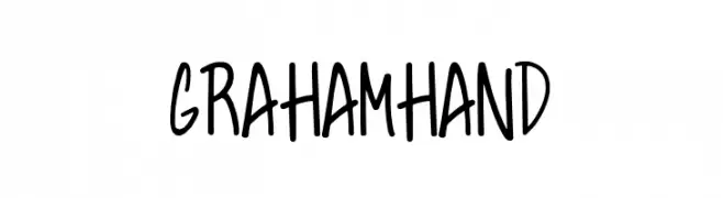
( Fonts by Tom Chalky - Personal-use only. For commercial use please contact owner. )
A playful, casual handwritten font with smooth, flowing lines.
![GrahamHand font caratteri gratis]() Scaricare 62 Downloads@WebFont
Scaricare 62 Downloads@WebFont -
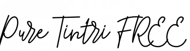
( Fonts by InspiraType )
Elegant cursive script with a handwritten feel.
![Pure Tintri FREE font caratteri gratis]() Scaricare 62 Downloads@WebFont
Scaricare 62 Downloads@WebFont -
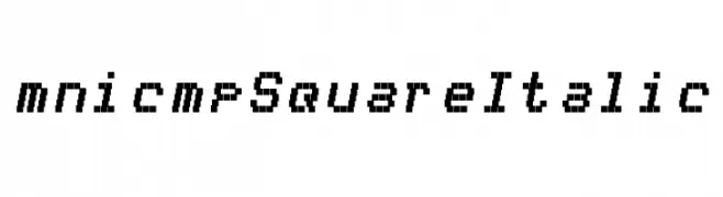
( Personal-use only. For commercial use please contact owner. )
A pixelated, square-shaped italic font with a digital, retro aesthetic.
![mnicmp Square Italic font caratteri gratis]() Scaricare 62 Downloads@WebFont
Scaricare 62 Downloads@WebFont -
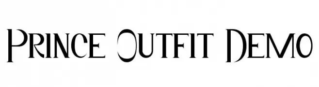
( Fonts by Edric Studio - Personal-use only. For commercial use please contact owner. )
A modern-vintage font with elegant, high-contrast letterforms and sharp serifs.
![Prince Outfit Demo font caratteri gratis]() Scaricare 62 Downloads@WebFont
Scaricare 62 Downloads@WebFont -
( Fonts by Hanzel Graphic - Personal-use only. For commercial use please contact owner. )
A modern, handwritten font with elegant, fluid strokes.
![Petricia font caratteri gratis]() Scaricare 62 Downloads@WebFont
Scaricare 62 Downloads@WebFont -
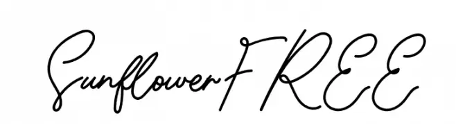
( Fonts by Vunira Design - Personal-use only. For commercial use please contact owner. )
A cursive, handwritten-style font with elegant, flowing strokes.
![SunflowerFREE font caratteri gratis]() Scaricare 62 Downloads@WebFont
Scaricare 62 Downloads@WebFont -
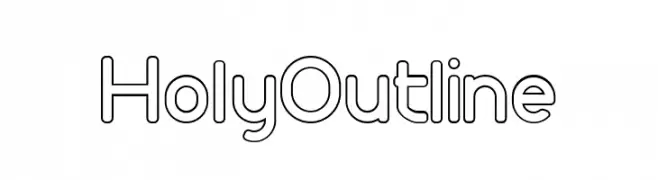
( Fonts by syabab - rahmad khoiri - Personal-use only. For commercial use please contact owner. )
A modern, geometric outline font with clean and consistent letterforms.
![Holy Outline font caratteri gratis]() Scaricare 62 Downloads@WebFont
Scaricare 62 Downloads@WebFont -
( Noto is a trademark of Google Inc. Noto fonts are open source. All Noto fonts are published under the SIL Open Font License, Version 1.1 )
Image contains placeholder glyphs, not a valid font sample.
![Noto Serif Lao Condensed ExtraLight font caratteri gratis]() Scaricare 62 Downloads@WebFont
Scaricare 62 Downloads@WebFont -
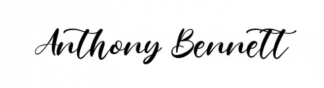
( Fonts by Kong Font - Personal-use only. For commercial use please contact owner. )
A stylish, cursive font with elegant, flowing strokes.
![Anthony Bennett font caratteri gratis]() Scaricare 62 Downloads@WebFont
Scaricare 62 Downloads@WebFont -
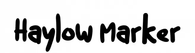
( Fonts by Kurnia Setyadi - Personal-use only. For commercial use please contact owner. )
A playful, handwritten marker-style font with bold, rounded characters.
![Haylow Marker font caratteri gratis]() Scaricare 62 Downloads@WebFont
Scaricare 62 Downloads@WebFont -
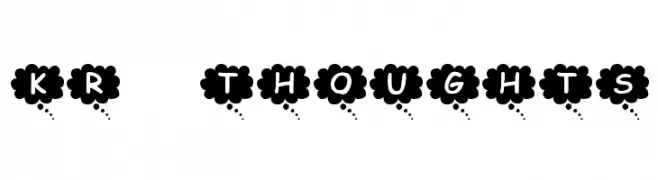
( Fonts by Kat`s Fun Fonts - Personal-use only. For commercial use please contact owner. )
A bold, decorative font with cloud-like borders around uppercase letters.
![KR Thoughts font caratteri gratis]() Scaricare 62 Downloads@WebFont
Scaricare 62 Downloads@WebFont -
( Fonts by Erik Studio - Personal-use only. For commercial use please contact owner. )
An elegant script font with flowing, cursive-like characters.
![Exotic font caratteri gratis]() Scaricare 62 Downloads@WebFont
Scaricare 62 Downloads@WebFont -
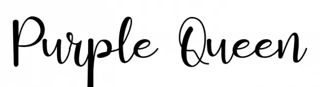
( Fonts by Fadlilah Studio - Personal-use only. For commercial use please contact owner. )
A playful and elegant script font with a handwritten appearance.
![Purple Queen font caratteri gratis]() Scaricare 62 Downloads@WebFont
Scaricare 62 Downloads@WebFont -
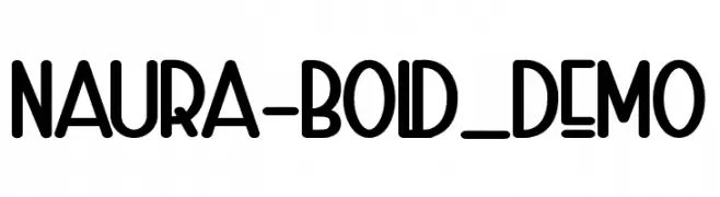
( Fonts by Omotu Studio - Ibnu Utomo - Personal-use only. For commercial use please contact owner. )
A bold, playful font with rounded edges and a modern look.
![Naura-Bold_DEMO font caratteri gratis]() Scaricare 62 Downloads@WebFont
Scaricare 62 Downloads@WebFont -
( Fonts by Chamdan Chakim - Personal-use only. For commercial use please contact owner. )
A bold, playful script font with a handwritten feel.
![Blackisot font caratteri gratis]() Scaricare 62 Downloads@WebFont
Scaricare 62 Downloads@WebFont -
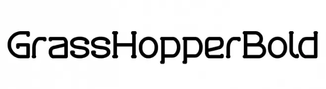
( Fonts by weknow - Wino S Kadir - Personal-use only. For commercial use please contact owner. )
A bold, playful font with rounded edges and a modern, whimsical style.
![Grass Hopper Bold font caratteri gratis]() Scaricare 62 Downloads@WebFont
Scaricare 62 Downloads@WebFont -
( Fonts by Bumbayo Font Fabrik - Personal-use only. For commercial use please contact owner. )
A bold, distressed font with a rugged, vintage appearance.
![3rdMan font caratteri gratis]() Scaricare 62 Downloads@WebFont
Scaricare 62 Downloads@WebFont -
( Fonts by Mans Greback - www.mansgreback.com - Personal-use only. For commercial use please contact owner. )
A modern, high-contrast font with elegant, slender characters.
![Sygma Bold font caratteri gratis]() Scaricare 62 Downloads@WebFont
Scaricare 62 Downloads@WebFont -
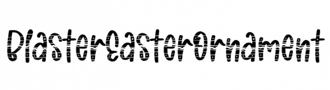
( Fonts by Rochart Studio )
A playful, decorative font with a festive pattern inside each character.
![Blaster Easter Ornament font caratteri gratis]() Scaricare 62 Downloads@WebFont
Scaricare 62 Downloads@WebFont -
( Fonts by Nasrun - Personal-use only. For commercial use please contact owner. )
A lively and energetic handwritten font with irregular strokes and playful style.
![ReadfasterRegular font caratteri gratis]() Scaricare 62 Downloads@WebFont
Scaricare 62 Downloads@WebFont -
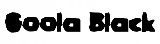
( Fonts by Meir Sadan - www.sadan.com Commerciali Caratteri )
A bold, playful font with irregular, chunky characters and a whimsical style.
![Goola Black font caratteri gratis]() Scaricare 62 Downloads
Scaricare 62 Downloads -
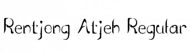
( Reiner Lomanto )
A decorative serif font with sharp serifs and elegant curves, blending traditional and modern styles.
![Rentjong Atjeh Regular font caratteri gratis]() Scaricare 62 Downloads@WebFont
Scaricare 62 Downloads@WebFont -
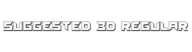
( Vladimir Nikolic - www.coroflot.com/vladimirnikolic )
A bold, 3D geometric font with angular, futuristic characters.
![Suggested 3D Regular font caratteri gratis]() Scaricare 62 Downloads@WebFont
Scaricare 62 Downloads@WebFont -
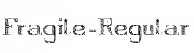
( Fonts by therefore - Personal-use only. For commercial use please contact owner. )
A decorative font with a mechanical, textured design using circles and lines.
![Fragile-Regular font caratteri gratis]() Scaricare 62 Downloads@WebFont
Scaricare 62 Downloads@WebFont -
Caratteri di ElBenjaZ09. For commercial use please contact the owner.
( Viejas Locas )
Energetic handwritten font with playful, irregular forms.
![Viejas Locas Regular font caratteri gratis]() Scaricare 62 Downloads@WebFont
Scaricare 62 Downloads@WebFont -
( Fonts by Typebae Foundry )
![Balgend font caratteri gratis]() Scaricare 62 Downloads@WebFont
Scaricare 62 Downloads@WebFont -
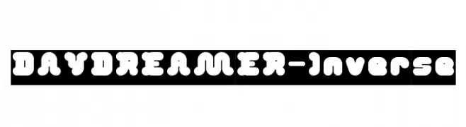
( weknow - Wino S Kadir - www.creativefabrica.com/designer/weknow/ )
A playful, bold font with rounded, bubbly characters and a whimsical style.
![DAY DREAMER-Inverse font caratteri gratis]() Scaricare 62 Downloads@WebFont
Scaricare 62 Downloads@WebFont -
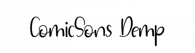
( Fonts by Edric Studio - Personal-use only. For commercial use please contact owner. )
A playful, handwritten-style font with flowing, cursive-like strokes.
![ComicSons Demp font caratteri gratis]() Scaricare 62 Downloads@WebFont
Scaricare 62 Downloads@WebFont -
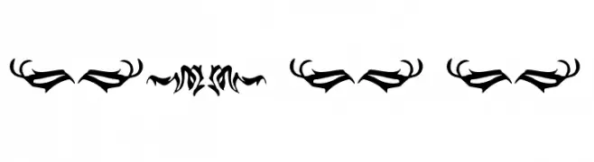
( Fonts by Kong Font - Personal-use only. For commercial use please contact owner. )
The image contains decorative ornaments, not a valid font.
![Black Panther Ornament font caratteri gratis]() Scaricare 62 Downloads@WebFont
Scaricare 62 Downloads@WebFont -
( Fonts by Pen Culture - Revo Farisky - Personal-use only. For commercial use please contact owner. )
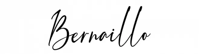
A dynamic, cursive script font with fluid, connected letters and a natural handwriting style.
![Bernaillo font caratteri gratis]() Scaricare 62 Downloads@WebFont
Scaricare 62 Downloads@WebFont -
( Fonts by Famco Typefoundry - Personal-use only. For commercial use please contact owner. )
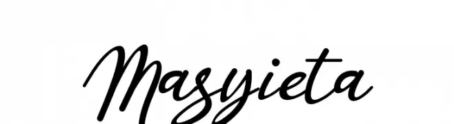
An elegant, flowing script font with interconnected, cursive letters.
![Masyieta font caratteri gratis]() Scaricare 62 Downloads@WebFont
Scaricare 62 Downloads@WebFont


Quali sono i font più popolari adesso?
Poppins, Roboto, Montserrat, Open Sans e Lato sono molto usati per le forme pulite e l'ampia applicabilità — dall'identità di marca alle landing page e ai poster.
Quali font si usano spesso nei loghi?
Le sans serif geometriche (es. Poppins, famiglie in stile Gotham) sono scelte comuni per un branding pulito e scalabile. Per un tocco personale restano valide script e stili manoscritti. Abbina un display deciso per i titoli a un corpo testo neutro per riconoscibilità ed equilibrio.
Ogni quanto si aggiorna la lista?
Con regolarità, in base ai download e all'attività reale. Torna spesso per scoprire in anticipo le nuove preferite.
💡 Consiglio: aggiungi ai preferiti — le tendenze cambiano in fretta e i font top di oggi possono ispirare il rebranding di domani.