Benvenuto nelle Font Più Popolari — dove popolarità e qualità si incontrano. Qui trovi i font più scaricati e usati dell'anno. Se cerchi scelte sicure per logo, web o social, inizia da qui.
Ogni font top si distingue per equilibrio, leggibilità e versatilità. Troverai sans serif moderne, script eleganti, serif vintage e display minimalisti.
-
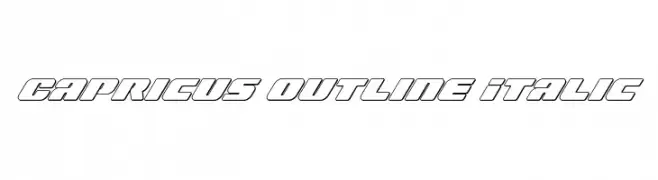
( Iconian Fonts - Daniel Zadorozny - www.iconian.com )
A bold, italicized outline font with a modern and dynamic style.
 Scaricare 64 Downloads@WebFont
 -
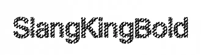
( Fonts by pOPdOG fONTS - Dimitris Kolyris - Personal-use only. For commercial use please contact owner. )
A bold, textured font with a diagonal crosshatch pattern, perfect for dynamic designs.
![Slang King Bold font caratteri gratis]() Scaricare 64 Downloads@WebFont
Scaricare 64 Downloads@WebFont -
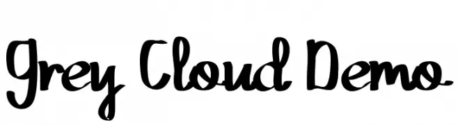
( Fonts by Edric Studio - Personal-use only. For commercial use please contact owner. )
A playful, bold handwritten font with smooth curves and a casual style.
![Grey Cloud Demo font caratteri gratis]() Scaricare 64 Downloads@WebFont
Scaricare 64 Downloads@WebFont -
( Fonts by Kong Font - Personal-use only. For commercial use please contact owner. )
A playful, cursive-like font with flowing strokes and varying thickness.
![MisterRoman font caratteri gratis]() Scaricare 64 Downloads@WebFont
Scaricare 64 Downloads@WebFont -
( Fonts by weknow - Wino S Kadir - Personal-use only. For commercial use please contact owner. )
A bold, playful font with a hand-drawn, rounded style.
![Back To Nature Bold font caratteri gratis]() Scaricare 64 Downloads@WebFont
Scaricare 64 Downloads@WebFont -
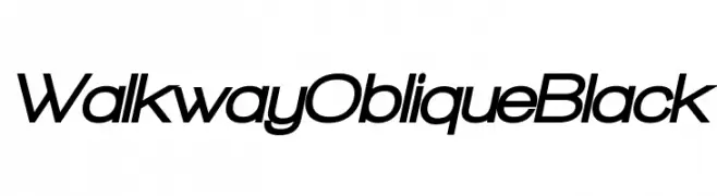
( Fonts by GemFonts - Typotheticals - Graham Meade - Personal-use only. For commercial use please contact owner. )
A bold, oblique font with a modern and dynamic style.
![Walkway Oblique Black font caratteri gratis]() Scaricare 64 Downloads@WebFont
Scaricare 64 Downloads@WebFont -
( madeDeduk )
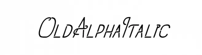
A cursive, elegant font with flowing lines and a modern twist.
![OldAlphaItalic font caratteri gratis]() Scaricare 64 Downloads@WebFont
Scaricare 64 Downloads@WebFont -
( Fonts by T. Christopher White - Personal-use only. For commercial use please contact owner. )
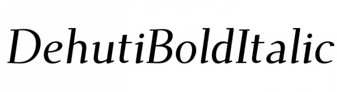
A bold, italic serif font with elegant curves and a classic style.
![Dehuti Bold Italic font caratteri gratis]() Scaricare 64 Downloads@WebFont
Scaricare 64 Downloads@WebFont -
( Fonts by GGBot - www.ggbot.net - Personal-use only. For commercial use please contact owner. )
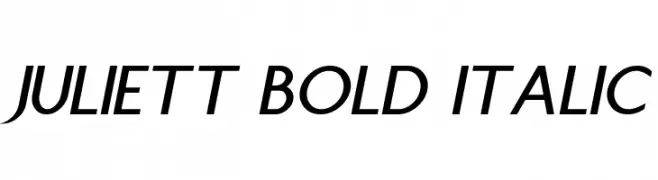
A bold and italicized font with smooth, elegant strokes and moderate contrast.
![Juliett Bold Italic font caratteri gratis]() Scaricare 64 Downloads@WebFont
Scaricare 64 Downloads@WebFont -
( Fonts by www.freesvgdesigns.com )
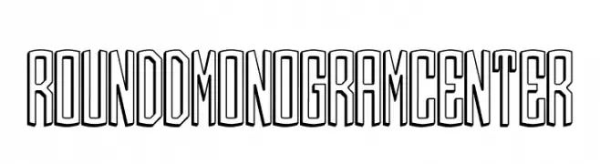
A bold, 3D monogram-style font with a modern, geometric design.
![Round_3D_Monogram_Center font caratteri gratis]() Scaricare 64 Downloads@WebFont
Scaricare 64 Downloads@WebFont -
( Fonts by Daniel Zadorozny - www.iconian.com - Personal-use only. For commercial use please contact owner. )
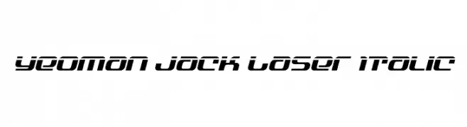
A futuristic, bold, and italicized font with sharp angles and a sleek design.
![Yeoman Jack Laser Italic font caratteri gratis]() Scaricare 64 Downloads@WebFont
Scaricare 64 Downloads@WebFont -
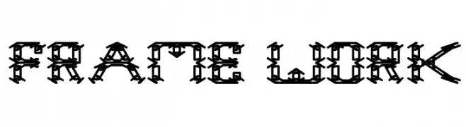
( Fonts by Wino S Kadir - weknow - www.revolge.com/shop/weknow/ - Personal-use only. For commercial use please contact owner. )
A bold, decorative font with intricate geometric patterns and industrial flair.
![frame work font caratteri gratis]() Scaricare 64 Downloads@WebFont
Scaricare 64 Downloads@WebFont -
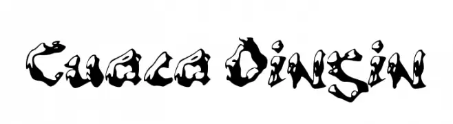
( Fonts by wep - Wahyu Eka Prasetya - Personal-use only. For commercial use please contact owner. )
A decorative font with a melting, fluid style and bold, irregular strokes.
![Cuaca Dingin font caratteri gratis]() Scaricare 64 Downloads@WebFont
Scaricare 64 Downloads@WebFont -
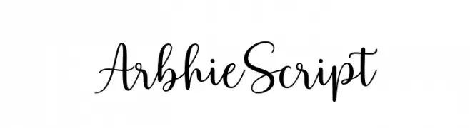
( Fonts by Zane Studio - Personal-use only. For commercial use please contact owner. )
An elegant, flowing script font with smooth, connected strokes.
![ArbhieScript font caratteri gratis]() Scaricare 64 Downloads@WebFont
Scaricare 64 Downloads@WebFont -
( Fonts by Mans Greback - www.mansgreback.com - Personal-use only. For commercial use please contact owner. )
A clean, modern sans-serif font with semi-bold weight and uniform stroke width.
![Garute Semi Bold font caratteri gratis]() Scaricare 64 Downloads@WebFont
Scaricare 64 Downloads@WebFont -
( Fonts by Ronny Studio )
A bold, graffiti-inspired font with sharp, angular lines and dynamic style.
![Wildside Regular font caratteri gratis]() Scaricare 64 Downloads@WebFont
Scaricare 64 Downloads@WebFont -
( Fonts by Damarletter )
Handwritten cursive script with elegant, flowing strokes.
![Kamilla Blue font caratteri gratis]() Scaricare 64 Downloads@WebFont
Scaricare 64 Downloads@WebFont -
( Fonts by FG Studios )
![Hurimate font caratteri gratis]() Scaricare 64 Downloads@WebFont
Scaricare 64 Downloads@WebFont -
( Fonts by Best Font Studio - Rifan Asri - Personal-use only. For commercial use please contact owner. )
A sophisticated, slanted script font with high contrast and flowing, connected characters.
![Cantona Slant Slant font caratteri gratis]() Scaricare 64 Downloads@WebFont
Scaricare 64 Downloads@WebFont -
( Fonts by Fontaris Studio - Aris Dpu - Personal-use only. For commercial use please contact owner. )
A dynamic and fluid script font with elegant, flowing letterforms.
![Amelli font caratteri gratis]() Scaricare 64 Downloads@WebFont
Scaricare 64 Downloads@WebFont -
![Furiosa Laser font caratteri gratis]() Scaricare 64 Downloads@WebFont
Scaricare 64 Downloads@WebFont -
( Noto is a trademark of Google Inc. Noto fonts are open source. All Noto fonts are published under the SIL Open Font License, Version 1.1 )
Error: No valid font glyphs visible.
![Noto Sans Khmer Condensed ExtraLight font caratteri gratis]() Scaricare 64 Downloads@WebFont
Scaricare 64 Downloads@WebFont -
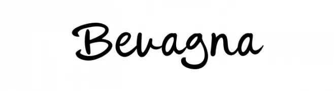
( Fonts by Khurasan )
![Bevagna font caratteri gratis]() Scaricare 64 Downloads@WebFont
Scaricare 64 Downloads@WebFont -
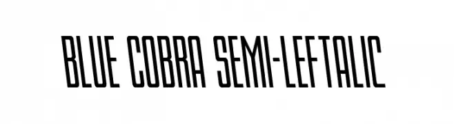
( Fonts by Daniel Zadorozny - www.iconian.com - Personal-use only. For commercial use please contact owner. )
A bold, condensed font with a leftward slant and modern geometric design.
![Blue Cobra Semi-Leftalic font caratteri gratis]() Scaricare 64 Downloads@WebFont
Scaricare 64 Downloads@WebFont -
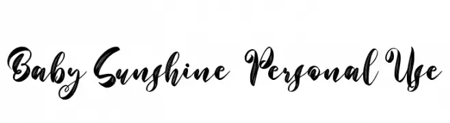
( Fonts by Sarif Letter - Personal-use only. For commercial use please contact owner. )
A bold, expressive script font with a lively, handwritten style.
![Baby Sunshine - Personal Use font caratteri gratis]() Scaricare 64 Downloads@WebFont
Scaricare 64 Downloads@WebFont -
( Fonts by ijem - Ferdiansyah Ferdiansyah - Personal-use only. For commercial use please contact owner. )
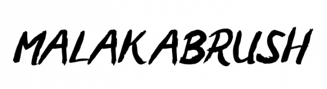
A bold, brush-style font with dynamic and expressive strokes.
![MALAKABRUSH font caratteri gratis]() Scaricare 64 Downloads@WebFont
Scaricare 64 Downloads@WebFont -
( Fonts by Cultivated Mind Fonts - Personal-use only. For commercial use please contact owner. )
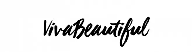
A bold, brush-style handwritten font with dynamic, expressive strokes.
![Viva Beautiful font caratteri gratis]() Scaricare 64 Downloads@WebFont
Scaricare 64 Downloads@WebFont -
( Odile Morales )
A modern, geometric font with consistent stroke width and angular design.
![rokyodil font caratteri gratis]() Scaricare 64 Downloads@WebFont
Scaricare 64 Downloads@WebFont -
( Helge Barske - www.barske.com )
A bold, geometric font with a blocky, digital appearance.
![kloezzler font caratteri gratis]() Scaricare 64 Downloads@WebFont
Scaricare 64 Downloads@WebFont -
( Fonts by Linecreative - ARI JUANDA - Personal-use only. For commercial use please contact owner. )
A hand-drawn, narrow font with textured, elongated characters.
![Kumachi font caratteri gratis]() Scaricare 64 Downloads@WebFont
Scaricare 64 Downloads@WebFont -
( Atjcloth Studio - Hanif Syahputra - creativemarket.com/Atjcloth?u=Atjcloth )
A playful, handwritten font with dynamic curves and unique flourishes.
![Limpoke Font Regular font caratteri gratis]() Scaricare 64 Downloads@WebFont
Scaricare 64 Downloads@WebFont -
( Iconian Fonts - Daniel Zadorozny - www.iconian.com )
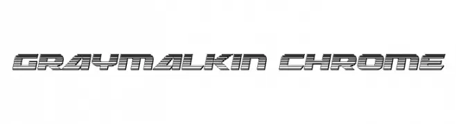
A bold, futuristic font with a chrome-like, striped design.
![Graymalkin Chrome font caratteri gratis]() Scaricare 64 Downloads@WebFont
Scaricare 64 Downloads@WebFont -
( Fonts by Daniel Zadorozny - www.iconian.com - Personal-use only. For commercial use please contact owner. )
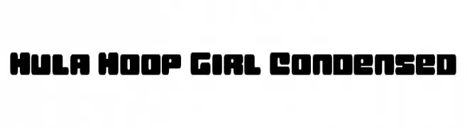
A bold, playful, and condensed font with rounded edges.
![Hula Hoop Girl Condensed font caratteri gratis]() Scaricare 64 Downloads@WebFont
Scaricare 64 Downloads@WebFont -
( Fonts by Daniel Zadorozny - www.iconian.com - Personal-use only. For commercial use please contact owner. )
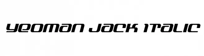
A modern, italic font with a sleek, futuristic design.
![Yeoman Jack Italic font caratteri gratis]() Scaricare 64 Downloads@WebFont
Scaricare 64 Downloads@WebFont -
( Fonts by Almarkhatype - Abdul Malik Wisnu - Personal-use only. For commercial use please contact owner. )
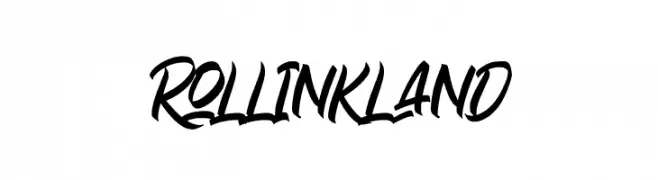
A bold, brush script font with dynamic, fluid strokes and a modern, edgy aesthetic.
![Rollinkland font caratteri gratis]() Scaricare 64 Downloads@WebFont
Scaricare 64 Downloads@WebFont


Quali sono i font più popolari adesso?
Poppins, Roboto, Montserrat, Open Sans e Lato sono molto usati per le forme pulite e l'ampia applicabilità — dall'identità di marca alle landing page e ai poster.
Quali font si usano spesso nei loghi?
Le sans serif geometriche (es. Poppins, famiglie in stile Gotham) sono scelte comuni per un branding pulito e scalabile. Per un tocco personale restano valide script e stili manoscritti. Abbina un display deciso per i titoli a un corpo testo neutro per riconoscibilità ed equilibrio.
Ogni quanto si aggiorna la lista?
Con regolarità, in base ai download e all'attività reale. Torna spesso per scoprire in anticipo le nuove preferite.
💡 Consiglio: aggiungi ai preferiti — le tendenze cambiano in fretta e i font top di oggi possono ispirare il rebranding di domani.