Benvenuto nelle Font Più Popolari — dove popolarità e qualità si incontrano. Qui trovi i font più scaricati e usati dell'anno. Se cerchi scelte sicure per logo, web o social, inizia da qui.
Ogni font top si distingue per equilibrio, leggibilità e versatilità. Troverai sans serif moderne, script eleganti, serif vintage e display minimalisti.
-
( Fonts by Kateeng Ciu - Personal-use only. For commercial use please contact owner. )
A bold, playful handwritten font with rounded, irregular letterforms.
 Scaricare 64 Downloads@WebFont
 -
( Fonts by Darrell Flood - Personal-use only. For commercial use please contact owner. )
A bold, geometric, and italic font with a futuristic and dynamic style.
![Robot Crush Italic font caratteri gratis]() Scaricare 64 Downloads@WebFont
Scaricare 64 Downloads@WebFont -
( Fonts by Hendra Pratama - Personal-use only. For commercial use please contact owner. )
A dynamic brush script font with expressive, fluid strokes.
![Rostheroid font caratteri gratis]() Scaricare 64 Downloads@WebFont
Scaricare 64 Downloads@WebFont -
( Fonts by Faldy Kudo - Personal-use only. For commercial use please contact owner. )
A lively, handwritten font with fluid, continuous strokes.
![Shafira font caratteri gratis]() Scaricare 64 Downloads@WebFont
Scaricare 64 Downloads@WebFont -
( Fonts by ingoFonts - Ingo Zimmermann - Personal-use only. For commercial use please contact owner. )
A bold, textured serif font with a handcrafted appearance.
![MaiersNr.Reduced-Bold font caratteri gratis]() Scaricare 64 Downloads@WebFont
Scaricare 64 Downloads@WebFont -
( Fonts by Aukimvisuel - Personal-use only. For commercial use please contact owner. )
A bold, flowing script font with elegant cursive letterforms.
![Rough Anthem font caratteri gratis]() Scaricare 64 Downloads@WebFont
Scaricare 64 Downloads@WebFont -
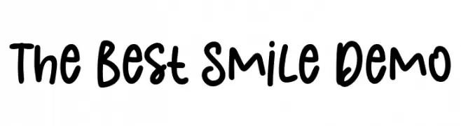
( Fonts by olivetype )
![The Best Smile Demo font caratteri gratis]() Scaricare 64 Downloads@WebFont
Scaricare 64 Downloads@WebFont -
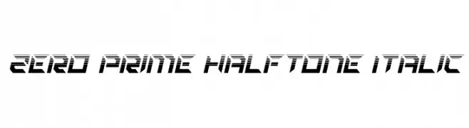
( Fonts by Daniel Zadorozny - www.iconian.com - Personal-use only. For commercial use please contact owner. )
A bold, italicized font with a futuristic halftone design and angular shapes.
![Zero Prime Halftone Italic font caratteri gratis]() Scaricare 64 Downloads@WebFont
Scaricare 64 Downloads@WebFont -
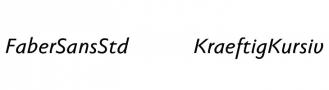
( Fonts by ingoFonts - Ingo Zimmermann - Personal-use only. For commercial use please contact owner. )
A modern, italic sans-serif font with clean lines and a dynamic slant.
![FaberSansStd-66KraeftigKursiv font caratteri gratis]() Scaricare 64 Downloads@WebFont
Scaricare 64 Downloads@WebFont -
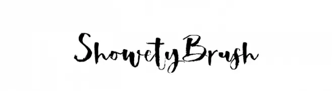
( Rifan Asri )
A bold, brush-style font with dynamic and expressive strokes.
![ShowetyBrush font caratteri gratis]() Scaricare 64 Downloads@WebFont
Scaricare 64 Downloads@WebFont -
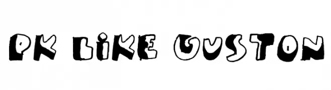
( paintblack - www.paintblackeditions.org/ )
A bold, playful, hand-drawn font with irregular, quirky characters.
![PK Like Guston font caratteri gratis]() Scaricare 64 Downloads@WebFont
Scaricare 64 Downloads@WebFont -
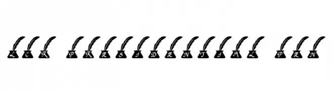
( LeChefRene - members.aol.com/lcrfonts/ )
A decorative serif font with characters in ink pots topped by quills.
![LCR Presidential Pen font caratteri gratis]() Scaricare 64 Downloads@WebFont
Scaricare 64 Downloads@WebFont -
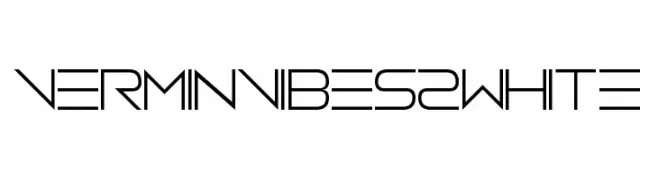
( Fonts by www.chequered.ink - Chequered Ink - Personal-use only. For commercial use please contact owner. )
A futuristic, geometric font with clean lines and angular shapes.
![Vermin Vibes 2 White font caratteri gratis]() Scaricare 64 Downloads@WebFont
Scaricare 64 Downloads@WebFont -
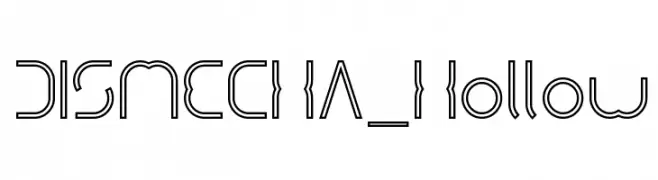
( weknow - Wino S Kadir - www.creativefabrica.com/designer/weknow/ )
A futuristic, hollow font with a mechanical and geometric design.
![DISMECHA_Hollow font caratteri gratis]() Scaricare 64 Downloads@WebFont
Scaricare 64 Downloads@WebFont -
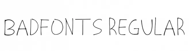
( Fonts by Miyawaki Yuki )
Playful handwritten font with irregular strokes.
![Badfonts Regular font caratteri gratis]() Scaricare 64 Downloads@WebFont
Scaricare 64 Downloads@WebFont -
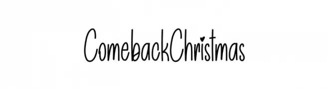
( Personal-use only. For commercial use please contact owner. )
Playful, tall handwritten font with a whimsical style.
![Comeback Christmas font caratteri gratis]() Scaricare 64 Downloads@WebFont
Scaricare 64 Downloads@WebFont -
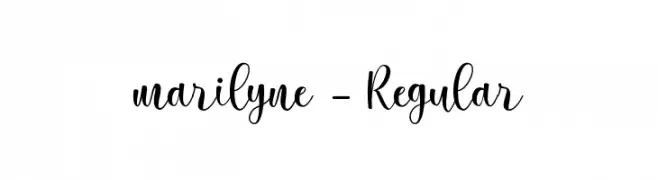
( Fonts by Silverdav Studio - David Kasidi - Personal-use only. For commercial use please contact owner. )
A flowing, cursive script with elegant loops and swashes.
![marilyne-Regular font caratteri gratis]() Scaricare 64 Downloads@WebFont
Scaricare 64 Downloads@WebFont -
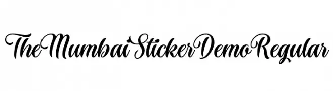
( Fonts by Roland Huse Design - Roland Huse - Personal-use only. For commercial use please contact owner. )
An elegant script font with flowing, cursive strokes and artistic flair.
![The Mumbai Sticker Demo Regular font caratteri gratis]() Scaricare 64 Downloads@WebFont
Scaricare 64 Downloads@WebFont -
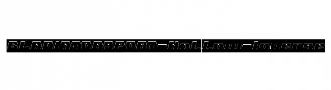
( weknow - Wino S Kadir - www.creativefabrica.com/designer/weknow/ )
A bold, hollow, inverse font with a modern, sporty aesthetic.
![GLADIATOR SPORT-Hollow-Inverse font caratteri gratis]() Scaricare 64 Downloads@WebFont
Scaricare 64 Downloads@WebFont -
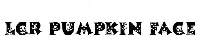
( LeChefRene - members.aol.com/lcrfonts/ )
A Halloween-themed font with jack-o'-lantern faces in each character.
![LCR Pumpkin Face font caratteri gratis]() Scaricare 64 Downloads@WebFont
Scaricare 64 Downloads@WebFont -
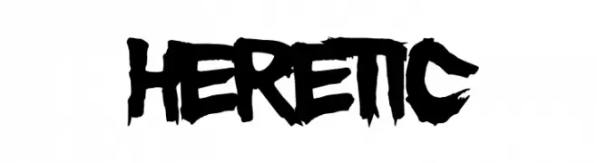
( Fonts by Font Monger - Chris Vile - Personal-use only. For commercial use please contact owner. )
A bold, edgy font with a hand-painted, rebellious style.
![Heretic font caratteri gratis]() Scaricare 64 Downloads@WebFont
Scaricare 64 Downloads@WebFont -
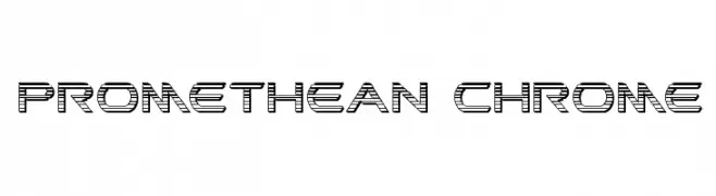
( Iconian Fonts - Daniel Zadorozny - www.iconian.com )
A futuristic, multi-line font with a geometric and industrial design.
![Promethean Chrome font caratteri gratis]() Scaricare 64 Downloads@WebFont
Scaricare 64 Downloads@WebFont -
( Fonts by Font Monger - Chris Vile - Personal-use only. For commercial use please contact owner. )
A bold, distressed font with a futuristic and edgy design.
![MustafarReloaded font caratteri gratis]() Scaricare 64 Downloads@WebFont
Scaricare 64 Downloads@WebFont -
( Fonts by Xerographer Fonts - Max Infeld - Personal-use only. For commercial use please contact owner. )
A geometric and futuristic font with sharp angles and clean lines.
![Martienso Medium font caratteri gratis]() Scaricare 64 Downloads@WebFont
Scaricare 64 Downloads@WebFont -
( Caveras - Cliff Modes - caveras.net )
A pixelated, retro-style font with a bold, blocky design.
![Kouryuu font caratteri gratis]() Scaricare 64 Downloads@WebFont
Scaricare 64 Downloads@WebFont -
( Fonts by Pineungtype Missinklab - Personal-use only. For commercial use please contact owner. )
An elegant, flowing script font with graceful curves and fluid strokes.
![Anstting Kishon font caratteri gratis]() Scaricare 64 Downloads@WebFont
Scaricare 64 Downloads@WebFont -
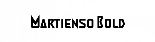
( Fonts by Xerographer Fonts - Max Infeld - Personal-use only. For commercial use please contact owner. )
A bold, geometric font with a futuristic and modern design.
![Martienso Bold font caratteri gratis]() Scaricare 64 Downloads@WebFont
Scaricare 64 Downloads@WebFont -
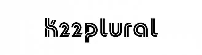
( Fonts by Toto - Personal-use only. For commercial use please contact owner. )
A geometric, double-line font with a modern and futuristic style.
![K22Plural font caratteri gratis]() Scaricare 64 Downloads@WebFont
Scaricare 64 Downloads@WebFont -
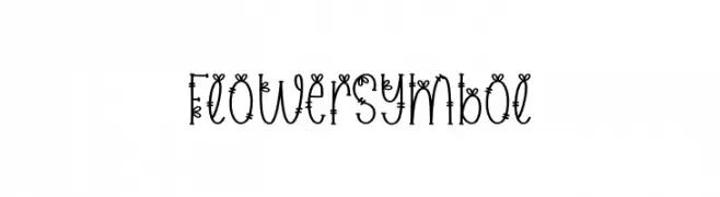
( Fonts by Scratchones )
A decorative font with floral elements integrated into each character.
![Flower Symbol font caratteri gratis]() Scaricare 64 Downloads@WebFont
Scaricare 64 Downloads@WebFont -
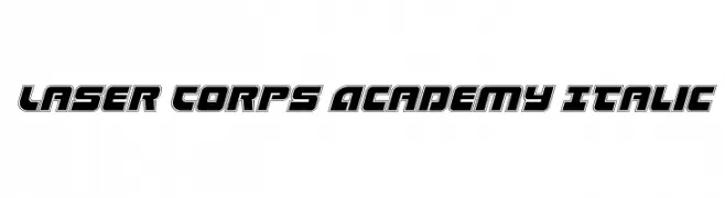
( Fonts by Daniel Zadorozny - www.iconian.com - Personal-use only. For commercial use please contact owner. )
A bold, italicized font with a futuristic and geometric design.
![Laser Corps Academy Italic font caratteri gratis]() Scaricare 64 Downloads@WebFont
Scaricare 64 Downloads@WebFont -
( Fonts by www.chequered.ink - Chequered Ink - Personal-use only. For commercial use please contact owner. )
A playful, double-line decorative font with a whimsical and dynamic style.
![Twizzled font caratteri gratis]() Scaricare 64 Downloads@WebFont
Scaricare 64 Downloads@WebFont -
( Fonts by Maulana Creative - Gilang Maulana - Personal-use only. For commercial use please contact owner. )
An elegant, flowing script font with a natural handwritten style.
![Blisslayton Free Regular font caratteri gratis]() Scaricare 64 Downloads@WebFont
Scaricare 64 Downloads@WebFont -
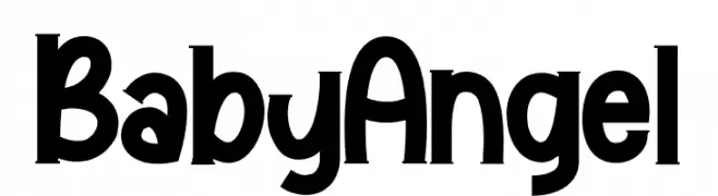
( Fonts by StringLabs - stringlabscreative.com - Personal-use only. For commercial use please contact owner. )
A playful and whimsical font with bold, curvy elements and a lively appearance.
![Baby Angel font caratteri gratis]() Scaricare 64 Downloads@WebFont
Scaricare 64 Downloads@WebFont -
( Intellecta Design - new.myfonts.com/search/intellecta/fonts/?sort=sales?refby=paulow )
Ornate hand-drawn calligraphic frames with vintage flourishes.
![RoughCalligraphicFrames font caratteri gratis]() Scaricare 64 Downloads@WebFont
Scaricare 64 Downloads@WebFont -
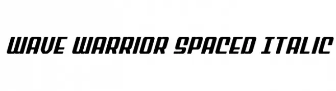
( Fonts by Daniel Zadorozny - www.iconian.com - Personal-use only. For commercial use please contact owner. )
A bold, italicized font with a modern, energetic style.
![Wave Warrior Spaced Italic font caratteri gratis]() Scaricare 64 Downloads@WebFont
Scaricare 64 Downloads@WebFont


Quali sono i font più popolari adesso?
Poppins, Roboto, Montserrat, Open Sans e Lato sono molto usati per le forme pulite e l'ampia applicabilità — dall'identità di marca alle landing page e ai poster.
Quali font si usano spesso nei loghi?
Le sans serif geometriche (es. Poppins, famiglie in stile Gotham) sono scelte comuni per un branding pulito e scalabile. Per un tocco personale restano valide script e stili manoscritti. Abbina un display deciso per i titoli a un corpo testo neutro per riconoscibilità ed equilibrio.
Ogni quanto si aggiorna la lista?
Con regolarità, in base ai download e all'attività reale. Torna spesso per scoprire in anticipo le nuove preferite.
💡 Consiglio: aggiungi ai preferiti — le tendenze cambiano in fretta e i font top di oggi possono ispirare il rebranding di domani.