Benvenuto nelle Font Più Popolari — dove popolarità e qualità si incontrano. Qui trovi i font più scaricati e usati dell'anno. Se cerchi scelte sicure per logo, web o social, inizia da qui.
Ogni font top si distingue per equilibrio, leggibilità e versatilità. Troverai sans serif moderne, script eleganti, serif vintage e display minimalisti.
-
( Fonts by Amin Studio - Personal-use only. For commercial use please contact owner. )
A bold, brush-style font with an edgy, dynamic appearance.
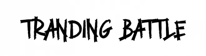 Scaricare 61 Downloads@WebFont
 -
( Fonts by Kong Font - fontkong.com - Personal-use only. For commercial use please contact owner. )
A bold, expressive script font with fluid, interconnected strokes.
![Warox font caratteri gratis]() Scaricare 61 Downloads@WebFont
Scaricare 61 Downloads@WebFont -
( Fonts by Vladimir Nikolic - www.creativefabrica.com/designer/vladimirnikolic/ - Personal-use only. For commercial use please contact owner. )
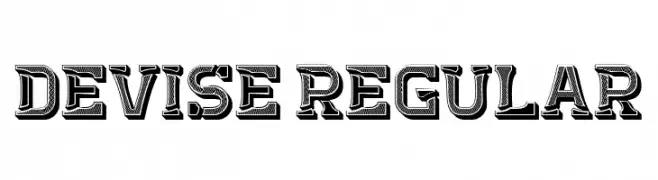
A bold, decorative font with intricate patterns and a vintage-modern style.
![Devise Regular font caratteri gratis]() Scaricare 61 Downloads@WebFont
Scaricare 61 Downloads@WebFont -
( Fonts by ingoFonts - Ingo Zimmermann - Personal-use only. For commercial use please contact owner. )
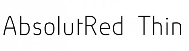
A sleek, modern font with thin, clean lines and a minimalist aesthetic.
![AbsolutRed-Thin font caratteri gratis]() Scaricare 61 Downloads@WebFont
Scaricare 61 Downloads@WebFont -
( Fonts by Inayati Thahir - Personal-use only. For commercial use please contact owner. )
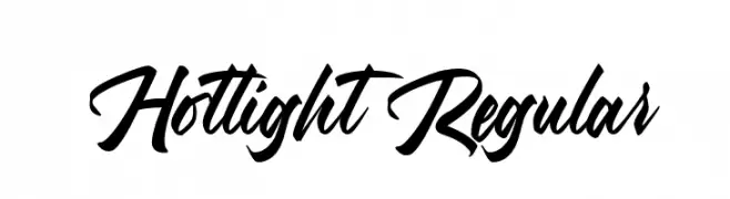
A bold, flowing script font with dynamic, connected letters.
![Hotlight Regular font caratteri gratis]() Scaricare 61 Downloads@WebFont
Scaricare 61 Downloads@WebFont -
( Fonts by wep - Wahyu Eka Prasetya - Personal-use only. For commercial use please contact owner. )
A bold, hand-drawn font with thick, uneven strokes and a dynamic style.
![Codetan font caratteri gratis]() Scaricare 61 Downloads@WebFont
Scaricare 61 Downloads@WebFont -
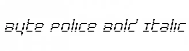
( Iconian Fonts - Daniel Zadorozny - www.iconian.com )
A bold, italic, dotted font with a modern, digital aesthetic.
![Byte Police Bold Italic font caratteri gratis]() Scaricare 61 Downloads@WebFont
Scaricare 61 Downloads@WebFont -
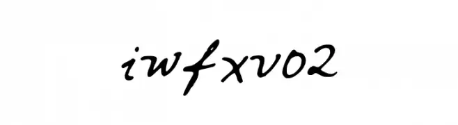
( iwfx - twitter.com/iwfx )
A cursive, handwritten font with fluid, connected strokes.
![iwfxv02 font caratteri gratis]() Scaricare 61 Downloads@WebFont
Scaricare 61 Downloads@WebFont -
( Fonts by BeauType Studio - beautique.vn - Personal-use only. For commercial use please contact owner. )
Elegant serif font with high contrast and refined details.
![Beautique Display Medium font caratteri gratis]() Scaricare 61 Downloads@WebFont
Scaricare 61 Downloads@WebFont -
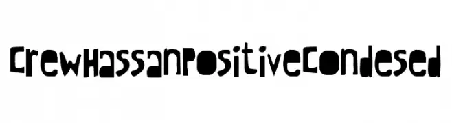
![CrewHassan Positive Condesed font caratteri gratis]() Scaricare 61 Downloads@WebFont
Scaricare 61 Downloads@WebFont -
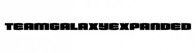
( Fonts by Daniel Zadorozny - www.iconian.com - Personal-use only. For commercial use please contact owner. )
A bold, expansive font with thick, block-like letterforms for a modern and strong appearance.
![Team Galaxy Expanded font caratteri gratis]() Scaricare 61 Downloads@WebFont
Scaricare 61 Downloads@WebFont -
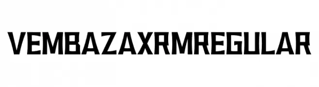
( Fonts by HIRO std - Personal-use only. For commercial use please contact owner. )
A bold, angular font with a geometric and striking design.
![VEMBAZAX RM REGULAR font caratteri gratis]() Scaricare 61 Downloads@WebFont
Scaricare 61 Downloads@WebFont -
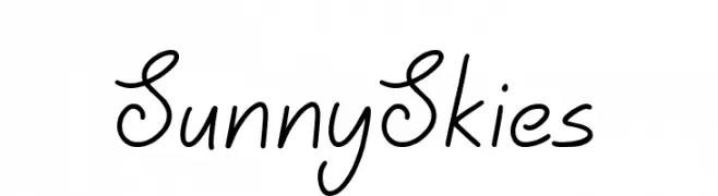
( Fonts by Jonathan S. Harris - Personal-use only. For commercial use please contact owner. )
A casual, friendly handwritten font with smooth, flowing lines and a slightly slanted style.
![Sunny Skies font caratteri gratis]() Scaricare 61 Downloads@WebFont
Scaricare 61 Downloads@WebFont -
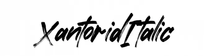
( Fonts by Letterena Studios - letterena.com - Personal-use only. For commercial use please contact owner. )
A bold, brush-style italic font with dynamic, hand-painted characteristics.
![Xantorid Italic font caratteri gratis]() Scaricare 61 Downloads@WebFont
Scaricare 61 Downloads@WebFont -
( Fonts by Kat`s Fun Fonts - Personal-use only. For commercial use please contact owner. )
A bold, decorative font with black cat silhouettes integrated into each letter.
![KR Black Kat font caratteri gratis]() Scaricare 61 Downloads@WebFont
Scaricare 61 Downloads@WebFont -
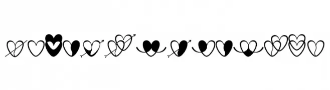
( Fonts by Marwah Store - Alexe Crisna - Personal-use only. For commercial use please contact owner. )
A playful heart and arrow design, ideal for romantic themes.
![love-artdesign font caratteri gratis]() Scaricare 61 Downloads@WebFont
Scaricare 61 Downloads@WebFont -
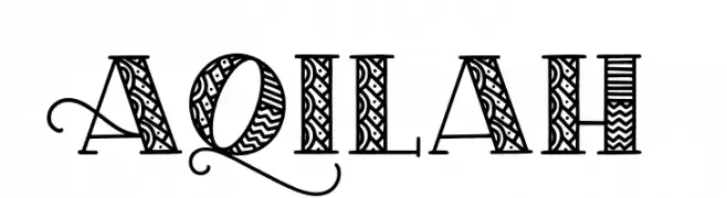
( Fonts by Abo Daniel Studio - Panggah Laksono - Personal-use only. For commercial use please contact owner. )
An ornate, decorative font with intricate patterns and flourishes.
![Aqilah font caratteri gratis]() Scaricare 61 Downloads@WebFont
Scaricare 61 Downloads@WebFont -
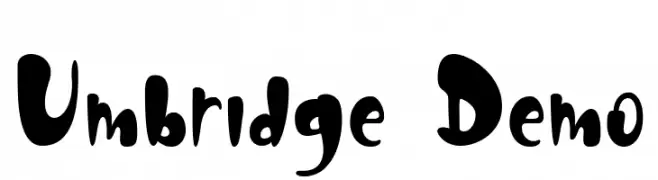
( Fonts by nariswari_creative - Taufik Dwi Purnomo - Personal-use only. For commercial use please contact owner. )
A playful, bold font with rounded, exaggerated curves and a whimsical style.
![Umbridge Demo font caratteri gratis]() Scaricare 61 Downloads@WebFont
Scaricare 61 Downloads@WebFont -
( Fonts by Kong Font - fontkong.com - Personal-use only. For commercial use please contact owner. )
A bold, expressive handwritten font with dynamic strokes and artistic flair.
![Olince font caratteri gratis]() Scaricare 61 Downloads@WebFont
Scaricare 61 Downloads@WebFont -
![Joy Shark Condensed font caratteri gratis]() Scaricare 61 Downloads@WebFont
Scaricare 61 Downloads@WebFont -
( Fonts by Yusa Studio )
![Fleur Denuit font caratteri gratis]() Scaricare 61 Downloads@WebFont
Scaricare 61 Downloads@WebFont -
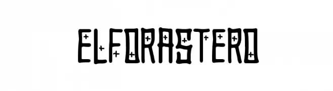
( Woodcutter - woodcutter Manero - www.woodcutter.es )
A bold, decorative font with cross-like embellishments and a cohesive design.
![El Forastero font caratteri gratis]() Scaricare 61 Downloads@WebFont
Scaricare 61 Downloads@WebFont -
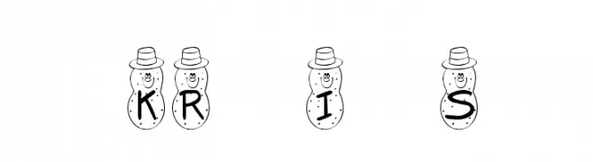
( Fonts by Kat`s Fun Fonts - Personal-use only. For commercial use please contact owner. )
A playful, decorative font with letters inside cartoon potato characters.
![KR Irish Spudman font caratteri gratis]() Scaricare 61 Downloads@WebFont
Scaricare 61 Downloads@WebFont -
( Fonts by Emily Lime Design - Emily Conners - Personal-use only. For commercial use please contact owner. )
An elegant, flowing script font with calligraphic influences and ornate flourishes.
![CarolynaWords font caratteri gratis]() Scaricare 61 Downloads@WebFont
Scaricare 61 Downloads@WebFont -
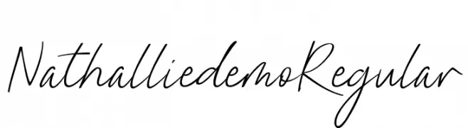
( Fonts by Tegaki Script - Personal-use only. For commercial use please contact owner. )
A flowing, elegant handwritten script with a personal touch.
![Nathallie demo Regular font caratteri gratis]() Scaricare 61 Downloads@WebFont
Scaricare 61 Downloads@WebFont -
( Fonts by Vultype )
![Wadmont font caratteri gratis]() Scaricare 61 Downloads@WebFont
Scaricare 61 Downloads@WebFont -
( Fonts by Edric Studio - Personal-use only. For commercial use please contact owner. )
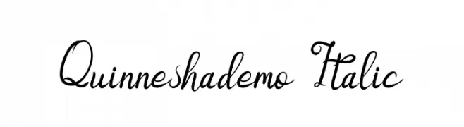
An elegant, flowing script font with ornate, cursive letterforms and italic styling.
![Quinneshademo Italic font caratteri gratis]() Scaricare 61 Downloads@WebFont
Scaricare 61 Downloads@WebFont -
( Fonts by Beautypes - Bhakti Al Akbar Pasaribu - Personal-use only. For commercial use please contact owner. )
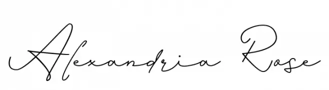
An elegant cursive script font with fluid, connected letters and graceful curves.
![Alexandria Rose font caratteri gratis]() Scaricare 61 Downloads@WebFont
Scaricare 61 Downloads@WebFont -
( Fonts by Justin Penner - Personal-use only. For commercial use please contact owner. )
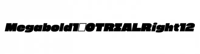
A bold, modern font with a dynamic slant and strong visual impact.
![Megabold 1.0 TRIAL Right 12 font caratteri gratis]() Scaricare 61 Downloads@WebFont
Scaricare 61 Downloads@WebFont -
( Fonts by Yoga Letter - Isroni Yoga Prasetya - Personal-use only. For commercial use please contact owner. )
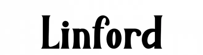
A bold, vintage-inspired font with a modern twist, featuring strong, condensed uppercase letters and harmonious lowercase characters.
![Linford font caratteri gratis]() Scaricare 61 Downloads@WebFont
Scaricare 61 Downloads@WebFont -
( Thor Christopher Arisland - www.tcarisland.com )
A modern, high-contrast font with sleek, elegant lines and geometric structure.
![HighSociety font caratteri gratis]() Scaricare 61 Downloads@WebFont
Scaricare 61 Downloads@WebFont -
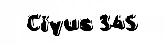
( Fonts by Wahyu Eka Prasetya - wepfont.com - Personal-use only. For commercial use please contact owner. )
A bold, artistic font with a brush-like texture and dynamic style.
![Ciyus 345 font caratteri gratis]() Scaricare 61 Downloads@WebFont
Scaricare 61 Downloads@WebFont -
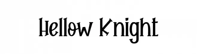
( Fonts by Beautypes - Bhakti Al Akbar Pasaribu - Personal-use only. For commercial use please contact owner. )
A playful and whimsical font with dynamic, slanted letterforms.
![Hellow Knight font caratteri gratis]() Scaricare 61 Downloads@WebFont
Scaricare 61 Downloads@WebFont -
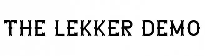
( Fonts by Edric Studio - Personal-use only. For commercial use please contact owner. )
A bold, decorative font with vintage and modern elements, ideal for standout designs.
![The Lekker DEMO font caratteri gratis]() Scaricare 61 Downloads@WebFont
Scaricare 61 Downloads@WebFont -
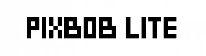
( Fonts by Habib Khoirul Fajar - Personal-use only. For commercial use please contact owner. )
A bold, pixelated font with a retro digital aesthetic.
![PixBob Lite font caratteri gratis]() Scaricare 61 Downloads@WebFont
Scaricare 61 Downloads@WebFont


Quali sono i font più popolari adesso?
Poppins, Roboto, Montserrat, Open Sans e Lato sono molto usati per le forme pulite e l'ampia applicabilità — dall'identità di marca alle landing page e ai poster.
Quali font si usano spesso nei loghi?
Le sans serif geometriche (es. Poppins, famiglie in stile Gotham) sono scelte comuni per un branding pulito e scalabile. Per un tocco personale restano valide script e stili manoscritti. Abbina un display deciso per i titoli a un corpo testo neutro per riconoscibilità ed equilibrio.
Ogni quanto si aggiorna la lista?
Con regolarità, in base ai download e all'attività reale. Torna spesso per scoprire in anticipo le nuove preferite.
💡 Consiglio: aggiungi ai preferiti — le tendenze cambiano in fretta e i font top di oggi possono ispirare il rebranding di domani.