Benvenuto nelle Font Più Popolari — dove popolarità e qualità si incontrano. Qui trovi i font più scaricati e usati dell'anno. Se cerchi scelte sicure per logo, web o social, inizia da qui.
Ogni font top si distingue per equilibrio, leggibilità e versatilità. Troverai sans serif moderne, script eleganti, serif vintage e display minimalisti.
-
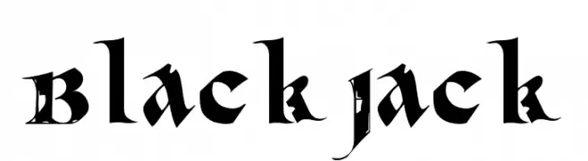
( Fonts by Kong Font - Personal-use only. For commercial use please contact owner. )
A bold, gothic-style font with intricate detailing and sharp angles.
 Scaricare 63 Downloads@WebFont
 -
( Fonts by Edy Wiyono )
A decorative font with floral patterns integrated into the outline of each character.
![Floral Season Outline font caratteri gratis]() Scaricare 63 Downloads@WebFont
Scaricare 63 Downloads@WebFont -
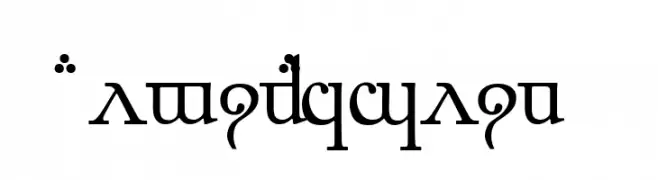
( Fonts by Peter Wiegel - www.peter-wiegel.de - Personal-use only. For commercial use please contact owner. )
An ornate and decorative font with intricate flourishes and a mystical style.
![ElbicCaslin font caratteri gratis]() Scaricare 63 Downloads@WebFont
Scaricare 63 Downloads@WebFont -
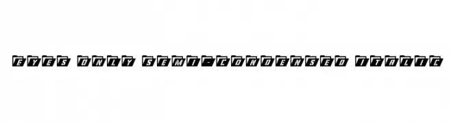
( Iconian Fonts - Daniel Zadorozny - www.iconian.com )
Bold, italicized font with a semi-condensed width and high contrast, enclosed in a folder-like shape.
![Eyes Only Semi-Condensed Italic font caratteri gratis]() Scaricare 63 Downloads@WebFont
Scaricare 63 Downloads@WebFont -
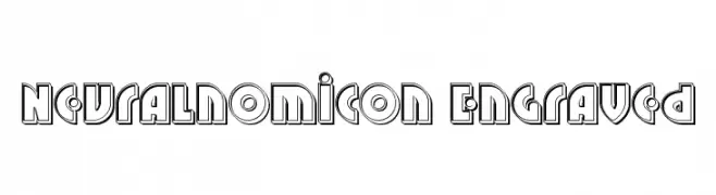
( Iconian Fonts - Daniel Zadorozny - www.iconian.com )
A bold, engraved font with a futuristic and geometric style.
![Neuralnomicon Engraved font caratteri gratis]() Scaricare 63 Downloads@WebFont
Scaricare 63 Downloads@WebFont -
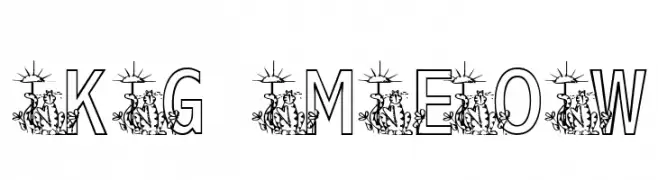
( Katz Fontz - katzfonts.50megs.com/kg.html )
A whimsical font with bold outlines and integrated cat illustrations.
![KG MEOW2 font caratteri gratis]() Scaricare 63 Downloads@WebFont
Scaricare 63 Downloads@WebFont -
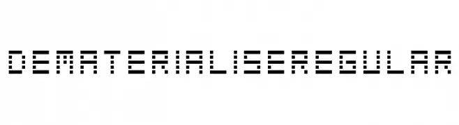
( Nicolarts )
A pixelated, futuristic font with a digital, geometric design.
![DematerialiseRegular font caratteri gratis]() Scaricare 63 Downloads@WebFont
Scaricare 63 Downloads@WebFont -
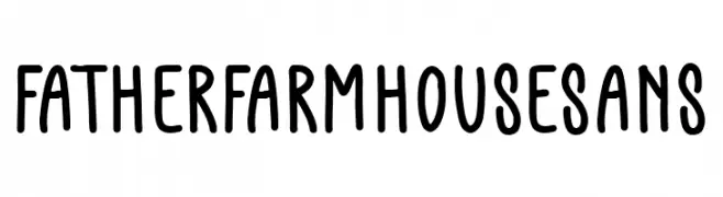
( Fonts by AZ Std - Muh Aswar - Personal-use only. For commercial use please contact owner. )
A playful, handwritten font with rounded, irregular letterforms.
![Father Farmhouse Sans font caratteri gratis]() Scaricare 63 Downloads@WebFont
Scaricare 63 Downloads@WebFont -
( aldedesign - Alde Saputro - creativemarket.com/aldedesign?u=aldedesign )
A whimsical, heart-adorned font with tall, slender characters and a modern flair.
![Ubur Ubur with Love alternatif1 font caratteri gratis]() Scaricare 63 Downloads@WebFont
Scaricare 63 Downloads@WebFont -
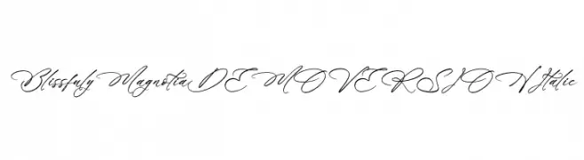
( Fonts by Letterena Studios )
A graceful, italic script font with a handwritten, calligraphic feel.
![Blissfuly Magnotia DEMO VERSION Italic font caratteri gratis]() Scaricare 63 Downloads@WebFont
Scaricare 63 Downloads@WebFont -
( Fonts by Peter Wiegel - www.peter-wiegel.de - Personal-use only. For commercial use please contact owner. )
Bold, geometric pictograms and sans-serif numerals for signage.
![Zeichen Zweihundert font caratteri gratis]() Scaricare 63 Downloads@WebFont
Scaricare 63 Downloads@WebFont -
( Fonts by Apulakan Siklab - Marthy Austria - Personal-use only. For commercial use please contact owner. )
A decorative and flowing font with artistic letterforms.
![Dutina font caratteri gratis]() Scaricare 63 Downloads@WebFont
Scaricare 63 Downloads@WebFont -
( Fonts by Letterhend Studio - Hendry Juanda - Personal-use only. For commercial use please contact owner. )
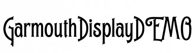
A decorative font with whimsical curves and artistic flair.
![GarmouthDisplayDEMO font caratteri gratis]() Scaricare 63 Downloads@WebFont
Scaricare 63 Downloads@WebFont -
( Fonts by Letterlycious - Personal-use only. For commercial use please contact owner. )
A playful, hand-drawn font with elongated, quirky letterforms.
![Avoid font caratteri gratis]() Scaricare 63 Downloads@WebFont
Scaricare 63 Downloads@WebFont -
( Iconian Fonts - Daniel Zadorozny - www.iconian.com )
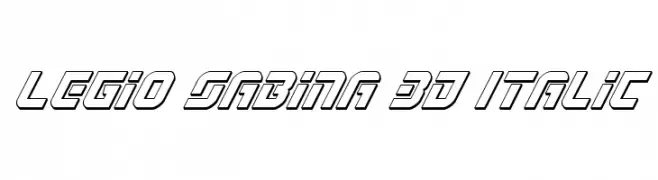
A bold, 3D italic font with a futuristic and dynamic design.
![Legio Sabina 3D Italic font caratteri gratis]() Scaricare 63 Downloads@WebFont
Scaricare 63 Downloads@WebFont -
( Iconian Fonts - Daniel Zadorozny - www.iconian.com )
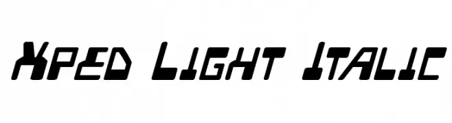
A dynamic, angular font with a futuristic and italicized style.
![Xped Light Italic font caratteri gratis]() Scaricare 63 Downloads@WebFont
Scaricare 63 Downloads@WebFont -
( weknow - Wino S Kadir - www.creativefabrica.com/designer/weknow/ )
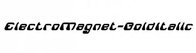
A bold, italicized font with a futuristic and dynamic style.
![ElectroMagnet-BoldItalic font caratteri gratis]() Scaricare 63 Downloads@WebFont
Scaricare 63 Downloads@WebFont -
( Font-a-licious - www.fontalicious.com/ )
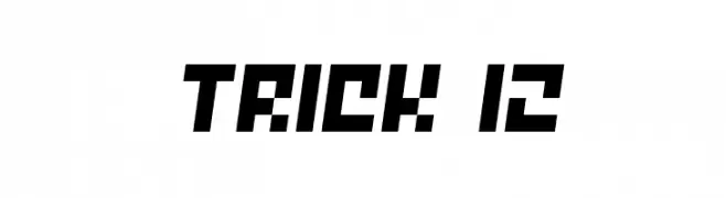
A bold, geometric font with a modern, angular design.
![Trick 12 font caratteri gratis]() Scaricare 63 Downloads@WebFont
Scaricare 63 Downloads@WebFont -
( Fonts by Ketapel Creative - Personal-use only. For commercial use please contact owner. )
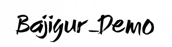
A bold, brush-style font with an energetic, hand-painted look.
![Bajigur_Demo font caratteri gratis]() Scaricare 63 Downloads@WebFont
Scaricare 63 Downloads@WebFont -
( Fonts by Kong Font - Personal-use only. For commercial use please contact owner. )
A lively and expressive handwritten font with elegant flourishes.
![Chrisbellin font caratteri gratis]() Scaricare 63 Downloads@WebFont
Scaricare 63 Downloads@WebFont -
( Fonts by Yves Michel - Personal-use only. For commercial use please contact owner. )
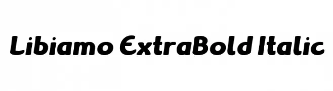
A bold, italic font with rounded characters and a dynamic, energetic style.
![Libiamo ExtraBold Italic font caratteri gratis]() Scaricare 63 Downloads@WebFont
Scaricare 63 Downloads@WebFont -
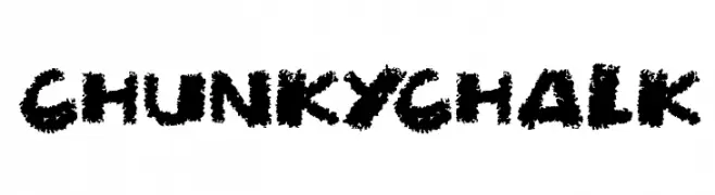
( Darrell Flood )
A bold, textured font with a chalk-like appearance, perfect for creative projects.
![Chunky Chalk font caratteri gratis]() Scaricare 63 Downloads@WebFont
Scaricare 63 Downloads@WebFont -
( Fonts by Ahmad Dindin )
A playful, bold font with rounded edges and a hand-drawn feel.
![Com_com Regular font caratteri gratis]() Scaricare 63 Downloads@WebFont
Scaricare 63 Downloads@WebFont -
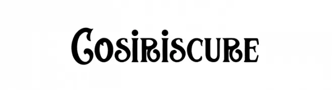
( Fonts by Kong Font - https://fontkong.com/ - Personal-use only. For commercial use please contact owner. )
A bold, decorative font with intricate swirls and flourishes.
![Cosiris cure font caratteri gratis]() Scaricare 63 Downloads@WebFont
Scaricare 63 Downloads@WebFont -
( Fonts by Letterlycious - Personal-use only. For commercial use please contact owner. )
A cursive, handwritten-style font with elegant, flowing characters.
![Rules font caratteri gratis]() Scaricare 63 Downloads@WebFont
Scaricare 63 Downloads@WebFont -
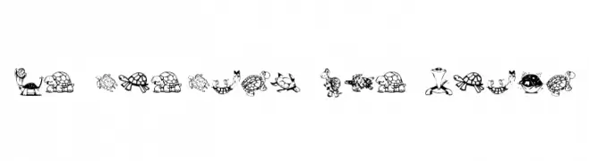
( Fonts by Kat`s Fun Fonts - Personal-use only. For commercial use please contact owner. )
Cartoon turtle illustrations replace standard alphanumeric characters.
![KR Turtles For Julie font caratteri gratis]() Scaricare 63 Downloads@WebFont
Scaricare 63 Downloads@WebFont -
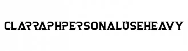
( Fonts by Vacatype Co. - Vacatype - Personal-use only. For commercial use please contact owner. )
A bold, angular font with a futuristic and edgy style.
![Clarraph Personal Use Heavy font caratteri gratis]() Scaricare 63 Downloads@WebFont
Scaricare 63 Downloads@WebFont -
( Fonts by Debut Studio - Ari Fadli - Personal-use only. For commercial use please contact owner. )
A bold and flowing script font with interconnected letters and expressive strokes.
![Debutan Brush Script font caratteri gratis]() Scaricare 63 Downloads@WebFont
Scaricare 63 Downloads@WebFont -
( Fonts by Weape Studio - Wahyu Andi - Personal-use only. For commercial use please contact owner. )
A playful, handwritten font with a casual and friendly style.
![Ginthul font caratteri gratis]() Scaricare 63 Downloads@WebFont
Scaricare 63 Downloads@WebFont -
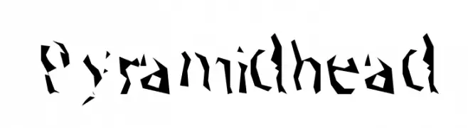
( Nihilschiz - nihilschiz.sheezyart.com )
A decorative, fragmented font with sharp, angular shapes and a chaotic artistic style.
![Pyramidhead font caratteri gratis]() Scaricare 63 Downloads@WebFont
Scaricare 63 Downloads@WebFont -
( Noto is a trademark of Google Inc. Noto fonts are open source. All Noto fonts are published under the SIL Open Font License, Version 1.1 )
A medium-weight serif font with a classic and elegant style.
![Noto Serif Sinhala Medium font caratteri gratis]() Scaricare 63 Downloads@WebFont
Scaricare 63 Downloads@WebFont -
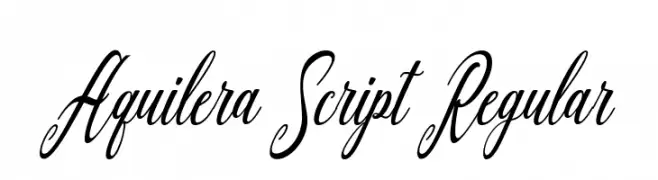
( Fonts by Aquilera Saiman - Personal-use only. For commercial use please contact owner. )
An elegant script font with flowing, cursive letters and intricate swashes.
![Aquilera Script Regular font caratteri gratis]() Scaricare 63 Downloads@WebFont
Scaricare 63 Downloads@WebFont -
( Fonts by Rantautype - Yudi Pratama Chandra - Personal-use only. For commercial use please contact owner. )
A bold, expressive brush script font with dynamic strokes and a hand-painted look.
![Realguy font caratteri gratis]() Scaricare 63 Downloads@WebFont
Scaricare 63 Downloads@WebFont -
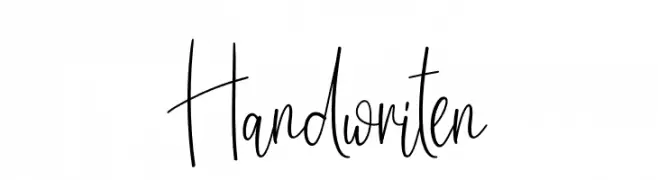
( Fonts by Scratchones )
A lively, expressive handwritten font with tall, slender letterforms and fluid strokes.
![Handwriten font caratteri gratis]() Scaricare 63 Downloads@WebFont
Scaricare 63 Downloads@WebFont -
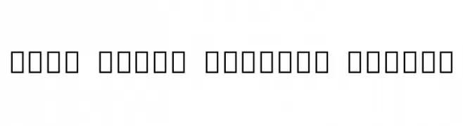
( Noto is a trademark of Google Inc. Noto fonts are open source. All Noto fonts are published under the SIL Open Font License, Version 1.1 )
No valid font glyphs are visible.
![Noto Sans Lao Condensed Thin font caratteri gratis]() Scaricare 63 Downloads@WebFont
Scaricare 63 Downloads@WebFont


Quali sono i font più popolari adesso?
Poppins, Roboto, Montserrat, Open Sans e Lato sono molto usati per le forme pulite e l'ampia applicabilità — dall'identità di marca alle landing page e ai poster.
Quali font si usano spesso nei loghi?
Le sans serif geometriche (es. Poppins, famiglie in stile Gotham) sono scelte comuni per un branding pulito e scalabile. Per un tocco personale restano valide script e stili manoscritti. Abbina un display deciso per i titoli a un corpo testo neutro per riconoscibilità ed equilibrio.
Ogni quanto si aggiorna la lista?
Con regolarità, in base ai download e all'attività reale. Torna spesso per scoprire in anticipo le nuove preferite.
💡 Consiglio: aggiungi ai preferiti — le tendenze cambiano in fretta e i font top di oggi possono ispirare il rebranding di domani.