Benvenuto nelle Font Più Popolari — dove popolarità e qualità si incontrano. Qui trovi i font più scaricati e usati dell'anno. Se cerchi scelte sicure per logo, web o social, inizia da qui.
Ogni font top si distingue per equilibrio, leggibilità e versatilità. Troverai sans serif moderne, script eleganti, serif vintage e display minimalisti.
-
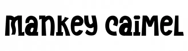
( Fonts by Dhabee Studio )
Bold, quirky display font with playful irregular shapes.
 Scaricare 60 Downloads@WebFont
 -
( Fonts by Bluestype Studio - Jefri Dwi Alfatah - Personal-use only. For commercial use please contact owner. )
A lively and elegant script font with fluid, cursive strokes.
![Handayani font caratteri gratis]() Scaricare 60 Downloads@WebFont
Scaricare 60 Downloads@WebFont -
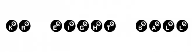
( Fonts by Kat`s Fun Fonts - Personal-use only. For commercial use please contact owner. )
A playful font with characters inside black eight-ball designs, ideal for thematic projects.
![KR Eight Ball font caratteri gratis]() Scaricare 60 Downloads@WebFont
Scaricare 60 Downloads@WebFont -
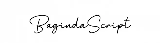
( Fonts by Zuzulgo Studio - Muhammad Zulfani - Personal-use only. For commercial use please contact owner. )
A graceful script font with fluid, connected strokes and a natural handwriting style.
![Baginda Script font caratteri gratis]() Scaricare 60 Downloads@WebFont
Scaricare 60 Downloads@WebFont -
( Ahmed Crvst )
A geometric, angular font with a modern and futuristic design.
![Lurix font caratteri gratis]() Scaricare 60 Downloads@WebFont
Scaricare 60 Downloads@WebFont -
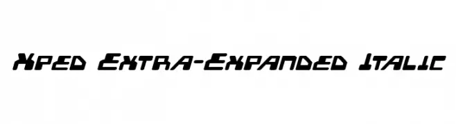
( Iconian Fonts - Daniel Zadorozny - www.iconian.com )
A bold, extra expanded italic font with a futuristic and dynamic style.
![Xped Extra-Expanded Italic font caratteri gratis]() Scaricare 60 Downloads@WebFont
Scaricare 60 Downloads@WebFont -
( Fonts by Cloutierfontes - Steve Cloutier - Personal-use only. For commercial use please contact owner. )
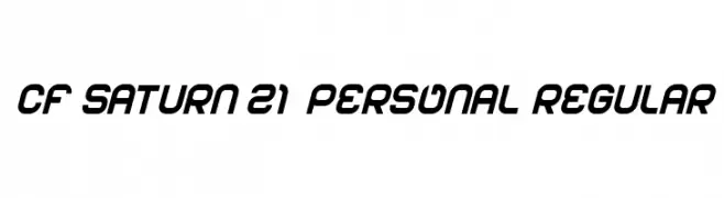
A modern, bold, and slightly slanted font with a geometric structure.
![CF Saturn 21 PERSONAL Regular font caratteri gratis]() Scaricare 60 Downloads@WebFont
Scaricare 60 Downloads@WebFont -
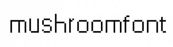
( Mushroom font )
A pixelated, grid-like font with a retro digital aesthetic.
![mushroomfont font caratteri gratis]() Scaricare 60 Downloads@WebFont
Scaricare 60 Downloads@WebFont -
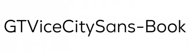
( Fonts by Giga Typography - GigaType - www.deviantart.com/wolves-fonts - Personal-use only. For commercial use please contact owner. )
Modern geometric sans-serif font.
![GT Vice City Sans - Book font caratteri gratis]() Scaricare 60 Downloads@WebFont
Scaricare 60 Downloads@WebFont -
( Noto is a trademark of Google Inc. Noto fonts are open source. All Noto fonts are published under the SIL Open Font License, Version 1.1 )
Invalid font image.
![Noto Serif Khmer SemiCondensed font caratteri gratis]() Scaricare 60 Downloads@WebFont
Scaricare 60 Downloads@WebFont -
( Fonts by Agni Ardi Rein Prasetyo - Personal-use only. For commercial use please contact owner. )
A bold, flowing script font with dynamic, interconnected letters.
![Argopuro Script Demo font caratteri gratis]() Scaricare 60 Downloads@WebFont
Scaricare 60 Downloads@WebFont -
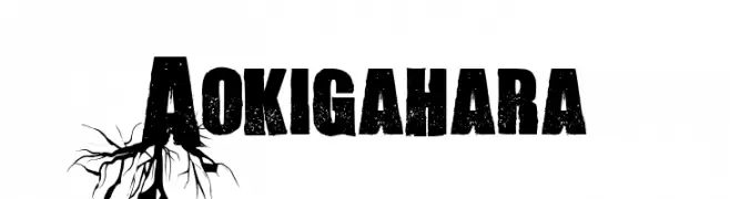
( Fonts by Font Monger - Chris Vile - Personal-use only. For commercial use please contact owner. )
A bold, distressed font with a grungy, textured appearance.
![Aokigahara font caratteri gratis]() Scaricare 60 Downloads@WebFont
Scaricare 60 Downloads@WebFont -
( Fonts by AVType - Personal-use only. For commercial use please contact owner. )
A bold, handwritten font with rounded strokes and a playful, approachable style.
![Dessert Sugar Bold font caratteri gratis]() Scaricare 60 Downloads@WebFont
Scaricare 60 Downloads@WebFont -
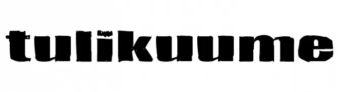
( Fonts by www.junkohanhero.com - Personal-use only. For commercial use please contact owner. )
A bold, distressed font with a rugged, industrial style.
![Tulikuume font caratteri gratis]() Scaricare 60 Downloads@WebFont
Scaricare 60 Downloads@WebFont -
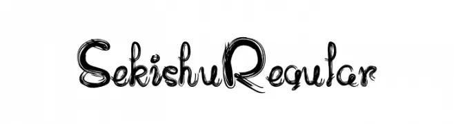
( Fonts by zone108.main.jp - Personal-use only. For commercial use please contact owner. )
A decorative and artistic font with swirling, brush-like strokes.
![Sekishu Regular font caratteri gratis]() Scaricare 60 Downloads@WebFont
Scaricare 60 Downloads@WebFont -
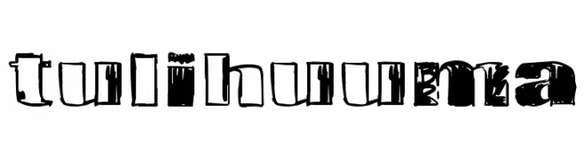
( Fonts by www.junkohanhero.com - Personal-use only. For commercial use please contact owner. )
A bold, distressed font with a grunge aesthetic and rough texture.
![Tulihuuma font caratteri gratis]() Scaricare 60 Downloads@WebFont
Scaricare 60 Downloads@WebFont -
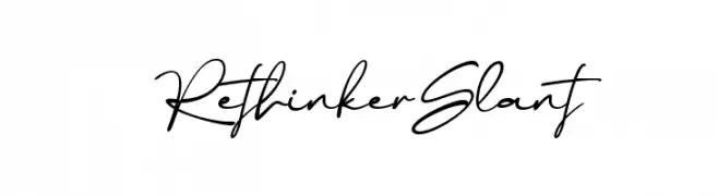
( Fonts by DumadiStyle )
Elegant, slanted handwritten script font.
![Rethinker Slant font caratteri gratis]() Scaricare 60 Downloads@WebFont
Scaricare 60 Downloads@WebFont -
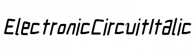
( Fonts by CannotIntoSpaceFonts - KineticPlasma Fonts - Personal-use only. For commercial use please contact owner. )
A modern, italic font with a technical, digital aesthetic.
![Electronic Circuit Italic font caratteri gratis]() Scaricare 60 Downloads@WebFont
Scaricare 60 Downloads@WebFont -
( Fonts by Kateeng Ciu - Personal-use only. For commercial use please contact owner. )
An elegant and flowing script font with graceful curves and a sophisticated style.
![Wedding font caratteri gratis]() Scaricare 60 Downloads@WebFont
Scaricare 60 Downloads@WebFont -
( Fonts by Kong Font - Personal-use only. For commercial use please contact owner. )
An elegant, cursive script font with a flowing, handwritten style.
![Double Signature Italic font caratteri gratis]() Scaricare 60 Downloads@WebFont
Scaricare 60 Downloads@WebFont -
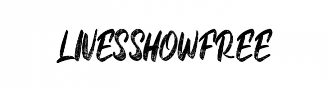
( Fonts by Vunira Design - Personal-use only. For commercial use please contact owner. )
A bold, brush-style script with a textured, distressed look.
![LivesShowFREE font caratteri gratis]() Scaricare 60 Downloads@WebFont
Scaricare 60 Downloads@WebFont -
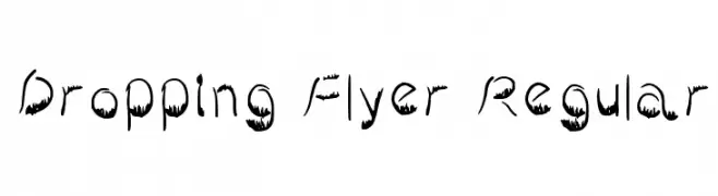
( Nouman )
A playful, dripping font with a dynamic, hand-drawn style.
![Dropping Flyer Regular font caratteri gratis]() Scaricare 60 Downloads@WebFont
Scaricare 60 Downloads@WebFont -
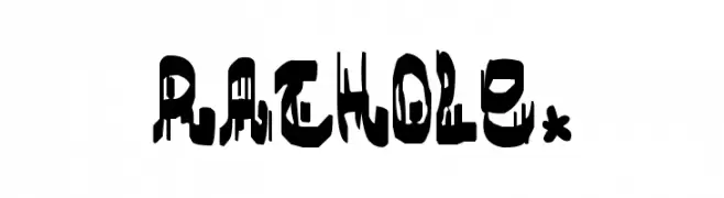
( SnailFonts - whatknot.tripod.com/snailfont/index2.html )
A bold, dripping font with a unique, edgy style.
![rathole. font caratteri gratis]() Scaricare 60 Downloads@WebFont
Scaricare 60 Downloads@WebFont -
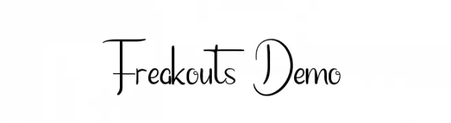
( Fonts by Edric Studio - Personal-use only. For commercial use please contact owner. )
A whimsical and decorative font with elegant, flowing letterforms and playful flourishes.
![Freakouts Demo font caratteri gratis]() Scaricare 60 Downloads@WebFont
Scaricare 60 Downloads@WebFont -
( Fonts by Denny Subagja - Personal-use only. For commercial use please contact owner. )
A playful, handwritten font with smooth, rounded edges and a casual style.
![Babybo font caratteri gratis]() Scaricare 60 Downloads@WebFont
Scaricare 60 Downloads@WebFont -
( Fonts by Bearytype - Dian Hadi - Personal-use only. For commercial use please contact owner. )
A bold, playful script font with a handwritten feel and rounded edges.
![Hansley font caratteri gratis]() Scaricare 60 Downloads@WebFont
Scaricare 60 Downloads@WebFont -
( Fonts by Denny Subagja - Personal-use only. For commercial use please contact owner. )
A playful, handwritten font with a casual and dynamic style.
![Capslock font caratteri gratis]() Scaricare 60 Downloads@WebFont
Scaricare 60 Downloads@WebFont -
( Fonts by Iconian Fonts - Daniel Zadorozny - Personal-use only. For commercial use please contact owner. )
A bold, outlined, italic font with a modern, dynamic style.
!['89 Speed Affair Outline Ital font caratteri gratis]() Scaricare 60 Downloads@WebFont
Scaricare 60 Downloads@WebFont -
( Fonts by Igor Kosinsky - Personal-use only. For commercial use please contact owner. )
A modern, clean sans-serif font with balanced proportions and geometric precision.
![Literal-Regular font caratteri gratis]() Scaricare 60 Downloads@WebFont
Scaricare 60 Downloads@WebFont -
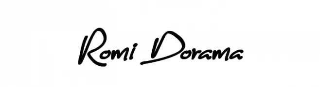
( Fonts by Subectype & Orenari - Rangga Subekti & Ari - Personal-use only. For commercial use please contact owner. )
A lively script font with fluid, cursive letterforms and a handwritten appearance.
![Romi Dorama font caratteri gratis]() Scaricare 60 Downloads@WebFont
Scaricare 60 Downloads@WebFont -
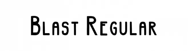
( Fonts by InkCloudDesign - Camilia Sa - Personal-use only. For commercial use please contact owner. )
A bold, playful font with rounded edges and a slightly condensed form.
![Blast Regular font caratteri gratis]() Scaricare 60 Downloads@WebFont
Scaricare 60 Downloads@WebFont -
( Fonts by wep - Wahyu Eka Prasetya - Personal-use only. For commercial use please contact owner. )
A bold, distressed font with a rugged, textured appearance.
![Dinding font caratteri gratis]() Scaricare 60 Downloads@WebFont
Scaricare 60 Downloads@WebFont -
( Fonts by Andika Fez - Personal-use only. For commercial use please contact owner. )
A bold, geometric font with clean lines and modern style.
![berlinsans font caratteri gratis]() Scaricare 60 Downloads@WebFont
Scaricare 60 Downloads@WebFont -
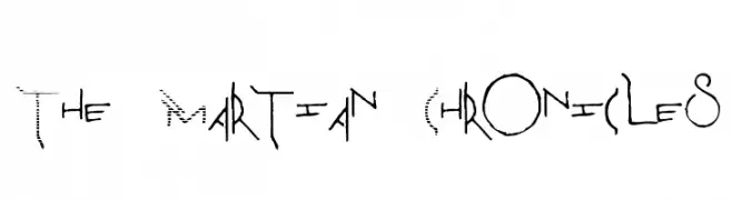
( tianrod - Cristian Rodríguez - tianrod.com/ )
A futuristic, angular font with a hand-drawn, artistic style.
![The Martian Chronicles font caratteri gratis]() Scaricare 60 Downloads@WebFont
Scaricare 60 Downloads@WebFont -
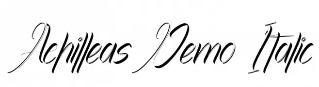
( Fonts by Noah Type - noahtype.com - Personal-use only. For commercial use please contact owner. )
A dynamic and elegant script font with fluid, cursive strokes and a pronounced italic slant.
![Achilleas Demo Italic font caratteri gratis]() Scaricare 60 Downloads@WebFont
Scaricare 60 Downloads@WebFont


Quali sono i font più popolari adesso?
Poppins, Roboto, Montserrat, Open Sans e Lato sono molto usati per le forme pulite e l'ampia applicabilità — dall'identità di marca alle landing page e ai poster.
Quali font si usano spesso nei loghi?
Le sans serif geometriche (es. Poppins, famiglie in stile Gotham) sono scelte comuni per un branding pulito e scalabile. Per un tocco personale restano valide script e stili manoscritti. Abbina un display deciso per i titoli a un corpo testo neutro per riconoscibilità ed equilibrio.
Ogni quanto si aggiorna la lista?
Con regolarità, in base ai download e all'attività reale. Torna spesso per scoprire in anticipo le nuove preferite.
💡 Consiglio: aggiungi ai preferiti — le tendenze cambiano in fretta e i font top di oggi possono ispirare il rebranding di domani.