Benvenuto nelle Font Più Popolari — dove popolarità e qualità si incontrano. Qui trovi i font più scaricati e usati dell'anno. Se cerchi scelte sicure per logo, web o social, inizia da qui.
Ogni font top si distingue per equilibrio, leggibilità e versatilità. Troverai sans serif moderne, script eleganti, serif vintage e display minimalisti.
-
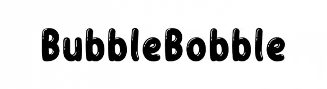
( Fonts by Almarkhatype )
A playful, rounded typeface with bold, bubble-like letters and a whimsical vibe.
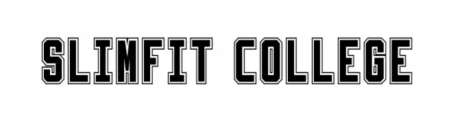
 Scaricare 1510 Downloads@WebFont
 -
![Slimfit College font caratteri gratis]() Scaricare 1510 Downloads@WebFont
Scaricare 1510 Downloads@WebFont -
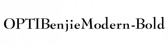
( Fonts by Castcraft Software - opti.netii.net - check the website before use )
A bold, modern serif font with sharp, angular serifs and a strong visual impact.
![OPTIBenjieModern-Bold font caratteri gratis]() Scaricare 1510 Downloads@WebFont
Scaricare 1510 Downloads@WebFont -
( Copyright (c) 2011 by Brian J. Bonislawsky DBA Astigmatic (AOETI) )
A playful, bold font with high contrast and unique curves.
![Ribeye font caratteri gratis]() Scaricare 1510 Downloads@WebFont
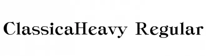
Scaricare 1510 Downloads@WebFont -
![ClassicaHeavy Regular font caratteri gratis]() Scaricare 1510 Downloads@WebFont
Scaricare 1510 Downloads@WebFont -
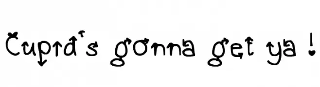
![Cupid's gonna get ya ! font caratteri gratis]() Scaricare 1510 Downloads@WebFont
Scaricare 1510 Downloads@WebFont -
![Quilted Butterfly Italic font caratteri gratis]() Scaricare 1510 Downloads@WebFont
Scaricare 1510 Downloads@WebFont -
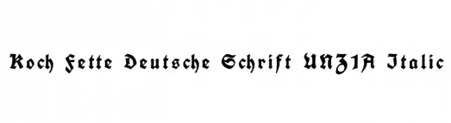
( Fonts by Peter Wiegel - www.peter-wiegel.de )
A bold, ornate blackletter font with intricate detailing and sharp serifs.
![Koch Fette Deutsche Schrift UNZ1A Italic font caratteri gratis]() Scaricare 1510 Downloads@WebFont
Scaricare 1510 Downloads@WebFont -
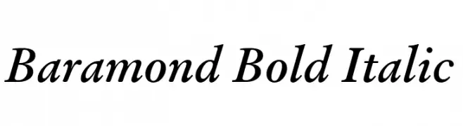
![Baramond Bold Italic font caratteri gratis]() Scaricare 1510 Downloads@WebFont
Scaricare 1510 Downloads@WebFont -
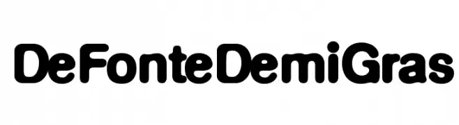
( Fonts by Ingo Zimmermann - www.ingofonts.com )
A bold, rounded font with a playful and approachable style.
![DeFonteDemiGras font caratteri gratis]() Scaricare 1510 Downloads@WebFont
Scaricare 1510 Downloads@WebFont -
![LEDFont font caratteri gratis]() Scaricare 1510 Downloads
Scaricare 1510 Downloads -
( Fonts by Original fonts by Vernon Adams / Changes by Cristiano Sobral - Personal-use only. For commercial use please contact owner. )
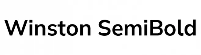
A clean, modern sans-serif font with a semi-bold weight and balanced proportions.
![Winston SemiBold font caratteri gratis]() Scaricare 1509 Downloads@WebFont
Scaricare 1509 Downloads@WebFont -
( Fonts by www.blambot.com )
A bold, geometric font with a modern and assertive style.
![GovernmentAgentBB font caratteri gratis]() Scaricare 1509 Downloads@WebFont
Scaricare 1509 Downloads@WebFont -
( Copyright (c) 2011 by Brian J. Bonislawsky DBA Astigmatic (AOETI) (astigma@astigmatic.com), with Reserved Font Names "Stint Ultra Condensed" )
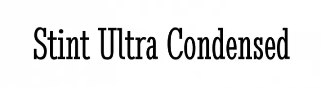
A highly condensed, clean, and organized font ideal for space-saving designs.
![Stint Ultra Condensed font caratteri gratis]() Scaricare 1509 Downloads@WebFont
Scaricare 1509 Downloads@WebFont -
![Lido STF CE Bold Italic font caratteri gratis]() Scaricare 1509 Downloads@WebFont
Scaricare 1509 Downloads@WebFont -
( Fonts by www.ajpaglia.com - FREE for personal or commercial usage )
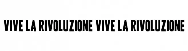
A bold, condensed typeface with strong, thick strokes.
![Vive la Rivoluzione Vive la Rivoluzione font caratteri gratis]() Scaricare 1509 Downloads@WebFont
Scaricare 1509 Downloads@WebFont -
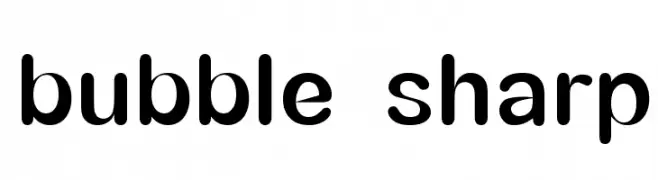
![bubble sharp font caratteri gratis]() Scaricare 1509 Downloads@WebFont
Scaricare 1509 Downloads@WebFont -
( Fonts by www.fontalicious.com )
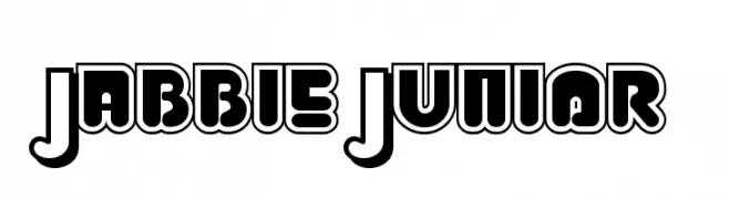
A bold, playful font with geometric shapes and thick outlines.
![Jabbie Junior font caratteri gratis]() Scaricare 1509 Downloads@WebFont
Scaricare 1509 Downloads@WebFont -
( Fonts by www.chequered.ink - Chequered Ink - Personal-use only. For commercial use please contact owner. )
A bold, futuristic font with sharp angles and geometric shapes.
![Play Pretend font caratteri gratis]() Scaricare 1508 Downloads@WebFont
Scaricare 1508 Downloads@WebFont -
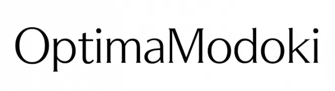
![OptimaModoki font caratteri gratis]() Scaricare 1508 Downloads@WebFont
Scaricare 1508 Downloads@WebFont -
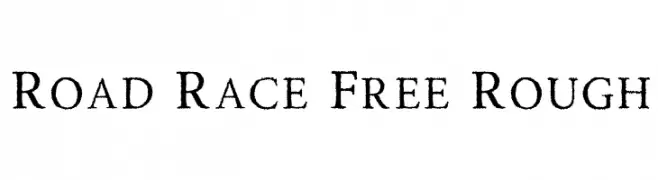
( Craft Supply Co. - creativemarket.com/craftsupplyco )
A rugged, vintage-style font with a textured, worn appearance.
![Road Race Free Rough font caratteri gratis]() Scaricare 1508 Downloads@WebFont
Scaricare 1508 Downloads@WebFont -
Caratteri di joorgemoron. For commercial use please contact the owner.
( Free for personal use. )
A bold, gothic-inspired font with sharp serifs and modern flair.
![JMHCthulhumbus-Regular font caratteri gratis]() Scaricare 1508 Downloads@WebFont
Scaricare 1508 Downloads@WebFont -
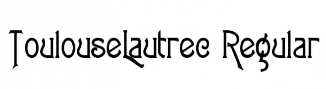
![ToulouseLautrec Regular font caratteri gratis]() Scaricare 1508 Downloads@WebFont
Scaricare 1508 Downloads@WebFont -
( Fonts by www.typodermicfonts.com - Ray Larabie )
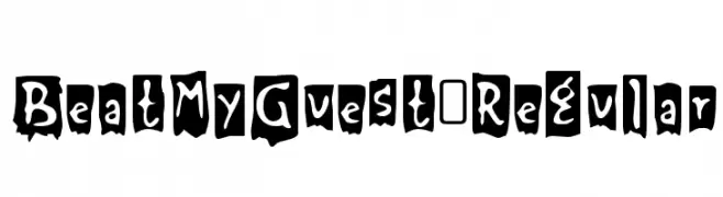
A bold, distressed font with a grunge-like, artistic style.
![BeatMyGuest-Regular font caratteri gratis]() Scaricare 1508 Downloads@WebFont
Scaricare 1508 Downloads@WebFont -
( Fonts by Manfred Klein - manfred-klein.ina-mar.com )
A sleek, ultra-condensed font with tall, narrow letterforms for a modern aesthetic.
![SantanaXtraCondensed font caratteri gratis]() Scaricare 1508 Downloads@WebFont
Scaricare 1508 Downloads@WebFont -
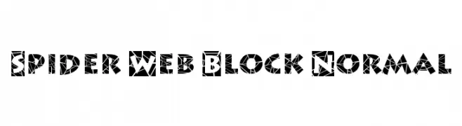
![Spider Web Block Normal font caratteri gratis]() Scaricare 1508 Downloads
Scaricare 1508 Downloads -
( Fonts by www.fontalicious.com )
A futuristic, pixelated font with a digital, geometric design.
![Astronaut II font caratteri gratis]() Scaricare 1508 Downloads@WebFont
Scaricare 1508 Downloads@WebFont -
( Fonts by Display Studio )
A bold, playful font with circular cutouts and a modern, quirky style.
![Linked font caratteri gratis]() Scaricare 1507 Downloads@WebFont
Scaricare 1507 Downloads@WebFont -
( Personal-use only. For commercial use please contact owner. )
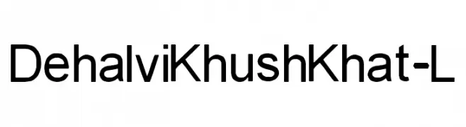
A modern sans-serif font with geometric shapes and uniform stroke width.
![Dehalvi Khush Khat-L font caratteri gratis]() Scaricare 1507 Downloads@WebFont
Scaricare 1507 Downloads@WebFont -
( Robert Allgeyer - www.icogitate.com/~ergosum/fonts/music-fonts2.htm )
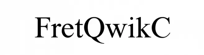
A classic serif font with elegant strokes and a refined appearance.
![FretQwikC font caratteri gratis]() Scaricare 1507 Downloads@WebFont
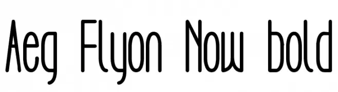
Scaricare 1507 Downloads@WebFont -
![Aeg Flyon Now bold font caratteri gratis]() Scaricare 1507 Downloads@WebFont
Scaricare 1507 Downloads@WebFont -
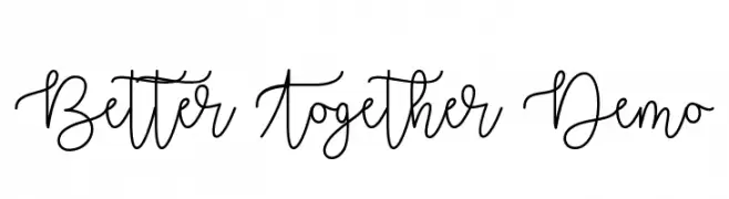
( Fonts by Misti's Fonts )
A playful, flowing script font with smooth, continuous strokes.
![Better Together Demo font caratteri gratis]() Scaricare 1507 Downloads@WebFont
Scaricare 1507 Downloads@WebFont -
( K-Type Freebies (Free for Personal Use Only) FROM http://www.k-type.com )
A pixelated, digital display-inspired font with a retro tech vibe.
![Subway Ticker font caratteri gratis]() Scaricare 1507 Downloads@WebFont
Scaricare 1507 Downloads@WebFont -
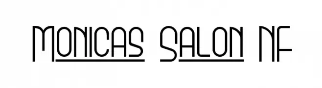
( Fonts by Nick Curtis - www.nicksfonts.com )
A modern, geometric font with a clean and condensed design.
![Monicas Salon NF font caratteri gratis]() Scaricare 1507 Downloads@WebFont
Scaricare 1507 Downloads@WebFont -
![Skinny font caratteri gratis]() Scaricare 1507 Downloads@WebFont
Scaricare 1507 Downloads@WebFont


Quali sono i font più popolari adesso?
Poppins, Roboto, Montserrat, Open Sans e Lato sono molto usati per le forme pulite e l'ampia applicabilità — dall'identità di marca alle landing page e ai poster.
Quali font si usano spesso nei loghi?
Le sans serif geometriche (es. Poppins, famiglie in stile Gotham) sono scelte comuni per un branding pulito e scalabile. Per un tocco personale restano valide script e stili manoscritti. Abbina un display deciso per i titoli a un corpo testo neutro per riconoscibilità ed equilibrio.
Ogni quanto si aggiorna la lista?
Con regolarità, in base ai download e all'attività reale. Torna spesso per scoprire in anticipo le nuove preferite.
💡 Consiglio: aggiungi ai preferiti — le tendenze cambiano in fretta e i font top di oggi possono ispirare il rebranding di domani.