Benvenuto nelle Font Più Popolari — dove popolarità e qualità si incontrano. Qui trovi i font più scaricati e usati dell'anno. Se cerchi scelte sicure per logo, web o social, inizia da qui.
Ogni font top si distingue per equilibrio, leggibilità e versatilità. Troverai sans serif moderne, script eleganti, serif vintage e display minimalisti.
-
( Fonts by Marwah Store - Alexe Crisna - Personal-use only. For commercial use please contact owner. )
A bold, brushstroke-style font with a dynamic and artistic flair.
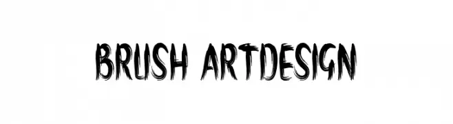 Scaricare 51 Downloads@WebFont
 -
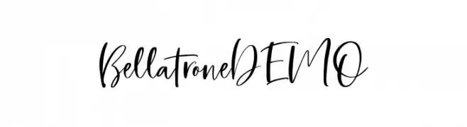
( Fonts by Saridezra - Personal-use only. For commercial use please contact owner. )
A lively, expressive handwritten font with fluid strokes and dynamic style.
![BellatroneDEMO font caratteri gratis]() Scaricare 51 Downloads@WebFont
Scaricare 51 Downloads@WebFont -
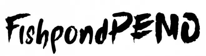
( Fonts by nariswari_creative - Taufik Dwi Purnomo - Personal-use only. For commercial use please contact owner. )
A bold, brush-style font with a dynamic and artistic appearance.
![FishpondDEMO font caratteri gratis]() Scaricare 51 Downloads@WebFont
Scaricare 51 Downloads@WebFont -
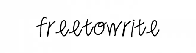
( LALATO FONTS )
A casual, handwritten font with a playful and informal style.
![freetowrite font caratteri gratis]() Scaricare 51 Downloads@WebFont
Scaricare 51 Downloads@WebFont -
( Fonts by Nick Curtis - Personal-use only. For commercial use please contact owner. )
A bold, decorative font with a fantasy-inspired, angular design.
![MiddleEarthNF font caratteri gratis]() Scaricare 51 Downloads@WebFont
Scaricare 51 Downloads@WebFont -
-
( Fonts by Daniel Zadorozny - www.iconian.com - Personal-use only. For commercial use please contact owner. )
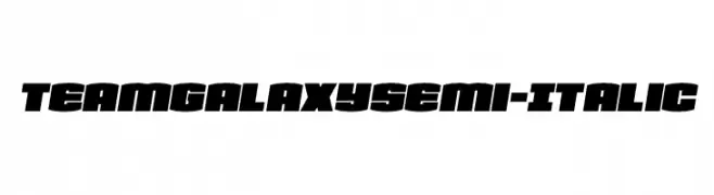
A bold, semi-italic font with a modern, dynamic style and high contrast.
![Team Galaxy Semi-Italic font caratteri gratis]() Scaricare 51 Downloads@WebFont
Scaricare 51 Downloads@WebFont -
( Fonts by Vladimir Nikolic - www.creativefabrica.com/designer/vladimirnikolic/ - Personal-use only. For commercial use please contact owner. )
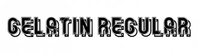
A bold, decorative font with a three-dimensional effect and vintage-modern aesthetics.
![Gelatin Regular font caratteri gratis]() Scaricare 51 Downloads@WebFont
Scaricare 51 Downloads@WebFont -
( Fonts by Vultype - Candra Hamdani - Personal-use only. For commercial use please contact owner. )
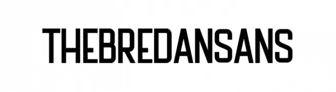
A bold, geometric sans-serif font with a modern and clean design.
![The Bredan Sans font caratteri gratis]() Scaricare 51 Downloads@WebFont
Scaricare 51 Downloads@WebFont -
( Fonts by LetterCraft Studio - Personal-use only. For commercial use please contact owner. )
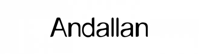
A modern, clean sans-serif font with geometric shapes and uniform stroke width.
![Andallan font caratteri gratis]() Scaricare 51 Downloads@WebFont
Scaricare 51 Downloads@WebFont -
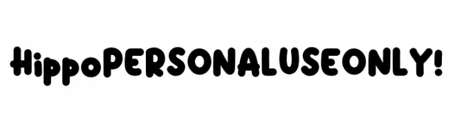
( Fonts by Kong Font )
A playful, bold font with rounded, bubbly characters ideal for fun and informal projects.
![Hippo PERSONAL USE ONLY! font caratteri gratis]() Scaricare 51 Downloads@WebFont
Scaricare 51 Downloads@WebFont -
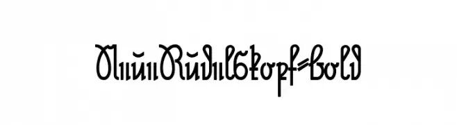
( Fonts by Peter Wiegel - www.peter-wiegel.de - Personal-use only. For commercial use please contact owner. )
A bold, decorative font with intricate loops and curves, perfect for artistic projects.
![NeueRudelskopf-Bold font caratteri gratis]() Scaricare 51 Downloads@WebFont
Scaricare 51 Downloads@WebFont -
( Fonts by Kong Font - https://fontkong.com/ - Personal-use only. For commercial use please contact owner. )
An elegant and decorative font with flowing swashes and intricate curves.
![Margo Swash font caratteri gratis]() Scaricare 51 Downloads@WebFont
Scaricare 51 Downloads@WebFont -
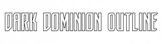
( Fonts by Iconian Fonts - Daniel Zadorozny - Personal-use only. For commercial use please contact owner. )
A bold, geometric outline font with sharp angles and a modern aesthetic.
![Dark Dominion Outline font caratteri gratis]() Scaricare 51 Downloads@WebFont
Scaricare 51 Downloads@WebFont -
( Fonts by Maulana Creative - Gilang Maulana - Personal-use only. For commercial use please contact owner. )
A flowing, elegant script font with a modern, handwritten style.
![Roma Invicta Free Regular font caratteri gratis]() Scaricare 51 Downloads@WebFont
Scaricare 51 Downloads@WebFont -
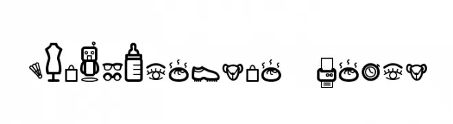
( Ekawit Lekviriyakul )
A bold, outlined dingbat font of department store-themed icons.
![Dingpartment Store font caratteri gratis]() Scaricare 51 Downloads@WebFont
Scaricare 51 Downloads@WebFont -
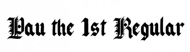
( Fonts by Pau Pineiro )
An ornate Blackletter font with intricate, angular letterforms.
![Pau the 1st Regular font caratteri gratis]() Scaricare 51 Downloads@WebFont
Scaricare 51 Downloads@WebFont -
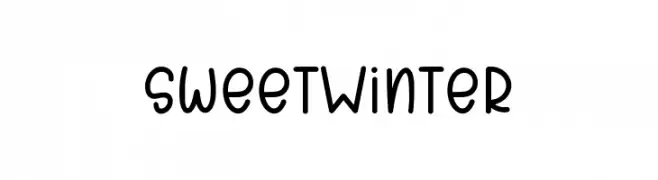
( Fonts by Letterayu - Sri Rahayu - Personal-use only. For commercial use please contact owner. )
A playful, hand-drawn font with rounded edges and a friendly style.
![SweetWinter font caratteri gratis]() Scaricare 51 Downloads@WebFont
Scaricare 51 Downloads@WebFont -
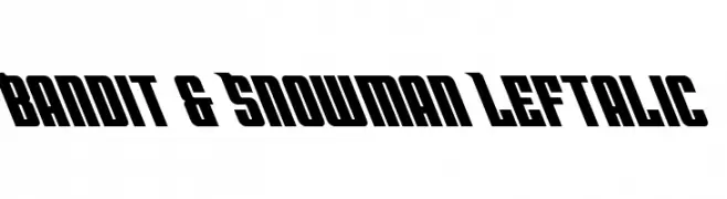
( Fonts by Daniel Zadorozny - www.iconian.com - Personal-use only. For commercial use please contact owner. )
A bold, left-slanted font with a dynamic and energetic style.
![Bandit & Snowman Leftalic font caratteri gratis]() Scaricare 51 Downloads@WebFont
Scaricare 51 Downloads@WebFont -
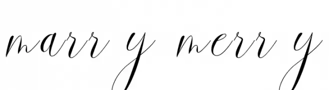
( Fonts by Hadjar Creative - Personal-use only. For commercial use please contact owner. )
A graceful script font with flowing, interconnected letters and a sophisticated style.
![marry merry font caratteri gratis]() Scaricare 51 Downloads@WebFont
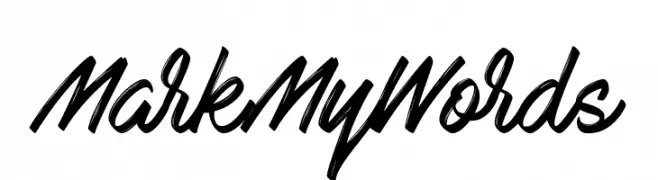
Scaricare 51 Downloads@WebFont -
( Fonts by StereoType - Clément Nicolle - Personal-use only. For commercial use please contact owner. )
A bold, cursive script font with fluid, expressive letterforms.
![Mark My Words font caratteri gratis]() Scaricare 51 Downloads@WebFont
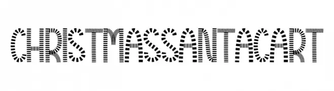
Scaricare 51 Downloads@WebFont -
( Fonts by Scratchones )
A festive, candy cane-inspired font with bold, striped characters.
![Christmas Santa Cart font caratteri gratis]() Scaricare 51 Downloads@WebFont
Scaricare 51 Downloads@WebFont -
( Fonts by AminMario - Amin Mario - Personal-use only. For commercial use please contact owner. )
A graceful and elegant script font with a handwritten style.
![Gladiators font caratteri gratis]() Scaricare 51 Downloads@WebFont
Scaricare 51 Downloads@WebFont -
( Fonts by Rangkai Aksara - Personal-use only. For commercial use please contact owner. )
A playful, casual handwritten font with smooth curves and bold strokes.
![Heavy Rain font caratteri gratis]() Scaricare 51 Downloads@WebFont
Scaricare 51 Downloads@WebFont -
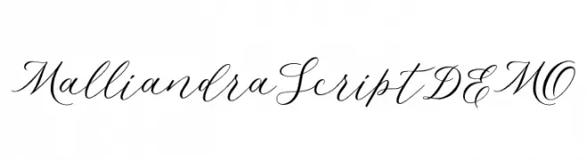
( Fonts by Letterhend Studio - Hendry Juanda - Personal-use only. For commercial use please contact owner. )
An elegant and flowing script font with ornate, cursive letterforms.
![MalliandraScriptDEMO font caratteri gratis]() Scaricare 51 Downloads@WebFont
Scaricare 51 Downloads@WebFont -
( Fonts by Kat`s Fun Fonts - Personal-use only. For commercial use please contact owner. )
A decorative dingbat font with assorted hand-drawn illustrations.
![KR Katlings Eight font caratteri gratis]() Scaricare 51 Downloads@WebFont
Scaricare 51 Downloads@WebFont -
( Fonts by Daniel Zadorozny - www.iconian.com - Personal-use only. For commercial use please contact owner. )
A futuristic, line-based font with a bold, modern aesthetic.
![Team Galaxy Gradient 2 font caratteri gratis]() Scaricare 51 Downloads@WebFont
Scaricare 51 Downloads@WebFont -
( Fonts by Letterena Studios - letterena.com - Personal-use only. For commercial use please contact owner. )
A bold, high-contrast serif font with dramatic strokes and elegant serifs.
![Hustle Bright font caratteri gratis]() Scaricare 51 Downloads@WebFont
Scaricare 51 Downloads@WebFont -
( Rafael Branco - www.ararazu.com )
A geometric, constellation-like font with a modern and technical style.
![Blocknation font caratteri gratis]() Scaricare 51 Downloads@WebFont
Scaricare 51 Downloads@WebFont -
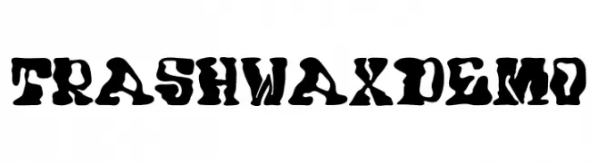
( Fonts by Trash Fonts )
A bold, grunge-style font with irregular, dynamic strokes.
![Trash Wax DEMO font caratteri gratis]() Scaricare 51 Downloads@WebFont
Scaricare 51 Downloads@WebFont -
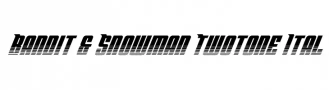
( Fonts by Daniel Zadorozny - www.iconian.com - Personal-use only. For commercial use please contact owner. )
A bold, italicized font with a two-tone gradient effect and tight spacing.
![Bandit & Snowman Twotone Ital font caratteri gratis]() Scaricare 51 Downloads@WebFont
Scaricare 51 Downloads@WebFont -
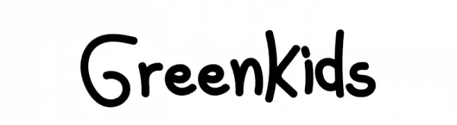
( Fonts by Hadjar Creative - Personal-use only. For commercial use please contact owner. )
A playful, hand-drawn font with rounded, bubbly characters.
![Green Kids font caratteri gratis]() Scaricare 51 Downloads@WebFont
Scaricare 51 Downloads@WebFont -
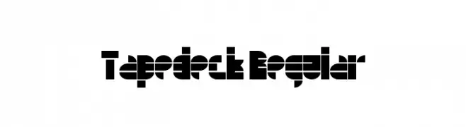
( Fonts by Jamie Place [FontBlast Design] - Personal-use only. For commercial use please contact owner. )
A bold, geometric font with a modern, futuristic aesthetic.
![Tapedeck Regular font caratteri gratis]() Scaricare 51 Downloads@WebFont
Scaricare 51 Downloads@WebFont -
( Fonts by Daniel Zadorozny - www.iconian.com - Personal-use only. For commercial use please contact owner. )
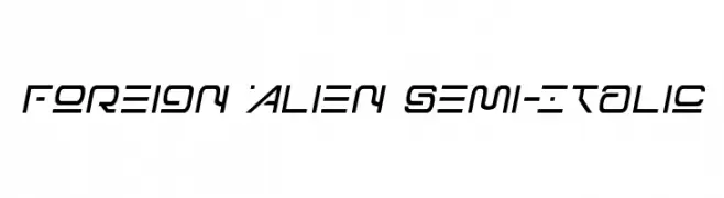
A futuristic, semi-italic font with angular and alien-like design.
![Foreign Alien Semi-Italic font caratteri gratis]() Scaricare 51 Downloads@WebFont
Scaricare 51 Downloads@WebFont -
( Fonts by Alifinart Studio - Personal-use only. For commercial use please contact owner. )
A playful and elegant handwritten script font with smooth, rounded strokes.
![Hello I'am Coming [version 2] font caratteri gratis]() Scaricare 51 Downloads@WebFont
Scaricare 51 Downloads@WebFont -
( Fonts by Gassstype - Anang Fibriyanto - www.gassstype.com - Personal-use only. For commercial use please contact owner. )
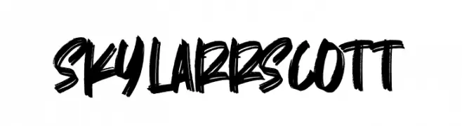
A bold, hand-drawn font with an energetic and expressive style.
![Skylarr Scott font caratteri gratis]() Scaricare 51 Downloads@WebFont
Scaricare 51 Downloads@WebFont


![Hello I'am Coming [version 2] font caratteri gratis](https://d144mzi0q5mijx.cloudfront.net/img/H/E/Hello-Iam-Coming-version-2.webp)
Quali sono i font più popolari adesso?
Poppins, Roboto, Montserrat, Open Sans e Lato sono molto usati per le forme pulite e l'ampia applicabilità — dall'identità di marca alle landing page e ai poster.
Quali font si usano spesso nei loghi?
Le sans serif geometriche (es. Poppins, famiglie in stile Gotham) sono scelte comuni per un branding pulito e scalabile. Per un tocco personale restano valide script e stili manoscritti. Abbina un display deciso per i titoli a un corpo testo neutro per riconoscibilità ed equilibrio.
Ogni quanto si aggiorna la lista?
Con regolarità, in base ai download e all'attività reale. Torna spesso per scoprire in anticipo le nuove preferite.
💡 Consiglio: aggiungi ai preferiti — le tendenze cambiano in fretta e i font top di oggi possono ispirare il rebranding di domani.