Benvenuto nelle Font Più Popolari — dove popolarità e qualità si incontrano. Qui trovi i font più scaricati e usati dell'anno. Se cerchi scelte sicure per logo, web o social, inizia da qui.
Ogni font top si distingue per equilibrio, leggibilità e versatilità. Troverai sans serif moderne, script eleganti, serif vintage e display minimalisti.
-
( Fonts by gluk - Grzegorz l - Personal-use only. For commercial use please contact owner. )
A sophisticated serif font with high contrast and elegant details.
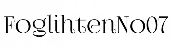 Scaricare 59 Downloads@WebFont
 -
( Fonts by Tribby )
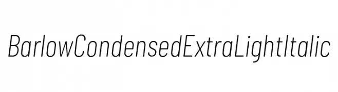
A sleek, modern, condensed, extra light italic font with clean lines and geometric shapes.
![Barlow Condensed ExtraLight Italic font caratteri gratis]() Scaricare 59 Downloads@WebFont
Scaricare 59 Downloads@WebFont -
( Fonts by NanaNissa - Personal-use only. For commercial use please contact owner. )
A flowing, cursive script font with elegant loops and flourishes.
![Michalina font caratteri gratis]() Scaricare 59 Downloads@WebFont
Scaricare 59 Downloads@WebFont -
( Fonts by Rizal Mustiko - Personal-use only. For commercial use please contact owner. )
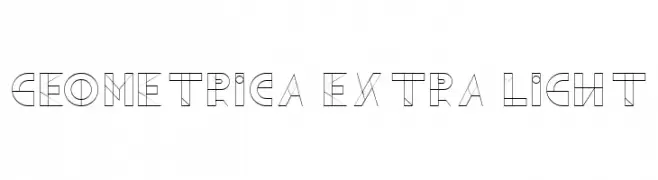
A geometric, minimalist font with thin lines and a modern, futuristic style.
![Geometrica Extra Light font caratteri gratis]() Scaricare 59 Downloads@WebFont
Scaricare 59 Downloads@WebFont -
( Fonts by Darrell Flood - Personal-use only. For commercial use please contact owner. )
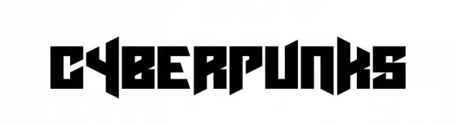
A bold, angular font with a futuristic and edgy design.
![Cyberpunks font caratteri gratis]() Scaricare 59 Downloads@WebFont
Scaricare 59 Downloads@WebFont -
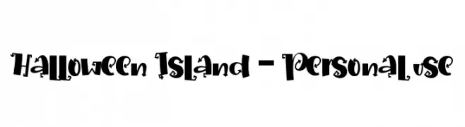
( Fonts by Letterara - Thomas Aradea - Personal-use only. For commercial use please contact owner. )
A playful, spooky font with quirky, decorative elements ideal for Halloween themes.
![Halloween Island - Personal use font caratteri gratis]() Scaricare 59 Downloads@WebFont
Scaricare 59 Downloads@WebFont -
( Fonts by kokostd - Haris Anggar - Personal-use only. For commercial use please contact owner. )
A bold, dynamic script font with a brush-like texture and expressive strokes.
![Beef font caratteri gratis]() Scaricare 59 Downloads@WebFont
Scaricare 59 Downloads@WebFont -
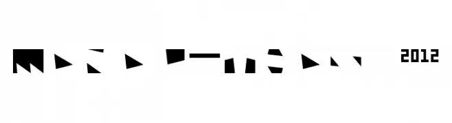
( Trypo - Gilles Pegel - www.trypo.com )
A bold, geometric font with a modern, futuristic style.
![Monolithos 2012 font caratteri gratis]() Scaricare 59 Downloads@WebFont
Scaricare 59 Downloads@WebFont -
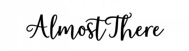
( Fonts by Zane Studio - Personal-use only. For commercial use please contact owner. )
A playful and elegant script font with decorative loops and a hand-drawn aesthetic.
![AlmostThere font caratteri gratis]() Scaricare 59 Downloads@WebFont
Scaricare 59 Downloads@WebFont -
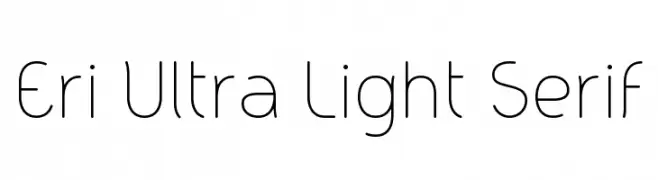
( Fonts by Carlos Barbosa - Personal-use only. For commercial use please contact owner. )
A clean, ultra-light serif font with a modern and elegant design.
![Eri Ultra Light Serif font caratteri gratis]() Scaricare 59 Downloads@WebFont
Scaricare 59 Downloads@WebFont -
( Fonts by Doehantz Studio - Abduhan Fikhri - Personal-use only. For commercial use please contact owner. )
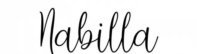
A flowing, cursive script with elegant loops and swashes.
![Nabilla font caratteri gratis]() Scaricare 59 Downloads@WebFont
Scaricare 59 Downloads@WebFont -
( Fonts by gluk - Grzegorz l - Personal-use only. For commercial use please contact owner. )
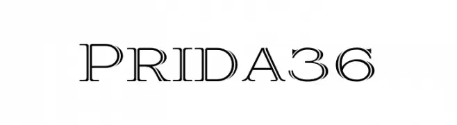
A classic serif font with modern elegance and thin lines.
![Prida36 font caratteri gratis]() Scaricare 59 Downloads@WebFont
Scaricare 59 Downloads@WebFont -
( Fonts by peterdraw - Ahmad Syarif Afandi - Personal-use only. For commercial use please contact owner. )
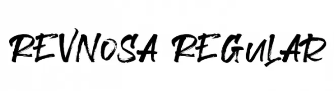
A bold, expressive brush script font with dynamic strokes and a hand-painted look.
![Revnosa Regular font caratteri gratis]() Scaricare 59 Downloads@WebFont
Scaricare 59 Downloads@WebFont -
( Fonts by twinletter )
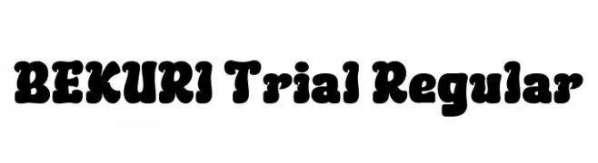
A bold, playful font with thick, rounded strokes and a bubbly appearance.
![BEKURI Trial Regular font caratteri gratis]() Scaricare 59 Downloads@WebFont
Scaricare 59 Downloads@WebFont -
( Fonts by SheillaType - Muhammad Taufiq - Personal-use only. For commercial use please contact owner. )
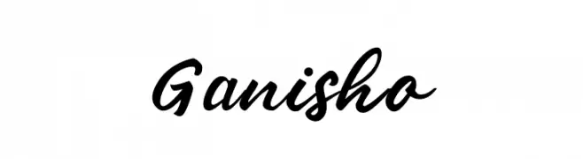
A bold, cursive font with elegant, flowing strokes.
![Ganisho font caratteri gratis]() Scaricare 59 Downloads@WebFont
Scaricare 59 Downloads@WebFont -
( Iconian Fonts - Daniel Zadorozny - www.iconian.com )
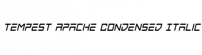
A dynamic, angular, condensed italic font with a modern, geometric style.
![Tempest Apache Condensed Italic font caratteri gratis]() Scaricare 59 Downloads@WebFont
Scaricare 59 Downloads@WebFont -
( Fonts by Letterena Studios )
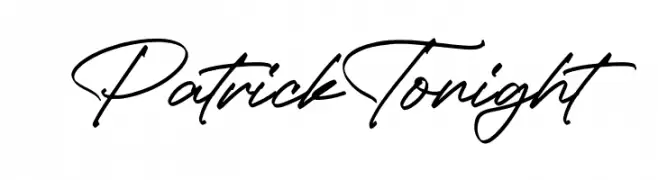
Handwritten script font with a natural, elegant flow.
![Patrick Tonight font caratteri gratis]() Scaricare 59 Downloads@WebFont
Scaricare 59 Downloads@WebFont -
( Fonts by StringLabs - stringlabscreative.com - Personal-use only. For commercial use please contact owner. )
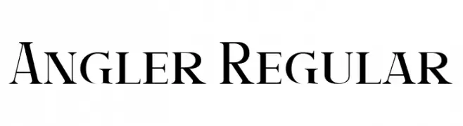
A classic serif font with high contrast and elegant strokes.
![Angler Regular font caratteri gratis]() Scaricare 59 Downloads@WebFont
Scaricare 59 Downloads@WebFont -
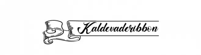
( Fonts by Kotak Kuning Studio - kotakkuning.com - Personal-use only. For commercial use please contact owner. )
A decorative ribbon-themed font with elegant, cursive lowercase letters.
![Kaldevaderibbon font caratteri gratis]() Scaricare 59 Downloads@WebFont
Scaricare 59 Downloads@WebFont -
( Fonts by Best Font Studio - Rifan Asri - Personal-use only. For commercial use please contact owner. )
A playful and elegant cursive font with interconnected letters and expressive characters.
![flashback font caratteri gratis]() Scaricare 59 Downloads@WebFont
Scaricare 59 Downloads@WebFont -
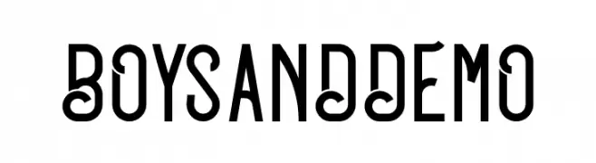
( Fonts by Linecreative - ARI JUANDA - Personal-use only. For commercial use please contact owner. )
A bold, playful font with unique curves and straight lines.
![BOYSANDDEMO font caratteri gratis]() Scaricare 59 Downloads@WebFont
Scaricare 59 Downloads@WebFont -
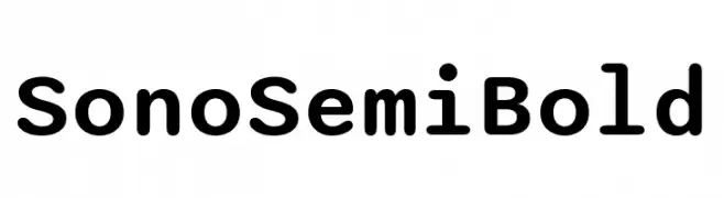
( Fonts by Tyler Finck )
A modern, rounded font with consistent stroke width and friendly appearance.
![Sono SemiBold font caratteri gratis]() Scaricare 59 Downloads@WebFont
Scaricare 59 Downloads@WebFont -
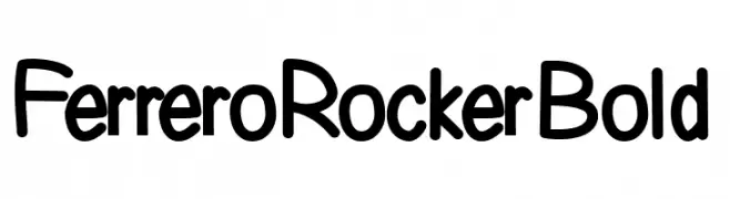
( Fonts by Letterara - Thomas Aradea - Personal-use only. For commercial use please contact owner. )
A bold, rounded font with a playful and friendly style.
![Ferrero Rocker Bold font caratteri gratis]() Scaricare 59 Downloads@WebFont
Scaricare 59 Downloads@WebFont -
( Noto is a trademark of Google Inc. Noto fonts are open source. All Noto fonts are published under the SIL Open Font License, Version 1.1 )
A modern, thin sans-serif font with clean lines and excellent readability.
![Noto Sans Georgian Thin font caratteri gratis]() Scaricare 59 Downloads@WebFont
Scaricare 59 Downloads@WebFont -
( Fonts by Md Shohail Bhuian - Personal-use only. For commercial use please contact owner. )
A bold, playful handwritten font with rounded strokes and uniform height.
![Journey Planner font caratteri gratis]() Scaricare 59 Downloads@WebFont
Scaricare 59 Downloads@WebFont -
( Fonts by ReyreyBlue - Reyrey Blue - Personal-use only. For commercial use please contact owner. )
A dynamic, brush-style handwritten font with expressive strokes and fluid movement.
![Bombast font caratteri gratis]() Scaricare 59 Downloads@WebFont
Scaricare 59 Downloads@WebFont -
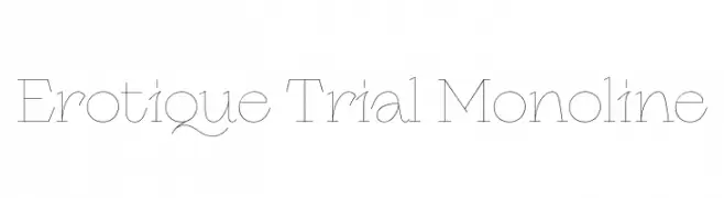
( Fonts by Zetafonts - Personal-use only. For commercial use please contact owner. )
A delicate monoline font with elegant, consistent strokes and geometric structure.
![Erotique Trial Monoline font caratteri gratis]() Scaricare 59 Downloads@WebFont
Scaricare 59 Downloads@WebFont -
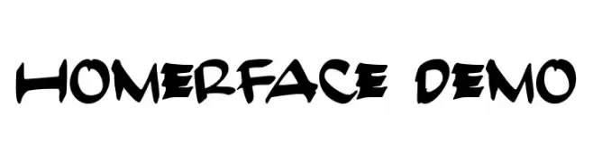
( Fonts by nariswari_creative - Taufik Dwi Purnomo - Personal-use only. For commercial use please contact owner. )
A bold, brush-style font with a playful and energetic look.
![HomerFace Demo font caratteri gratis]() Scaricare 59 Downloads@WebFont
Scaricare 59 Downloads@WebFont -
( Fonts by Vunira Design - Personal-use only. For commercial use please contact owner. )
A bold, handwritten font with a playful and energetic style.
![Catch Talent font caratteri gratis]() Scaricare 59 Downloads@WebFont
Scaricare 59 Downloads@WebFont -
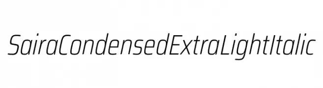
( Fonts by Omnibus Type )
A sleek, modern, condensed italic font with an extra light weight.
![Saira Condensed ExtraLight Italic font caratteri gratis]() Scaricare 59 Downloads@WebFont
Scaricare 59 Downloads@WebFont -
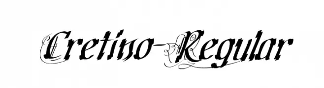
( Fonts by Typodermic Fonts - Raymond Larabie - Personal-use only. For commercial use please contact owner. )
An ornate and bold font with intricate swirls and angular lowercase letters.
![Cretino-Regular font caratteri gratis]() Scaricare 59 Downloads@WebFont
Scaricare 59 Downloads@WebFont -
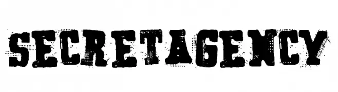
( imagex - www.imagex-fonts.com )
A bold, distressed font with a rugged, vintage appearance.
![Secret Agency font caratteri gratis]() Scaricare 59 Downloads@WebFont
Scaricare 59 Downloads@WebFont -
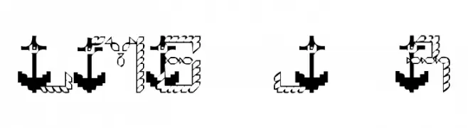
( London's Letters - www.londonsletters.com/ )
A nautical-themed decorative font with rope and anchor motifs.
![LMS Jeremy's Rigging font caratteri gratis]() Scaricare 59 Downloads@WebFont
Scaricare 59 Downloads@WebFont -
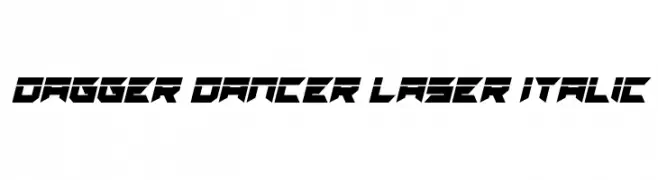
( Fonts by Daniel Zadorozny - www.iconian.com - Personal-use only. For commercial use please contact owner. )
A bold, angular font with a futuristic and dynamic design.
![Dagger Dancer Laser Italic font caratteri gratis]() Scaricare 59 Downloads@WebFont
Scaricare 59 Downloads@WebFont -
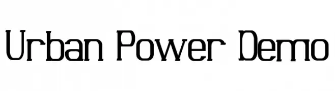
( Fonts by Edric Studio - Personal-use only. For commercial use please contact owner. )
A modern, geometric font with bold, angular letterforms and a strong, industrial aesthetic.
![Urban Power Demo font caratteri gratis]() Scaricare 59 Downloads@WebFont
Scaricare 59 Downloads@WebFont


Quali sono i font più popolari adesso?
Poppins, Roboto, Montserrat, Open Sans e Lato sono molto usati per le forme pulite e l'ampia applicabilità — dall'identità di marca alle landing page e ai poster.
Quali font si usano spesso nei loghi?
Le sans serif geometriche (es. Poppins, famiglie in stile Gotham) sono scelte comuni per un branding pulito e scalabile. Per un tocco personale restano valide script e stili manoscritti. Abbina un display deciso per i titoli a un corpo testo neutro per riconoscibilità ed equilibrio.
Ogni quanto si aggiorna la lista?
Con regolarità, in base ai download e all'attività reale. Torna spesso per scoprire in anticipo le nuove preferite.
💡 Consiglio: aggiungi ai preferiti — le tendenze cambiano in fretta e i font top di oggi possono ispirare il rebranding di domani.