Benvenuto nelle Font Più Popolari — dove popolarità e qualità si incontrano. Qui trovi i font più scaricati e usati dell'anno. Se cerchi scelte sicure per logo, web o social, inizia da qui.
Ogni font top si distingue per equilibrio, leggibilità e versatilità. Troverai sans serif moderne, script eleganti, serif vintage e display minimalisti.
-
( Fonts by Daniel Zadorozny - www.iconian.com - Personal-use only. For commercial use please contact owner. )
A bold, italicized font with a halftone effect, perfect for dynamic and modern designs.
 Scaricare 59 Downloads@WebFont
 -
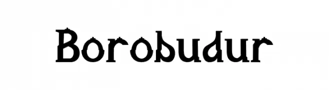
( Fonts by Hapsain - Hafiz Amanudin - Personal-use only. For commercial use please contact owner. )
A distinctive serif font with angular serifs and a blend of traditional and modern elements.
![Borobudur font caratteri gratis]() Scaricare 59 Downloads@WebFont
Scaricare 59 Downloads@WebFont -
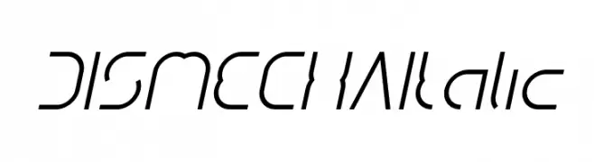
( weknow - Wino S Kadir - www.creativefabrica.com/designer/weknow/ )
A futuristic, geometric italic font with sharp lines and dynamic style.
![DISMECHA Italic font caratteri gratis]() Scaricare 59 Downloads@WebFont
Scaricare 59 Downloads@WebFont -
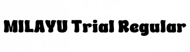
( Fonts by twinletter )
A bold, playful font with rounded edges and a whimsical style.
![MILAYU Trial Regular font caratteri gratis]() Scaricare 59 Downloads@WebFont
Scaricare 59 Downloads@WebFont -
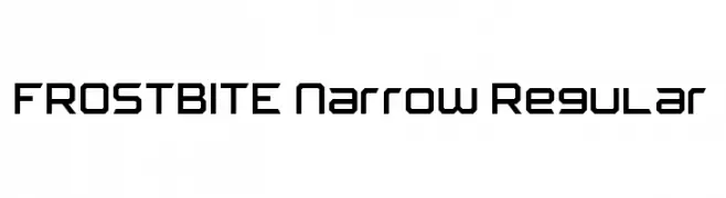
( Fonts by Isaac K )
A geometric, angular font with a futuristic and modern design.
![FROSTBITE Narrow Regular font caratteri gratis]() Scaricare 59 Downloads@WebFont
Scaricare 59 Downloads@WebFont -
( Fonts by Jimtype Studio - Personal-use only. For commercial use please contact owner. )
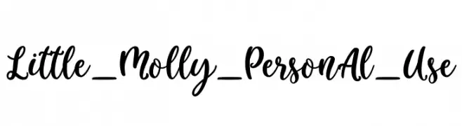
A playful, handwritten script font with a lively and dynamic style.
![Little_Molly_Personal_Use font caratteri gratis]() Scaricare 59 Downloads@WebFont
Scaricare 59 Downloads@WebFont -
( Fonts by Kong Font - Personal-use only. For commercial use please contact owner. )
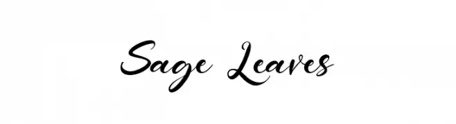
An elegant, flowing script font with ornate uppercase and smooth lowercase characters.
![Sage Leaves font caratteri gratis]() Scaricare 59 Downloads@WebFont
Scaricare 59 Downloads@WebFont -
( Fonts by GorillaBlu - Personal-use only. For commercial use please contact owner. )
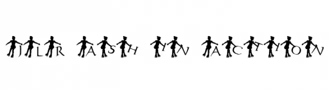
A decorative font featuring dancer silhouettes integrated with each letter.
![JLR Ash in Action font caratteri gratis]() Scaricare 59 Downloads@WebFont
Scaricare 59 Downloads@WebFont -
( Fonts by Daniel Zadorozny - www.iconian.com - Personal-use only. For commercial use please contact owner. )
A bold, expanded italic font with a modern, dynamic style.
![Wave Warrior Expanded Italic font caratteri gratis]() Scaricare 59 Downloads@WebFont
Scaricare 59 Downloads@WebFont -
( Fonts by Hanken Design Co. )
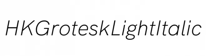
A sleek, modern sans-serif font with a light, italic style.
![HK Grotesk Light Italic font caratteri gratis]() Scaricare 59 Downloads@WebFont
Scaricare 59 Downloads@WebFont -
( Noto is a trademark of Google Inc. Noto fonts are open source. All Noto fonts are published under the SIL Open Font License, Version 1.1 )
Extra condensed, light sans-serif font.
![Noto Sans Ethiopic ExtraCondensed Light font caratteri gratis]() Scaricare 59 Downloads@WebFont
Scaricare 59 Downloads@WebFont -
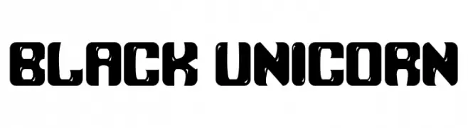
( Fonts by Rusd - Personal-use only. For commercial use please contact owner. )
A bold, geometric font with modern, futuristic design elements.
![Black Unicorn font caratteri gratis]() Scaricare 59 Downloads@WebFont
Scaricare 59 Downloads@WebFont -
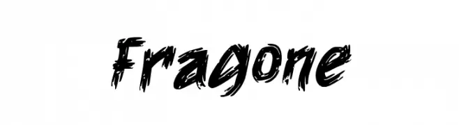
( Fonts by Wahyu Eka Prasetya - wepfont.com - Personal-use only. For commercial use please contact owner. )
A bold, brushstroke font with a dynamic and expressive style.
![Fragone font caratteri gratis]() Scaricare 59 Downloads@WebFont
Scaricare 59 Downloads@WebFont -
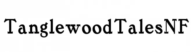
( Fonts by Nick Curtis - Personal-use only. For commercial use please contact owner. )
A bold serif font with a classic yet modern style.
![TanglewoodTalesNF font caratteri gratis]() Scaricare 59 Downloads@WebFont
Scaricare 59 Downloads@WebFont -
( Fonts by Mans Greback - Personal-use only. For commercial use please contact owner. )
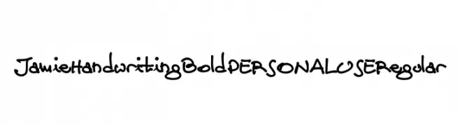
A bold, playful handwritten font with a casual, artistic style.
![Jamie Handwriting Bold PERSONAL USE Regular font caratteri gratis]() Scaricare 59 Downloads@WebFont
Scaricare 59 Downloads@WebFont -
( Fonts by Roland Huse Design - Roland Huse - Personal-use only. For commercial use please contact owner. )
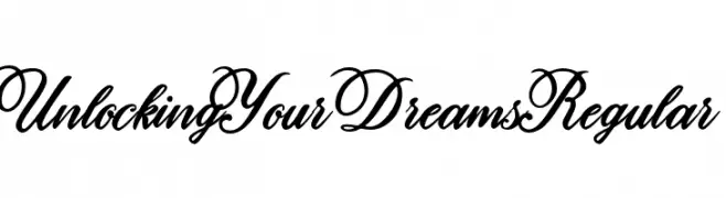
An elegant and flowing script font with ornate, interconnected letterforms.
![Unlocking Your Dreams Regular font caratteri gratis]() Scaricare 59 Downloads@WebFont
Scaricare 59 Downloads@WebFont -
( Iconian Fonts - Daniel Zadorozny - www.iconian.com )
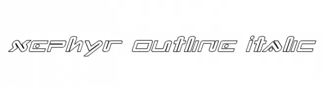
A futuristic, geometric outline font with an italic slant.
![Xephyr Outline Italic font caratteri gratis]() Scaricare 59 Downloads@WebFont
Scaricare 59 Downloads@WebFont -
( Fonts by FallenGraphic Studio - Vava Aryanto - Personal-use only. For commercial use please contact owner. )
A playful, whimsical font with bold curves and heart-shaped details.
![Imagine Dreams Personal Use Onl font caratteri gratis]() Scaricare 59 Downloads@WebFont
Scaricare 59 Downloads@WebFont -
( Fonts by Jimtype Studio - Personal-use only. For commercial use please contact owner. )
A playful handwritten font with tall, narrow letters and a casual style.
![Angelica Jealous font caratteri gratis]() Scaricare 59 Downloads@WebFont
Scaricare 59 Downloads@WebFont -
( Fonts by Roland Huse Design - Roland Huse - Personal-use only. For commercial use please contact owner. )
A playful, handwritten script font with dynamic and fluid characters.
![Shape Variable Script font caratteri gratis]() Scaricare 59 Downloads@WebFont
Scaricare 59 Downloads@WebFont -
( Fonts by Faris Graphic Art - Personal-use only. For commercial use please contact owner. )
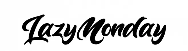
A bold, expressive script font with flowing, interconnected characters.
![Lazy Monday font caratteri gratis]() Scaricare 59 Downloads@WebFont
Scaricare 59 Downloads@WebFont -
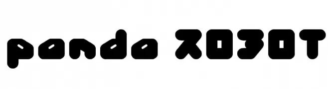
( weknow - Wino S Kadir - www.creativefabrica.com/designer/weknow/ )
A bold, rounded, and futuristic font with a playful and modern appearance.
![panda ROBOT font caratteri gratis]() Scaricare 59 Downloads@WebFont
Scaricare 59 Downloads@WebFont -
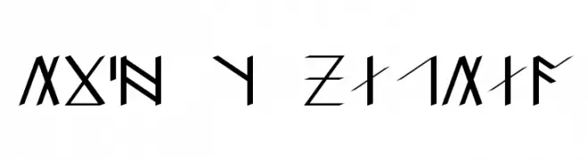
( Dan Smith's Fantasy Fonts - www.acondia.com/fonts/index.html )
A decorative, runic-inspired font with angular, geometric shapes.
![DS_Kha'zuldum font caratteri gratis]() Scaricare 59 Downloads
Scaricare 59 Downloads -
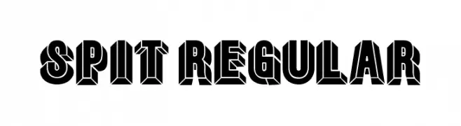
( Fonts by Vladimir Nikolic - www.creativefabrica.com/designer/vladimirnikolic/ - Personal-use only. For commercial use please contact owner. )
A bold, three-dimensional font with a strong, block-like appearance.
![Spit Regular font caratteri gratis]() Scaricare 59 Downloads@WebFont
Scaricare 59 Downloads@WebFont -
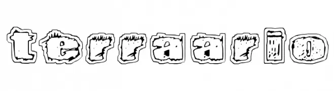
( Fonts by www.junkohanhero.com - Personal-use only. For commercial use please contact owner. )
A rugged, hand-drawn font with a distressed, sketch-like appearance.
![Terraario font caratteri gratis]() Scaricare 59 Downloads@WebFont
Scaricare 59 Downloads@WebFont -
( Fonts by Thor Christopher Arisland - Personal-use only. For commercial use please contact owner. )
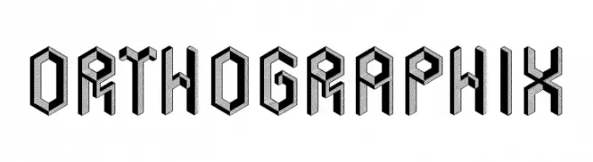
A bold, three-dimensional font with a modern, industrial style.
![Orthographix font caratteri gratis]() Scaricare 59 Downloads@WebFont
Scaricare 59 Downloads@WebFont -
( Fonts by Zulfikar Ali - Personal-use only. For commercial use please contact owner. )
A bold, decorative font with unique serifs and a strong presence.
![BataviaGlamoreBOLD-Bold font caratteri gratis]() Scaricare 59 Downloads@WebFont
Scaricare 59 Downloads@WebFont -
( Fonts by Letterena Studios - letterena.com - Personal-use only. For commercial use please contact owner. )
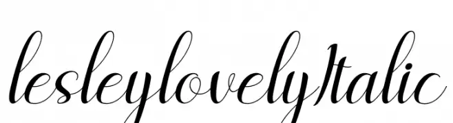
An elegant, flowing script font with a sophisticated italic style.
![lesley lovely Italic font caratteri gratis]() Scaricare 59 Downloads@WebFont
Scaricare 59 Downloads@WebFont -
( weknow - Wino S Kadir - www.creativefabrica.com/designer/weknow/ )
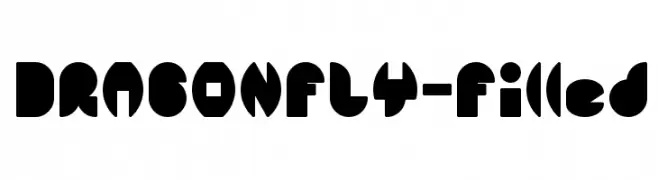
A bold, geometric font with playful and abstract character shapes.
![DRAGON FLY-Filled font caratteri gratis]() Scaricare 59 Downloads@WebFont
Scaricare 59 Downloads@WebFont -
( Fonts by Tup Wanders )
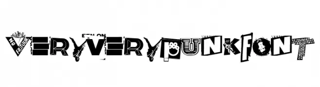
A bold, punk-inspired font with chaotic and rebellious design elements.
![Very very punk font font caratteri gratis]() Scaricare 59 Downloads@WebFont
Scaricare 59 Downloads@WebFont -
( Fonts by Greentrik6789 - Tri Kuncoro - Personal-use only. For commercial use please contact owner. )
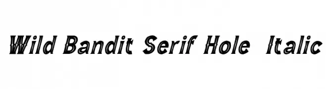
A bold, italic serif font with a unique 'hole' effect for a dynamic and adventurous look.
![Wild Bandit Serif Hole Italic font caratteri gratis]() Scaricare 59 Downloads@WebFont
Scaricare 59 Downloads@WebFont -
( Fonts by www.junkohanhero.com - Personal-use only. For commercial use please contact owner. )
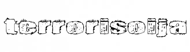
A bold, distressed font with a grungy, weathered appearance.
![Terrorisoija font caratteri gratis]() Scaricare 59 Downloads@WebFont
Scaricare 59 Downloads@WebFont -
( Fonts by Peter Wiegel - www.peter-wiegel.de - Personal-use only. For commercial use please contact owner. )
An elegant, calligraphy-inspired font with ornate details and flowing curves.
![Gianna font caratteri gratis]() Scaricare 59 Downloads@WebFont
Scaricare 59 Downloads@WebFont -
( Fonts by Jprint Studio - Gais Zaelani - Personal-use only. For commercial use please contact owner. )
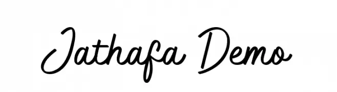
A lively, flowing script font with smooth, cursive strokes.
![Jathafa Demo font caratteri gratis]() Scaricare 59 Downloads@WebFont
Scaricare 59 Downloads@WebFont -
( Fonts by Pineungtype Missinklab - Personal-use only. For commercial use please contact owner. )
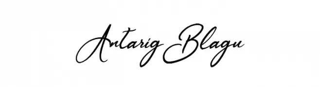
A graceful script font with fluid, cursive strokes and elegant curves.
![AntarigBlagu font caratteri gratis]() Scaricare 59 Downloads@WebFont
Scaricare 59 Downloads@WebFont


Quali sono i font più popolari adesso?
Poppins, Roboto, Montserrat, Open Sans e Lato sono molto usati per le forme pulite e l'ampia applicabilità — dall'identità di marca alle landing page e ai poster.
Quali font si usano spesso nei loghi?
Le sans serif geometriche (es. Poppins, famiglie in stile Gotham) sono scelte comuni per un branding pulito e scalabile. Per un tocco personale restano valide script e stili manoscritti. Abbina un display deciso per i titoli a un corpo testo neutro per riconoscibilità ed equilibrio.
Ogni quanto si aggiorna la lista?
Con regolarità, in base ai download e all'attività reale. Torna spesso per scoprire in anticipo le nuove preferite.
💡 Consiglio: aggiungi ai preferiti — le tendenze cambiano in fretta e i font top di oggi possono ispirare il rebranding di domani.