Benvenuto nelle Font Più Popolari — dove popolarità e qualità si incontrano. Qui trovi i font più scaricati e usati dell'anno. Se cerchi scelte sicure per logo, web o social, inizia da qui.
Ogni font top si distingue per equilibrio, leggibilità e versatilità. Troverai sans serif moderne, script eleganti, serif vintage e display minimalisti.
-
( ingoFonts - Ingo Zimmermann - www.ingofonts.com )
A bold, modern sans-serif font with clean lines and high legibility.
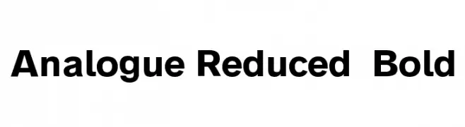 Scaricare 1464 Downloads@WebFont
 -
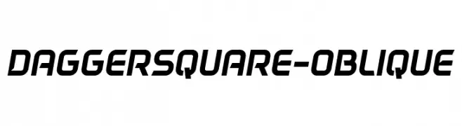
( Fonts by Nestor Delgado )
A modern, oblique font with bold, angular characters and a dynamic style.
![DAGGERSQUARE-OBLIQUE font caratteri gratis]() Scaricare 1464 Downloads@WebFont
Scaricare 1464 Downloads@WebFont -
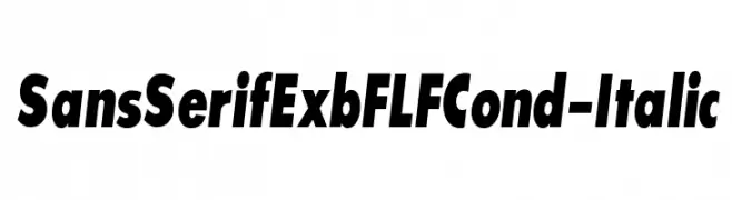
( Fonts by Casady & Greene )
Bold, condensed sans-serif font with an italic slant.
![SansSerifExbFLFCond-Italic font caratteri gratis]() Scaricare 1464 Downloads@WebFont
Scaricare 1464 Downloads@WebFont -
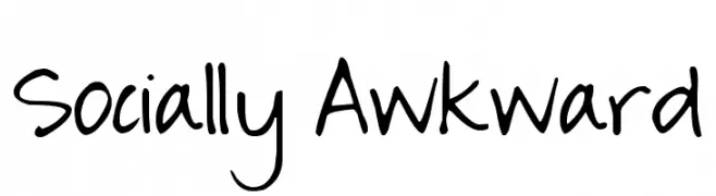
( Free for a personal use. For a commercial use please visit www.kevinandamanda.com )
A casual, handwritten font with a playful and authentic style.
![Socially Awkward font caratteri gratis]() Scaricare 1464 Downloads@WebFont
Scaricare 1464 Downloads@WebFont -
( Fonts by LeFly Fonts - lefly.vepar.nl )
A clean, handwritten font with a pencil-like appearance.
![Blokletters Potlood font caratteri gratis]() Scaricare 1464 Downloads@WebFont
Scaricare 1464 Downloads@WebFont -
-
Caratteri di erielarsonor. For commercial use please contact the owner.
![PC.DE font caratteri gratis]() Scaricare 1464 Downloads@WebFont
Scaricare 1464 Downloads@WebFont -
( Fonts by Jacob Fisher - www.pizzadude.dk )
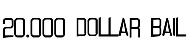
A bold, geometric font with sharp angles and a modern aesthetic.
![20.000 dollar bail font caratteri gratis]() Scaricare 1464 Downloads@WebFont
Scaricare 1464 Downloads@WebFont -
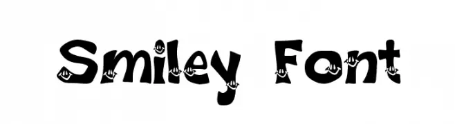
![Smiley Font font caratteri gratis]() Scaricare 1464 Downloads@WebFont
Scaricare 1464 Downloads@WebFont -
( Fonts by Vernon Adams )
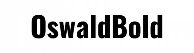
A bold, modern font with a condensed and impactful design.
![Oswald Bold font caratteri gratis]() Scaricare 1463 Downloads@WebFont
Scaricare 1463 Downloads@WebFont -
( Fonts by Khurasan )
A bold, handwritten font with a playful and lively style.
![Fresh Lychee font caratteri gratis]() Scaricare 1463 Downloads@WebFont
Scaricare 1463 Downloads@WebFont -
( Fonts by Alit Design )
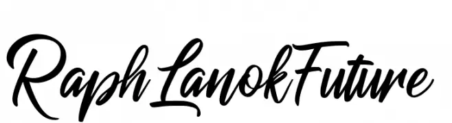
A dynamic and flowing script font with elegant cursive letterforms.
![RaphLanokFuture font caratteri gratis]() Scaricare 1463 Downloads@WebFont
Scaricare 1463 Downloads@WebFont -
![Zentangle font caratteri gratis]() Scaricare 1463 Downloads@WebFont
Scaricare 1463 Downloads@WebFont -
( Fonts by Castcraft Software - opti.netii.net - check the website before use )
A tall, elegant font with high contrast and elongated uppercase letters.
![OPTIBorDen-Roman font caratteri gratis]() Scaricare 1463 Downloads@WebFont
Scaricare 1463 Downloads@WebFont -
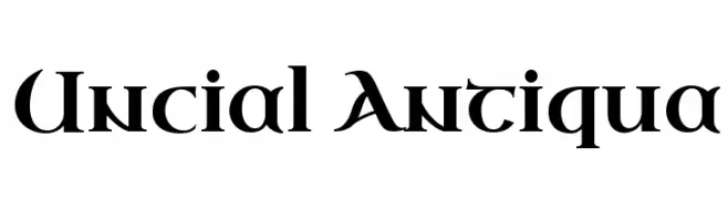
( Copyright (c) 2011 by Brian J. Bonislawsky DBA Astigmatic (AOETI) )
A medieval-inspired font with sharp angles and smooth curves, exuding classic elegance.
![Uncial Antiqua font caratteri gratis]() Scaricare 1463 Downloads@WebFont
Scaricare 1463 Downloads@WebFont -
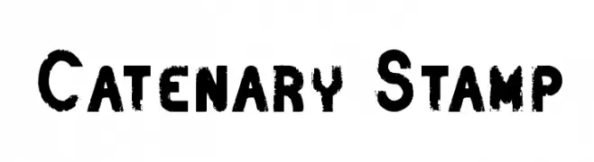
![Catenary Stamp font caratteri gratis]() Scaricare 1463 Downloads@WebFont
Scaricare 1463 Downloads@WebFont -
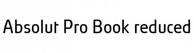
( Fonts by Ingo Zimmermann - www.ingofonts.com )
A modern, geometric sans-serif font with clean lines and excellent legibility.
![Absolut Pro Book reduced font caratteri gratis]() Scaricare 1463 Downloads@WebFont
Scaricare 1463 Downloads@WebFont -
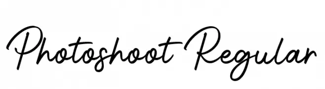
( Fonts by Suby Studio - Teguh Subiyantoro - Personal-use only. For commercial use please contact owner. )
A lively, flowing script font with smooth, connected strokes.
![Photoshoot Regular font caratteri gratis]() Scaricare 1462 Downloads@WebFont
Scaricare 1462 Downloads@WebFont -
( Fonts by Syaf Rizal - www.creativefabrica.com/ref/53/ - Personal-use only. For commercial use please contact owner. )
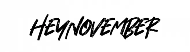
A bold, brush-style font with dynamic, expressive strokes.
![Hey November font caratteri gratis]() Scaricare 1462 Downloads@WebFont
Scaricare 1462 Downloads@WebFont -
( Fonts by Eknoji Studio - www.eknojistudio.com - Personal-use only. For commercial use please contact owner. )
A bold, flowing script font with a playful and energetic vibe.
![Light Beach font caratteri gratis]() Scaricare 1462 Downloads@WebFont
Scaricare 1462 Downloads@WebFont -
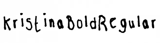
( Fonts by kristinabold.com - Download,print,chop,share. Do whatever.Just spread the word. )
A bold, hand-drawn font with playful, irregular characters.
![Kristina Bold Regular font caratteri gratis]() Scaricare 1462 Downloads@WebFont
Scaricare 1462 Downloads@WebFont -
( Fonts by Mans Greback - www.mawns.com )
An artistic, calligraphic font with flowing strokes and elegant curves.
![Yoghurt font caratteri gratis]() Scaricare 1462 Downloads@WebFont
Scaricare 1462 Downloads@WebFont -
![BD Bankwell font caratteri gratis]() Scaricare 1462 Downloads@WebFont
Scaricare 1462 Downloads@WebFont -
![Ingleby Bold font caratteri gratis]() Scaricare 1462 Downloads@WebFont
Scaricare 1462 Downloads@WebFont -
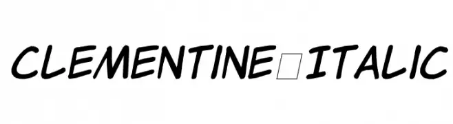
( Fonts by Jason Arthur - JibbaJabba Fonts - www.myspace.com/jasonarthurloaded )
A playful, handwritten-style italic font with smooth curves and consistent strokes.
![Clementine Italic font caratteri gratis]() Scaricare 1462 Downloads@WebFont
Scaricare 1462 Downloads@WebFont -
( Fonts by Alan Carr )
A bold, slanted font with a brush-like texture and dynamic style.
![Roller font caratteri gratis]() Scaricare 1462 Downloads@WebFont
Scaricare 1462 Downloads@WebFont -
( Fonts by Blue Vinyl - Jess Latham - www.bvfonts.com )
A retro collection of bold, geometric shapes and playful motifs inspired by 1960s design.
![60s Chic font caratteri gratis]() Scaricare 1462 Downloads@WebFont
Scaricare 1462 Downloads@WebFont -
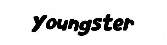
( Fonts by Pinisiart )
A playful, bold font with rounded edges and a youthful style.
![Youngster font caratteri gratis]() Scaricare 1461 Downloads@WebFont
Scaricare 1461 Downloads@WebFont -
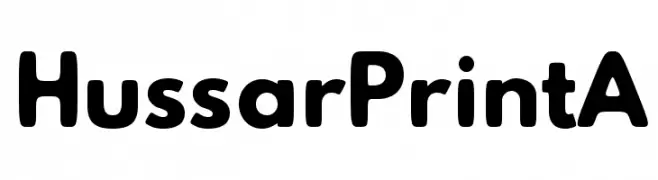
( Fonts by CannotIntoSpaceFonts - KineticPlasma Fonts - Personal-use only. For commercial use please contact owner. )
A bold, rounded font with a playful and approachable style.
![Hussar Print A font caratteri gratis]() Scaricare 1461 Downloads@WebFont
Scaricare 1461 Downloads@WebFont -
( Fonts by 7NTypes )
A playful, handwritten-style font with rounded edges and even spacing.
![Warung Kopi Light font caratteri gratis]() Scaricare 1461 Downloads@WebFont
Scaricare 1461 Downloads@WebFont -
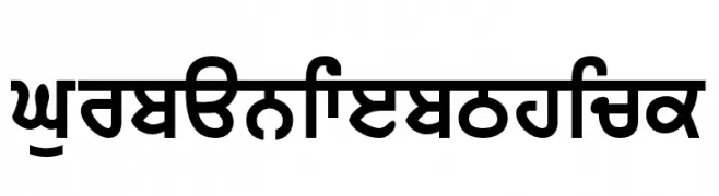
![GurbaniWebThick font caratteri gratis]() Scaricare 1461 Downloads@WebFont
Scaricare 1461 Downloads@WebFont -
![Conundrum font caratteri gratis]() Scaricare 1461 Downloads@WebFont
Scaricare 1461 Downloads@WebFont -
( Fonts by Holydie Studio - Personal-use only. For commercial use please contact owner. )
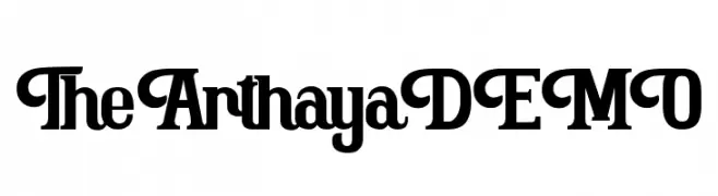
A bold, modern serif font with unique curves and strong presence.
![The Arthaya DEMO font caratteri gratis]() Scaricare 1460 Downloads@WebFont
Scaricare 1460 Downloads@WebFont -
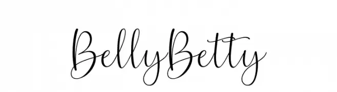
![Belly Betty font caratteri gratis]() Scaricare 1460 Downloads@WebFont
Scaricare 1460 Downloads@WebFont -
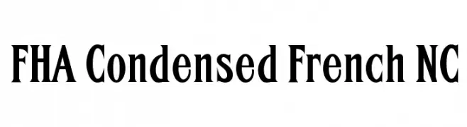
![FHA Condensed French NC font caratteri gratis]() Scaricare 1460 Downloads@WebFont
Scaricare 1460 Downloads@WebFont -
( truefonts.blogspot.com )
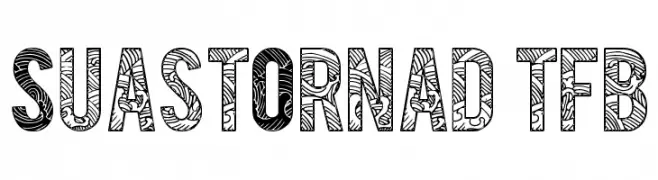
A bold, decorative font with intricate, hand-drawn patterns inside each character.
![SuastOrnad tfb font caratteri gratis]() Scaricare 1460 Downloads@WebFont
Scaricare 1460 Downloads@WebFont


Quali sono i font più popolari adesso?
Poppins, Roboto, Montserrat, Open Sans e Lato sono molto usati per le forme pulite e l'ampia applicabilità — dall'identità di marca alle landing page e ai poster.
Quali font si usano spesso nei loghi?
Le sans serif geometriche (es. Poppins, famiglie in stile Gotham) sono scelte comuni per un branding pulito e scalabile. Per un tocco personale restano valide script e stili manoscritti. Abbina un display deciso per i titoli a un corpo testo neutro per riconoscibilità ed equilibrio.
Ogni quanto si aggiorna la lista?
Con regolarità, in base ai download e all'attività reale. Torna spesso per scoprire in anticipo le nuove preferite.
💡 Consiglio: aggiungi ai preferiti — le tendenze cambiano in fretta e i font top di oggi possono ispirare il rebranding di domani.