Benvenuto nelle Font Più Popolari — dove popolarità e qualità si incontrano. Qui trovi i font più scaricati e usati dell'anno. Se cerchi scelte sicure per logo, web o social, inizia da qui.
Ogni font top si distingue per equilibrio, leggibilità e versatilità. Troverai sans serif moderne, script eleganti, serif vintage e display minimalisti.
-
( Collection of Korean web fonts - Personal-use only. For commercial use please contact owner. )
A bold, modern sans-serif font with clean lines and balanced spacing.
 Scaricare 58 Downloads@WebFont
 -
( Fonts by Edric Studio - Personal-use only. For commercial use please contact owner. )
A bold, brush-style handwritten font with dynamic and playful characters.
![Burning Sun Demo font caratteri gratis]() Scaricare 58 Downloads@WebFont
Scaricare 58 Downloads@WebFont -
( Fonts by Vultype - Candra Hamdani - Personal-use only. For commercial use please contact owner. )
A bold, geometric sans-serif font with a modern and clean design.
![The Bredan Sans font caratteri gratis]() Scaricare 58 Downloads@WebFont
Scaricare 58 Downloads@WebFont -
( Fonts by Niklas Johnson - Personal-use only. For commercial use please contact owner. )
A bold, geometric font with a modern and clean aesthetic.
![Ampero Regular font caratteri gratis]() Scaricare 58 Downloads@WebFont
Scaricare 58 Downloads@WebFont -
( Fonts by Tegaki Script - Personal-use only. For commercial use please contact owner. )
A bold, cursive font with smooth, flowing lines and a modern elegance.
![Yuko Regular font caratteri gratis]() Scaricare 58 Downloads@WebFont
Scaricare 58 Downloads@WebFont -
( Fonts by Kong Font - https://fontkong.com/ - Personal-use only. For commercial use please contact owner. )
An elegant and decorative font with flowing swashes and intricate curves.
![Margo Swash font caratteri gratis]() Scaricare 58 Downloads@WebFont
Scaricare 58 Downloads@WebFont -
( Fonts by Daniel Zadorozny - www.iconian.com - Personal-use only. For commercial use please contact owner. )
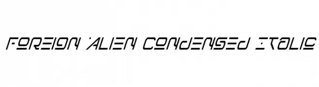
A futuristic, condensed italic font with angular, geometric characters.
![Foreign Alien Condensed Italic font caratteri gratis]() Scaricare 58 Downloads@WebFont
Scaricare 58 Downloads@WebFont -
( Fonts by Daniel Zadorozny - www.iconian.com - Personal-use only. For commercial use please contact owner. )
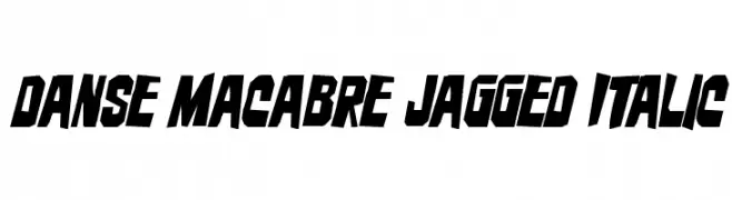
A bold, jagged, and italic font with sharp angles and high contrast.
![Danse Macabre Jagged Italic font caratteri gratis]() Scaricare 58 Downloads@WebFont
Scaricare 58 Downloads@WebFont -
( Fonts by www.junkohanhero.com - Personal-use only. For commercial use please contact owner. )
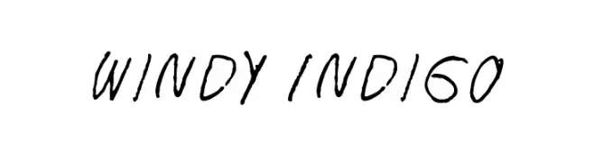
A dynamic, handwritten font with an expressive and casual style.
![Windy Indigo font caratteri gratis]() Scaricare 58 Downloads@WebFont
Scaricare 58 Downloads@WebFont -
( Fonts by Vultype - Candra Hamdani - Personal-use only. For commercial use please contact owner. )
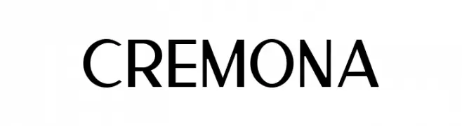
A modern sans-serif font with clean lines and excellent readability.
![Cremona font caratteri gratis]() Scaricare 58 Downloads@WebFont
Scaricare 58 Downloads@WebFont -
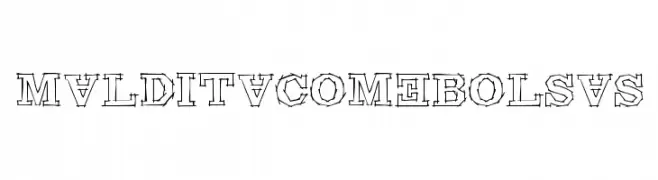
( Fonts by www.woodcutter.es - woodcutter Manero - Personal-use only. For commercial use please contact owner. )
A bold, hand-drawn font with jagged, edgy outlines.
![Maldita Comebolsas font caratteri gratis]() Scaricare 58 Downloads@WebFont
Scaricare 58 Downloads@WebFont -
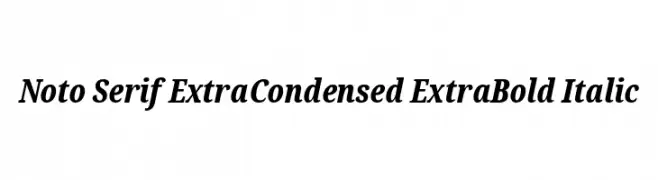
( Noto is a trademark of Google Inc. Noto fonts are open source. All Noto fonts are published under the SIL Open Font License, Version 1.1 )
A classic serif typeface with extra bold, italic, and extra condensed features.
![Noto Serif ExtraCondensed ExtraBold Italic font caratteri gratis]() Scaricare 58 Downloads@WebFont
Scaricare 58 Downloads@WebFont -
( Fonts by Rangkai Aksara - Personal-use only. For commercial use please contact owner. )
A playful, casual handwritten font with smooth curves and bold strokes.
![Heavy Rain font caratteri gratis]() Scaricare 58 Downloads@WebFont
Scaricare 58 Downloads@WebFont -
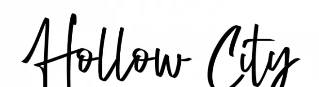
( Fonts by Fontherapy - Siti Anisa - Personal-use only. For commercial use please contact owner. )
A lively handwritten font with fluid, energetic strokes and a playful style.
![Hollow City font caratteri gratis]() Scaricare 58 Downloads@WebFont
Scaricare 58 Downloads@WebFont -
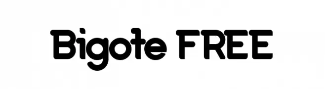
( Fonts by Vunira Design - Personal-use only. For commercial use please contact owner. )
A bold, rounded font with smooth curves and a modern, friendly style.
![Bigote FREE font caratteri gratis]() Scaricare 58 Downloads@WebFont
Scaricare 58 Downloads@WebFont -
( Fonts by sronstudio - Yusron Billah - Personal-use only. For commercial use please contact owner. )
A whimsical and elegant script font with flowing strokes.
![Mystical Snow font caratteri gratis]() Scaricare 58 Downloads@WebFont
Scaricare 58 Downloads@WebFont -
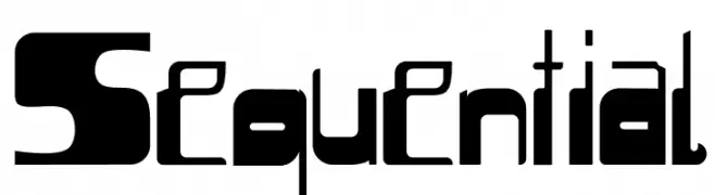
( Elan Shohet Zabin - shohetzabin.com )
A bold, futuristic font with geometric shapes and dynamic style.
![Sequential font caratteri gratis]() Scaricare 58 Downloads@WebFont
Scaricare 58 Downloads@WebFont -
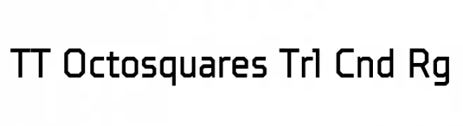
( Fonts by TypeType Foundry )
A geometric, modern font with octagonal shapes and a condensed width.
![TT Octosquares Trl Cnd Rg font caratteri gratis]() Scaricare 58 Downloads@WebFont
Scaricare 58 Downloads@WebFont -
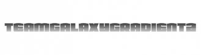
( Fonts by Daniel Zadorozny - www.iconian.com - Personal-use only. For commercial use please contact owner. )
A futuristic, line-based font with a bold, modern aesthetic.
![Team Galaxy Gradient 2 font caratteri gratis]() Scaricare 58 Downloads@WebFont
Scaricare 58 Downloads@WebFont -
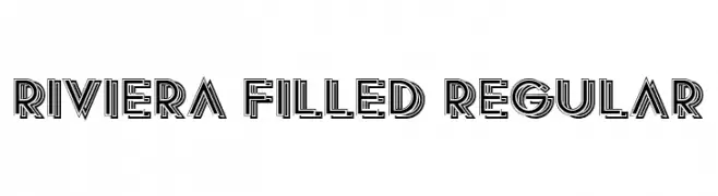
( Fonts by Vladimir Nikolic - www.creativefabrica.com/designer/vladimirnikolic/ - Personal-use only. For commercial use please contact owner. )
A bold, geometric font with a filled, layered design for a modern, decorative look.
![Riviera Filled Regular font caratteri gratis]() Scaricare 58 Downloads@WebFont
Scaricare 58 Downloads@WebFont -
( Fonts by CBRTEXT Studio - Muhammad Khoirul Amal - Personal-use only. For commercial use please contact owner. )
A dynamic and fluid script font with elegant, flowing letterforms.
![Dapka font caratteri gratis]() Scaricare 58 Downloads@WebFont
Scaricare 58 Downloads@WebFont -
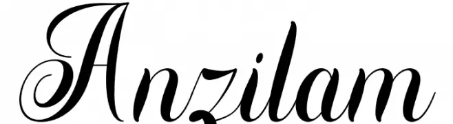
( Fonts by Din Studio - Donis Miftahudin - Personal-use only. For commercial use please contact owner. )
An elegant script font with graceful curves and decorative swirls.
![Anzilam font caratteri gratis]() Scaricare 58 Downloads@WebFont
Scaricare 58 Downloads@WebFont -
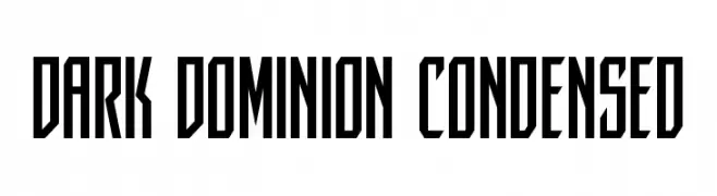
( Fonts by Iconian Fonts - Daniel Zadorozny - Personal-use only. For commercial use please contact owner. )
A bold, condensed font with sharp, angular edges for a modern look.
![Dark Dominion Condensed font caratteri gratis]() Scaricare 58 Downloads@WebFont
Scaricare 58 Downloads@WebFont -
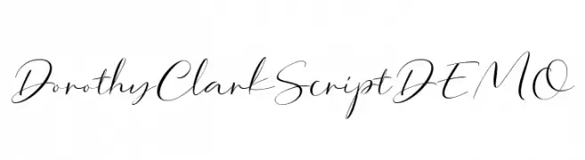
( Fonts by Letterhend Studio - Hendry Juanda - Personal-use only. For commercial use please contact owner. )
An elegant, flowing script font with graceful, connected characters.
![DorothyClarkScriptDEMO font caratteri gratis]() Scaricare 58 Downloads@WebFont
Scaricare 58 Downloads@WebFont -
( Fonts by Md Shohail Bhuian - Personal-use only. For commercial use please contact owner. )
A bold, rounded, and playful font with a hand-drawn feel.
![Enjoy Summer font caratteri gratis]() Scaricare 58 Downloads@WebFont
Scaricare 58 Downloads@WebFont -
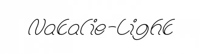
( Fonts by weknow - Wino S Kadir - Personal-use only. For commercial use please contact owner. )
An elegant and fluid cursive script font with interconnected characters.
![Natalie-Light font caratteri gratis]() Scaricare 58 Downloads@WebFont
Scaricare 58 Downloads@WebFont -
( Fonts by Booga Letter - Fajar Wicaksono - Personal-use only. For commercial use please contact owner. )
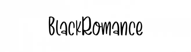
A playful, casual handwritten font with smooth curves and consistent height.
![Black Romance font caratteri gratis]() Scaricare 58 Downloads@WebFont
Scaricare 58 Downloads@WebFont -
( Fonts by Fanastudio - Personal-use only. For commercial use please contact owner. )
An elegant, flowing script font with bold, cursive strokes.
![Wristen font caratteri gratis]() Scaricare 58 Downloads@WebFont
Scaricare 58 Downloads@WebFont -
( Fonts by Masanis Studio - Naufal Anis - Personal-use only. For commercial use please contact owner. )
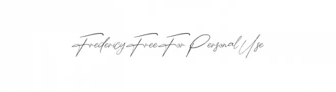
A graceful, cursive font with a fluid, handwritten style.
![Fredericy Free For Personal Use font caratteri gratis]() Scaricare 58 Downloads@WebFont
Scaricare 58 Downloads@WebFont -
( Fonts by nariswari_creative - Taufik Dwi Purnomo - Personal-use only. For commercial use please contact owner. )
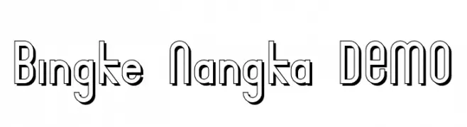
A bold, geometric font with a three-dimensional outline and modern aesthetic.
![Bingke Nangka DEMO font caratteri gratis]() Scaricare 58 Downloads@WebFont
Scaricare 58 Downloads@WebFont -
( Fonts by Art Designs by Sue - Personal-use only. For commercial use please contact owner. )
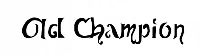
An ornate, calligraphy-inspired font with elaborate flourishes and dramatic strokes.
![Old Champion font caratteri gratis]() Scaricare 58 Downloads@WebFont
Scaricare 58 Downloads@WebFont -
( David Flor )
The image contains decorative symbols, not a valid font.
![DLI LightScript font caratteri gratis]() Scaricare 58 Downloads@WebFont
Scaricare 58 Downloads@WebFont -
( Noem9 Studio - www.noem9studio.com )
A modern, shadowed font with a striped, three-dimensional appearance.
![Chronic Shadow font caratteri gratis]() Scaricare 58 Downloads@WebFont
Scaricare 58 Downloads@WebFont -
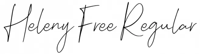
( Fonts by Craft Supply Co. )
![Heleny Free Regular font caratteri gratis]() Scaricare 58 Downloads@WebFont
Scaricare 58 Downloads@WebFont -
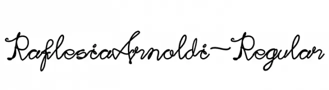
( Fonts by Indra Gunawan - Personal-use only. For commercial use please contact owner. )
An elegant, flowing script font with intricate loops and flourishes.
![RaflesiaArnoldi-Regular font caratteri gratis]() Scaricare 58 Downloads@WebFont
Scaricare 58 Downloads@WebFont


Quali sono i font più popolari adesso?
Poppins, Roboto, Montserrat, Open Sans e Lato sono molto usati per le forme pulite e l'ampia applicabilità — dall'identità di marca alle landing page e ai poster.
Quali font si usano spesso nei loghi?
Le sans serif geometriche (es. Poppins, famiglie in stile Gotham) sono scelte comuni per un branding pulito e scalabile. Per un tocco personale restano valide script e stili manoscritti. Abbina un display deciso per i titoli a un corpo testo neutro per riconoscibilità ed equilibrio.
Ogni quanto si aggiorna la lista?
Con regolarità, in base ai download e all'attività reale. Torna spesso per scoprire in anticipo le nuove preferite.
💡 Consiglio: aggiungi ai preferiti — le tendenze cambiano in fretta e i font top di oggi possono ispirare il rebranding di domani.