Benvenuto nelle Font Più Popolari — dove popolarità e qualità si incontrano. Qui trovi i font più scaricati e usati dell'anno. Se cerchi scelte sicure per logo, web o social, inizia da qui.
Ogni font top si distingue per equilibrio, leggibilità e versatilità. Troverai sans serif moderne, script eleganti, serif vintage e display minimalisti.
-
( Fonts by Twicolabs Fontdation - Fahrizal Tawakkal - Personal-use only. For commercial use please contact owner. )
A bold, dramatic serif font with strong, angular serifs and a modern twist.
 Scaricare 57 Downloads@WebFont
 -
( Fonts by Abdullah Daud )
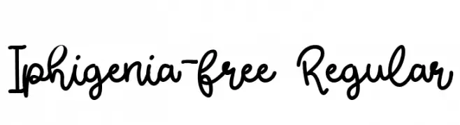
Casual handwritten script font.
![Iphigenia-free Regular font caratteri gratis]() Scaricare 57 Downloads@WebFont
Scaricare 57 Downloads@WebFont -
( Fonts by Situjuh Nazara - 7ntypes.com - Personal-use only. For commercial use please contact owner. )
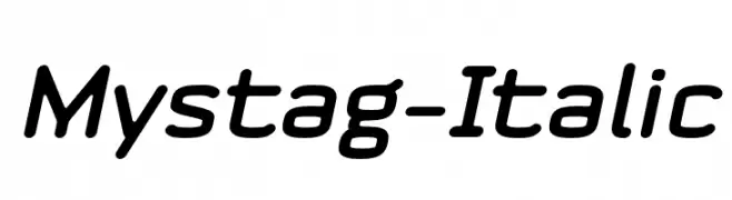
A sleek, italicized font with a modern and dynamic style.
![Mystag-Italic font caratteri gratis]() Scaricare 57 Downloads@WebFont
Scaricare 57 Downloads@WebFont -
( Fonts by Design a Lot - Bogdan Casota - Personal-use only. For commercial use please contact owner. )
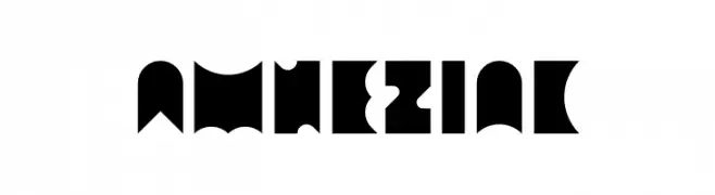
A bold, geometric font with sharp angles and a modern look.
![Amneziak font caratteri gratis]() Scaricare 57 Downloads@WebFont
Scaricare 57 Downloads@WebFont -
( Luis Villarroel - freecreating.wixsite.com/designkrea-type )
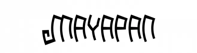
A bold, angular font with a geometric and modern style.
![Mayapan font caratteri gratis]() Scaricare 57 Downloads@WebFont
Scaricare 57 Downloads@WebFont -
( Ned Semoff - nedsemoff.com )
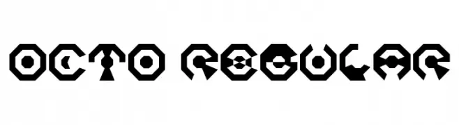
A bold, geometric font with a futuristic and abstract design.
![Octo Regular font caratteri gratis]() Scaricare 57 Downloads@WebFont
Scaricare 57 Downloads@WebFont -
( beery )
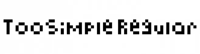
A pixelated, blocky font with a retro digital aesthetic.
![TooSimple Regular font caratteri gratis]() Scaricare 57 Downloads@WebFont
Scaricare 57 Downloads@WebFont -
( Fonts by Dharmas Studio )
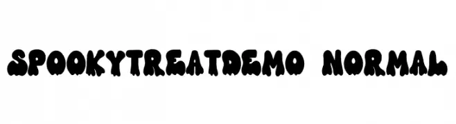
A playful, spooky font with dripping, bold characters ideal for Halloween themes.
![SpookyTreatDEMO-Normal font caratteri gratis]() Scaricare 57 Downloads@WebFont
Scaricare 57 Downloads@WebFont -
( Fonts by Daniel Zadorozny - www.iconian.com - Personal-use only. For commercial use please contact owner. )
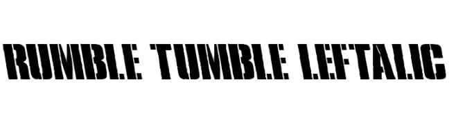
A bold, distressed font with a rugged, stencil-like appearance.
![Rumble Tumble Leftalic font caratteri gratis]() Scaricare 57 Downloads@WebFont
Scaricare 57 Downloads@WebFont -
( Fonts by Vunira Design - Personal-use only. For commercial use please contact owner. )
A bold, handwritten font with a playful and artistic style.
![Artesy FREE font caratteri gratis]() Scaricare 57 Downloads@WebFont
Scaricare 57 Downloads@WebFont -
( John Annear - www.johnannear.tumblr.com )
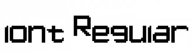
A pixelated, blocky font with a retro digital aesthetic.
![lont Regular font caratteri gratis]() Scaricare 57 Downloads@WebFont
Scaricare 57 Downloads@WebFont -
( Fonts by InspiraType )
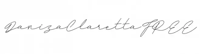
Light, flowing handwritten script with a casual, elegant style.
![DanizaClarettaFREE font caratteri gratis]() Scaricare 57 Downloads@WebFont
Scaricare 57 Downloads@WebFont -
( Fonts by Ketikata Studio - Fuad Hasan - Personal-use only. For commercial use please contact owner. )
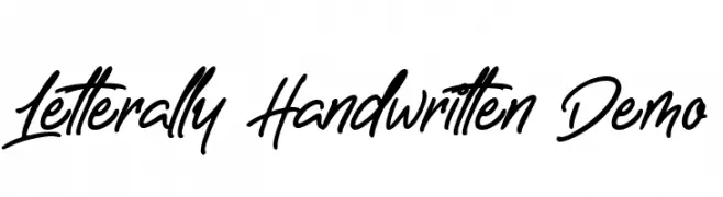
A lively, cursive handwritten font with fluid strokes and dynamic energy.
![Letterally Handwritten Demo font caratteri gratis]() Scaricare 57 Downloads@WebFont
Scaricare 57 Downloads@WebFont -
( Fonts by Pollem Studio - Muhammad Nur - Personal-use only. For commercial use please contact owner. )
A bold, brush-style font with dynamic, slanted strokes.
![Shutter font caratteri gratis]() Scaricare 57 Downloads@WebFont
Scaricare 57 Downloads@WebFont -
( Fonts by ingoFonts - Ingo Zimmermann - Personal-use only. For commercial use please contact owner. )
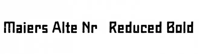
A bold, textured font with a vintage, industrial aesthetic.
![Maiers Alte Nr.8 Reduced Bold font caratteri gratis]() Scaricare 57 Downloads@WebFont
Scaricare 57 Downloads@WebFont -
( Fonts by PutraCetol Studio )
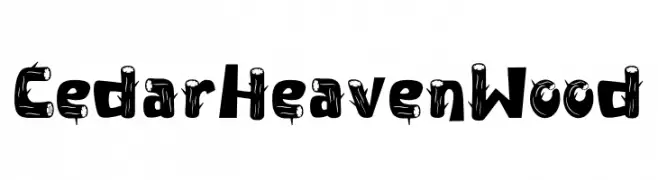
A decorative, wood-grain inspired font with a rustic and playful style.
![Cedar Heaven Wood font caratteri gratis]() Scaricare 57 Downloads@WebFont
Scaricare 57 Downloads@WebFont -
( Fonts by Vladimir Nikolic - www.creativefabrica.com/designer/vladimirnikolic/ - Personal-use only. For commercial use please contact owner. )
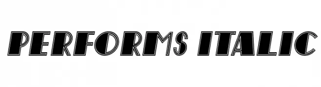
A bold, italic font with a dynamic, outlined style and tight spacing.
![Performs Italic font caratteri gratis]() Scaricare 57 Downloads@WebFont
Scaricare 57 Downloads@WebFont -
( Fonts by Edric Studio - Personal-use only. For commercial use please contact owner. )
A bold, hand-drawn font with a textured, artistic style.
![Dazz Place Demo Display font caratteri gratis]() Scaricare 57 Downloads@WebFont
Scaricare 57 Downloads@WebFont -
( Fonts by Attype Studio - Fadli Ramadhan Iskandar - Personal-use only. For commercial use please contact owner. )
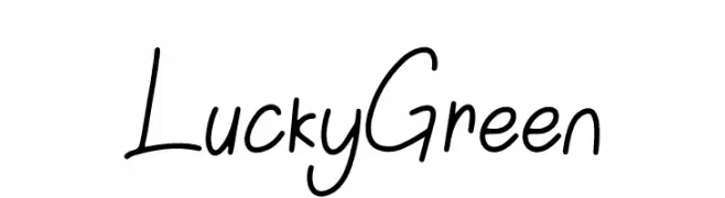
A playful, casual handwritten font with smooth, flowing lines.
![Lucky Green font caratteri gratis]() Scaricare 57 Downloads@WebFont
Scaricare 57 Downloads@WebFont -
( Fonts by Darrell Flood - Personal-use only. For commercial use please contact owner. )
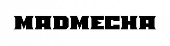
A bold, futuristic font with sharp, angular edges and a mechanical aesthetic.
![Mad Mecha font caratteri gratis]() Scaricare 57 Downloads@WebFont
Scaricare 57 Downloads@WebFont -
( Fonts by Kat`s Fun Fonts - Personal-use only. For commercial use please contact owner. )
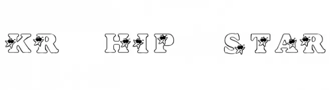
A bold, decorative font with star motifs and a whimsical, retro style.
![KR Hip Star font caratteri gratis]() Scaricare 57 Downloads@WebFont
Scaricare 57 Downloads@WebFont -
( Fonts by Muhammad Iqbal Faizin - Personal-use only. For commercial use please contact owner. )
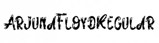
A bold, brush-stroke font with a distressed, hand-painted texture.
![ArjunaFloydRegular font caratteri gratis]() Scaricare 57 Downloads@WebFont
Scaricare 57 Downloads@WebFont -
( Fonts by Tokokoo Studio )
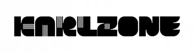
A bold, geometric font with artistic cutouts and a modern flair.
![KARLZone font caratteri gratis]() Scaricare 57 Downloads@WebFont
Scaricare 57 Downloads@WebFont -
( Fonts by www.selawetype.com - Personal-use only. FOR DONATION https://www.paypal.me/selawe . For commercial use please contact owner. )
An artistic and decorative font with high contrast and dynamic curves.
![Quillines2 font caratteri gratis]() Scaricare 57 Downloads@WebFont
Scaricare 57 Downloads@WebFont -
( Fonts by AVType - Personal-use only. For commercial use please contact owner. )
A whimsical, handwritten font with tall, narrow letters and playful strokes.
![Spooky Mistery font caratteri gratis]() Scaricare 57 Downloads@WebFont
Scaricare 57 Downloads@WebFont -
( Fonts by Mindtype Co. - Putra Khan - Personal-use only. For commercial use please contact owner. )
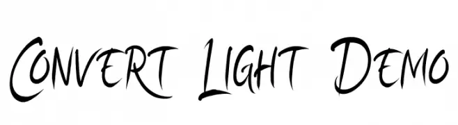
A dynamic, brush-style font with expressive, fluid strokes.
![Convert Light Demo font caratteri gratis]() Scaricare 57 Downloads@WebFont
Scaricare 57 Downloads@WebFont -
( Fonts by fadlilunasi - Fadli raihan - Personal-use only. For commercial use please contact owner. )
A playful, rounded font with a hand-drawn, casual style.
![melunasi-v2 font caratteri gratis]() Scaricare 57 Downloads@WebFont
Scaricare 57 Downloads@WebFont -
( hechicero - www.ff-omeganebula.com )
A decorative and abstract font with mystical, symbolic characters.
![Clavat Script font caratteri gratis]() Scaricare 57 Downloads@WebFont
Scaricare 57 Downloads@WebFont -
( Fonts by DmLetter31 - Dimas Prasetyo - Personal-use only. For commercial use please contact owner. )
A bold, blocky font with a retro, vintage style and tight character spacing.
![Blocky font caratteri gratis]() Scaricare 57 Downloads@WebFont
Scaricare 57 Downloads@WebFont -
( Fonts by Letternun - Saeful Bahri - Personal-use only. For commercial use please contact owner. )
A bold, playful script font with a hand-drawn, energetic style.
![Balina font caratteri gratis]() Scaricare 57 Downloads@WebFont
Scaricare 57 Downloads@WebFont -
( Fonts by Subectype & Orenari - Rangga Subekti & Ari - Personal-use only. For commercial use please contact owner. )
A playful, handwritten font with a casual and dynamic style.
![Sunday Mood font caratteri gratis]() Scaricare 57 Downloads@WebFont
Scaricare 57 Downloads@WebFont -
( Fonts by FallenGraphic Studio - Vava Aryanto - Personal-use only. For commercial use please contact owner. )
A flowing, cursive font with elegant, handwritten style.
![Silhouette Re 02 Personal Use font caratteri gratis]() Scaricare 57 Downloads@WebFont
Scaricare 57 Downloads@WebFont -
( Fonts by Get Studio - Hermansyah , - Personal-use only. For commercial use please contact owner. )
A playful, casual handwritten font with irregular strokes and an organic flow.
![AmelianaTwo font caratteri gratis]() Scaricare 57 Downloads@WebFont
Scaricare 57 Downloads@WebFont -
( Fonts by Muhammad Novianto - Personal-use only. For commercial use please contact owner. )
A cursive, handwritten font with elegant, flowing strokes.
![Westhamp font caratteri gratis]() Scaricare 57 Downloads@WebFont
Scaricare 57 Downloads@WebFont -
( Fonts by StringLabs - stringlabscreative.com - Personal-use only. For commercial use please contact owner. )
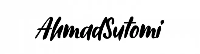
A bold, expressive handwritten font with fluid, dynamic strokes.
![Ahmad Sutomi font caratteri gratis]() Scaricare 57 Downloads@WebFont
Scaricare 57 Downloads@WebFont


Quali sono i font più popolari adesso?
Poppins, Roboto, Montserrat, Open Sans e Lato sono molto usati per le forme pulite e l'ampia applicabilità — dall'identità di marca alle landing page e ai poster.
Quali font si usano spesso nei loghi?
Le sans serif geometriche (es. Poppins, famiglie in stile Gotham) sono scelte comuni per un branding pulito e scalabile. Per un tocco personale restano valide script e stili manoscritti. Abbina un display deciso per i titoli a un corpo testo neutro per riconoscibilità ed equilibrio.
Ogni quanto si aggiorna la lista?
Con regolarità, in base ai download e all'attività reale. Torna spesso per scoprire in anticipo le nuove preferite.
💡 Consiglio: aggiungi ai preferiti — le tendenze cambiano in fretta e i font top di oggi possono ispirare il rebranding di domani.