Benvenuto nelle Font Più Popolari — dove popolarità e qualità si incontrano. Qui trovi i font più scaricati e usati dell'anno. Se cerchi scelte sicure per logo, web o social, inizia da qui.
Ogni font top si distingue per equilibrio, leggibilità e versatilità. Troverai sans serif moderne, script eleganti, serif vintage e display minimalisti.
-
( Fonts by Letterara - Thomas Aradea - Personal-use only. For commercial use please contact owner. )
A bold, dripping font with a spooky, horror-themed style.
 Scaricare 46 Downloads@WebFont
 -
( Fonts by Mans Greback - Personal-use only. For commercial use please contact owner. )
A bold, Art Deco-inspired italic font with angular lines and geometric shapes.
![Artisual Deco Regular Italic PERSONAL USE ONLY PERSONAL USE ONLY font caratteri gratis]() Scaricare 46 Downloads@WebFont
Scaricare 46 Downloads@WebFont -
( Fonts by GoldenGraph Design - Personal-use only. For commercial use please contact owner. )
A bold, cursive font with a playful and dynamic style.
![Deqboza font caratteri gratis]() Scaricare 46 Downloads@WebFont
Scaricare 46 Downloads@WebFont -
( Fonts by StringLabs - stringlabscreative.com - Personal-use only. For commercial use please contact owner. )
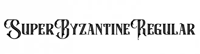
An ornate, Byzantine-inspired decorative font with intricate flourishes.
![Super Byzantine Regular font caratteri gratis]() Scaricare 46 Downloads@WebFont
Scaricare 46 Downloads@WebFont -
( imagex - www.imagex-fonts.com )
A playful, cartoonish font with bold outlines and a whimsical, hand-drawn style.
![ToonLand font caratteri gratis]() Scaricare 46 Downloads@WebFont
Scaricare 46 Downloads@WebFont -
-
( Fonts by Woodcutter )
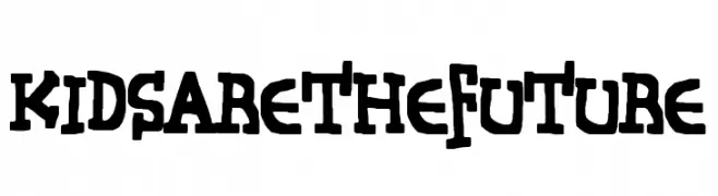
A playful, hand-drawn font with bold, irregular strokes and quirky characters.
![Kids Are The Future font caratteri gratis]() Scaricare 46 Downloads@WebFont
Scaricare 46 Downloads@WebFont -
( Fonts by GoldenGraph Design - Personal-use only. For commercial use please contact owner. )
A dynamic and flowing script font with elegant, cursive letterforms.
![Ganbatte font caratteri gratis]() Scaricare 46 Downloads@WebFont
Scaricare 46 Downloads@WebFont -
( Fonts by Seckin Hatipoglu )
A decorative font with intricate maze-like patterns within each character.
![infinitylabyrinth-Regular font caratteri gratis]() Scaricare 46 Downloads@WebFont
Scaricare 46 Downloads@WebFont -
( Fonts by Mr.W - Willian Santos - Personal-use only. For commercial use please contact owner. )
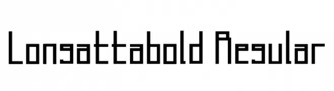
A geometric, modern font with bold weight and sharp angles.
![Longatta_bold Regular font caratteri gratis]() Scaricare 46 Downloads@WebFont
Scaricare 46 Downloads@WebFont -
( Fonts by Omotu Studio - Ibnu Utomo - Personal-use only. For commercial use please contact owner. )
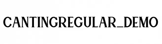
A classic serif font with sharp, angular serifs and a modern touch.
![Canting Regular_DEMO font caratteri gratis]() Scaricare 46 Downloads@WebFont
Scaricare 46 Downloads@WebFont -
( Noto is a trademark of Google Inc. Noto fonts are open source. All Noto fonts are published under the SIL Open Font License, Version 1.1 )
Invalid font image.
![Noto Sans Ethiopic ExtraCondensed SemiBold font caratteri gratis]() Scaricare 46 Downloads@WebFont
Scaricare 46 Downloads@WebFont -
( Fonts by Vladimir Nikolic - www.creativefabrica.com/designer/vladimirnikolic/ - Personal-use only. For commercial use please contact owner. )
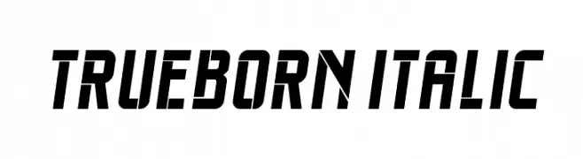
A bold, italic font with a modern, angular design and strong visual impact.
![Trueborn Italic font caratteri gratis]() Scaricare 46 Downloads@WebFont
Scaricare 46 Downloads@WebFont -
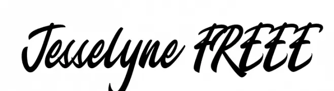
( Fonts by Typetemp Studio - Personal-use only. For commercial use please contact owner. )
A bold, cursive font with a dynamic, handwritten style.
![Jesselyne FREEE font caratteri gratis]() Scaricare 46 Downloads@WebFont
Scaricare 46 Downloads@WebFont -
( Fonts by Vunira Design - Personal-use only. For commercial use please contact owner. )
A bold, expressive brush script font with a modern, handwritten style.
![Alkilri FREE font caratteri gratis]() Scaricare 46 Downloads@WebFont
Scaricare 46 Downloads@WebFont -
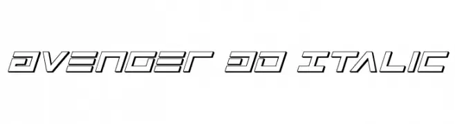
( Iconian Fonts - Daniel Zadorozny - www.iconian.com )
A bold, 3D italic font with a futuristic and dynamic style.
![Avenger 3D Italic font caratteri gratis]() Scaricare 46 Downloads@WebFont
Scaricare 46 Downloads@WebFont -
( imagex - www.imagex-fonts.com )
A bold, 3D geometric font with shadow effects for impactful designs.
![Top View font caratteri gratis]() Scaricare 46 Downloads@WebFont
Scaricare 46 Downloads@WebFont -
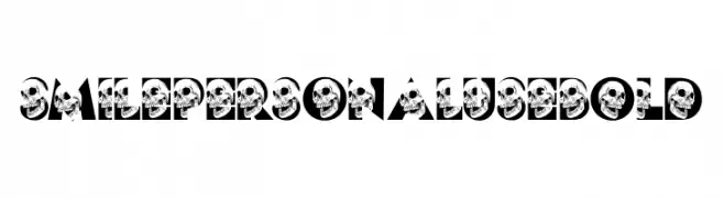
( Fonts by Billy Argel Fonts - www.billyargel.com - Personal-use only. For commercial use please contact owner. )
A bold, skull-themed font with geometric uppercase letters.
![SMILE PERSONAL USE Bold font caratteri gratis]() Scaricare 46 Downloads@WebFont
Scaricare 46 Downloads@WebFont -
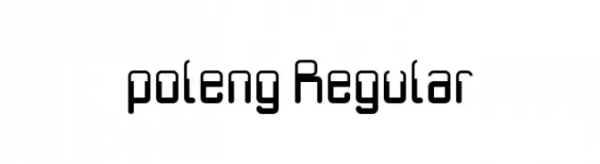
( BangDje - bangdje.wordpress.com/ )
A modern, geometric font with rounded edges and consistent stroke width.
![poleng Regular font caratteri gratis]() Scaricare 46 Downloads@WebFont
Scaricare 46 Downloads@WebFont -
( Fonts by Iconian Fonts )
A bold, geometric font with a modern, industrial style.
![Capitol City Expanded Straight font caratteri gratis]() Scaricare 46 Downloads@WebFont
Scaricare 46 Downloads@WebFont -
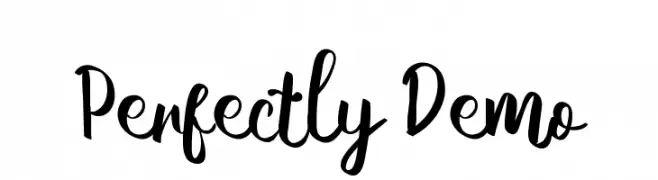
( Fonts by Aditya Rezki Apriyadi - Personal-use only. For commercial use please contact owner. )
A playful handwritten font with a lively and dynamic style.
![Perfectly Demo font caratteri gratis]() Scaricare 46 Downloads@WebFont
Scaricare 46 Downloads@WebFont -
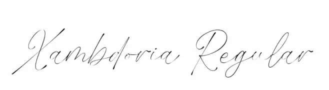
( Fonts by Brithos Type - Personal-use only. For commercial use please contact owner. )
An elegant, flowing script font with delicate, thin strokes.
![Xambdoria Regular font caratteri gratis]() Scaricare 46 Downloads@WebFont
Scaricare 46 Downloads@WebFont -
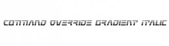
( Iconian Fonts - Daniel Zadorozny - www.iconian.com )
A futuristic, gradient-striped italic font with a bold and dynamic style.
![Command Override Gradient Italic font caratteri gratis]() Scaricare 46 Downloads@WebFont
Scaricare 46 Downloads@WebFont -
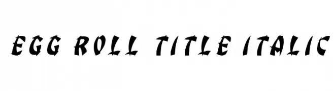
( Iconian Fonts - Daniel Zadorozny - www.iconian.com )
A bold, italic font with dynamic angles and thick strokes.
![Egg Roll Title Italic font caratteri gratis]() Scaricare 46 Downloads@WebFont
Scaricare 46 Downloads@WebFont -
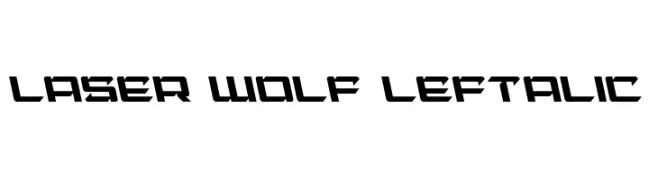
( Iconian Fonts - Daniel Zadorozny - www.iconian.com )
A bold, angular font with a futuristic and dynamic style.
![Laser Wolf Leftalic font caratteri gratis]() Scaricare 46 Downloads@WebFont
Scaricare 46 Downloads@WebFont -
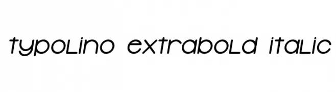
( Vladimir Nikolic - www.coroflot.com/vladimirnikolic )
A playful, bold, and italicized font with rounded, smooth characters.
![Typolino ExtraBold Italic font caratteri gratis]() Scaricare 46 Downloads@WebFont
Scaricare 46 Downloads@WebFont -
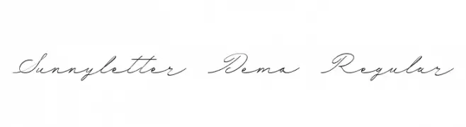
( Fonts by Mans Greback - www.mansgreback.com - Personal-use only. For commercial use please contact owner. )
A flowing, cursive script font with elegant, connected characters.
![Sunnyletter Demo Regular font caratteri gratis]() Scaricare 46 Downloads@WebFont
Scaricare 46 Downloads@WebFont -
( Noto is a trademark of Google Inc. Noto fonts are open source. All Noto fonts are published under the SIL Open Font License, Version 1.1 )
A modern, condensed sans-serif font designed for UI clarity and readability.
![Noto Sans Arabic UI Condensed font caratteri gratis]() Scaricare 46 Downloads@WebFont
Scaricare 46 Downloads@WebFont -
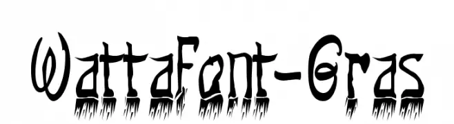
( Fonts by Malre - Personal-use only. For commercial use please contact owner. )
A bold, artistic font with a hand-drawn, whimsical style.
![Wattafont-Gras font caratteri gratis]() Scaricare 46 Downloads@WebFont
Scaricare 46 Downloads@WebFont -
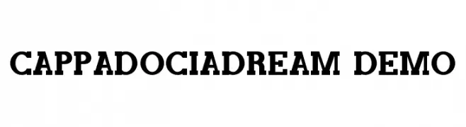
( Fonts by CalligraphyFonts - Personal-use only. For commercial use please contact owner. )
A bold, classic serif font with strong, authoritative characters.
![CappadociaDream Demo font caratteri gratis]() Scaricare 46 Downloads@WebFont
Scaricare 46 Downloads@WebFont -
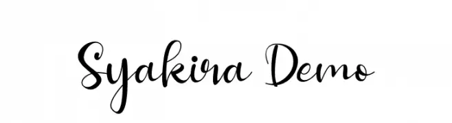
( Fonts by Aditya Rezki Apriyadi - Personal-use only. For commercial use please contact owner. )
A playful and elegant script font with dynamic strokes and modern flair.
![Syakira Demo font caratteri gratis]() Scaricare 46 Downloads@WebFont
Scaricare 46 Downloads@WebFont -
( Fonts by Erik Studio - Personal-use only. For commercial use please contact owner. )
A modern, elegant script font with intricate loops and artistic flourishes.
![Prestige font caratteri gratis]() Scaricare 46 Downloads@WebFont
Scaricare 46 Downloads@WebFont -
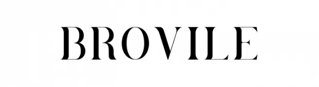
( Fonts by Hanzel Space - Personal-use only. For commercial use please contact owner. )
A classic serif font with high contrast and elegant strokes.
![Brovile font caratteri gratis]() Scaricare 46 Downloads@WebFont
Scaricare 46 Downloads@WebFont -
( Fonts by PenPointype - Personal-use only. For commercial use please contact owner. )
A playful handwritten font with smooth, flowing lines and a casual style.
![Vinally font caratteri gratis]() Scaricare 46 Downloads@WebFont
Scaricare 46 Downloads@WebFont -
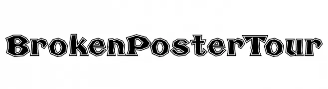
( Fonts by Fontry - M.G. Adkins - Personal-use only. For commercial use please contact owner. )
A bold, outlined font with a dynamic, edgy style.
![Broken Poster Tour font caratteri gratis]() Scaricare 46 Downloads@WebFont
Scaricare 46 Downloads@WebFont -
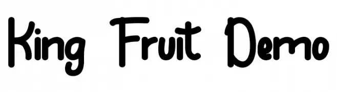
( Fonts by VinType )
Playful, rounded sans-serif with a hand-drawn, informal look.
![King Fruit Demo font caratteri gratis]() Scaricare 46 Downloads@WebFont
Scaricare 46 Downloads@WebFont


Quali sono i font più popolari adesso?
Poppins, Roboto, Montserrat, Open Sans e Lato sono molto usati per le forme pulite e l'ampia applicabilità — dall'identità di marca alle landing page e ai poster.
Quali font si usano spesso nei loghi?
Le sans serif geometriche (es. Poppins, famiglie in stile Gotham) sono scelte comuni per un branding pulito e scalabile. Per un tocco personale restano valide script e stili manoscritti. Abbina un display deciso per i titoli a un corpo testo neutro per riconoscibilità ed equilibrio.
Ogni quanto si aggiorna la lista?
Con regolarità, in base ai download e all'attività reale. Torna spesso per scoprire in anticipo le nuove preferite.
💡 Consiglio: aggiungi ai preferiti — le tendenze cambiano in fretta e i font top di oggi possono ispirare il rebranding di domani.