Benvenuto nelle Font Più Popolari — dove popolarità e qualità si incontrano. Qui trovi i font più scaricati e usati dell'anno. Se cerchi scelte sicure per logo, web o social, inizia da qui.
Ogni font top si distingue per equilibrio, leggibilità e versatilità. Troverai sans serif moderne, script eleganti, serif vintage e display minimalisti.
-
( Fonts by Steve Cloutier - www.cloutierfontes.ca )
A bold, distressed font with a vintage, textured appearance.
 Scaricare 1443 Downloads@WebFont
 -
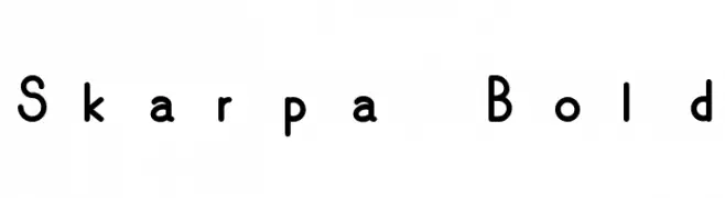
![Skarpa Bold font caratteri gratis]() Scaricare 1443 Downloads@WebFont
Scaricare 1443 Downloads@WebFont -
![DC Comics font caratteri gratis]() Scaricare 1443 Downloads@WebFont
Scaricare 1443 Downloads@WebFont -
( Fonts by HPLHS Prop Fonts - Andrew H. Leman http://www.cthulhulives.org/toybox/propdocs/propfonts.html )
A classic old-style serif font with pronounced serifs and a timeless elegance.
![OldstyleHPLHS-SC font caratteri gratis]() Scaricare 1443 Downloads@WebFont
Scaricare 1443 Downloads@WebFont -
![Eraser font caratteri gratis]() Scaricare 1443 Downloads@WebFont
Scaricare 1443 Downloads@WebFont -
-
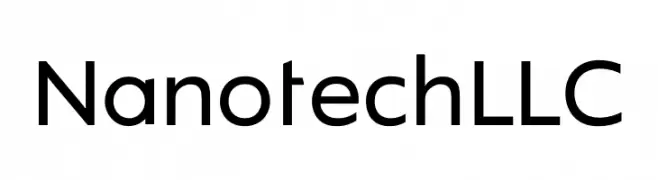
![Nanotech LLC font caratteri gratis]() Scaricare 1442 Downloads@WebFont
Scaricare 1442 Downloads@WebFont -
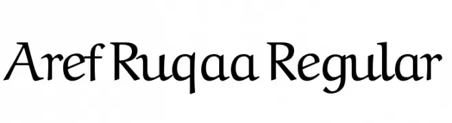
( Copyright (c) 2015, Khaled Hosny (
An elegant serif font with a blend of traditional and modern elements.
![Aref Ruqaa Regular font caratteri gratis]() Scaricare 1442 Downloads@WebFont
Scaricare 1442 Downloads@WebFont -
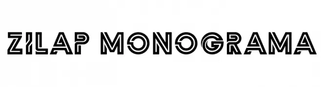
( Fonts by LJ Design Studios )
A bold, geometric font with outlined characters and a modern-retro aesthetic.
![Zilap Monograma font caratteri gratis]() Scaricare 1442 Downloads@WebFont
Scaricare 1442 Downloads@WebFont -
Caratteri di spideraysfonts. For commercial use please contact the owner.
![REGISTRATION PLATE UK font caratteri gratis]() Scaricare 1442 Downloads@WebFont
Scaricare 1442 Downloads@WebFont -
Caratteri di spideraysfonts. For commercial use please contact the owner.
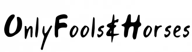
( ONLY FOOLS AND HORSES )
A playful, handwritten font with quirky, uneven strokes and a casual style.
![Only Fools & Horses font caratteri gratis]() Scaricare 1442 Downloads@WebFont
Scaricare 1442 Downloads@WebFont -
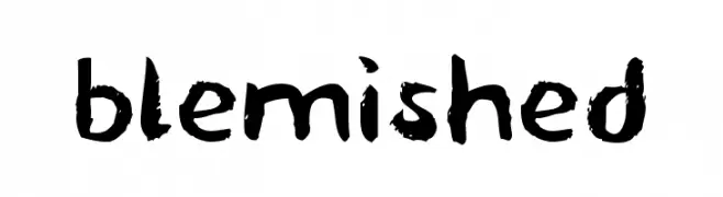
![blemished font caratteri gratis]() Scaricare 1442 Downloads@WebFont
Scaricare 1442 Downloads@WebFont -
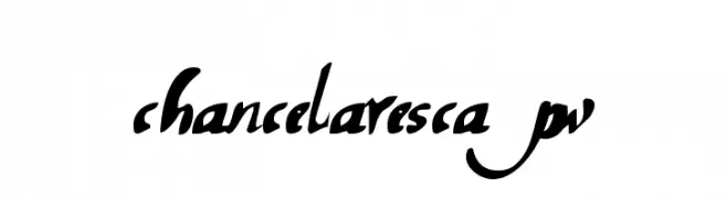
![chancelaresca pw font caratteri gratis]() Scaricare 1442 Downloads@WebFont
Scaricare 1442 Downloads@WebFont -
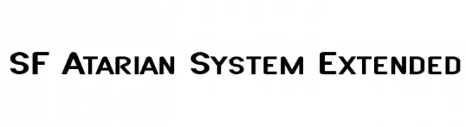
( Fonts by ShyFonts )
A bold, geometric font with a modern, tech-inspired aesthetic.
![SF Atarian System Extended font caratteri gratis]() Scaricare 1442 Downloads@WebFont
Scaricare 1442 Downloads@WebFont -
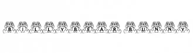
( Fonts by Loraine Wauer Ferus www.billybear4kids.com )
A playful font with characters embedded in cartoon bunny designs.
![BillyBear Bunny font caratteri gratis]() Scaricare 1442 Downloads@WebFont
Scaricare 1442 Downloads@WebFont -
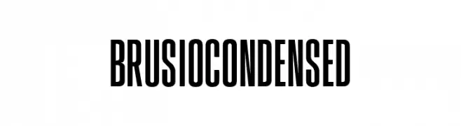
( Fonts by James Barnardo - Personal-use only. For commercial use please contact owner. )
A bold, condensed, and modern sans-serif font with a strong vertical emphasis.
![BrusioCondensed font caratteri gratis]() Scaricare 1441 Downloads@WebFont
Scaricare 1441 Downloads@WebFont -
![ClementePDam-Bold font caratteri gratis]() Scaricare 1441 Downloads@WebFont
Scaricare 1441 Downloads@WebFont -
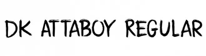
![DK Attaboy Regular font caratteri gratis]() Scaricare 1441 Downloads@WebFont
Scaricare 1441 Downloads@WebFont -
( Fonts by www.kimberlygeswein.com - Kimberly Geswein )
A graceful, flowing script font with elegant, continuous strokes.
![Janda Elegant Handwriting font caratteri gratis]() Scaricare 1441 Downloads@WebFont
Scaricare 1441 Downloads@WebFont -
![Papercuts font caratteri gratis]() Scaricare 1441 Downloads@WebFont
Scaricare 1441 Downloads@WebFont -
![Ghetto Streetz font caratteri gratis]() Scaricare 1441 Downloads@WebFont
Scaricare 1441 Downloads@WebFont -
( Fonts by Nick Curtis - www.nicksfonts.com )
A bold, geometric font with an Art Deco influence, featuring sharp angles and smooth curves.
![Copasetic NF Bold font caratteri gratis]() Scaricare 1441 Downloads@WebFont
Scaricare 1441 Downloads@WebFont -
( Fonts by Heath Kane Commerciali Caratteri )
An edgy, thorn-like font with a distressed and chaotic appearance.
![Bleed font caratteri gratis]() Scaricare 1441 Downloads
Scaricare 1441 Downloads -
![Fernando font caratteri gratis]() Scaricare 1441 Downloads
Scaricare 1441 Downloads -
( Fonts by Niskala Huruf )
A bold, angular font with a geometric and dynamic style.
![Supply Center font caratteri gratis]() Scaricare 1440 Downloads@WebFont
Scaricare 1440 Downloads@WebFont -
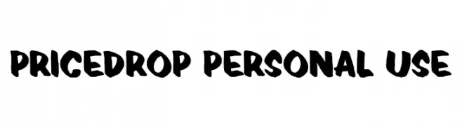
( Fonts by Guaraldo Fonts - Personal-use only. For commercial use please contact owner. )
A bold, brush-style font with an energetic and artistic feel.
![Pricedrop Personal Use font caratteri gratis]() Scaricare 1440 Downloads@WebFont
Scaricare 1440 Downloads@WebFont -
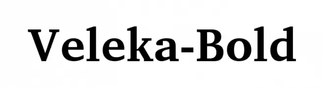
( Fonts by Stefan Peev, Context Ltd - Personal-use only. For commercial use please contact owner. )
A bold serif font with strong vertical strokes and a classic yet modern appearance.
![Veleka-Bold font caratteri gratis]() Scaricare 1440 Downloads@WebFont
Scaricare 1440 Downloads@WebFont -
Caratteri di joorgemoron. For commercial use please contact the owner.
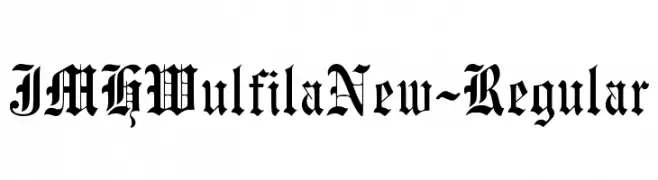
( Free for personal use )
A bold, ornate blackletter font with a gothic, medieval style.
![JMHWulfilaNew-Regular font caratteri gratis]() Scaricare 1440 Downloads@WebFont
Scaricare 1440 Downloads@WebFont -
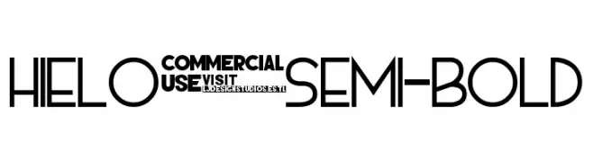
![HIELO Semi-bold font caratteri gratis]() Scaricare 1440 Downloads@WebFont
Scaricare 1440 Downloads@WebFont -
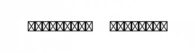
![Christmas Numerals font caratteri gratis]() Scaricare 1440 Downloads@WebFont
Scaricare 1440 Downloads@WebFont -
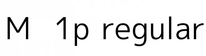
![M+ 1p regular font caratteri gratis]() Scaricare 1440 Downloads@WebFont
Scaricare 1440 Downloads@WebFont -
![monoMMM_5 font caratteri gratis]() Scaricare 1440 Downloads@WebFont
Scaricare 1440 Downloads@WebFont -
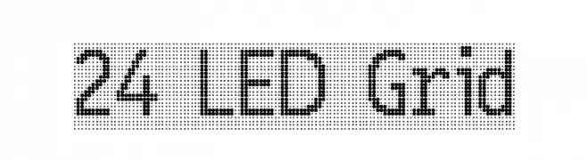
![24 LED Grid font caratteri gratis]() Scaricare 1440 Downloads@WebFont
Scaricare 1440 Downloads@WebFont -
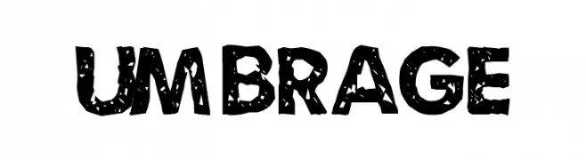
![Umbrage font caratteri gratis]() Scaricare 1440 Downloads@WebFont
Scaricare 1440 Downloads@WebFont -
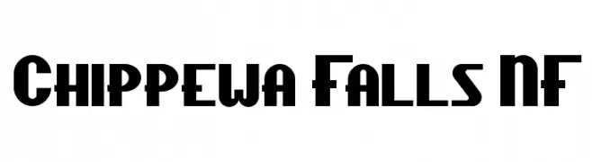
( Fonts by Nick Curtis - www.nicksfonts.com )
A bold, geometric font with Art Deco influences, perfect for striking headlines and branding.
![Chippewa Falls NF font caratteri gratis]() Scaricare 1440 Downloads@WebFont
Scaricare 1440 Downloads@WebFont -
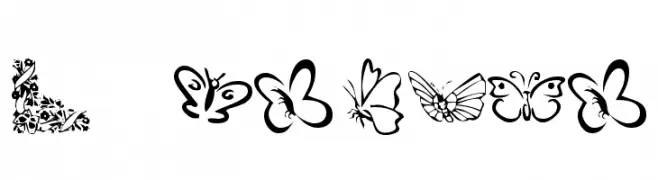
( Fonts by Kat`s Fun Fonts - Personal-use only. For commercial use please contact owner. )
A decorative set of butterfly illustrations in place of traditional characters.
![KR Butterflies font caratteri gratis]() Scaricare 1440 Downloads@WebFont
Scaricare 1440 Downloads@WebFont


Quali sono i font più popolari adesso?
Poppins, Roboto, Montserrat, Open Sans e Lato sono molto usati per le forme pulite e l'ampia applicabilità — dall'identità di marca alle landing page e ai poster.
Quali font si usano spesso nei loghi?
Le sans serif geometriche (es. Poppins, famiglie in stile Gotham) sono scelte comuni per un branding pulito e scalabile. Per un tocco personale restano valide script e stili manoscritti. Abbina un display deciso per i titoli a un corpo testo neutro per riconoscibilità ed equilibrio.
Ogni quanto si aggiorna la lista?
Con regolarità, in base ai download e all'attività reale. Torna spesso per scoprire in anticipo le nuove preferite.
💡 Consiglio: aggiungi ai preferiti — le tendenze cambiano in fretta e i font top di oggi possono ispirare il rebranding di domani.