Benvenuto nelle Font Più Popolari — dove popolarità e qualità si incontrano. Qui trovi i font più scaricati e usati dell'anno. Se cerchi scelte sicure per logo, web o social, inizia da qui.
Ogni font top si distingue per equilibrio, leggibilità e versatilità. Troverai sans serif moderne, script eleganti, serif vintage e display minimalisti.
-
 Scaricare 399 Downloads@WebFont
 -
( fonts.pistocasero.com )
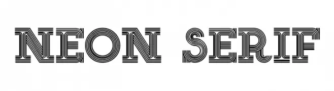
A bold, decorative font with a layered, neon sign-inspired design.
![NEON SERIF font caratteri gratis]() Scaricare 399 Downloads@WebFont
Scaricare 399 Downloads@WebFont -
( Fonts by www.aenigmafonts.com )
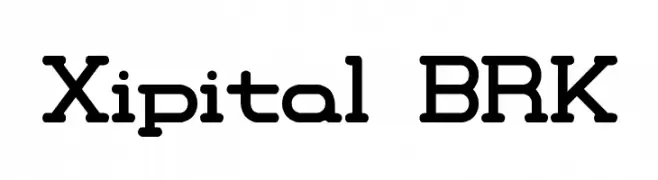
A bold, geometric font with rounded edges and a modern, futuristic style.
![Xipital BRK font caratteri gratis]() Scaricare 399 Downloads@WebFont
Scaricare 399 Downloads@WebFont -
( monkeyroodlesfonts.weebly.com/ )
A playful, handwritten font with tall, narrow letters and a casual style.
![dill pickles font caratteri gratis]() Scaricare 399 Downloads@WebFont
Scaricare 399 Downloads@WebFont -
( Copyright 2017 The Literata Project Authors (https://github.com/googlefonts/literata) )
An elegant italic serif font with a classic and refined style.
![Literata Italic font caratteri gratis]() Scaricare 399 Downloads@WebFont
Scaricare 399 Downloads@WebFont -
-
( Fonts by MagicType - Jaikishan Patel - Personal-use only. For commercial use please contact owner. )
A bold, modern sans-serif font with strong, thick strokes.
![Red Rose Bold font caratteri gratis]() Scaricare 399 Downloads@WebFont
Scaricare 399 Downloads@WebFont -
( Fonts by Fontfabric - Svetoslav Simov - Personal-use only. For commercial use please contact owner. )
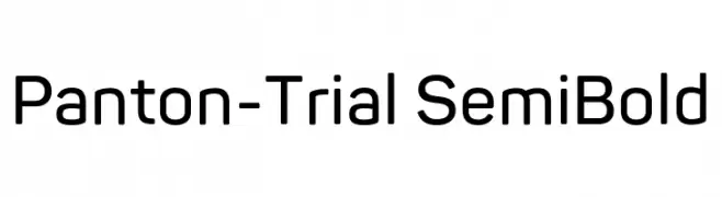
A modern, semi-bold sans-serif font with smooth, rounded edges and excellent readability.
![Panton-Trial SemiBold font caratteri gratis]() Scaricare 399 Downloads@WebFont
Scaricare 399 Downloads@WebFont -
( Fonts by Apostrophic Lab )
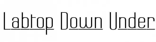
A modern, sleek font with tall, narrow characters and a clean, minimalistic style.
![Labtop Down Under font caratteri gratis]() Scaricare 399 Downloads@WebFont
Scaricare 399 Downloads@WebFont -
( Fonts by Darrell Flood - Personal-use only. For commercial use please contact owner. )
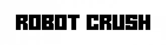
A bold, geometric font with a futuristic and industrial design.
![Robot Crush font caratteri gratis]() Scaricare 399 Downloads@WebFont
Scaricare 399 Downloads@WebFont -
![SeattleAvenue font caratteri gratis]() Scaricare 399 Downloads@WebFont
Scaricare 399 Downloads@WebFont


Quali sono i font più popolari adesso?
Poppins, Roboto, Montserrat, Open Sans e Lato sono molto usati per le forme pulite e l'ampia applicabilità — dall'identità di marca alle landing page e ai poster.
Quali font si usano spesso nei loghi?
Le sans serif geometriche (es. Poppins, famiglie in stile Gotham) sono scelte comuni per un branding pulito e scalabile. Per un tocco personale restano valide script e stili manoscritti. Abbina un display deciso per i titoli a un corpo testo neutro per riconoscibilità ed equilibrio.
Ogni quanto si aggiorna la lista?
Con regolarità, in base ai download e all'attività reale. Torna spesso per scoprire in anticipo le nuove preferite.
💡 Consiglio: aggiungi ai preferiti — le tendenze cambiano in fretta e i font top di oggi possono ispirare il rebranding di domani.