Benvenuto nelle Font Più Popolari — dove popolarità e qualità si incontrano. Qui trovi i font più scaricati e usati dell'anno. Se cerchi scelte sicure per logo, web o social, inizia da qui.
Ogni font top si distingue per equilibrio, leggibilità e versatilità. Troverai sans serif moderne, script eleganti, serif vintage e display minimalisti.
-
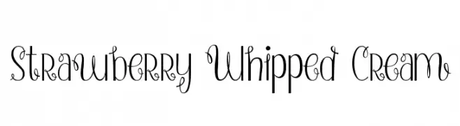
( Fonts by a Emily Spadoni - http://creativemarket.com/emilyspadoni/. Personal-use only. For commercial use please contact owner. )
A whimsical and decorative font with elegant swirls and loops.
 Scaricare 399 Downloads@WebFont
 -
( www.швчк.рф )
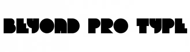
A bold, geometric font with a futuristic and modern design.
![Beyond pro type font caratteri gratis]() Scaricare 399 Downloads@WebFont
Scaricare 399 Downloads@WebFont -
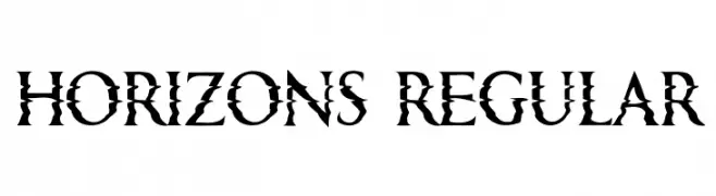
( Fonts by Vladimir Nikolic )
A bold, edgy font with sharp, jagged edges and high contrast strokes.
![Horizons Regular font caratteri gratis]() Scaricare 399 Downloads@WebFont
Scaricare 399 Downloads@WebFont -
( Fonts by Tup Wanders - www.tupwanders.nl )
A playful, hand-drawn font with tall, narrow letters and a whimsical style.
![greenbeans Thin font caratteri gratis]() Scaricare 399 Downloads@WebFont
Scaricare 399 Downloads@WebFont -
![The Cool font caratteri gratis]() Scaricare 399 Downloads@WebFont
Scaricare 399 Downloads@WebFont -
-
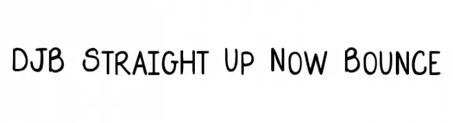
( Fonts by Darcy Baldwin - darcybaldwin.com. Free for personal use only )
A playful, handwritten font with a lively bounce and smooth, rounded characters.
![DJB Straight Up Now Bounce font caratteri gratis]() Scaricare 399 Downloads@WebFont
Scaricare 399 Downloads@WebFont -
![Candle3d-black font caratteri gratis]() Scaricare 399 Downloads@WebFont
Scaricare 399 Downloads@WebFont -
( Fonts by Kris Holmes and Charles Bigelow - Personal-use only. For commercial use please contact owner. )
A modern, geometric sans-serif font with uniform stroke width.
![Go Medium font caratteri gratis]() Scaricare 399 Downloads@WebFont
Scaricare 399 Downloads@WebFont -
( Fonts by Spork Thug Typography - Josh Wilhelm - www.lifewithouttaffy.com/taffy/blog )
A bold, playful font with a hand-drawn, artistic style.
![Eulogy font caratteri gratis]() Scaricare 399 Downloads@WebFont
Scaricare 399 Downloads@WebFont -
( Fonts by xlntelecom )
Bold, modern sans-serif font with uniform stroke width.
![Langdon font caratteri gratis]() Scaricare 399 Downloads@WebFont
Scaricare 399 Downloads@WebFont


Quali sono i font più popolari adesso?
Poppins, Roboto, Montserrat, Open Sans e Lato sono molto usati per le forme pulite e l'ampia applicabilità — dall'identità di marca alle landing page e ai poster.
Quali font si usano spesso nei loghi?
Le sans serif geometriche (es. Poppins, famiglie in stile Gotham) sono scelte comuni per un branding pulito e scalabile. Per un tocco personale restano valide script e stili manoscritti. Abbina un display deciso per i titoli a un corpo testo neutro per riconoscibilità ed equilibrio.
Ogni quanto si aggiorna la lista?
Con regolarità, in base ai download e all'attività reale. Torna spesso per scoprire in anticipo le nuove preferite.
💡 Consiglio: aggiungi ai preferiti — le tendenze cambiano in fretta e i font top di oggi possono ispirare il rebranding di domani.