Benvenuto nelle Font Più Popolari — dove popolarità e qualità si incontrano. Qui trovi i font più scaricati e usati dell'anno. Se cerchi scelte sicure per logo, web o social, inizia da qui.
Ogni font top si distingue per equilibrio, leggibilità e versatilità. Troverai sans serif moderne, script eleganti, serif vintage e display minimalisti.
-
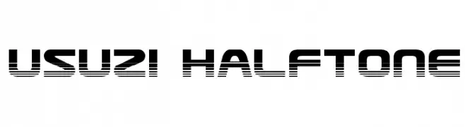
( Fonts by Daniel Zadorozny - www.iconian.com )
A bold, geometric font with a halftone effect, ideal for modern and tech-themed designs.
 Scaricare 397 Downloads@WebFont
 -
( mlkwsn - Malik Wisnu )
A bold, expressive handwritten font with dynamic brush strokes.
![Nocturnal font caratteri gratis]() Scaricare 397 Downloads@WebFont
Scaricare 397 Downloads@WebFont -
![Dabble[eval] font caratteri gratis]() Scaricare 397 Downloads@WebFont
Scaricare 397 Downloads@WebFont -
Caratteri di gatype. For commercial use please contact the owner.
( Free for personal use )
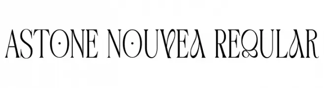
An elegant, high-contrast font with unique curves and a modern flair.
![Astone Nouvea Regular font caratteri gratis]() Scaricare 397 Downloads@WebFont
Scaricare 397 Downloads@WebFont -
( Fonts by www.lars-manenschijn.nl )
A bold, ornate blackletter font with a medieval and gothic aesthetic.
![KingjolA font caratteri gratis]() Scaricare 397 Downloads@WebFont
Scaricare 397 Downloads@WebFont -
-
( Fonts by www.gliphmaker.com. Personal-use only. For commercial use please contact owner. )
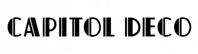
A bold Art Deco style font with geometric shapes and strong vertical lines.
![Capitol Deco font caratteri gratis]() Scaricare 397 Downloads@WebFont
Scaricare 397 Downloads@WebFont -
( Fonts by Alit Suarnegara - Alit Design - www.alitdesign.net - Personal-use only. For commercial use please contact owner. )
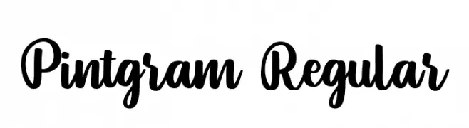
A bold, expressive script font with fluid, connected letterforms.
![Pintgram Regular font caratteri gratis]() Scaricare 397 Downloads@WebFont
Scaricare 397 Downloads@WebFont -
( Fonts by Ward Zwart - wardzwart.blogspot.com - free for personal use only! )
A bold, textured font with a vintage, distressed appearance.
![ves font caratteri gratis]() Scaricare 397 Downloads@WebFont
Scaricare 397 Downloads@WebFont -
( Free for personal use - fontstruct.fontshop.com/fontstructors/neoqueto )
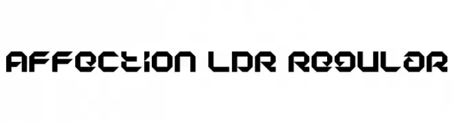
A bold, geometric font with sharp angles and a futuristic style.
![Affection LDR Regular font caratteri gratis]() Scaricare 397 Downloads@WebFont
Scaricare 397 Downloads@WebFont -
Caratteri di KiddieFonts. For commercial use please contact the owner.
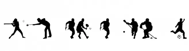
![SPORT RELIEF font caratteri gratis]() Scaricare 397 Downloads@WebFont
Scaricare 397 Downloads@WebFont

![Dabble[eval] font caratteri gratis](https://d144mzi0q5mijx.cloudfront.net/img/D/A/Dabble-eval.webp)


Quali sono i font più popolari adesso?
Poppins, Roboto, Montserrat, Open Sans e Lato sono molto usati per le forme pulite e l'ampia applicabilità — dall'identità di marca alle landing page e ai poster.
Quali font si usano spesso nei loghi?
Le sans serif geometriche (es. Poppins, famiglie in stile Gotham) sono scelte comuni per un branding pulito e scalabile. Per un tocco personale restano valide script e stili manoscritti. Abbina un display deciso per i titoli a un corpo testo neutro per riconoscibilità ed equilibrio.
Ogni quanto si aggiorna la lista?
Con regolarità, in base ai download e all'attività reale. Torna spesso per scoprire in anticipo le nuove preferite.
💡 Consiglio: aggiungi ai preferiti — le tendenze cambiano in fretta e i font top di oggi possono ispirare il rebranding di domani.