Benvenuto nelle Font Più Popolari — dove popolarità e qualità si incontrano. Qui trovi i font più scaricati e usati dell'anno. Se cerchi scelte sicure per logo, web o social, inizia da qui.
Ogni font top si distingue per equilibrio, leggibilità e versatilità. Troverai sans serif moderne, script eleganti, serif vintage e display minimalisti.
-
( Personal-use only. For commercial use please contact owner. )
A bold, chaotic font with a distressed, ink-splattered appearance.
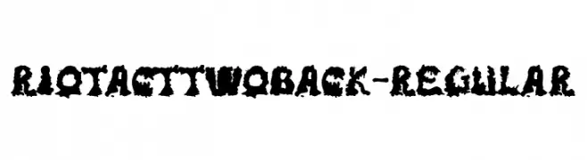 Scaricare 52 Downloads@WebFont
 -
( Fonts by Din Studio - Donis Miftahudin - Personal-use only. For commercial use please contact owner. )
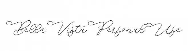
An elegant script font with flowing, cursive style and intricate loops.
![Bella Vista Personal Use font caratteri gratis]() Scaricare 52 Downloads@WebFont
Scaricare 52 Downloads@WebFont -
( Fonts by Indriyanti - Personal-use only. For commercial use please contact owner. )
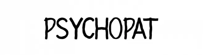
A bold, hand-drawn font with an energetic and playful style.
![PSYCHOPAT font caratteri gratis]() Scaricare 52 Downloads@WebFont
Scaricare 52 Downloads@WebFont -
( Fonts by wep - Wahyu Eka Prasetya - Personal-use only. For commercial use please contact owner. )
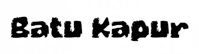
A bold, textured font with a rugged, hand-crafted appearance.
![Batu Kapur font caratteri gratis]() Scaricare 52 Downloads@WebFont
Scaricare 52 Downloads@WebFont -
( Fonts by Tezar Tantular )
Loose, handwritten script with tall, narrow letters and thin strokes.
![Handikraf font caratteri gratis]() Scaricare 52 Downloads@WebFont
Scaricare 52 Downloads@WebFont -
( Noto is a trademark of Google Inc. Noto fonts are open source. All Noto fonts are published under the SIL Open Font License, Version 1.1 )
A modern, condensed, extra bold sans-serif font with a clean and geometric design.
![Noto Sans Georgian Condensed ExtraBold font caratteri gratis]() Scaricare 52 Downloads@WebFont
Scaricare 52 Downloads@WebFont -
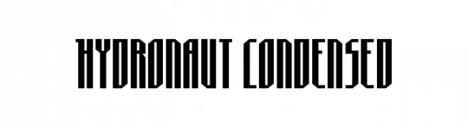
( Fonts by Daniel Zadorozny - www.iconian.com - Personal-use only. For commercial use please contact owner. )
A bold, condensed font with sharp, angular edges and a modern, futuristic style.
![Hydronaut Condensed font caratteri gratis]() Scaricare 52 Downloads@WebFont
Scaricare 52 Downloads@WebFont -
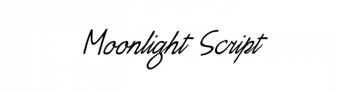
( Fonts by Jee Shu - Personal-use only. For commercial use please contact owner. )
A graceful script font with fluid, connected strokes and a natural handwriting style.
![Moonlight Script font caratteri gratis]() Scaricare 52 Downloads@WebFont
Scaricare 52 Downloads@WebFont -
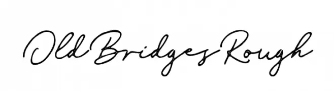
( Fonts by Vultype - Candra Hamdani - Personal-use only. For commercial use please contact owner. )
A cursive, hand-drawn font with a vintage, personal touch.
![Old Bridges Rough font caratteri gratis]() Scaricare 52 Downloads@WebFont
Scaricare 52 Downloads@WebFont -
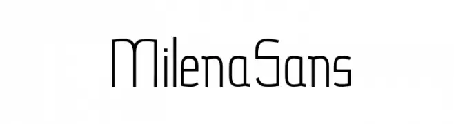
( Milena Gajovic - www.behance.net/milenagajovic )
A modern, geometric font with clean lines and a minimalist style.
![MilenaSans font caratteri gratis]() Scaricare 52 Downloads@WebFont
Scaricare 52 Downloads@WebFont -
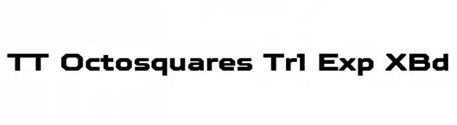
( Fonts by TypeType Foundry )
A bold, geometric font with a modern, futuristic style.
![TT Octosquares Trl Exp XBd font caratteri gratis]() Scaricare 52 Downloads@WebFont
Scaricare 52 Downloads@WebFont -
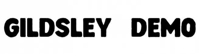
( Fonts by Floves Type )
A bold, hand-drawn sans-serif font with playful, rounded forms.
![Gildsley DEMO font caratteri gratis]() Scaricare 52 Downloads@WebFont
Scaricare 52 Downloads@WebFont -
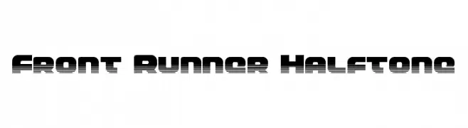
( Fonts by Daniel Zadorozny - www.iconian.com - Personal-use only. For commercial use please contact owner. )
A bold, futuristic font with a halftone effect and geometric structure.
![Front Runner Halftone font caratteri gratis]() Scaricare 52 Downloads@WebFont
Scaricare 52 Downloads@WebFont -
( Fonts by Vladimir Nikolic - www.creativefabrica.com/designer/vladimirnikolic/ - Personal-use only. For commercial use please contact owner. )
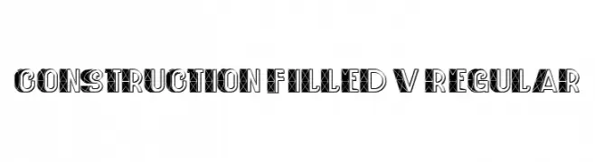
A bold, geometric font with an industrial, construction-inspired design.
![Construction Filled V1 Regular font caratteri gratis]() Scaricare 52 Downloads@WebFont
Scaricare 52 Downloads@WebFont -
( Fonts by Rafantype Studio - Ahmad Saiful Mutohhar - Personal-use only. For commercial use please contact owner. )
A playful, handwritten font with a casual and friendly style.
![PINKY LOVE font caratteri gratis]() Scaricare 52 Downloads@WebFont
Scaricare 52 Downloads@WebFont -
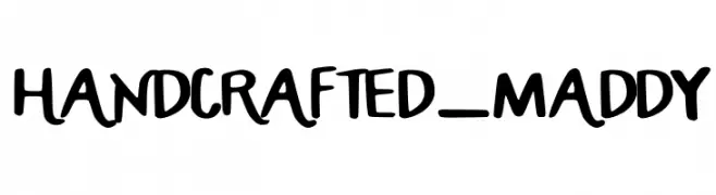
( Fonts by Maddy Baker - Personal-use only. For commercial use please contact owner. )
A playful, handcrafted font with bold, irregular strokes and a whimsical style.
![HANDCRAFTED_MADDY font caratteri gratis]() Scaricare 52 Downloads@WebFont
Scaricare 52 Downloads@WebFont -
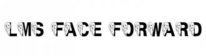
( London's Letters - www.londonsletters.com/ )
A bold, decorative font with integrated face illustrations in each letter.
![LMS Face Forward font caratteri gratis]() Scaricare 52 Downloads@WebFont
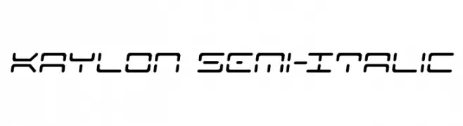
Scaricare 52 Downloads@WebFont -
![Kaylon Semi-Italic font caratteri gratis]() Scaricare 52 Downloads@WebFont
Scaricare 52 Downloads@WebFont -
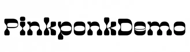
( Fonts by madeDeduk )
A bold, playful font with a bubbly and whimsical design.
![PinkponkDemo font caratteri gratis]() Scaricare 52 Downloads@WebFont
Scaricare 52 Downloads@WebFont -
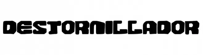
( Fonts by Woodcutter )
A bold, chunky font with a playful, retro aesthetic.
![Destornillador font caratteri gratis]() Scaricare 52 Downloads@WebFont
Scaricare 52 Downloads@WebFont -
( Fonts by Kong Font - https://fontkong.com/ - Personal-use only. For commercial use please contact owner. )
A modern, geometric font with sharp edges and clean lines.
![Borju3 font caratteri gratis]() Scaricare 52 Downloads@WebFont
Scaricare 52 Downloads@WebFont -
( Fonts by Namara Creative Studio - Personal-use only. For commercial use please contact owner. )
A graceful script font with flowing, cursive letters and high contrast strokes.
![Rexland font caratteri gratis]() Scaricare 52 Downloads@WebFont
Scaricare 52 Downloads@WebFont -
( Fonts by wep - Wahyu Eka Prasetya - Personal-use only. For commercial use please contact owner. )
A bold, Gothic-inspired font with sharp, textured characters.
![Coolizer font caratteri gratis]() Scaricare 52 Downloads@WebFont
Scaricare 52 Downloads@WebFont -
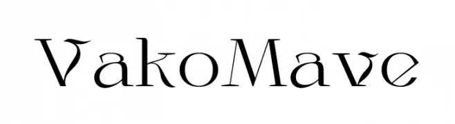
( Fonts by Nirmana Visual - Sigit Dwipa - Personal-use only. For commercial use please contact owner. )
A decorative serif font with a blend of modern and classic elements, featuring ornate uppercase and traditional lowercase letters.
![VakoMave font caratteri gratis]() Scaricare 52 Downloads@WebFont
Scaricare 52 Downloads@WebFont -
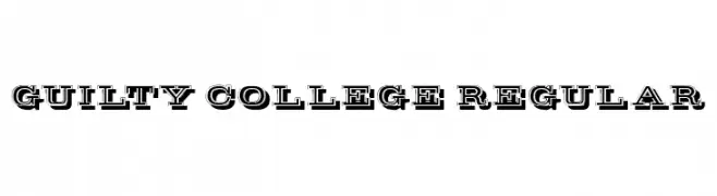
( Fonts by Vladimir Nikolic - www.creativefabrica.com/designer/vladimirnikolic/ - Personal-use only. For commercial use please contact owner. )
A bold, collegiate-style font with double-line outlines and strong geometric shapes.
![Guilty College Regular font caratteri gratis]() Scaricare 52 Downloads@WebFont
Scaricare 52 Downloads@WebFont -
( Fonts by nariswari_creative - Taufik Dwi Purnomo - Personal-use only. For commercial use please contact owner. )
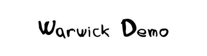
A playful, handwritten font with irregular, organic shapes and a whimsical style.
![Warwick Demo font caratteri gratis]() Scaricare 52 Downloads@WebFont
Scaricare 52 Downloads@WebFont -
( Personal-use only. For commercial use please contact owner. )
A bold, dripping display font ideal for horror or Halloween themes.
![Bloody Scene font caratteri gratis]() Scaricare 52 Downloads@WebFont
Scaricare 52 Downloads@WebFont -
( Fonts by Vladimir Nikolic )
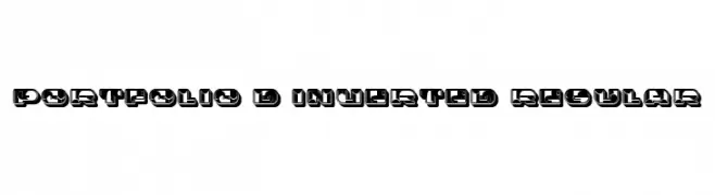
A bold, 3D font with an inverted color scheme and strong visual impact.
![Portfolio 3D Inverted Regular font caratteri gratis]() Scaricare 52 Downloads@WebFont
Scaricare 52 Downloads@WebFont -
( Fonts by Linafis Studio - Ahmad Fashihullisan - Personal-use only. For commercial use please contact owner. )
A playful, flowing script font with smooth, connected strokes.
![EllieMagdalena font caratteri gratis]() Scaricare 52 Downloads@WebFont
Scaricare 52 Downloads@WebFont -
( Fonts by Vladimir Nikolic - www.creativefabrica.com/designer/vladimirnikolic/ - Personal-use only. For commercial use please contact owner. )
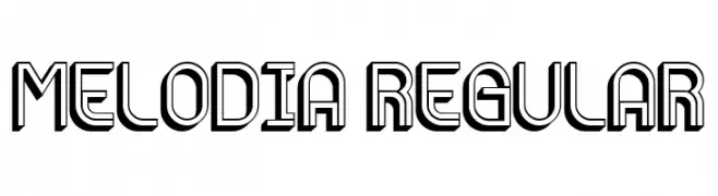
A bold, decorative font with a three-dimensional effect and geometric structure.
![Melodia Regular font caratteri gratis]() Scaricare 52 Downloads@WebFont
Scaricare 52 Downloads@WebFont -
( Fonts by Khurasan - Syaf Rizal - Personal-use only. For commercial use please contact owner. )
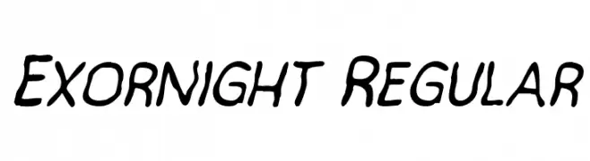
A playful, handwritten font with fluid and dynamic strokes.
![Exornight Regular font caratteri gratis]() Scaricare 52 Downloads@WebFont
Scaricare 52 Downloads@WebFont -
( Iconian Fonts - Daniel Zadorozny - www.iconian.com )
A bold, 3D geometric font with a futuristic design.
![Range Paladin 3D font caratteri gratis]() Scaricare 52 Downloads@WebFont
Scaricare 52 Downloads@WebFont -
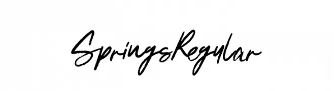
( Fonts by Leonard Posavec - LeoSupply.co - Leonard Posavec - Personal-use only. For commercial use please contact owner. )
A dynamic handwritten font with fluid, slightly irregular strokes and a casual, elegant style.
![SpringsRegular font caratteri gratis]() Scaricare 52 Downloads@WebFont
Scaricare 52 Downloads@WebFont -
( Fonts by Vunira Design - Personal-use only. For commercial use please contact owner. )
A bold, expressive script font with a hand-drawn, lively style.
![When Plants FREE font caratteri gratis]() Scaricare 52 Downloads@WebFont
Scaricare 52 Downloads@WebFont -
![SelenasHandwriting font caratteri gratis]() Scaricare 52 Downloads@WebFont
Scaricare 52 Downloads@WebFont


Quali sono i font più popolari adesso?
Poppins, Roboto, Montserrat, Open Sans e Lato sono molto usati per le forme pulite e l'ampia applicabilità — dall'identità di marca alle landing page e ai poster.
Quali font si usano spesso nei loghi?
Le sans serif geometriche (es. Poppins, famiglie in stile Gotham) sono scelte comuni per un branding pulito e scalabile. Per un tocco personale restano valide script e stili manoscritti. Abbina un display deciso per i titoli a un corpo testo neutro per riconoscibilità ed equilibrio.
Ogni quanto si aggiorna la lista?
Con regolarità, in base ai download e all'attività reale. Torna spesso per scoprire in anticipo le nuove preferite.
💡 Consiglio: aggiungi ai preferiti — le tendenze cambiano in fretta e i font top di oggi possono ispirare il rebranding di domani.