Benvenuto nelle Font Più Popolari — dove popolarità e qualità si incontrano. Qui trovi i font più scaricati e usati dell'anno. Se cerchi scelte sicure per logo, web o social, inizia da qui.
Ogni font top si distingue per equilibrio, leggibilità e versatilità. Troverai sans serif moderne, script eleganti, serif vintage e display minimalisti.
-
( Fonts by Vladimir Nikolic - www.creativefabrica.com/designer/vladimirnikolic/ - Personal-use only. For commercial use please contact owner. )
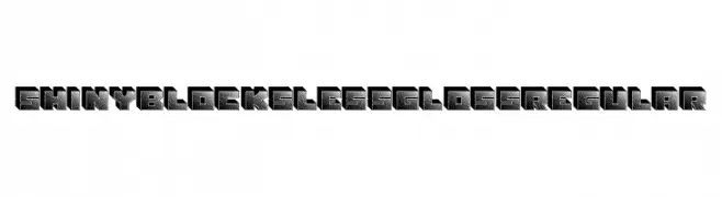
A bold, 3D block font with a glossy, dotted texture and sharp edges.
 Scaricare 53 Downloads@WebFont
 -
( Fonts by Hamzah Muhamad Ihsan - Typesthetic Studio - Personal-use only. For commercial use please contact owner. )
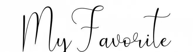
An elegant, flowing script font with a modern touch.
![My Favorite font caratteri gratis]() Scaricare 53 Downloads@WebFont
Scaricare 53 Downloads@WebFont -
( Fonts by Vunira Design - Personal-use only. For commercial use please contact owner. )
A playful, handwritten script font with a dynamic and informal style.
![Catars FREE font caratteri gratis]() Scaricare 53 Downloads@WebFont
Scaricare 53 Downloads@WebFont -
( Fonts by Nurul Kamal )
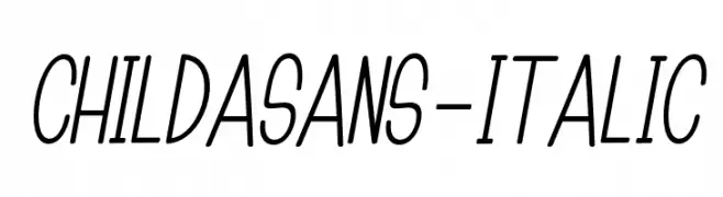
A playful, handwritten-style font with an italic slant and rounded edges.
![ChildaSans-Italic font caratteri gratis]() Scaricare 53 Downloads@WebFont
Scaricare 53 Downloads@WebFont -
( Fonts by LetterStock Std )
![Dancing Ghost font caratteri gratis]() Scaricare 53 Downloads@WebFont
Scaricare 53 Downloads@WebFont -
( Copyright 2019 The Big Shoulders Project Authors (https://github.com/xotypeco/big_shoulders) )
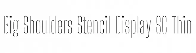
![Big Shoulders Stencil Display SC Thin font caratteri gratis]() Scaricare 53 Downloads@WebFont
Scaricare 53 Downloads@WebFont -
( Fonts by Phitradesign )
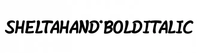
A bold, italic, handwritten font with a playful and dynamic style.
![Shelta Hand* Bold Italic font caratteri gratis]() Scaricare 53 Downloads@WebFont
Scaricare 53 Downloads@WebFont -
( Fonts by Igor Kosinsky - Personal-use only. For commercial use please contact owner. )
A clean, modern sans-serif font with light weight and uniform strokes.
![Literal-Light font caratteri gratis]() Scaricare 53 Downloads@WebFont
Scaricare 53 Downloads@WebFont -
( Fonts by Mindtype Co. - Putra Khan - Personal-use only. For commercial use please contact owner. )
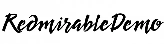
A bold, expressive script font with fluid, cursive letterforms.
![Redmirable Demo font caratteri gratis]() Scaricare 53 Downloads@WebFont
Scaricare 53 Downloads@WebFont -
( Fonts by NowType - Claudio Rocha - Personal-use only. For commercial use please contact owner. )
A bold serif font with strong strokes and a modern twist.
![Rock Titling DemiBold Trial font caratteri gratis]() Scaricare 53 Downloads@WebFont
Scaricare 53 Downloads@WebFont -
( Fonts by Vacatype Co. - Vacatype - Personal-use only. For commercial use please contact owner. )
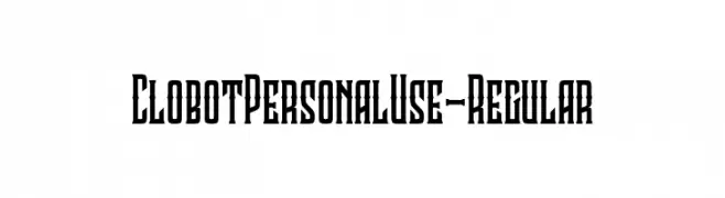
A bold, decorative font with a modern, angular design.
![ClobotPersonalUse-Regular font caratteri gratis]() Scaricare 53 Downloads@WebFont
Scaricare 53 Downloads@WebFont -
( Fonts by AVType - Personal-use only. For commercial use please contact owner. )
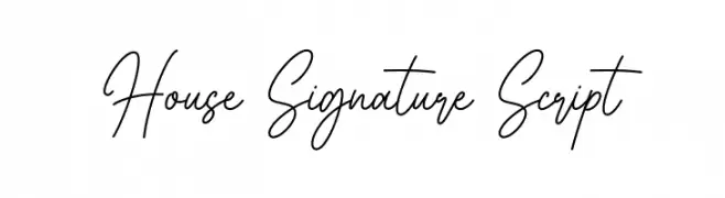
A graceful and fluid script font with interconnected, cursive letters.
![House Signature Script font caratteri gratis]() Scaricare 53 Downloads@WebFont
Scaricare 53 Downloads@WebFont -
( Fonts by Bluestype Studio - Jefri Dwi Alfatah - Personal-use only. For commercial use please contact owner. )
A playful and whimsical cursive font with bold, flowing letters.
![Dreamily font caratteri gratis]() Scaricare 53 Downloads@WebFont
Scaricare 53 Downloads@WebFont -
( Fonts by Denny Subagja - Personal-use only. For commercial use please contact owner. )
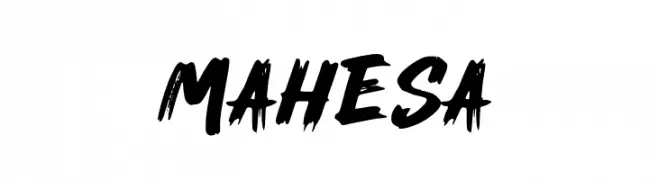
A bold, brush-style font with dynamic and expressive strokes.
![Mahesa font caratteri gratis]() Scaricare 53 Downloads@WebFont
Scaricare 53 Downloads@WebFont -
( Fonts by Matias Romero - Personal-use only. For commercial use please contact owner. )
A bold, condensed, and modern font with a strong presence.
![Ignoto font caratteri gratis]() Scaricare 53 Downloads@WebFont
Scaricare 53 Downloads@WebFont -
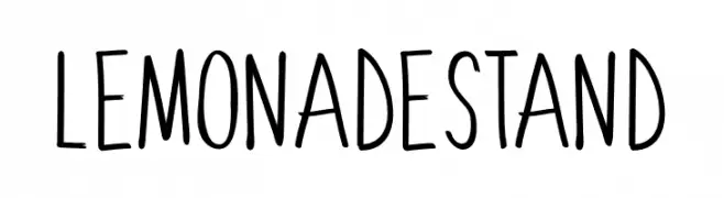
( Fonts by Sharkshock - Dennis Ludlow - Personal-use only. For commercial use please contact owner. )
A playful, hand-drawn font with tall, narrow letters and a casual style.
![LemonadeStand font caratteri gratis]() Scaricare 53 Downloads@WebFont
Scaricare 53 Downloads@WebFont -
( London's Letters - www.londonsletters.com/ )
A bold, modern font with integrated yin-yang symbols for a unique, thematic style.
![LMS Ying & Yang font caratteri gratis]() Scaricare 53 Downloads@WebFont
Scaricare 53 Downloads@WebFont -
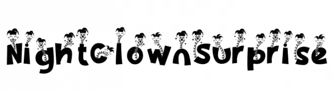
( Fonts by PutraCetol Studio )
A playful, clown-themed decorative font with bold, quirky characters.
![Night Clown Surprise font caratteri gratis]() Scaricare 53 Downloads@WebFont
Scaricare 53 Downloads@WebFont -
( Fonts by Daniel Zadorozny - www.iconian.com - Personal-use only. For commercial use please contact owner. )
A bold, italic font with a modern, dynamic style and clean lines.
![Globe Trekker Title Italic font caratteri gratis]() Scaricare 53 Downloads@WebFont
Scaricare 53 Downloads@WebFont -
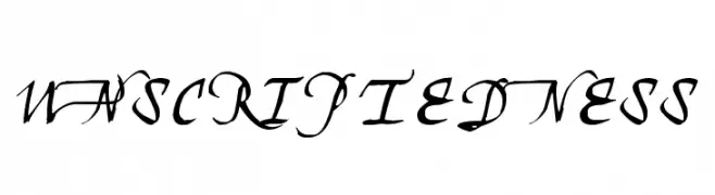
( Sinna - Sinna Bandalor )
An elegant script font with flowing, cursive letterforms and ornate details.
![Unscriptedness font caratteri gratis]() Scaricare 53 Downloads@WebFont
Scaricare 53 Downloads@WebFont -
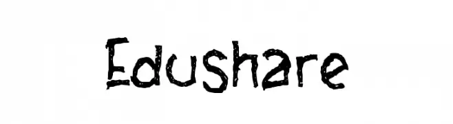
( Fonts by Wahyu Eka Prasetya - wepfont.com - Personal-use only. For commercial use please contact owner. )
A bold, hand-drawn font with a textured, playful appearance.
![Edushare font caratteri gratis]() Scaricare 53 Downloads@WebFont
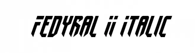
Scaricare 53 Downloads@WebFont -
![Fedyral II Italic font caratteri gratis]() Scaricare 53 Downloads@WebFont
Scaricare 53 Downloads@WebFont -
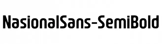
( Fonts by Jetsmax.com - Personal-use only. For commercial use please contact owner. )
A modern, semi-bold sans-serif font with clean lines and rounded edges.
![NasionalSans-SemiBold font caratteri gratis]() Scaricare 53 Downloads@WebFont
Scaricare 53 Downloads@WebFont -
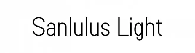
( Fonts by Amru ID - Personal-use only. For commercial use please contact owner. )
A modern, light sans-serif font with clean lines and excellent readability.
![Sanlulus Light font caratteri gratis]() Scaricare 53 Downloads@WebFont
Scaricare 53 Downloads@WebFont -
( Fonts by Bearytype - Dian Hadi - Personal-use only. For commercial use please contact owner. )
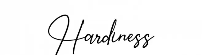
A dynamic and elegant script font with flowing curves and a handwritten feel.
![Hardiness font caratteri gratis]() Scaricare 53 Downloads@WebFont
Scaricare 53 Downloads@WebFont -
( Fonts by Wates Awal - Personal-use only. For commercial use please contact owner. )
A bold, geometric font with sharp angles and a futuristic style.
![bimasakti font caratteri gratis]() Scaricare 53 Downloads@WebFont
Scaricare 53 Downloads@WebFont -
( Fonts by Kong Font - https://fontkong.com/ - Personal-use only. For commercial use please contact owner. )
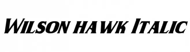
A bold, italic font with strong diagonal emphasis and thick strokes.
![Wilson hawk Italic font caratteri gratis]() Scaricare 53 Downloads@WebFont
Scaricare 53 Downloads@WebFont -
( Fonts by Daniel Zadorozny - www.iconian.com - Personal-use only. For commercial use please contact owner. )
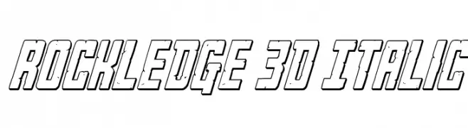
A bold, 3D italic font with a dynamic and impactful style.
![Rockledge 3D Italic font caratteri gratis]() Scaricare 53 Downloads@WebFont
Scaricare 53 Downloads@WebFont -
( Fonts by Alpaprana - Personal-use only. For commercial use please contact owner. )
A playful handwritten font with smooth, rounded edges and consistent height.
![Replay Time font caratteri gratis]() Scaricare 53 Downloads@WebFont
Scaricare 53 Downloads@WebFont -
( Fonts by Aleksandar Stevanov - Personal-use only. For commercial use please contact owner. )
A vintage typewriter-style font with rounded edges and a handcrafted look.
![Selectric Orator Regular font caratteri gratis]() Scaricare 53 Downloads@WebFont
Scaricare 53 Downloads@WebFont -
( Fonts by Pollem Studio - Muhammad Nur - Personal-use only. For commercial use please contact owner. )
A dynamic and elegant script font with fluid, cursive letterforms.
![Chietah font caratteri gratis]() Scaricare 53 Downloads@WebFont
Scaricare 53 Downloads@WebFont -
( Fonts by Vladimir Nikolic - www.creativefabrica.com/designer/vladimirnikolic/ - Personal-use only. For commercial use please contact owner. )
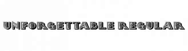
A bold, decorative font with a 3D effect and intricate inner patterns.
![Unforgettable Regular font caratteri gratis]() Scaricare 53 Downloads@WebFont
Scaricare 53 Downloads@WebFont -
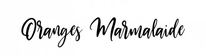
( Fonts by Damarletter - Ardian Nuvianto - Personal-use only. For commercial use please contact owner. )
A lively and expressive script font with dynamic strokes and a handwritten appeal.
![Oranges Marmalaide font caratteri gratis]() Scaricare 53 Downloads@WebFont
Scaricare 53 Downloads@WebFont -
( Fonts by Swadharma Wiyastana - Personal-use only. For commercial use please contact owner. )
A bold, geometric font with a 3D striped effect, ideal for impactful headlines.
![Xico font caratteri gratis]() Scaricare 53 Downloads@WebFont
Scaricare 53 Downloads@WebFont -
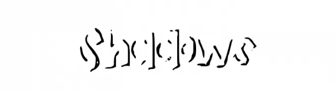
( AllThingsLettering )
A bold, stencil-like font with a fragmented, shadowy effect.
![Shadows font caratteri gratis]() Scaricare 53 Downloads@WebFont
Scaricare 53 Downloads@WebFont


Quali sono i font più popolari adesso?
Poppins, Roboto, Montserrat, Open Sans e Lato sono molto usati per le forme pulite e l'ampia applicabilità — dall'identità di marca alle landing page e ai poster.
Quali font si usano spesso nei loghi?
Le sans serif geometriche (es. Poppins, famiglie in stile Gotham) sono scelte comuni per un branding pulito e scalabile. Per un tocco personale restano valide script e stili manoscritti. Abbina un display deciso per i titoli a un corpo testo neutro per riconoscibilità ed equilibrio.
Ogni quanto si aggiorna la lista?
Con regolarità, in base ai download e all'attività reale. Torna spesso per scoprire in anticipo le nuove preferite.
💡 Consiglio: aggiungi ai preferiti — le tendenze cambiano in fretta e i font top di oggi possono ispirare il rebranding di domani.