Benvenuto nelle Font Più Popolari — dove popolarità e qualità si incontrano. Qui trovi i font più scaricati e usati dell'anno. Se cerchi scelte sicure per logo, web o social, inizia da qui.
Ogni font top si distingue per equilibrio, leggibilità e versatilità. Troverai sans serif moderne, script eleganti, serif vintage e display minimalisti.
-
( Fonts by Em Nazar - Personal-use only. For commercial use please contact owner. )
A bold, brush-stroke font with a dynamic, hand-drawn appearance.
 Scaricare 52 Downloads@WebFont
 -
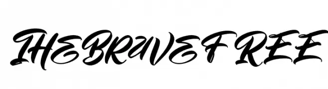
( Fonts by Vunira Design - Personal-use only. For commercial use please contact owner. )
A bold, expressive script font with fluid, interconnected strokes.
![TheBraveFREE font caratteri gratis]() Scaricare 52 Downloads@WebFont
Scaricare 52 Downloads@WebFont -
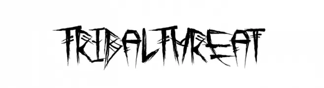
( Fonts by Dirt2.com - SickCapital - Andrew Hart - Personal-use only. For commercial use please contact owner. )
A bold, jagged font with a tribal, hand-drawn aesthetic.
![Tribal Threat font caratteri gratis]() Scaricare 52 Downloads@WebFont
Scaricare 52 Downloads@WebFont -
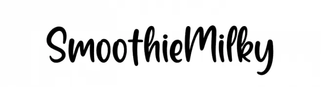
( Fonts by Nirmala Creative - Personal-use only. For commercial use please contact owner. )
A playful, casual handwritten font with smooth, rounded strokes.
![Smoothie Milky font caratteri gratis]() Scaricare 52 Downloads@WebFont
Scaricare 52 Downloads@WebFont -
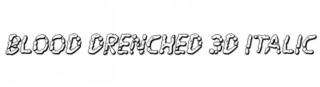
( Fonts by Daniel Zadorozny - www.iconian.com - Personal-use only. For commercial use please contact owner. )
A bold, 3D italic font with a dripping, liquid texture for a horror-themed aesthetic.
![Blood Drenched 3D Italic font caratteri gratis]() Scaricare 52 Downloads@WebFont
Scaricare 52 Downloads@WebFont -
( Fonts by Vultype - Candra Hamdani - Personal-use only. For commercial use please contact owner. )
An elegant and flowing script font with graceful loops and swashes.
![Gustera font caratteri gratis]() Scaricare 52 Downloads@WebFont
Scaricare 52 Downloads@WebFont -
( Fonts by AminMario - Amin Mario - Personal-use only. For commercial use please contact owner. )
A bold, expressive script font with a handwritten feel.
![Butter Notes font caratteri gratis]() Scaricare 52 Downloads@WebFont
Scaricare 52 Downloads@WebFont -
( Fonts by Garisman Studio - Risman Ginarwan - Personal-use only. For commercial use please contact owner. )
An elegant, cursive handwritten font with smooth, flowing strokes.
![Meranie font caratteri gratis]() Scaricare 52 Downloads@WebFont
Scaricare 52 Downloads@WebFont -
( Fonts by Md Shohail Bhuian - Personal-use only. For commercial use please contact owner. )
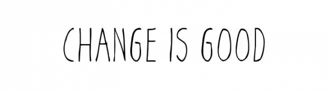
A playful, handwritten font with tall, narrow letters and a light, airy appearance.
![Change Is Good font caratteri gratis]() Scaricare 52 Downloads@WebFont
Scaricare 52 Downloads@WebFont -
( Fonts by Muksal Creative - Personal-use only. For commercial use please contact owner. )
An elegant and whimsical script font with flowing, interconnected letterforms and ornate flourishes.
![sallea font caratteri gratis]() Scaricare 52 Downloads@WebFont
Scaricare 52 Downloads@WebFont -
( Fonts by Parker Creative - Alan Parker - Personal-use only. For commercial use please contact owner. )
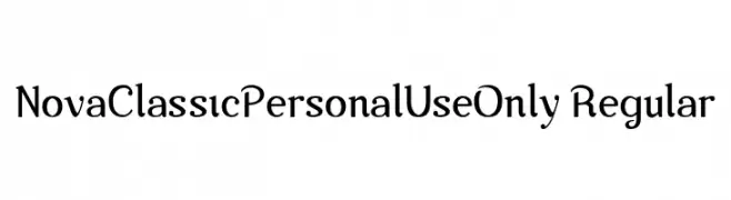
A classic serif font with elegant curves and modern touches.
![Nova-Classic-Personal-Use-Only Regular font caratteri gratis]() Scaricare 52 Downloads@WebFont
Scaricare 52 Downloads@WebFont -
( Fonts by Bexxtype - Personal-use only. For commercial use please contact owner. )
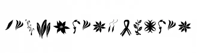
A decorative floral dingbat font with diverse botanical icons.
![CraftersFlowers font caratteri gratis]() Scaricare 52 Downloads@WebFont
Scaricare 52 Downloads@WebFont -
( Fonts by Miss Tiina Fonts - MTF - Miss Tiina - Personal-use only. For commercial use please contact owner. )
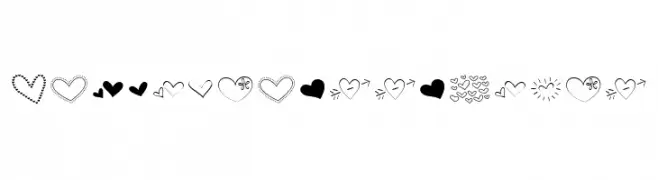
A decorative font with playful heart-themed doodles.
![MTFHeartDoodlePro font caratteri gratis]() Scaricare 52 Downloads@WebFont
Scaricare 52 Downloads@WebFont -
( Fonts by Zetafonts - Personal-use only. For commercial use please contact owner. )
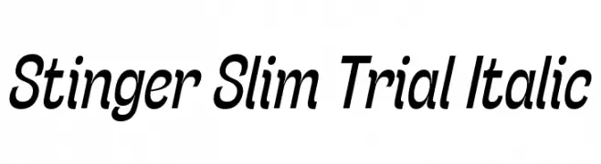
A sleek, modern italic font with slim, elongated characters.
![Stinger Slim Trial Italic font caratteri gratis]() Scaricare 52 Downloads@WebFont
Scaricare 52 Downloads@WebFont -
( Fonts by Iconian Fonts - Daniel Zadorozny - Personal-use only. For commercial use please contact owner. )
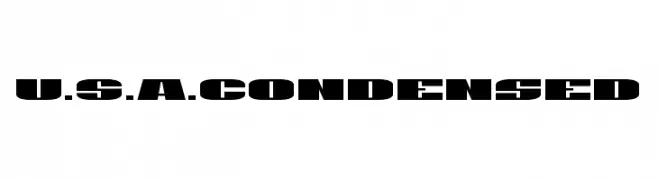
A bold, condensed font with a strong, industrial style.
![U.S.A. Condensed font caratteri gratis]() Scaricare 52 Downloads@WebFont
Scaricare 52 Downloads@WebFont -
( Fonts by Maddy Baker - Personal-use only. For commercial use please contact owner. )
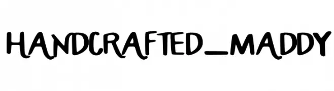
A playful, handcrafted font with bold, irregular strokes and a whimsical style.
![HANDCRAFTED_MADDY font caratteri gratis]() Scaricare 52 Downloads@WebFont
Scaricare 52 Downloads@WebFont -
( Fonts by Jef Triforce - Francisco Arellano - Personal-use only. For commercial use please contact owner. )
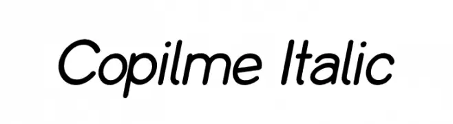
A modern, italicized font with smooth, rounded edges and consistent stroke thickness.
![Copilme Italic font caratteri gratis]() Scaricare 52 Downloads@WebFont
Scaricare 52 Downloads@WebFont -
( Fonts by Kong Font - https://fontkong.com/ - Personal-use only. For commercial use please contact owner. )
A modern, geometric font with sharp edges and clean lines.
![Borju3 font caratteri gratis]() Scaricare 52 Downloads@WebFont
Scaricare 52 Downloads@WebFont -
( Fonts by Iconian Fonts - Daniel Zadorozny - Personal-use only. For commercial use please contact owner. )
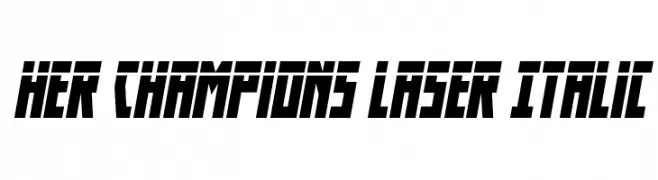
A bold, italic font with sharp angles and a futuristic style.
![Her Champions Laser Italic font caratteri gratis]() Scaricare 52 Downloads@WebFont
Scaricare 52 Downloads@WebFont -
( Fonts by Namara Creative Studio - Personal-use only. For commercial use please contact owner. )
A graceful script font with flowing, cursive letters and high contrast strokes.
![Rexland font caratteri gratis]() Scaricare 52 Downloads@WebFont
Scaricare 52 Downloads@WebFont -
( Fonts by Nirmana Visual )
A bold, shadowed graffiti-style font with a dynamic and edgy appearance.
![Graffiti Xenoa Shadow font caratteri gratis]() Scaricare 52 Downloads@WebFont
Scaricare 52 Downloads@WebFont -
( Fonts by Bangkit Tri Setiadi - Personal-use only. For commercial use please contact owner. )
A playful, cursive font with a bold, hand-drawn style.
![Stay Girly Regular font caratteri gratis]() Scaricare 52 Downloads@WebFont
Scaricare 52 Downloads@WebFont -
( Fonts by Kong Font - Personal-use only. For commercial use please contact owner. )
A bold, expressive script font with fluid, dynamic strokes.
![JuliaAntonio font caratteri gratis]() Scaricare 52 Downloads@WebFont
Scaricare 52 Downloads@WebFont -
( Fonts by Trequartista Studio - Personal-use only. For commercial use please contact owner. )
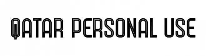
A bold, geometric font with a modern, double-line design.
![Qatar Personal Use font caratteri gratis]() Scaricare 52 Downloads@WebFont
Scaricare 52 Downloads@WebFont -
( Fonts by Vunira Design - Personal-use only. For commercial use please contact owner. )
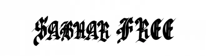
A bold, ornate blackletter font with a gothic, medieval style.
![Sabhar FREE font caratteri gratis]() Scaricare 52 Downloads@WebFont
Scaricare 52 Downloads@WebFont -
( Fonts by Linafis Studio - Ahmad Fashihullisan - Personal-use only. For commercial use please contact owner. )
A playful, flowing script font with smooth, connected strokes.
![EllieMagdalena font caratteri gratis]() Scaricare 52 Downloads@WebFont
Scaricare 52 Downloads@WebFont -
( weknow - Wino S Kadir - www.creativefabrica.com/designer/weknow/ )
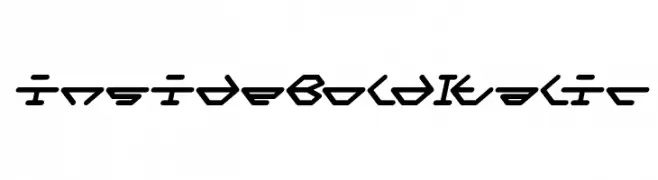
A bold, italicized font with a futuristic, geometric design.
![inside Bold Italic font caratteri gratis]() Scaricare 52 Downloads@WebFont
Scaricare 52 Downloads@WebFont -
( Fonts by Kong Font - Personal-use only. For commercial use please contact owner. )
A bold, playful script font with a handwritten style.
![East Passage font caratteri gratis]() Scaricare 52 Downloads@WebFont
Scaricare 52 Downloads@WebFont -
( Fonts by Dirt2.com - SickCapital - Andrew Hart - Personal-use only. For commercial use please contact owner. )
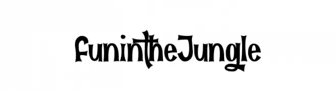
A playful and whimsical font with bold, exaggerated letterforms.
![Fun in the Jungle font caratteri gratis]() Scaricare 52 Downloads@WebFont
Scaricare 52 Downloads@WebFont -
( Fonts by Nirmana Visual - Sigit Dwipa - Personal-use only. For commercial use please contact owner. )
A graceful and elegant script font with fluid, cursive strokes.
![Gelathy font caratteri gratis]() Scaricare 52 Downloads@WebFont
Scaricare 52 Downloads@WebFont -
( Fonts by Youthlabs Studio - Personal-use only. For commercial use please contact owner. )
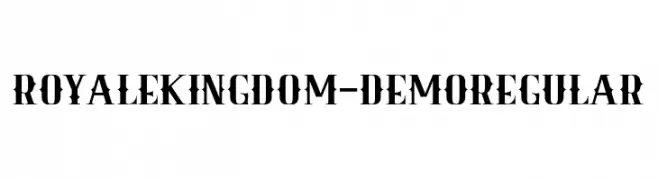
A bold, vintage-inspired font with sharp serifs and high contrast, perfect for striking headlines.
![Royale Kingdom - DEMO Regular font caratteri gratis]() Scaricare 52 Downloads@WebFont
Scaricare 52 Downloads@WebFont -
( Fonts by Vunira Design - Personal-use only. For commercial use please contact owner. )
A bold, expressive script font with a hand-drawn, lively style.
![When Plants FREE font caratteri gratis]() Scaricare 52 Downloads@WebFont
Scaricare 52 Downloads@WebFont -
( Fonts by Kong Font - fontkong.com - Personal-use only. For commercial use please contact owner. )
A modern, geometric font with rounded edges and balanced spacing.
![Stikco font caratteri gratis]() Scaricare 52 Downloads@WebFont
Scaricare 52 Downloads@WebFont -
( Fonts by Typegenic Studio - Personal-use only. For commercial use please contact owner. )
A graceful, handwritten font with elongated, flowing characters.
![Bristya Free font caratteri gratis]() Scaricare 52 Downloads@WebFont
Scaricare 52 Downloads@WebFont -
( Fonts by Vunira Design - Personal-use only. For commercial use please contact owner. )
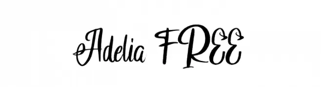
A modern, cursive font with elegant, flowing lines and a handwritten style.
![Adelia FREE font caratteri gratis]() Scaricare 52 Downloads@WebFont
Scaricare 52 Downloads@WebFont


Quali sono i font più popolari adesso?
Poppins, Roboto, Montserrat, Open Sans e Lato sono molto usati per le forme pulite e l'ampia applicabilità — dall'identità di marca alle landing page e ai poster.
Quali font si usano spesso nei loghi?
Le sans serif geometriche (es. Poppins, famiglie in stile Gotham) sono scelte comuni per un branding pulito e scalabile. Per un tocco personale restano valide script e stili manoscritti. Abbina un display deciso per i titoli a un corpo testo neutro per riconoscibilità ed equilibrio.
Ogni quanto si aggiorna la lista?
Con regolarità, in base ai download e all'attività reale. Torna spesso per scoprire in anticipo le nuove preferite.
💡 Consiglio: aggiungi ai preferiti — le tendenze cambiano in fretta e i font top di oggi possono ispirare il rebranding di domani.