Benvenuto nelle Font Più Popolari — dove popolarità e qualità si incontrano. Qui trovi i font più scaricati e usati dell'anno. Se cerchi scelte sicure per logo, web o social, inizia da qui.
Ogni font top si distingue per equilibrio, leggibilità e versatilità. Troverai sans serif moderne, script eleganti, serif vintage e display minimalisti.
-
( Fonts by Masinong Studio - Personal-use only. For commercial use please contact owner. )
An elegant, cursive font with flowing, decorative elements.
 Scaricare 51 Downloads@WebFont
 -
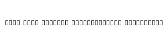
( Noto is a trademark of Google Inc. Noto fonts are open source. All Noto fonts are published under the SIL Open Font License, Version 1.1 )
A modern, extra light, semi-condensed sans-serif font.
![Noto Sans Sinhala SemiCondensed ExtraLight font caratteri gratis]() Scaricare 51 Downloads@WebFont
Scaricare 51 Downloads@WebFont -
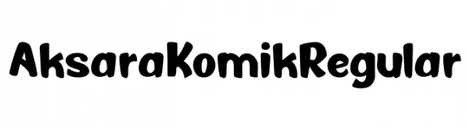
( Fonts by Eko Kurniawan )
Bold, rounded comic-style sans-serif font with a playful feel.
![Aksara Komik Regular font caratteri gratis]() Scaricare 51 Downloads@WebFont
Scaricare 51 Downloads@WebFont -
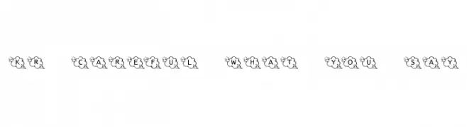
( Fonts by Kat`s Fun Fonts - Personal-use only. For commercial use please contact owner. )
A whimsical, cloud-encased decorative font perfect for playful designs.
![KR Careful What You Say! font caratteri gratis]() Scaricare 51 Downloads@WebFont
Scaricare 51 Downloads@WebFont -
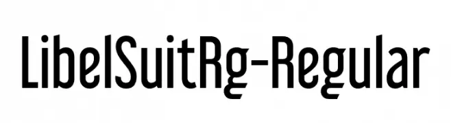
( Fonts by Typodermic Fonts - Raymond Larabie - Personal-use only. For commercial use please contact owner. )
A modern, tall, and narrow sans-serif font with a clean and professional look.
![LibelSuitRg-Regular font caratteri gratis]() Scaricare 51 Downloads@WebFont
Scaricare 51 Downloads@WebFont -
( Fonts by Nabila )
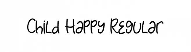
Playful handwritten font with a casual style.
![Child Happy Regular font caratteri gratis]() Scaricare 51 Downloads@WebFont
Scaricare 51 Downloads@WebFont -
( Fonts by Zuzulgo Studio - Muhammad Zulfani - Personal-use only. For commercial use please contact owner. )
A modern, rounded sans-serif font with a friendly and clean appearance.
![Matrouh font caratteri gratis]() Scaricare 51 Downloads@WebFont
Scaricare 51 Downloads@WebFont -
( Fonts by setyaisiam _type - Personal-use only. For commercial use please contact owner. )
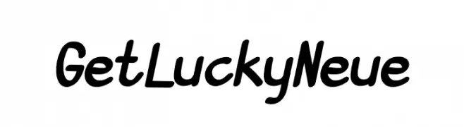
A playful, handwritten-style font with bold, rounded strokes.
![GetLuckyNeue font caratteri gratis]() Scaricare 51 Downloads@WebFont
Scaricare 51 Downloads@WebFont -
( Fonts by AV Type - Aldo Vesely - Personal-use only. For commercial use please contact owner. )
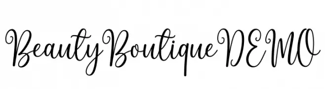
An elegant, cursive font with flowing loops and swirls.
![Beauty Boutique DEMO font caratteri gratis]() Scaricare 51 Downloads@WebFont
Scaricare 51 Downloads@WebFont -
( Fonts by Shanaya Studio - Personal-use only. For commercial use please contact owner. )
A bold, geometric font with clean lines and a modern style.
![Bartenique font caratteri gratis]() Scaricare 51 Downloads@WebFont
Scaricare 51 Downloads@WebFont -
( Fonts by Vladimir Nikolic - https://www.creativefabrica.com/product/educated-deers/ref/144265/ - Personal-use only. For commercial use please contact owner. )
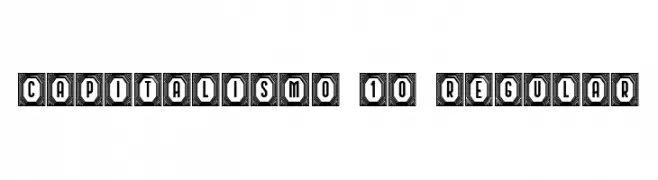
A bold, geometric font with decorative octagonal frames around each character.
![Capitalismo 10 Regular font caratteri gratis]() Scaricare 51 Downloads@WebFont
Scaricare 51 Downloads@WebFont -
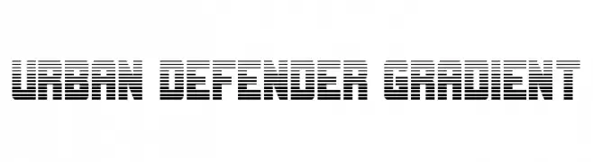
( Fonts by Daniel Zadorozny - www.iconian.com - Personal-use only. For commercial use please contact owner. )
A bold, futuristic font with a gradient effect and high contrast, ideal for modern designs.
![Urban Defender Gradient font caratteri gratis]() Scaricare 51 Downloads@WebFont
Scaricare 51 Downloads@WebFont -
( Fonts by Letterara - Thomas Aradea - Personal-use only. For commercial use please contact owner. )
A flowing, cursive font with elegant, interconnected strokes and decorative flourishes.
![Brenda Valentine font caratteri gratis]() Scaricare 51 Downloads@WebFont
Scaricare 51 Downloads@WebFont -
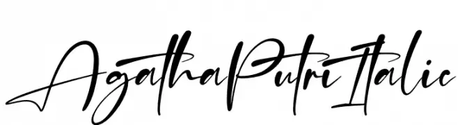
( Fonts by Perspectype Studio - Personal-use only. For commercial use please contact owner. )
A dynamic and flowing script font with elegant, interconnected strokes.
![Agatha Putri Italic font caratteri gratis]() Scaricare 51 Downloads@WebFont
Scaricare 51 Downloads@WebFont -
( Fonts by Zetafonts - Personal-use only. For commercial use please contact owner. )
A thin, italicized typeface with a modern and elegant style.
![CalvinoTrial Thin Italic font caratteri gratis]() Scaricare 51 Downloads@WebFont
Scaricare 51 Downloads@WebFont -
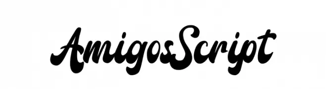
( Fonts by StringLabs - stringlabscreative.com - Personal-use only. For commercial use please contact owner. )
A bold, flowing script font with elegant curves and dynamic strokes.
![Amigos Script font caratteri gratis]() Scaricare 51 Downloads@WebFont
Scaricare 51 Downloads@WebFont -
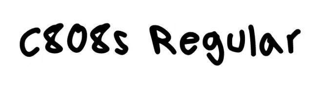
( Fonts by Maxx Lopez )
Bold, playful handwritten style with rounded, informal strokes.
![C808s Regular font caratteri gratis]() Scaricare 51 Downloads@WebFont
Scaricare 51 Downloads@WebFont -
( Fonts by Daniel Zadorozny - www.iconian.com - Personal-use only. For commercial use please contact owner. )
A bold, futuristic outline font with geometric and mechanical elements.
![Combat Droid Outline font caratteri gratis]() Scaricare 51 Downloads@WebFont
Scaricare 51 Downloads@WebFont -
( Fonts by Rantautype - Yudi Pratama Chandra - Personal-use only. For commercial use please contact owner. )
A bold, expressive script font with flowing, connected characters and a modern calligraphic style.
![Podcast font caratteri gratis]() Scaricare 51 Downloads@WebFont
Scaricare 51 Downloads@WebFont -
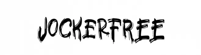
( Fonts by Vunira Design - Personal-use only. For commercial use please contact owner. )
A bold, hand-drawn font with a brush-like texture and dynamic, edgy style.
![JockerFREE font caratteri gratis]() Scaricare 51 Downloads@WebFont
Scaricare 51 Downloads@WebFont -
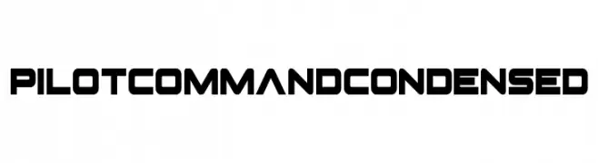
( Fonts by Iconian Fonts - Daniel Zadorozny - Personal-use only. For commercial use please contact owner. )
A bold, geometric, and condensed font with a modern, futuristic style.
![Pilot Command Condensed font caratteri gratis]() Scaricare 51 Downloads@WebFont
Scaricare 51 Downloads@WebFont -
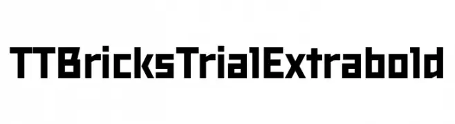
( Fonts by TypeType Foundry )
A bold, geometric font with blocky, angular letterforms and a modern style.
![TT Bricks Trial Extrabold font caratteri gratis]() Scaricare 51 Downloads@WebFont
Scaricare 51 Downloads@WebFont -
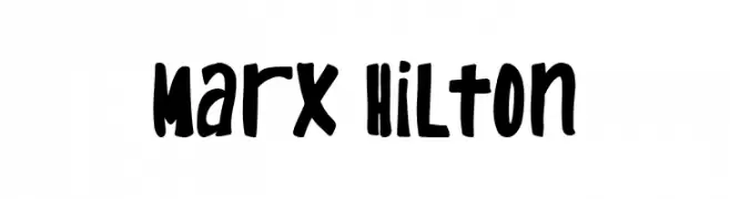
( Fonts by Wildan Type )
A bold, playful font with a hand-drawn, whimsical style.
![Marx Hilton font caratteri gratis]() Scaricare 51 Downloads@WebFont
Scaricare 51 Downloads@WebFont -
( Fonts by typeformerstudio.com - Personal-use only. For commercial use please contact owner. )
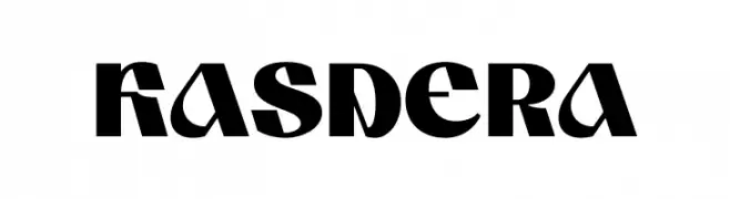
A bold, geometric font with sharp angles and a modern aesthetic.
![KASDERA font caratteri gratis]() Scaricare 51 Downloads@WebFont
Scaricare 51 Downloads@WebFont -
( Fonts by Brittney Murphy Design - Brittney Murphy - Personal-use only. For commercial use please contact owner. )
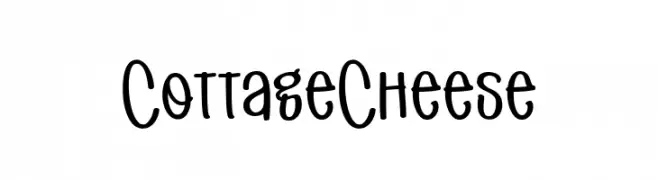
A playful, handwritten font with a whimsical and casual style.
![Cottage Cheese font caratteri gratis]() Scaricare 51 Downloads@WebFont
Scaricare 51 Downloads@WebFont -
( Fonts by Kong Font - Personal-use only. For commercial use please contact owner. )
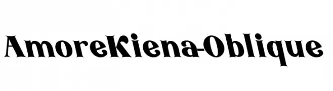
A bold, oblique serif font with dynamic and elegant characteristics.
![AmoreKiena-Oblique font caratteri gratis]() Scaricare 51 Downloads@WebFont
Scaricare 51 Downloads@WebFont -
( Fonts by Typia Nesia - Personal-use only. For commercial use please contact owner. )
A bold, brush-style font with dynamic, hand-painted strokes.
![AvailaBrush font caratteri gratis]() Scaricare 51 Downloads@WebFont
Scaricare 51 Downloads@WebFont -
( Fonts by JOEBOB graphics - Joe vanderHam - Personal-use only. For commercial use please contact owner. )
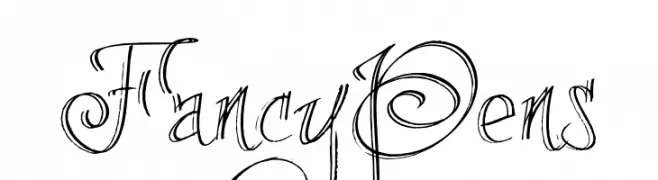
An artistic and decorative font with intricate flourishes and swirls.
![FancyPens font caratteri gratis]() Scaricare 51 Downloads@WebFont
Scaricare 51 Downloads@WebFont -
( Fonts by Enxyclo Studio )
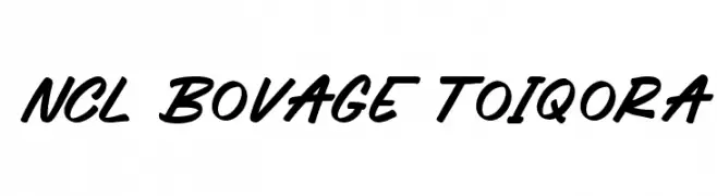
Bold, slanted script with a handwritten, casual style.
![NCL Bovage Toiqora font caratteri gratis]() Scaricare 51 Downloads@WebFont
Scaricare 51 Downloads@WebFont -
( Fonts by Edric Studio - Personal-use only. For commercial use please contact owner. )
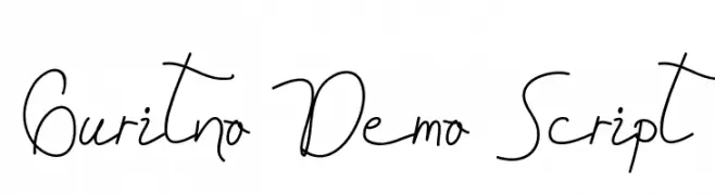
A fluid and elegant script font with a cursive, handwritten style.
![Guritno Demo Script font caratteri gratis]() Scaricare 51 Downloads@WebFont
Scaricare 51 Downloads@WebFont -
( Fonts by Amru ID - Personal-use only. For commercial use please contact owner. )
A bold, italicized font with a strong, dynamic appearance.
![Andala Bold Italic font caratteri gratis]() Scaricare 51 Downloads@WebFont
Scaricare 51 Downloads@WebFont -
( Fonts by Febri_Creative - Febrianto Yuwono - Personal-use only. For commercial use please contact owner. )
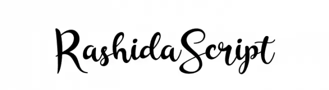
A lively and dynamic script font with elegant, flowing characters.
![RashidaScript font caratteri gratis]() Scaricare 51 Downloads@WebFont
Scaricare 51 Downloads@WebFont -
( Noto is a trademark of Google Inc. Noto fonts are open source. All Noto fonts are published under the SIL Open Font License, Version 1.1 )
A bold, extra-condensed sans-serif font with geometric shapes and tight spacing.
![Noto Sans Hebrew ExtraCondensed Black font caratteri gratis]() Scaricare 51 Downloads@WebFont
Scaricare 51 Downloads@WebFont -
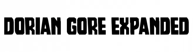
( Fonts by Iconian Fonts - Daniel Zadorozny - Personal-use only. For commercial use please contact owner. )
A bold, blocky font with a modern and impactful style.
![Dorian Gore Expanded font caratteri gratis]() Scaricare 51 Downloads@WebFont
Scaricare 51 Downloads@WebFont -
( Fonts by Letterara - Thomas Aradea - Personal-use only. For commercial use please contact owner. )
A whimsical, festive script font with elegant swirls and loops.
![Christmas Magic font caratteri gratis]() Scaricare 51 Downloads@WebFont
Scaricare 51 Downloads@WebFont


Quali sono i font più popolari adesso?
Poppins, Roboto, Montserrat, Open Sans e Lato sono molto usati per le forme pulite e l'ampia applicabilità — dall'identità di marca alle landing page e ai poster.
Quali font si usano spesso nei loghi?
Le sans serif geometriche (es. Poppins, famiglie in stile Gotham) sono scelte comuni per un branding pulito e scalabile. Per un tocco personale restano valide script e stili manoscritti. Abbina un display deciso per i titoli a un corpo testo neutro per riconoscibilità ed equilibrio.
Ogni quanto si aggiorna la lista?
Con regolarità, in base ai download e all'attività reale. Torna spesso per scoprire in anticipo le nuove preferite.
💡 Consiglio: aggiungi ai preferiti — le tendenze cambiano in fretta e i font top di oggi possono ispirare il rebranding di domani.