Benvenuto nelle Font Più Popolari — dove popolarità e qualità si incontrano. Qui trovi i font più scaricati e usati dell'anno. Se cerchi scelte sicure per logo, web o social, inizia da qui.
Ogni font top si distingue per equilibrio, leggibilità e versatilità. Troverai sans serif moderne, script eleganti, serif vintage e display minimalisti.
-
( Fonts by Zetafonts - Personal-use only. For commercial use please contact owner. )
A modern inline font with geometric letterforms and consistent width.
 Scaricare 1406 Downloads@WebFont
 -
( Fonts by Situjuh Nazara - 7ntypes.com - Personal-use only. For commercial use please contact owner. )
A bold, modern sans-serif font with a condensed, geometric style.
![Chosence font caratteri gratis]() Scaricare 1406 Downloads@WebFont
Scaricare 1406 Downloads@WebFont -
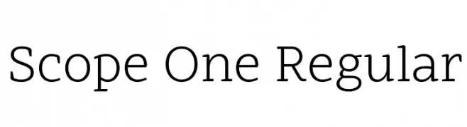
( Copyright 2015 Dalton Maag Ltd (info@daltonmaag.com) )
A modern serif font with clean lines and balanced proportions.
![Scope One Regular font caratteri gratis]() Scaricare 1406 Downloads@WebFont
Scaricare 1406 Downloads@WebFont -
![Cookiesandcream font caratteri gratis]() Scaricare 1406 Downloads@WebFont
Scaricare 1406 Downloads@WebFont -
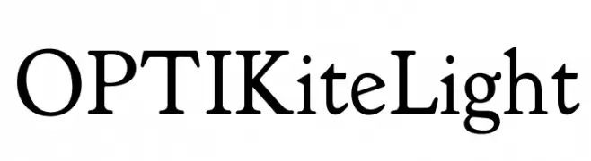
( Fonts by Castcraft Software - opti.netii.net - check the website before use )
A classic serif font with elegant strokes and refined serifs.
![OPTIKiteLight font caratteri gratis]() Scaricare 1406 Downloads@WebFont
Scaricare 1406 Downloads@WebFont -
( Fonts by Arkandis Digital Foundry )
A bold, classic serif font with strong strokes and elegant proportions.
![Romande ADF No2 Std Bold font caratteri gratis]() Scaricare 1406 Downloads@WebFont
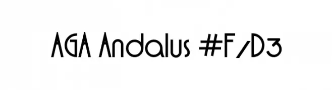
Scaricare 1406 Downloads@WebFont -
![AGA Andalus #F/D3 font caratteri gratis]() Scaricare 1406 Downloads@WebFont
Scaricare 1406 Downloads@WebFont -
![Swansea Bold Italic font caratteri gratis]() Scaricare 1406 Downloads@WebFont
Scaricare 1406 Downloads@WebFont -
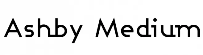
( Fonts by Apostrophic Lab )
A modern, geometric font with clean lines and uniform stroke width.
![Ashby Medium font caratteri gratis]() Scaricare 1406 Downloads@WebFont
Scaricare 1406 Downloads@WebFont -
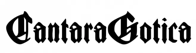
( Fonts by Manfred Klein - manfred-klein.ina-mar.com )
A bold, intricate Blackletter font with dramatic, angular lines and ornate details.
![CantaraGotica font caratteri gratis]() Scaricare 1406 Downloads@WebFont
Scaricare 1406 Downloads@WebFont -
( Fonts by Daniel Zadorozny - www.iconian.com - Free for personal use )
A geometric, futuristic font with sharp angles and clean lines.
![Low Gun Screen Expanded font caratteri gratis]() Scaricare 1406 Downloads@WebFont
Scaricare 1406 Downloads@WebFont -
( Fonts by Paul Lloyd )
A decorative blackletter font with ornate, gothic styling.
![Minster No 4 font caratteri gratis]() Scaricare 1406 Downloads@WebFont
Scaricare 1406 Downloads@WebFont -
![Oncial font caratteri gratis]() Scaricare 1406 Downloads@WebFont
Scaricare 1406 Downloads@WebFont -
![KiraLynn font caratteri gratis]() Scaricare 1406 Downloads@WebFont
Scaricare 1406 Downloads@WebFont -
( Fonts by Khurasan )
A playful, handwritten font with bold, rounded strokes and a casual, dynamic style.
![Jessycat font caratteri gratis]() Scaricare 1405 Downloads@WebFont
Scaricare 1405 Downloads@WebFont -
( Fonts by Pinisiart )
A playful, bold font with a whimsical and slightly irregular design.
![BINGO font caratteri gratis]() Scaricare 1405 Downloads@WebFont
Scaricare 1405 Downloads@WebFont -
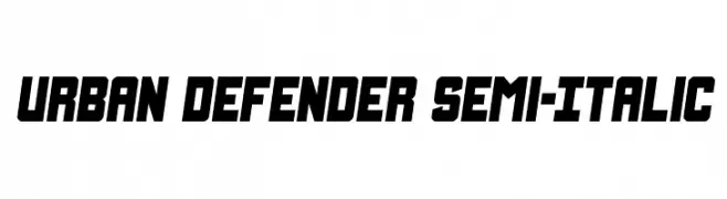
( Fonts by Daniel Zadorozny - www.iconian.com - Personal-use only. For commercial use please contact owner. )
A bold, semi-italic font with a modern, urban aesthetic.
![Urban Defender Semi-Italic font caratteri gratis]() Scaricare 1405 Downloads@WebFont
Scaricare 1405 Downloads@WebFont -
( Copyright (c) 2015, Christian Thalmann and the Cormorant Project Authors (github.com/CatharsisFonts/Cormorant) )
A semi-bold italic serif font with elegant and classic characteristics.
![Cormorant SemiBold Italic font caratteri gratis]() Scaricare 1405 Downloads@WebFont
Scaricare 1405 Downloads@WebFont -
( Fonts by Rodrigo German - RASDESIGN )
A bold, expressive handwritten font with dynamic strokes and unique embellishments.
![saint font caratteri gratis]() Scaricare 1405 Downloads@WebFont
Scaricare 1405 Downloads@WebFont -
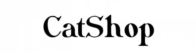
( Fonts by www.peter-wiegel.de. Personal-use only. For commercial use please contact owner. )
A bold, high-contrast serif font with elegant curves and pronounced serifs.
![CatShop font caratteri gratis]() Scaricare 1405 Downloads@WebFont
Scaricare 1405 Downloads@WebFont -
( Fonts by Dieter Steffmann )
An ornate, vintage-style decorative font with intricate detailing.
![Romantiques font caratteri gratis]() Scaricare 1405 Downloads@WebFont
Scaricare 1405 Downloads@WebFont -
![JacksonvilleOldStyle font caratteri gratis]() Scaricare 1405 Downloads@WebFont
Scaricare 1405 Downloads@WebFont -
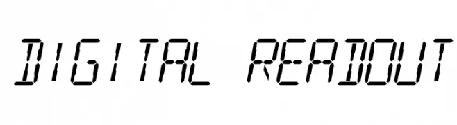
![Digital Readout font caratteri gratis]() Scaricare 1405 Downloads@WebFont
Scaricare 1405 Downloads@WebFont -
( Fonts by Weape Studio )
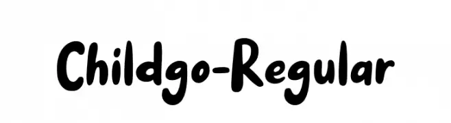
A playful, rounded font with bold, smooth curves and a friendly style.
![Childgo-Regular font caratteri gratis]() Scaricare 1404 Downloads@WebFont
Scaricare 1404 Downloads@WebFont -
( Phitradesign - Philip Trautmann - www.phitradesign-fonts.com )
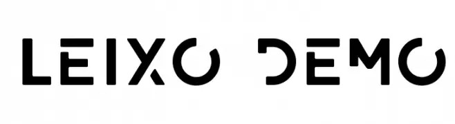
A bold, geometric font with a modern and technical design.
![LEIXO DEMO font caratteri gratis]() Scaricare 1404 Downloads@WebFont
Scaricare 1404 Downloads@WebFont -
( Fonts by Geronimo Fonts - Personal-use only. For commercial use please contact owner. )
A playful, rounded font with a friendly and approachable style.
![Back to School font caratteri gratis]() Scaricare 1404 Downloads@WebFont
Scaricare 1404 Downloads@WebFont -
![Uchiyama-Regular font caratteri gratis]() Scaricare 1404 Downloads@WebFont
Scaricare 1404 Downloads@WebFont -
![Evelyn font caratteri gratis]() Scaricare 1404 Downloads@WebFont
Scaricare 1404 Downloads@WebFont -
( Fonts by www.TomzWeb.com - Thomas E. Harvey - NOT free - Commercial use requires license )
A bold, high-contrast font with a dynamic and decorative style.
![NewForum font caratteri gratis]() Scaricare 1404 Downloads@WebFont
Scaricare 1404 Downloads@WebFont -
![Drips Regular font caratteri gratis]() Scaricare 1404 Downloads@WebFont
Scaricare 1404 Downloads@WebFont -
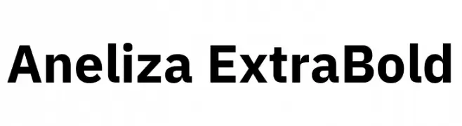
( Fonts by Mike Abbink, Paul van der Laan, Pieter van Rosmalen - Personal-use only. For commercial use please contact owner. )
A bold, modern sans-serif typeface with strong, uniform strokes.
![Aneliza ExtraBold font caratteri gratis]() Scaricare 1403 Downloads@WebFont
Scaricare 1403 Downloads@WebFont -
![UVN Co Dien font caratteri gratis]() Scaricare 1403 Downloads@WebFont
Scaricare 1403 Downloads@WebFont -
( Fonts by Yasir Ekinci )
A playful and elegant script font with smooth, flowing curves.
![BeautifyScript font caratteri gratis]() Scaricare 1403 Downloads@WebFont
Scaricare 1403 Downloads@WebFont -
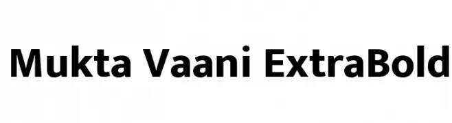
( Copyright (c) 2016, Ek Type. All rights reserved. )
A bold, modern sans-serif font with clean lines and strong presence.
![Mukta Vaani ExtraBold font caratteri gratis]() Scaricare 1403 Downloads@WebFont
Scaricare 1403 Downloads@WebFont -
( Fonts by Geronimo Fonts - Personal-use only. For commercial use please contact owner. )
A playful, hand-drawn font with bold, rounded characters and a casual style.
![internet friends font caratteri gratis]() Scaricare 1403 Downloads@WebFont
Scaricare 1403 Downloads@WebFont


Quali sono i font più popolari adesso?
Poppins, Roboto, Montserrat, Open Sans e Lato sono molto usati per le forme pulite e l'ampia applicabilità — dall'identità di marca alle landing page e ai poster.
Quali font si usano spesso nei loghi?
Le sans serif geometriche (es. Poppins, famiglie in stile Gotham) sono scelte comuni per un branding pulito e scalabile. Per un tocco personale restano valide script e stili manoscritti. Abbina un display deciso per i titoli a un corpo testo neutro per riconoscibilità ed equilibrio.
Ogni quanto si aggiorna la lista?
Con regolarità, in base ai download e all'attività reale. Torna spesso per scoprire in anticipo le nuove preferite.
💡 Consiglio: aggiungi ai preferiti — le tendenze cambiano in fretta e i font top di oggi possono ispirare il rebranding di domani.