Benvenuto nelle Font Più Popolari — dove popolarità e qualità si incontrano. Qui trovi i font più scaricati e usati dell'anno. Se cerchi scelte sicure per logo, web o social, inizia da qui.
Ogni font top si distingue per equilibrio, leggibilità e versatilità. Troverai sans serif moderne, script eleganti, serif vintage e display minimalisti.
-
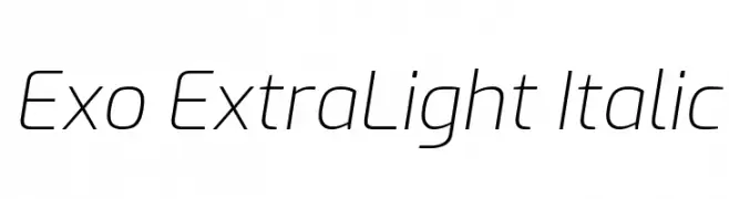
( Copyright 2017 The Exo Project Authors (https://github.com/NDISCOVER/Exo-1.0) )
A sleek, modern, and extra-light italic font with geometric precision.
 Scaricare 378 Downloads@WebFont
 -
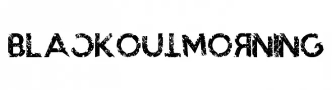
( www.facebook.com/darkoarts )
A bold, distressed font with a grunge aesthetic and textured appearance.
![BlackoutMorning font caratteri gratis]() Scaricare 378 Downloads@WebFont
Scaricare 378 Downloads@WebFont -
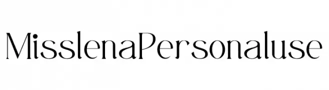
( Fonts by Din Studio - Donis Miftahudin - Personal-use only. For commercial use please contact owner. )
A sophisticated and elegant font with high contrast and modern flair.
![Misslena Personal use font caratteri gratis]() Scaricare 378 Downloads@WebFont
Scaricare 378 Downloads@WebFont -
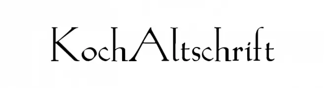
( Fonts by Dieter Steffmann )
A classic serif font with sharp, angular serifs and a formal, elegant style.
![KochAltschrift font caratteri gratis]() Scaricare 378 Downloads@WebFont
Scaricare 378 Downloads@WebFont -
( Paul Lloyd Fonts )
A modern outline font with geometric shapes and balanced proportions.
![Claritty_Outline font caratteri gratis]() Scaricare 378 Downloads
Scaricare 378 Downloads -
-
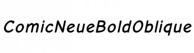
( Fonts by www.comicneue.com - Personal-use only. For commercial use please contact owner. )
A bold, playful, and slightly slanted font with a comic-inspired style.
![Comic Neue Bold Oblique font caratteri gratis]() Scaricare 378 Downloads@WebFont
Scaricare 378 Downloads@WebFont -
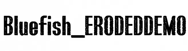
![Bluefish_ERODED DEMO font caratteri gratis]() Scaricare 378 Downloads@WebFont
Scaricare 378 Downloads@WebFont -
( Fonts by Andrew Hart - dirt2.com )
A bold, edgy font inspired by body piercings and chains.
![Body Piercing & Chains font caratteri gratis]() Scaricare 378 Downloads@WebFont
Scaricare 378 Downloads@WebFont -
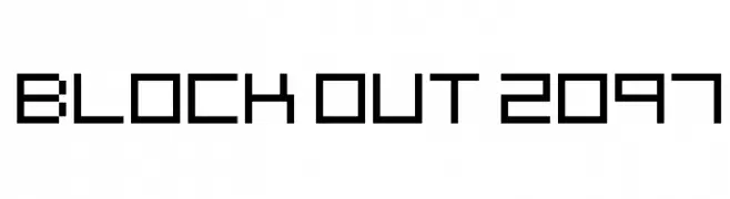
![Block Out 2097 font caratteri gratis]() Scaricare 378 Downloads@WebFont
Scaricare 378 Downloads@WebFont -
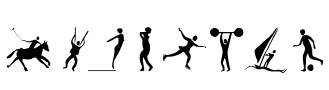
( Fonts by Manfred Klein - manfred-klein.ina-mar.com )
A set of sports-themed pictograms.
![Sportive font caratteri gratis]() Scaricare 378 Downloads@WebFont
Scaricare 378 Downloads@WebFont


Quali sono i font più popolari adesso?
Poppins, Roboto, Montserrat, Open Sans e Lato sono molto usati per le forme pulite e l'ampia applicabilità — dall'identità di marca alle landing page e ai poster.
Quali font si usano spesso nei loghi?
Le sans serif geometriche (es. Poppins, famiglie in stile Gotham) sono scelte comuni per un branding pulito e scalabile. Per un tocco personale restano valide script e stili manoscritti. Abbina un display deciso per i titoli a un corpo testo neutro per riconoscibilità ed equilibrio.
Ogni quanto si aggiorna la lista?
Con regolarità, in base ai download e all'attività reale. Torna spesso per scoprire in anticipo le nuove preferite.
💡 Consiglio: aggiungi ai preferiti — le tendenze cambiano in fretta e i font top di oggi possono ispirare il rebranding di domani.