Benvenuto nelle Font Più Popolari — dove popolarità e qualità si incontrano. Qui trovi i font più scaricati e usati dell'anno. Se cerchi scelte sicure per logo, web o social, inizia da qui.
Ogni font top si distingue per equilibrio, leggibilità e versatilità. Troverai sans serif moderne, script eleganti, serif vintage e display minimalisti.
-
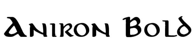
( Fonts by Pete Klassen - www.thehutt.de )
A bold, medieval-inspired font with sharp, angular lines and decorative elements.
 Scaricare 1397 Downloads@WebFont
 -
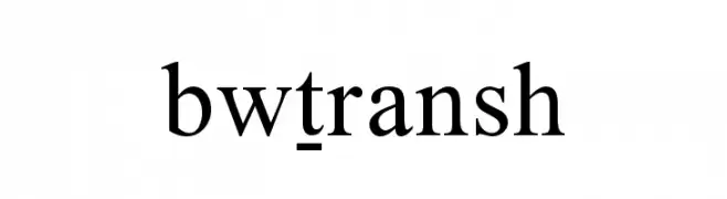
![Bwtransh font caratteri gratis]() Scaricare 1397 Downloads@WebFont
Scaricare 1397 Downloads@WebFont -
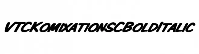
![VTCKomixationSCBoldItalic font caratteri gratis]() Scaricare 1397 Downloads@WebFont
Scaricare 1397 Downloads@WebFont -
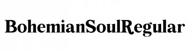
( Fonts by Maria Feliz Studio - Personal-use only. For commercial use please contact owner. )
A bold and high-contrast serif font with pronounced serifs and strong strokes.
![Bohemian Soul Regular font caratteri gratis]() Scaricare 1396 Downloads@WebFont
Scaricare 1396 Downloads@WebFont -
( Fonts by casualized )
A playful, bubbly font with a hand-drawn, whimsical style.
![Little Jelly font caratteri gratis]() Scaricare 1396 Downloads@WebFont
Scaricare 1396 Downloads@WebFont -
( Fonts by Cristiano Sobral - Personal-use only. For commercial use please contact owner. )
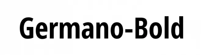
A bold, modern sans-serif font with strong lines and excellent readability.
![Germano-Bold font caratteri gratis]() Scaricare 1396 Downloads@WebFont
Scaricare 1396 Downloads@WebFont -
( Fonts by Fran Fernandez - Personal-use only. For commercial use please contact owner. )
A modern, angular font with a futuristic and dynamic style.
![Spectre 007 font caratteri gratis]() Scaricare 1396 Downloads@WebFont
Scaricare 1396 Downloads@WebFont -
( Fonts by rolandhuse.com - Runes & Fonts - Personal-use only. For commercial use please contact owner. )
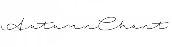
A graceful and elegant script font with flowing cursive letterforms.
![AutumnChant font caratteri gratis]() Scaricare 1396 Downloads@WebFont
Scaricare 1396 Downloads@WebFont -
( Fonts by Castcraft Software - opti.netii.net - check the website before use )
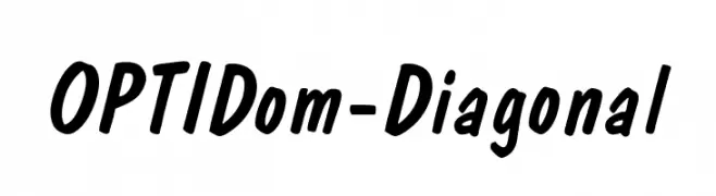
A bold, slanted font with rounded characters and a dynamic, energetic style.
![OPTIDom-Diagonal font caratteri gratis]() Scaricare 1396 Downloads@WebFont
Scaricare 1396 Downloads@WebFont -
![VI Bodacious [Bum] Normal font caratteri gratis]() Scaricare 1396 Downloads
Scaricare 1396 Downloads -
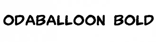
![OdaBalloon Bold font caratteri gratis]() Scaricare 1396 Downloads@WebFont
Scaricare 1396 Downloads@WebFont -
( Fonts by www.aenigmafonts.com )
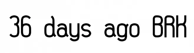
A modern, geometric font with rounded edges and a clean, streamlined appearance.
![36 days ago BRK font caratteri gratis]() Scaricare 1396 Downloads@WebFont
Scaricare 1396 Downloads@WebFont -
( Fonts by www.stimuleyefonts.com )
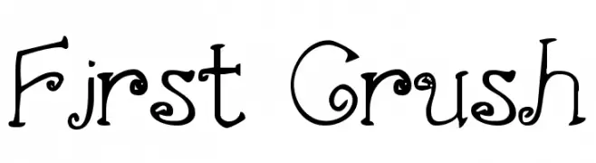
A whimsical decorative font with curly and swirly elements.
![First Crush font caratteri gratis]() Scaricare 1396 Downloads@WebFont
Scaricare 1396 Downloads@WebFont -
( Fonts by Galdino Otten Fonts - www.galdinootten.com - Personal-use only. For commercial use please contact owner. )
A bold, pixelated font with a retro digital aesthetic.
![Pixel Book font caratteri gratis]() Scaricare 1395 Downloads@WebFont
Scaricare 1395 Downloads@WebFont -
( Fonts by Cristiano Sobral - Personal-use only. For commercial use please contact owner. )
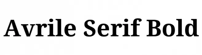
A bold serif font with classic elegance and strong readability.
![Avrile Serif Bold font caratteri gratis]() Scaricare 1395 Downloads@WebFont
Scaricare 1395 Downloads@WebFont -
( Måns Grebäck - www.mansgreback.com )
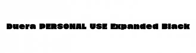
A bold, expanded font with high contrast and strong visual impact.
![Duera PERSONAL USE Expanded Black font caratteri gratis]() Scaricare 1395 Downloads@WebFont
Scaricare 1395 Downloads@WebFont -
( Fonts by Oriol Esparraguera - Personal-use only. For commercial use please contact owner. )
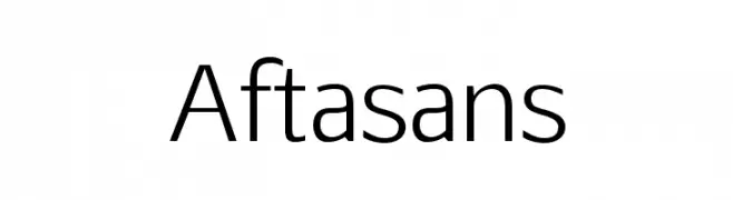
A modern, clean sans-serif typeface with a minimalistic design.
![Aftasans font caratteri gratis]() Scaricare 1395 Downloads@WebFont
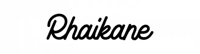
Scaricare 1395 Downloads@WebFont -
![Rhaikane font caratteri gratis]() Scaricare 1395 Downloads@WebFont
Scaricare 1395 Downloads@WebFont -
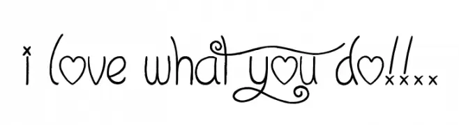
( Font by Jonathan Harris - www.tattoowoo.com )
A whimsical, decorative font with playful swirls and heart motifs.
![I Love What You Do!!.. font caratteri gratis]() Scaricare 1395 Downloads@WebFont
Scaricare 1395 Downloads@WebFont -
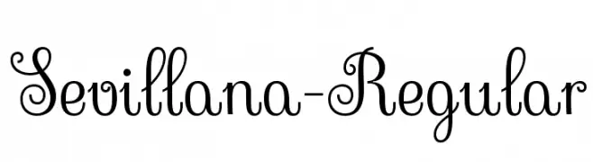
( Copyright (c) 2011, Brownfox (gayaneh.b@gmail.com) )
An elegant, decorative script font with intricate loops and swirls.
![Sevillana-Regular font caratteri gratis]() Scaricare 1395 Downloads@WebFont
Scaricare 1395 Downloads@WebFont -
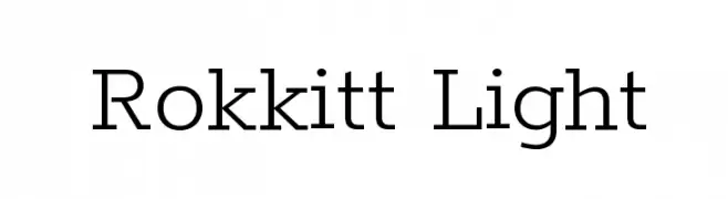
( Copyright 2016 The Rokkit Project Authors (contact@sansoxygen.com) )
A modern, light serif font with elegant proportions and excellent readability.
![Rokkitt Light font caratteri gratis]() Scaricare 1395 Downloads@WebFont
Scaricare 1395 Downloads@WebFont -
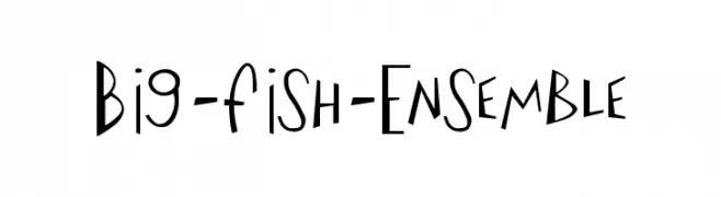
( Free for non-commercial use. www.johnmartz.com )
A playful and whimsical font with irregular, dynamic letterforms.
![Big-Fish-Ensemble font caratteri gratis]() Scaricare 1395 Downloads
Scaricare 1395 Downloads -
( Fonts by Galdino Otten Fonts - www.galdinootten.com - Personal-use only. For commercial use please contact owner. )
A bold, distressed font with a vintage letterpress style.
![Press Style font caratteri gratis]() Scaricare 1394 Downloads@WebFont
Scaricare 1394 Downloads@WebFont -
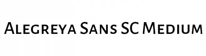
( Copyright 2013 The Alegreya Sans Project Authors (https://github.com/huertatipografica/Alegreya-Sans) )
A modern sans-serif font with medium weight, offering clarity and versatility.
![Alegreya Sans SC Medium font caratteri gratis]() Scaricare 1394 Downloads@WebFont
Scaricare 1394 Downloads@WebFont -
( Copyright (c) 2011, Cyreal (www.cyreal.org) )
A modern, geometric sans-serif font with clean lines and uniform stroke width.
![Rationale font caratteri gratis]() Scaricare 1394 Downloads@WebFont
Scaricare 1394 Downloads@WebFont -
![Action of the Time Upper Lower font caratteri gratis]() Scaricare 1394 Downloads@WebFont
Scaricare 1394 Downloads@WebFont -
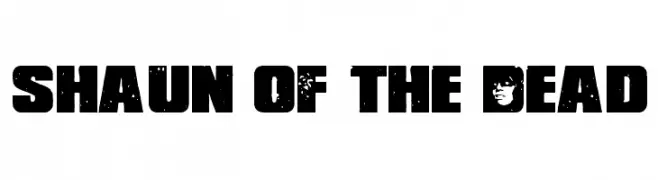
( Fonts by Jens R. Ziehn - www.filmhimmel.com )
A bold, distressed font with horror-themed elements and rugged textures.
![Shaun of the Dead font caratteri gratis]() Scaricare 1394 Downloads@WebFont
Scaricare 1394 Downloads@WebFont -
( Fonts by a Max Infeld - XEROGRAPHER FONTS - xerographer.blogspot.com . Personal-use only. For commercial use please contact owner. )
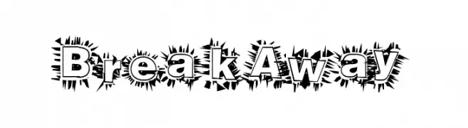
A bold, spiky decorative font with an explosive effect.
![BreakAway font caratteri gratis]() Scaricare 1394 Downloads@WebFont
Scaricare 1394 Downloads@WebFont -
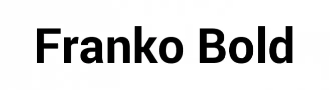
( Fonts by Google - Personal-use only. For commercial use please contact owner. )
A bold, clean sans-serif typeface with geometric shapes and uniform strokes.
![Franko Bold font caratteri gratis]() Scaricare 1393 Downloads@WebFont
Scaricare 1393 Downloads@WebFont -
Caratteri di HammerBro101. For commercial use please contact the owner.
![HelveticaNowText-Medium font caratteri gratis]() Scaricare 1393 Downloads@WebFont
Scaricare 1393 Downloads@WebFont -
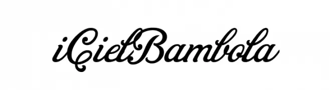
![iCielBambola font caratteri gratis]() Scaricare 1393 Downloads@WebFont
Scaricare 1393 Downloads@WebFont -
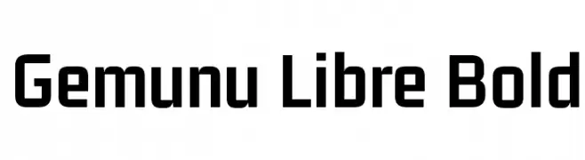
( Copyright 2017 The Gemunu Libre Project Authors (https://github.com/mooniak/gemunu-libre-font) )
A bold, modern sans-serif font with clean lines and strong presence.
![Gemunu Libre Bold font caratteri gratis]() Scaricare 1393 Downloads@WebFont
Scaricare 1393 Downloads@WebFont -
( Fonts by a Max Infeld - XEROGRAPHER FONTS - xerographer.blogspot.com . Personal-use only. For commercial use please contact owner. )
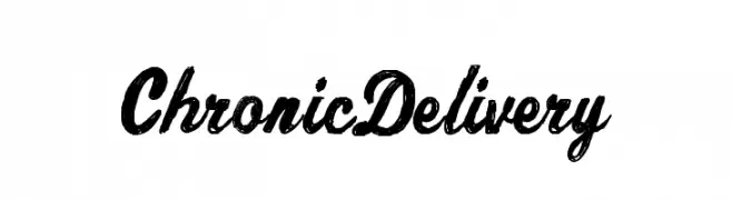
A bold, textured cursive font with a vintage, distressed look.
![ChronicDelivery font caratteri gratis]() Scaricare 1393 Downloads@WebFont
Scaricare 1393 Downloads@WebFont -
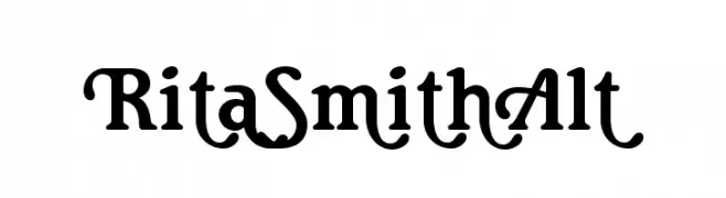
( Fonts by a Claude Pelletier . Personal-use only. For commercial use please contact owner. )
A playful and decorative font with bold, curvy strokes and whimsical elements.
![RitaSmithAlt font caratteri gratis]() Scaricare 1393 Downloads@WebFont
Scaricare 1393 Downloads@WebFont -
![Trek Movie font caratteri gratis]() Scaricare 1393 Downloads@WebFont
Scaricare 1393 Downloads@WebFont


![VI Bodacious [Bum] Normal font caratteri gratis](https://d144mzi0q5mijx.cloudfront.net/img/V/I/VI-Bodacious-Bum-Normal.webp)


Quali sono i font più popolari adesso?
Poppins, Roboto, Montserrat, Open Sans e Lato sono molto usati per le forme pulite e l'ampia applicabilità — dall'identità di marca alle landing page e ai poster.
Quali font si usano spesso nei loghi?
Le sans serif geometriche (es. Poppins, famiglie in stile Gotham) sono scelte comuni per un branding pulito e scalabile. Per un tocco personale restano valide script e stili manoscritti. Abbina un display deciso per i titoli a un corpo testo neutro per riconoscibilità ed equilibrio.
Ogni quanto si aggiorna la lista?
Con regolarità, in base ai download e all'attività reale. Torna spesso per scoprire in anticipo le nuove preferite.
💡 Consiglio: aggiungi ai preferiti — le tendenze cambiano in fretta e i font top di oggi possono ispirare il rebranding di domani.