Benvenuto nelle Font Più Popolari — dove popolarità e qualità si incontrano. Qui trovi i font più scaricati e usati dell'anno. Se cerchi scelte sicure per logo, web o social, inizia da qui.
Ogni font top si distingue per equilibrio, leggibilità e versatilità. Troverai sans serif moderne, script eleganti, serif vintage e display minimalisti.
-
( Fonts by www.selawetype.com - Personal-use only. FOR DONATION https://www.paypal.me/selawe . For commercial use please contact owner. )
A bold, handwritten font with a brush-like texture and playful style.
 Scaricare 374 Downloads@WebFont
 -
( Fonts by Des Gomez )
A bold, playful handwritten font with thick strokes and a casual style.
![Crush font caratteri gratis]() Scaricare 374 Downloads@WebFont
Scaricare 374 Downloads@WebFont -
( Fonts by Roland Huse Design - Roland Huse - Personal-use only. For commercial use please contact owner. )
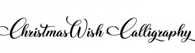
An elegant calligraphy font with flowing strokes and decorative flourishes.
![ChristmasWish-Calligraphy font caratteri gratis]() Scaricare 374 Downloads@WebFont
Scaricare 374 Downloads@WebFont -
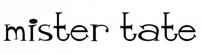
![mister tate font caratteri gratis]() Scaricare 374 Downloads@WebFont
Scaricare 374 Downloads@WebFont -
( Free for a personal use. For a commercial use please visit www.kevinandamanda.com )
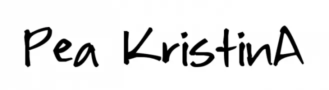
A playful, casual handwritten font with irregular strokes and a lively feel.
![Pea KristinA font caratteri gratis]() Scaricare 374 Downloads@WebFont
Scaricare 374 Downloads@WebFont -
-
( Fonts by Daniel Zadorozny - www.iconian.com - Free for personal use )
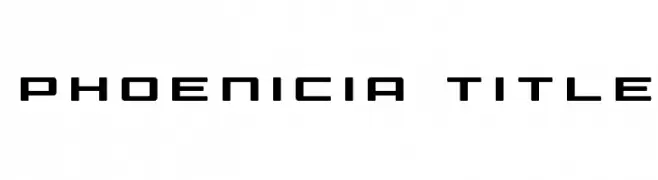
A geometric, modern font with bold, clean lines and a futuristic style.
![Phoenicia Title font caratteri gratis]() Scaricare 374 Downloads@WebFont
Scaricare 374 Downloads@WebFont -
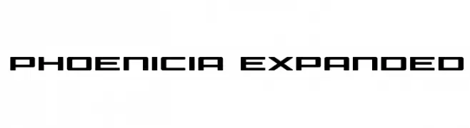
( Fonts by Daniel Zadorozny - www.iconian.com - Free for personal use )
A bold, geometric font with a futuristic and expanded style.
![Phoenicia Expanded font caratteri gratis]() Scaricare 374 Downloads@WebFont
Scaricare 374 Downloads@WebFont -
( Fonts by Jacob Fisher - www.pizzadude.dk )
A pixelated, retro-style font with a digital display aesthetic.
![Exit font [for a film] font caratteri gratis]() Scaricare 374 Downloads@WebFont
Scaricare 374 Downloads@WebFont -
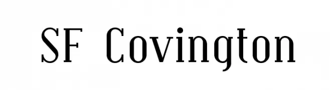
![SF Covington font caratteri gratis]() Scaricare 374 Downloads@WebFont
Scaricare 374 Downloads@WebFont -
( Fonts by Denis Jacquerye )
A clean, modern sans-serif typeface with balanced characters and consistent stroke width.
![Molengo font caratteri gratis]() Scaricare 373 Downloads@WebFont
Scaricare 373 Downloads@WebFont

![Exit font [for a film] font caratteri gratis](https://d144mzi0q5mijx.cloudfront.net/img/E/X/Exit-font-for-a-film.webp)

Quali sono i font più popolari adesso?
Poppins, Roboto, Montserrat, Open Sans e Lato sono molto usati per le forme pulite e l'ampia applicabilità — dall'identità di marca alle landing page e ai poster.
Quali font si usano spesso nei loghi?
Le sans serif geometriche (es. Poppins, famiglie in stile Gotham) sono scelte comuni per un branding pulito e scalabile. Per un tocco personale restano valide script e stili manoscritti. Abbina un display deciso per i titoli a un corpo testo neutro per riconoscibilità ed equilibrio.
Ogni quanto si aggiorna la lista?
Con regolarità, in base ai download e all'attività reale. Torna spesso per scoprire in anticipo le nuove preferite.
💡 Consiglio: aggiungi ai preferiti — le tendenze cambiano in fretta e i font top di oggi possono ispirare il rebranding di domani.