Benvenuto nelle Font Più Popolari — dove popolarità e qualità si incontrano. Qui trovi i font più scaricati e usati dell'anno. Se cerchi scelte sicure per logo, web o social, inizia da qui.
Ogni font top si distingue per equilibrio, leggibilità e versatilità. Troverai sans serif moderne, script eleganti, serif vintage e display minimalisti.
-
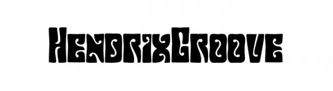
( Fonts by Sahirul Iman - Personal-use only. For commercial use please contact owner. )
A bold, psychedelic font with swirling, organic shapes and high contrast.
 Scaricare 49 Downloads@WebFont
 -
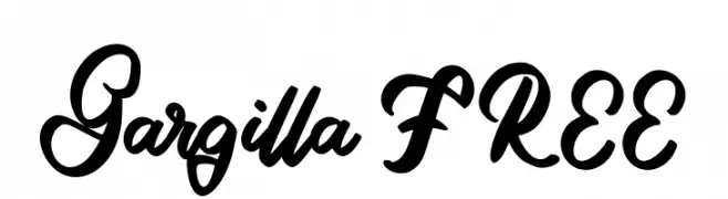
( Fonts by Vunira Design - Personal-use only. For commercial use please contact owner. )
A bold, expressive script font with flowing cursive letters and high contrast strokes.
![Gargilla FREE font caratteri gratis]() Scaricare 49 Downloads@WebFont
Scaricare 49 Downloads@WebFont -
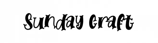
( Fonts by AZ Std - Muh Aswar - Personal-use only. For commercial use please contact owner. )
A playful, hand-drawn font with bold, whimsical characters.
![Sunday Craft font caratteri gratis]() Scaricare 49 Downloads@WebFont
Scaricare 49 Downloads@WebFont -
( Fonts by D&K Project - Degi Kurniawan - Personal-use only. For commercial use please contact owner. )
A bold, brush-style font with an energetic and artistic feel.
![Gudnite font caratteri gratis]() Scaricare 49 Downloads@WebFont
Scaricare 49 Downloads@WebFont -
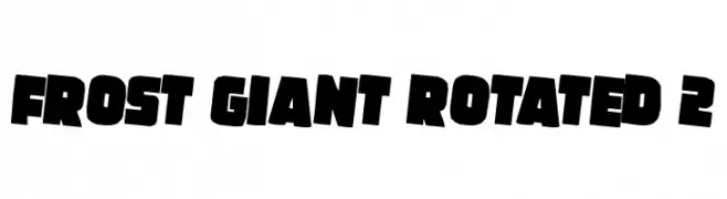
( Fonts by Iconian Fonts - Daniel Zadorozny - Personal-use only. For commercial use please contact owner. )
A bold, dynamic font with thick, slanted characters and a modern aesthetic.
![Frost Giant Rotated 2 font caratteri gratis]() Scaricare 49 Downloads@WebFont
Scaricare 49 Downloads@WebFont -
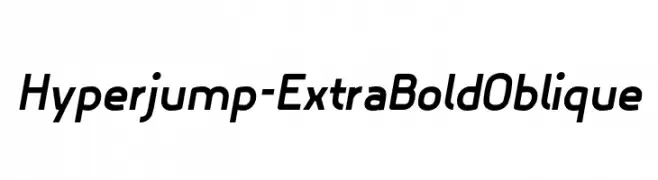
( Fonts by Toufique Islam - Personal-use only. For commercial use please contact owner. )
A bold, oblique sans-serif font with a modern and dynamic style.
![Hyperjump-ExtraBoldOblique font caratteri gratis]() Scaricare 49 Downloads@WebFont
Scaricare 49 Downloads@WebFont -
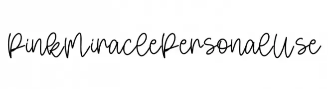
( Fonts by Yumna Family - yumna Type - Personal-use only. For commercial use please contact owner. )
A playful, whimsical handwritten font with smooth, flowing cursive letters.
![Pink Miracle Personal Use font caratteri gratis]() Scaricare 49 Downloads@WebFont
Scaricare 49 Downloads@WebFont -
( Fonts by Intellecta Design - Paulo W - Personal-use only. For commercial use please contact owner. )
A bold, cursive font with elegant, sweeping curves and expressive flourishes.
![Exiles font caratteri gratis]() Scaricare 49 Downloads@WebFont
Scaricare 49 Downloads@WebFont -
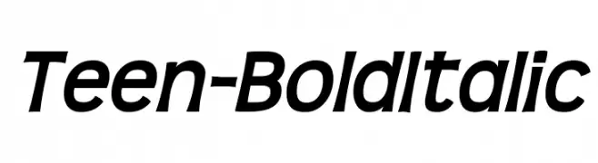
( Fonts by Typodermic Fonts - Raymond Larabie - Personal-use only. For commercial use please contact owner. )
A bold, italicized font with a modern and dynamic style.
![Teen-BoldItalic font caratteri gratis]() Scaricare 49 Downloads@WebFont
Scaricare 49 Downloads@WebFont -
( Fonts by Daniel Zadorozny - www.iconian.com - Personal-use only. For commercial use please contact owner. )
A futuristic, circuit-inspired italic font with a bold, digital aesthetic.
![Neon Circuit Gradient Italic font caratteri gratis]() Scaricare 49 Downloads@WebFont
Scaricare 49 Downloads@WebFont -
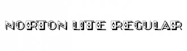
( Fonts by Vladimir Nikolic - www.creativefabrica.com/designer/vladimirnikolic/ - Personal-use only. For commercial use please contact owner. )
A bold, decorative font with geometric cutouts and a shadow effect.
![Norton Lite Regular font caratteri gratis]() Scaricare 49 Downloads@WebFont
Scaricare 49 Downloads@WebFont -
( Fonts by 177studio - Personal-use only. For commercial use please contact owner. )
A bold, geometric font with sharp angles and rounded edges, perfect for modern designs.
![Taygiacs Regular font caratteri gratis]() Scaricare 49 Downloads@WebFont
Scaricare 49 Downloads@WebFont -
( Fonts by Chequered Ink - Personal-use only. For commercial use please contact owner. )
A bold, distressed font with a rugged, vintage appearance.
![Shoutyperson font caratteri gratis]() Scaricare 49 Downloads@WebFont
Scaricare 49 Downloads@WebFont -
( Fonts by Creativework69 Studio - Daddi Daryawan - Personal-use only. For commercial use please contact owner. )
An elegant and sophisticated cursive script font with ornate flourishes.
![The King Of Romance font caratteri gratis]() Scaricare 49 Downloads@WebFont
Scaricare 49 Downloads@WebFont -
( Fonts by Scratch Design - Studio 41 - Personal-use only. For commercial use please contact owner. )
A playful, handwritten font with a whimsical and dynamic style.
![Shavnaz Regular font caratteri gratis]() Scaricare 49 Downloads@WebFont
Scaricare 49 Downloads@WebFont -
( Fonts by StereoType - Clément Nicolle - Personal-use only. For commercial use please contact owner. )
A festive, bold font with decorative holiday elements and a playful style.
![Holly And Berries font caratteri gratis]() Scaricare 49 Downloads@WebFont
Scaricare 49 Downloads@WebFont -
( Fonts by vilogsign - Nur Kholis - Personal-use only. For commercial use please contact owner. )
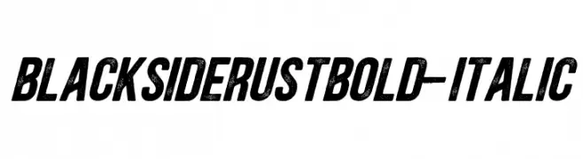
A bold, italicized font with a distressed, vintage texture.
![BlacksideRustBold-Italic font caratteri gratis]() Scaricare 49 Downloads@WebFont
Scaricare 49 Downloads@WebFont -
( Devon Burgoyne - devonburgoyneart.carbonmade.com )
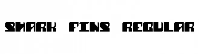
A bold, geometric font with sharp angles and a modern look.
![Shark Fins Regular font caratteri gratis]() Scaricare 49 Downloads@WebFont
Scaricare 49 Downloads@WebFont -
( Fonts by aqr typeface - Azra Qaireen - Personal-use only. For commercial use please contact owner. )
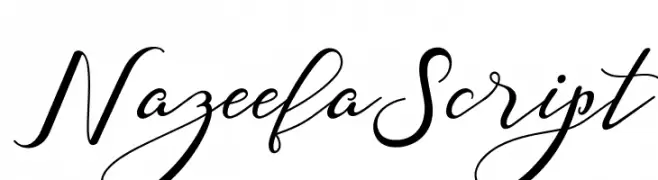
An elegant, flowing script font with graceful loops and swashes.
![Nazeefa Script font caratteri gratis]() Scaricare 49 Downloads@WebFont
Scaricare 49 Downloads@WebFont -
( Fonts by Blankids )
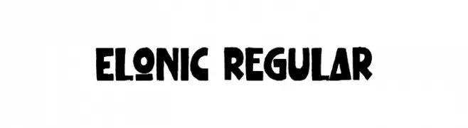
Bold, playful hand-drawn font.
![Elonic Regular font caratteri gratis]() Scaricare 49 Downloads@WebFont
Scaricare 49 Downloads@WebFont -
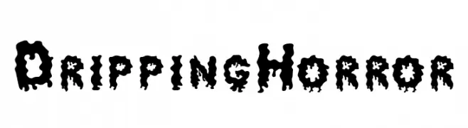
( Fonts by Said Zuzawarsyah - Personal-use only. For commercial use please contact owner. )
A dripping, horror-themed font with a bold, eerie style.
![Dripping Horror font caratteri gratis]() Scaricare 49 Downloads@WebFont
Scaricare 49 Downloads@WebFont -
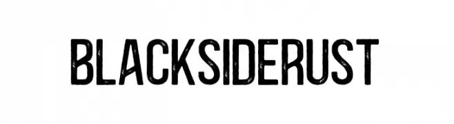
( Fonts by vilogsign - Nur Kholis - Personal-use only. For commercial use please contact owner. )
A bold, distressed font with a rugged, vintage texture.
![BlacksideRust font caratteri gratis]() Scaricare 49 Downloads@WebFont
Scaricare 49 Downloads@WebFont -
( Fonts by Hanzel Space - Personal-use only. For commercial use please contact owner. )
A lively, expressive handwritten font with dynamic strokes.
![Gisellya font caratteri gratis]() Scaricare 49 Downloads@WebFont
Scaricare 49 Downloads@WebFont -
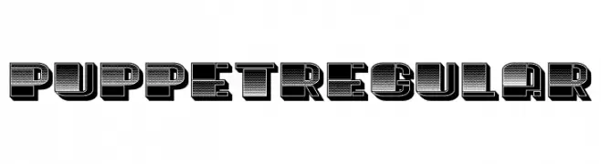
( Fonts by Vladimir Nikolic - www.creativefabrica.com/designer/vladimirnikolic/ - Personal-use only. For commercial use please contact owner. )
A bold, 3D font with a striped pattern and shadow effect, ideal for impactful display use.
![Puppet Regular font caratteri gratis]() Scaricare 49 Downloads@WebFont
Scaricare 49 Downloads@WebFont -
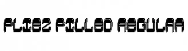
( Fonts by Vladimir Nikolic - www.creativefabrica.com/designer/vladimirnikolic/ - Personal-use only. For commercial use please contact owner. )
A bold, futuristic font with a three-dimensional, outlined style.
![Pliez Filled Regular font caratteri gratis]() Scaricare 49 Downloads@WebFont
Scaricare 49 Downloads@WebFont -
( Fonts by Pen Culture - Revo Farisky - Personal-use only. For commercial use please contact owner. )
A dynamic and elegant script font with fluid, cursive letterforms.
![Sheltone font caratteri gratis]() Scaricare 49 Downloads@WebFont
Scaricare 49 Downloads@WebFont -
( Fonts by Saiful Bahri - Personal-use only. For commercial use please contact owner. )
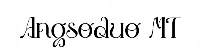
An elegant, decorative font with flowing curves and intricate details.
![Angsoduo MT font caratteri gratis]() Scaricare 49 Downloads@WebFont
Scaricare 49 Downloads@WebFont -
( Daniel Angermann - www.daniel-angermann.de/ )
A bold, modern font with horizontal stripes and italicized, expanded characters.
![DrebiekExpandedStripesItalic font caratteri gratis]() Scaricare 49 Downloads@WebFont
Scaricare 49 Downloads@WebFont -
( Fonts by Edric Studio - Personal-use only. For commercial use please contact owner. )
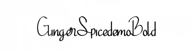
A playful handwritten font with flowing, irregular letterforms.
![Ginger Spicedemo Bold font caratteri gratis]() Scaricare 49 Downloads@WebFont
Scaricare 49 Downloads@WebFont -
( Fonts by Mans Greback - www.mansgreback.com - Personal-use only. For commercial use please contact owner. )
A playful, bold font with rounded, thick strokes and a whimsical touch.
![Cheese Market font caratteri gratis]() Scaricare 49 Downloads@WebFont
Scaricare 49 Downloads@WebFont -
( Fonts by Aksoro 99 - Wahyu Nugroho - Personal-use only. For commercial use please contact owner. )
A modern, cursive font with flowing, connected letters.
![Rapsody font caratteri gratis]() Scaricare 49 Downloads@WebFont
Scaricare 49 Downloads@WebFont -
( Fonts by Kong Font - Personal-use only. For commercial use please contact owner. )
An elegant, flowing script font with high contrast and decorative flourishes.
![ChapterFive font caratteri gratis]() Scaricare 49 Downloads@WebFont
Scaricare 49 Downloads@WebFont -
( Fonts by Fontry - M.G. Adkins - Personal-use only. For commercial use please contact owner. )
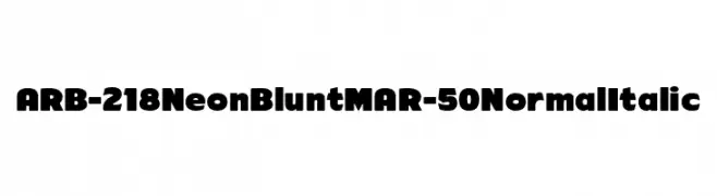
A bold, rounded font with a playful and modern style.
![ARB-218 Neon Blunt MAR-50 Normal Italic font caratteri gratis]() Scaricare 49 Downloads@WebFont
Scaricare 49 Downloads@WebFont -
( Fonts by DDLab - Ferdiansyah - Personal-use only. For commercial use please contact owner. )
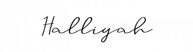
A graceful and flowing script font with a natural handwriting style.
![Halliyah font caratteri gratis]() Scaricare 49 Downloads@WebFont
Scaricare 49 Downloads@WebFont -
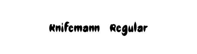
( Fonts by Michelle Kauffmann - Personal-use only. For commercial use please contact owner. )
A bold, jagged font with a playful and edgy appearance.
![Knifemann-Regular font caratteri gratis]() Scaricare 49 Downloads@WebFont
Scaricare 49 Downloads@WebFont


Quali sono i font più popolari adesso?
Poppins, Roboto, Montserrat, Open Sans e Lato sono molto usati per le forme pulite e l'ampia applicabilità — dall'identità di marca alle landing page e ai poster.
Quali font si usano spesso nei loghi?
Le sans serif geometriche (es. Poppins, famiglie in stile Gotham) sono scelte comuni per un branding pulito e scalabile. Per un tocco personale restano valide script e stili manoscritti. Abbina un display deciso per i titoli a un corpo testo neutro per riconoscibilità ed equilibrio.
Ogni quanto si aggiorna la lista?
Con regolarità, in base ai download e all'attività reale. Torna spesso per scoprire in anticipo le nuove preferite.
💡 Consiglio: aggiungi ai preferiti — le tendenze cambiano in fretta e i font top di oggi possono ispirare il rebranding di domani.