Benvenuto nelle Font Più Popolari — dove popolarità e qualità si incontrano. Qui trovi i font più scaricati e usati dell'anno. Se cerchi scelte sicure per logo, web o social, inizia da qui.
Ogni font top si distingue per equilibrio, leggibilità e versatilità. Troverai sans serif moderne, script eleganti, serif vintage e display minimalisti.
-
( Fonts by Style-7 - www.styleseven.com - Personal-use only. For commercial use please contact owner. )
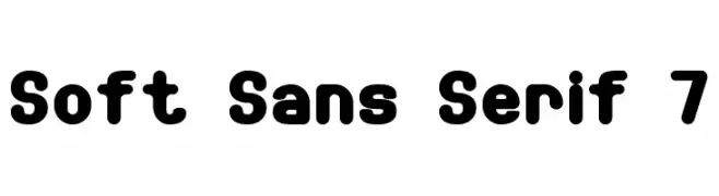
A playful, rounded sans-serif font with bold, uniform strokes.
 Scaricare 370 Downloads@WebFont
 -
( Michael D. Adams - www.triskele.com/roadgeek-fonts/ )
A modern sans-serif font with bold, geometric shapes and excellent readability.
![Roadgeek 2005 Series 5W font caratteri gratis]() Scaricare 370 Downloads@WebFont
Scaricare 370 Downloads@WebFont -
![BRDoodles font caratteri gratis]() Scaricare 370 Downloads@WebFont
Scaricare 370 Downloads@WebFont -
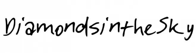
![DiamondsintheSky font caratteri gratis]() Scaricare 370 Downloads@WebFont
Scaricare 370 Downloads@WebFont -
( Fonts by Dave Kellam - Brian Stuparyk - www.eightface.com )
A playful, hand-drawn font with bold, irregular letterforms.
![Cof font caratteri gratis]() Scaricare 370 Downloads@WebFont
Scaricare 370 Downloads@WebFont -
-
( Fonts by www.dcoxy.com )
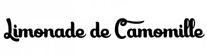
A playful, bold, and whimsical font with rounded, flowing strokes.
![Limonade de Camomille font caratteri gratis]() Scaricare 370 Downloads@WebFont
Scaricare 370 Downloads@WebFont -
( Fonts by Apostrophic Lab )
A bold, geometric font with a modern and uniform appearance.
![Lady Ice - SC Bold font caratteri gratis]() Scaricare 370 Downloads@WebFont
Scaricare 370 Downloads@WebFont -
( Fonts by Jacob Fisher - www.pizzadude.dk )
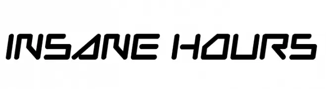
A futuristic, angular font with bold, geometric letterforms.
![Insane Hours font caratteri gratis]() Scaricare 370 Downloads@WebFont
Scaricare 370 Downloads@WebFont -
( Fonts by Kong Font - https://fontkong.com/ - Personal-use only. For commercial use please contact owner. )
A bold, cursive font with smooth, flowing lines and a handwritten appearance.
![Dakiens font caratteri gratis]() Scaricare 370 Downloads@WebFont
Scaricare 370 Downloads@WebFont -
( Fonts by Paulo Cunha Jr. - tutano.zip.net - Personal-use only. For commercial use please contact owner. )
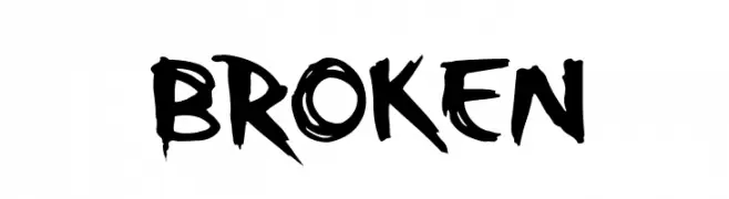
A bold, jagged font with an energetic and rebellious style.
![Broken font caratteri gratis]() Scaricare 370 Downloads@WebFont
Scaricare 370 Downloads@WebFont


Quali sono i font più popolari adesso?
Poppins, Roboto, Montserrat, Open Sans e Lato sono molto usati per le forme pulite e l'ampia applicabilità — dall'identità di marca alle landing page e ai poster.
Quali font si usano spesso nei loghi?
Le sans serif geometriche (es. Poppins, famiglie in stile Gotham) sono scelte comuni per un branding pulito e scalabile. Per un tocco personale restano valide script e stili manoscritti. Abbina un display deciso per i titoli a un corpo testo neutro per riconoscibilità ed equilibrio.
Ogni quanto si aggiorna la lista?
Con regolarità, in base ai download e all'attività reale. Torna spesso per scoprire in anticipo le nuove preferite.
💡 Consiglio: aggiungi ai preferiti — le tendenze cambiano in fretta e i font top di oggi possono ispirare il rebranding di domani.