Benvenuto nelle Font Più Popolari — dove popolarità e qualità si incontrano. Qui trovi i font più scaricati e usati dell'anno. Se cerchi scelte sicure per logo, web o social, inizia da qui.
Ogni font top si distingue per equilibrio, leggibilità e versatilità. Troverai sans serif moderne, script eleganti, serif vintage e display minimalisti.
-
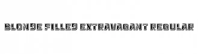
( Fonts by Vladimir Nikolic - www.creativefabrica.com/designer/vladimirnikolic/ - Personal-use only. For commercial use please contact owner. )
A bold, decorative font with a three-dimensional, outlined style.
 Scaricare 48 Downloads@WebFont
 -
( Fonts by Beautypes - Bhakti Al Akbar Pasaribu - Personal-use only. For commercial use please contact owner. )
A modern, elegant script font with decorative loops and smooth flow.
![Holysthic font caratteri gratis]() Scaricare 48 Downloads@WebFont
Scaricare 48 Downloads@WebFont -
( Fonts by DmLetter31 - Dimas Prasetyo - Personal-use only. For commercial use please contact owner. )
Hand-drawn, decorative swash lines with calligraphic flair.
![Parfait Swash Line font caratteri gratis]() Scaricare 48 Downloads@WebFont
Scaricare 48 Downloads@WebFont -
( Fonts by Yoga Letter - Isroni Yoga Prasetya - Personal-use only. For commercial use please contact owner. )
A bold, horror-themed font with jagged, thorn-like details and a gothic style.
![Devil Scream - Personal Use font caratteri gratis]() Scaricare 48 Downloads@WebFont
Scaricare 48 Downloads@WebFont -
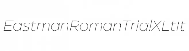
( Fonts by Zetafonts - Personal-use only. For commercial use please contact owner. )
A sleek, modern font with thin lines and a slightly italicized style.
![Eastman Roman Trial XLt It font caratteri gratis]() Scaricare 48 Downloads@WebFont
Scaricare 48 Downloads@WebFont -
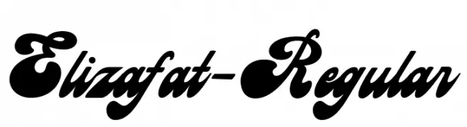
( Fonts by Ahwe Project - Dida Ahluddin - Personal-use only. For commercial use please contact owner. )
A bold, expressive script font with flowing, connected characters.
![Elizafat-Regular font caratteri gratis]() Scaricare 48 Downloads@WebFont
Scaricare 48 Downloads@WebFont -
( Fonts by Lemonthe - Dwi Ahidian - Personal-use only. For commercial use please contact owner. )
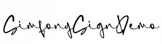
A lively, expressive handwritten font with fluid, dynamic strokes.
![SimfonySign-Demo font caratteri gratis]() Scaricare 48 Downloads@WebFont
Scaricare 48 Downloads@WebFont -
( Fonts by Prioritype Co - Prio Nurokhim Aji - Personal-use only. For commercial use please contact owner. )
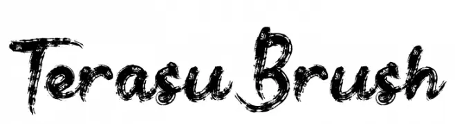
A bold, textured brush font with dynamic, hand-painted strokes.
![Terasu Brush font caratteri gratis]() Scaricare 48 Downloads@WebFont
Scaricare 48 Downloads@WebFont -
( Fonts by weknow - Wino S Kadir - Personal-use only. For commercial use please contact owner. )
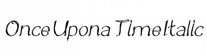
A whimsical, italic cursive font with enchanting swirls and loops.
![Once Upon a Time Italic font caratteri gratis]() Scaricare 48 Downloads@WebFont
Scaricare 48 Downloads@WebFont -
( Fonts by Skinny Type - Muhajir - Personal-use only. For commercial use please contact owner. )
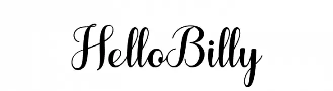
A modern, elegant script font with graceful loops and swashes.
![HelloBilly font caratteri gratis]() Scaricare 48 Downloads@WebFont
Scaricare 48 Downloads@WebFont -
( Fonts by StringLabs )
Elegant, thin handwritten script with tall, flowing forms.
![Orang Indonesia font caratteri gratis]() Scaricare 48 Downloads@WebFont
Scaricare 48 Downloads@WebFont -
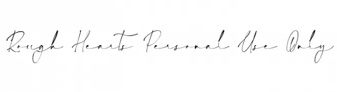
( Fonts by Nathatype )
![Rough Hearts Personal Use Only font caratteri gratis]() Scaricare 48 Downloads@WebFont
Scaricare 48 Downloads@WebFont -
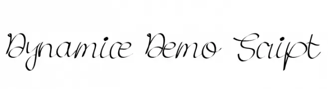
( Fonts by Edric Studio - Personal-use only. For commercial use please contact owner. )
A graceful and fluid script font with elegant, cursive strokes.
![Dynamice Demo Script font caratteri gratis]() Scaricare 48 Downloads@WebFont
Scaricare 48 Downloads@WebFont -
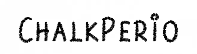
( Fonts by Prioritype Co - Prio Nurokhim Aji - Personal-use only. For commercial use please contact owner. )
A playful, chalk-like font with a textured, hand-drawn appearance.
![Chalk Perio font caratteri gratis]() Scaricare 48 Downloads@WebFont
Scaricare 48 Downloads@WebFont -
( Fonts by Vunira Design - Personal-use only. For commercial use please contact owner. )
A bold, brush-style font with a dynamic and artistic flair.
![KalledFREE font caratteri gratis]() Scaricare 48 Downloads@WebFont
Scaricare 48 Downloads@WebFont -
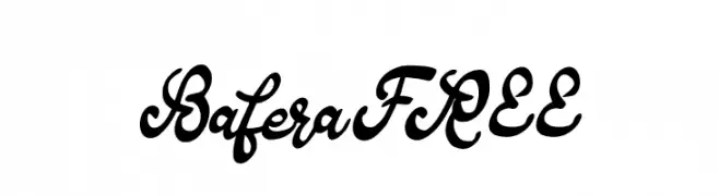
( Fonts by Vunira Design - Personal-use only. For commercial use please contact owner. )
A flowing, cursive font with elegant loops and a classic calligraphy style.
![BaferaFREE font caratteri gratis]() Scaricare 48 Downloads@WebFont
Scaricare 48 Downloads@WebFont -
Caratteri di ZedFonts2334. For commercial use please contact the owner.
( Updated : Multilingual support has been added; The Italic style has been removed as it looks too weird; 2 styles have been added : Light and Hairline. ZF2334 Squarish is a condensed monoline sans-serif font. It is similar to Helvetica Condensed. Lice )
A geometric, modern font with a squarish design and consistent structure.
![ZF2334 Squarish font caratteri gratis]() Scaricare 48 Downloads@WebFont
Scaricare 48 Downloads@WebFont -
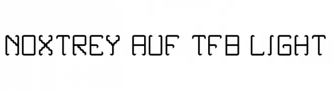
( Fonts by Zanatlija - Personal-use only. For commercial use please contact owner. )
A modern, segmented font with a futuristic, digital aesthetic.
![Noxtrey Auf tfb light font caratteri gratis]() Scaricare 48 Downloads@WebFont
Scaricare 48 Downloads@WebFont -
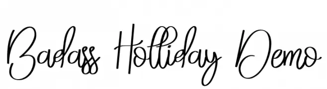
( Fonts by Edric Studio - Personal-use only. For commercial use please contact owner. )
A flowing, elegant script font with smooth, cursive letterforms and artistic flourishes.
![Badass Holliday Demo font caratteri gratis]() Scaricare 48 Downloads@WebFont
Scaricare 48 Downloads@WebFont -
( Fonts by Beautypes - Bhakti Al Akbar Pasaribu - Personal-use only. For commercial use please contact owner. )
A charming and playful script font with fluid, connected letterforms.
![Cattoms cute font caratteri gratis]() Scaricare 48 Downloads@WebFont
Scaricare 48 Downloads@WebFont -
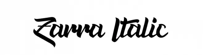
( Fonts by Bykineks - Dede Kurniawan - Personal-use only. For commercial use please contact owner. )
A bold, italic, and cursive font with dynamic strokes and artistic flair.
![Zarra Italic font caratteri gratis]() Scaricare 48 Downloads@WebFont
Scaricare 48 Downloads@WebFont -
( Fonts by Team Project - Personal-use only. For commercial use please contact owner. )
A dynamic, handwritten script font with fluid strokes and artistic flair.
![Beltra font caratteri gratis]() Scaricare 48 Downloads@WebFont
Scaricare 48 Downloads@WebFont -
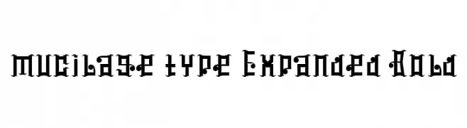
( Brave - ngulik BRAVE )
A bold, blackletter-inspired font with intricate, gothic details.
![mucilage type Expanded Bold font caratteri gratis]() Scaricare 48 Downloads@WebFont
Scaricare 48 Downloads@WebFont -
( Fonts by Albertako - Albert Akho - Personal-use only. For commercial use please contact owner. )
A bold, rounded font with a modern and playful style.
![Keyla Bold font caratteri gratis]() Scaricare 48 Downloads@WebFont
Scaricare 48 Downloads@WebFont -
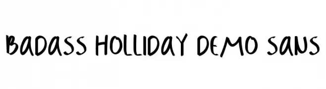
( Fonts by Edric Studio - Personal-use only. For commercial use please contact owner. )
A bold, playful handwritten font with a casual and modern style.
![Badass Holliday Demo Sans font caratteri gratis]() Scaricare 48 Downloads@WebFont
Scaricare 48 Downloads@WebFont -
( Fonts by RVST - Personal-use only. For commercial use please contact owner. )
A bold, elegant script font with flowing, decorative curves.
![Sweets Delight DEMO font caratteri gratis]() Scaricare 48 Downloads@WebFont
Scaricare 48 Downloads@WebFont -
( Fonts by Khurasan - Syaf Rizal - Personal-use only. For commercial use please contact owner. )
A bold, expressive handwritten font with a brush-like texture.
![Rastazm font caratteri gratis]() Scaricare 48 Downloads@WebFont
Scaricare 48 Downloads@WebFont -
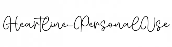
( Fonts by Letterafa Studio )
Casual, connected handwritten script with playful loops.
![Heartline - Personal Use font caratteri gratis]() Scaricare 48 Downloads@WebFont
Scaricare 48 Downloads@WebFont -
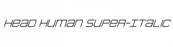
( Fonts by Daniel Zadorozny - www.iconian.com - Personal-use only. For commercial use please contact owner. )
A sleek, italic font with a modern and dynamic style.
![Head Human Super-Italic font caratteri gratis]() Scaricare 48 Downloads@WebFont
Scaricare 48 Downloads@WebFont -
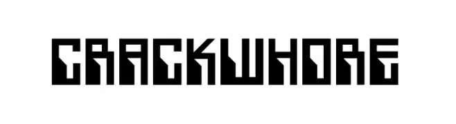
( Fonts by Pierre Enorm Exner - Personal-use only. For commercial use please contact owner. )
A bold, geometric font with sharp angles and a futuristic design.
![Crackwhore font caratteri gratis]() Scaricare 48 Downloads@WebFont
Scaricare 48 Downloads@WebFont -
( Fonts by Fanastudio - Personal-use only. For commercial use please contact owner. )
A graceful script font with elegant loops and high contrast strokes.
![hello olive font caratteri gratis]() Scaricare 48 Downloads@WebFont
Scaricare 48 Downloads@WebFont -
( Fonts by I Putu Gede Krisna - Personal-use only. For commercial use please contact owner. )
A delicate, handwritten font with thin, flowing lines and a whimsical touch.
![Ayunindra Font font caratteri gratis]() Scaricare 48 Downloads@WebFont
Scaricare 48 Downloads@WebFont -
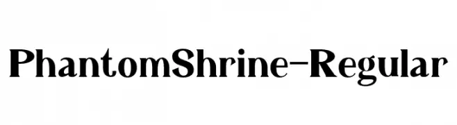
( Fonts by StringLabs - stringlabscreative.com - Personal-use only. For commercial use please contact owner. )
A bold, high-contrast serif font with a classic yet modern appeal.
![PhantomShrine-Regular font caratteri gratis]() Scaricare 48 Downloads@WebFont
Scaricare 48 Downloads@WebFont -
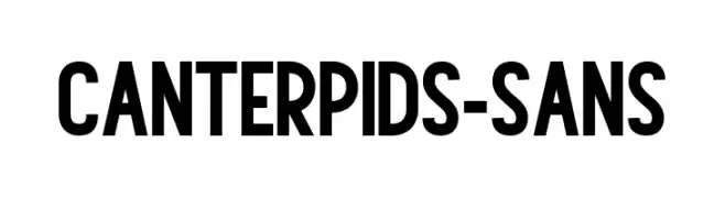
( Fonts by Vz Type - Personal-use only. For commercial use please contact owner. )
A bold, modern sans-serif font with clean lines and a strong presence.
![Canterpids-Sans font caratteri gratis]() Scaricare 48 Downloads@WebFont
Scaricare 48 Downloads@WebFont -
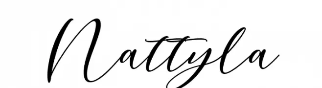
( Fonts by mightype - Personal-use only. For commercial use please contact owner. )
A cursive script font with elegant, flowing lines and a sophisticated style.
![Nattyla font caratteri gratis]() Scaricare 48 Downloads@WebFont
Scaricare 48 Downloads@WebFont


Quali sono i font più popolari adesso?
Poppins, Roboto, Montserrat, Open Sans e Lato sono molto usati per le forme pulite e l'ampia applicabilità — dall'identità di marca alle landing page e ai poster.
Quali font si usano spesso nei loghi?
Le sans serif geometriche (es. Poppins, famiglie in stile Gotham) sono scelte comuni per un branding pulito e scalabile. Per un tocco personale restano valide script e stili manoscritti. Abbina un display deciso per i titoli a un corpo testo neutro per riconoscibilità ed equilibrio.
Ogni quanto si aggiorna la lista?
Con regolarità, in base ai download e all'attività reale. Torna spesso per scoprire in anticipo le nuove preferite.
💡 Consiglio: aggiungi ai preferiti — le tendenze cambiano in fretta e i font top di oggi possono ispirare il rebranding di domani.