Benvenuto nelle Font Più Popolari — dove popolarità e qualità si incontrano. Qui trovi i font più scaricati e usati dell'anno. Se cerchi scelte sicure per logo, web o social, inizia da qui.
Ogni font top si distingue per equilibrio, leggibilità e versatilità. Troverai sans serif moderne, script eleganti, serif vintage e display minimalisti.
-
( Fonts by Phillip Cavette )
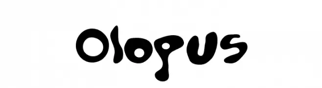
A playful, bold font with an organic and whimsical design.
 Scaricare 367 Downloads@WebFont
 -
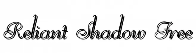
![Reliant Shadow Free font caratteri gratis]() Scaricare 367 Downloads@WebFont
Scaricare 367 Downloads@WebFont -
( Fonts by Omega Font Labs )
A bold, gothic-inspired font with sharp angles and thick strokes.
![Elric font caratteri gratis]() Scaricare 367 Downloads@WebFont
Scaricare 367 Downloads@WebFont -
( Fonts by Jonathan Harris - www.tattoowoo.com )
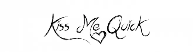
A dynamic, hand-drawn script font with bold, sweeping strokes and artistic flair.
![Kiss Me Quick font caratteri gratis]() Scaricare 367 Downloads@WebFont
Scaricare 367 Downloads@WebFont -
( Fonts by Billy Argel )
A bold, Gothic-style font with sharp, angular lines and intricate detailing.
![BACKSTABFULL font caratteri gratis]() Scaricare 367 Downloads@WebFont
Scaricare 367 Downloads@WebFont -
-
( Fonts by Paul Reid - tracertong.co.uk )
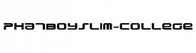
A bold, futuristic font with geometric shapes and clean lines.
![PhatBoySlim-College font caratteri gratis]() Scaricare 367 Downloads@WebFont
Scaricare 367 Downloads@WebFont -
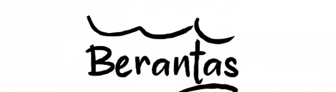
( Fonts by wep )
A bold, handwritten font with a playful and casual style.
![Berantas_ font caratteri gratis]() Scaricare 367 Downloads@WebFont
Scaricare 367 Downloads@WebFont -
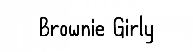
( Fonts by OCSstudio )
A playful, hand-drawn font with rounded, uniform characters and a whimsical style.
![Brownie Girly font caratteri gratis]() Scaricare 367 Downloads@WebFont
Scaricare 367 Downloads@WebFont -
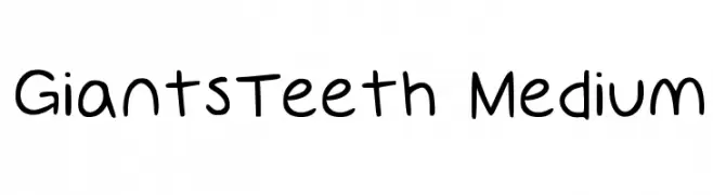
( www.GiantsTeeth.com )
A playful, handwritten-style font with consistent stroke thickness and a casual appearance.
![GiantsTeeth Medium font caratteri gratis]() Scaricare 367 Downloads@WebFont
Scaricare 367 Downloads@WebFont -
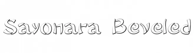
![Sayonara Beveled font caratteri gratis]() Scaricare 367 Downloads@WebFont
Scaricare 367 Downloads@WebFont


Quali sono i font più popolari adesso?
Poppins, Roboto, Montserrat, Open Sans e Lato sono molto usati per le forme pulite e l'ampia applicabilità — dall'identità di marca alle landing page e ai poster.
Quali font si usano spesso nei loghi?
Le sans serif geometriche (es. Poppins, famiglie in stile Gotham) sono scelte comuni per un branding pulito e scalabile. Per un tocco personale restano valide script e stili manoscritti. Abbina un display deciso per i titoli a un corpo testo neutro per riconoscibilità ed equilibrio.
Ogni quanto si aggiorna la lista?
Con regolarità, in base ai download e all'attività reale. Torna spesso per scoprire in anticipo le nuove preferite.
💡 Consiglio: aggiungi ai preferiti — le tendenze cambiano in fretta e i font top di oggi possono ispirare il rebranding di domani.