Benvenuto nelle Font Più Popolari — dove popolarità e qualità si incontrano. Qui trovi i font più scaricati e usati dell'anno. Se cerchi scelte sicure per logo, web o social, inizia da qui.
Ogni font top si distingue per equilibrio, leggibilità e versatilità. Troverai sans serif moderne, script eleganti, serif vintage e display minimalisti.
-
( Fonts by Al Ghul - Personal-use only. For commercial use please contact owner. )
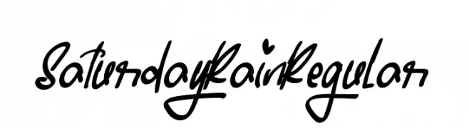
A dynamic, handwritten font with bold, fluid strokes and a playful, informal style.
 Scaricare 47 Downloads@WebFont
 -
( Fonts by Amru ID - Personal-use only. For commercial use please contact owner. )
A modern italic font with smooth curves and a sleek design.
![Andala Italic font caratteri gratis]() Scaricare 47 Downloads@WebFont
Scaricare 47 Downloads@WebFont -
( Fonts by Attype Studio - Fadli Ramadhan Iskandar - Personal-use only. For commercial use please contact owner. )
A decorative font with uppercase letters in leafy wreaths, perfect for festive projects.
![Shanty Christmas Monogram Reg font caratteri gratis]() Scaricare 47 Downloads@WebFont
Scaricare 47 Downloads@WebFont -
( Fonts by Denny Subagja - Personal-use only. For commercial use please contact owner. )
A playful and elegant script font with flowing, cursive letterforms.
![Angitany font caratteri gratis]() Scaricare 47 Downloads@WebFont
Scaricare 47 Downloads@WebFont -
( Fonts by Typnco Studio - Personal-use only. For commercial use please contact owner. )
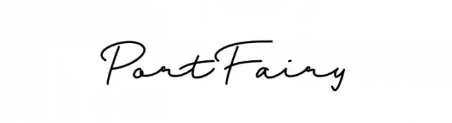
A fluid and elegant script font with smooth, flowing lines and cursive letterforms.
![Port Fairy font caratteri gratis]() Scaricare 47 Downloads@WebFont
Scaricare 47 Downloads@WebFont -
( Fonts by Vunira Design - Personal-use only. For commercial use please contact owner. )
A bold, modern script font with elegant loops and high contrast.
![MaybelinFREE font caratteri gratis]() Scaricare 47 Downloads@WebFont
Scaricare 47 Downloads@WebFont -
( Fonts by Yahhya Anas - Personal-use only. For commercial use please contact owner. )
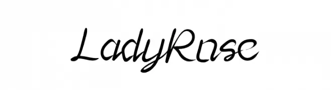
An elegant script font with fluid, cursive strokes and sophisticated style.
![Lady Rose font caratteri gratis]() Scaricare 47 Downloads@WebFont
Scaricare 47 Downloads@WebFont -
( Fonts by Kong Font - fontkong.com - Personal-use only. For commercial use please contact owner. )
An elegant, flowing cursive font with a dynamic and graceful style.
![Saggitarius Italic font caratteri gratis]() Scaricare 47 Downloads@WebFont
Scaricare 47 Downloads@WebFont -
( Fonts by Integritype Studio )
Elegant script font with intricate swirls.
![Chandler Beautiful font caratteri gratis]() Scaricare 47 Downloads@WebFont
Scaricare 47 Downloads@WebFont -
( Fonts by Daniel Zadorozny - www.iconian.com - Personal-use only. For commercial use please contact owner. )
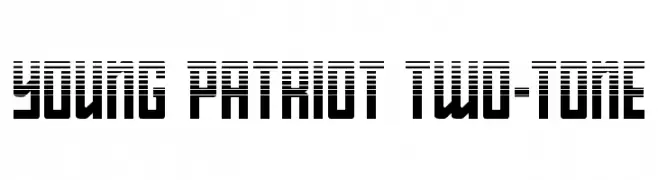
A bold, geometric font with a two-tone striped design.
![Young Patriot Two-Tone font caratteri gratis]() Scaricare 47 Downloads@WebFont
Scaricare 47 Downloads@WebFont -
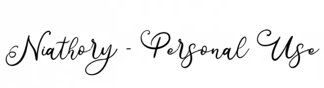
( Fonts by Attype Studio - Fadli Ramadhan Iskandar - Personal-use only. For commercial use please contact owner. )
An elegant cursive font with decorative swirls and flowing lines.
![Niathory - Personal Use font caratteri gratis]() Scaricare 47 Downloads@WebFont
Scaricare 47 Downloads@WebFont -
( Fonts by Maulana Creative - Gilang Maulana - Personal-use only. For commercial use please contact owner. )
A bold, brush-style font with dynamic, artistic strokes.
![Bestro Free font caratteri gratis]() Scaricare 47 Downloads@WebFont
Scaricare 47 Downloads@WebFont -
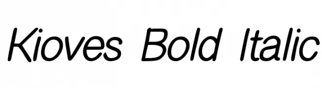
( Fonts by Siti Nurjannah - Personal-use only. For commercial use please contact owner. )
A bold, italicized modern font with sleek, consistent strokes and balanced spacing.
![Kioves Bold Italic font caratteri gratis]() Scaricare 47 Downloads@WebFont
Scaricare 47 Downloads@WebFont -
( Fonts by Edric Studio - Personal-use only. For commercial use please contact owner. )
A bold, angular font with a modern and edgy style, perfect for impactful designs.
![SimpleCharacter Demo font caratteri gratis]() Scaricare 47 Downloads@WebFont
Scaricare 47 Downloads@WebFont -
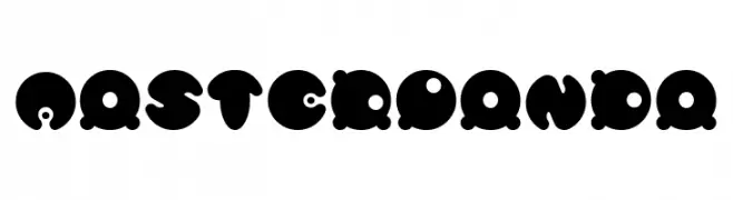
( Fonts by weknow - Wino S Kadir - Personal-use only. For commercial use please contact owner. )
A playful, bold font with rounded, bubble-like characters and unique cutouts.
![MASTER PANDA font caratteri gratis]() Scaricare 47 Downloads@WebFont
Scaricare 47 Downloads@WebFont -
( Fonts by Alpaprana - Personal-use only. For commercial use please contact owner. )
A playful, bold font with rounded, bubbly characters and a handwritten style.
![Snow Candy font caratteri gratis]() Scaricare 47 Downloads@WebFont
Scaricare 47 Downloads@WebFont -
( Fonts by Typnco Studio - Personal-use only. For commercial use please contact owner. )
A fluid and elegant script font with dynamic letterforms.
![Geuliss font caratteri gratis]() Scaricare 47 Downloads@WebFont
Scaricare 47 Downloads@WebFont -
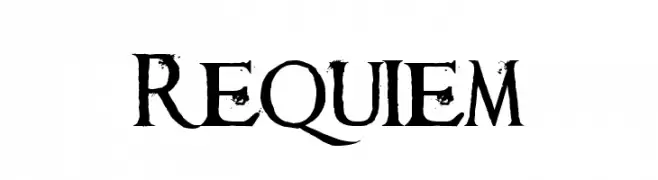
( Fonts by Kacper Seredyn - Personal-use only. For commercial use please contact owner. )
A distressed serif font with a vintage, grunge aesthetic.
![Requiem font caratteri gratis]() Scaricare 47 Downloads@WebFont
Scaricare 47 Downloads@WebFont -
( Fonts by DmLetter31 - Dimas Prasetyo - Personal-use only. For commercial use please contact owner. )
A dynamic handwritten font with fluid, continuous strokes and a casual elegance.
![Bambang font caratteri gratis]() Scaricare 47 Downloads@WebFont
Scaricare 47 Downloads@WebFont -
( Fonts by Subectype & Orenari - Rangga Subekti & Ari - Personal-use only. For commercial use please contact owner. )
A decorative script font with elegant swirls and flourishes.
![Herlambang font caratteri gratis]() Scaricare 47 Downloads@WebFont
Scaricare 47 Downloads@WebFont -
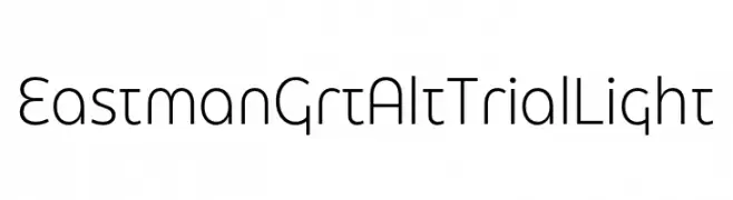
( Fonts by Zetafonts - Personal-use only. For commercial use please contact owner. )
A modern, geometric sans-serif font with clean lines and a minimalistic style.
![Eastman Grt Alt Trial Light font caratteri gratis]() Scaricare 47 Downloads@WebFont
Scaricare 47 Downloads@WebFont -
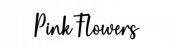
( Fonts by Wahyu Studio - Wahyu Setiyawan - Personal-use only. For commercial use please contact owner. )
A lively and elegant script font with smooth, cursive letterforms.
![Pink Flowers font caratteri gratis]() Scaricare 47 Downloads@WebFont
Scaricare 47 Downloads@WebFont -
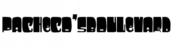
( Fonts by Woodcutter )
A bold, blocky font with a strong and impactful design.
![Pacheco's Boulevard font caratteri gratis]() Scaricare 47 Downloads@WebFont
Scaricare 47 Downloads@WebFont -
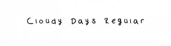
( Fonts by Claudia Kills - Personal-use only. For commercial use please contact owner. )
A playful handwritten font with irregular strokes and a casual feel.
![Cloudy Days Regular font caratteri gratis]() Scaricare 47 Downloads@WebFont
Scaricare 47 Downloads@WebFont -
( Fonts by Letterara - Thomas Aradea - Personal-use only. For commercial use please contact owner. )
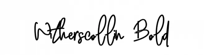
A lively, handwritten font with dynamic strokes and playful character.
![Witherscollin Bold font caratteri gratis]() Scaricare 47 Downloads@WebFont
Scaricare 47 Downloads@WebFont -
( Fonts by Hugefonts - Personal-use only. For commercial use please contact owner. )
A dynamic, cursive script font with fluid strokes and high contrast.
![Fatigod font caratteri gratis]() Scaricare 47 Downloads@WebFont
Scaricare 47 Downloads@WebFont -
( Fonts by Royaltype - Darwinoo - Personal-use only. For commercial use please contact owner. )
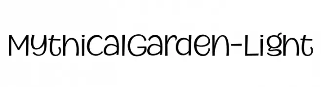
A whimsical, handwritten-style font with playful and rounded characters.
![MythicalGarden-Light font caratteri gratis]() Scaricare 47 Downloads@WebFont
Scaricare 47 Downloads@WebFont -
( Fonts by TypeType Foundry )
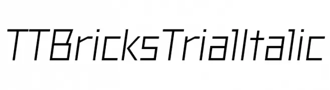
A modern, geometric italic font with clean lines and sharp angles.
![TT Bricks Trial Italic font caratteri gratis]() Scaricare 47 Downloads@WebFont
Scaricare 47 Downloads@WebFont -
( Fonts by Denny Subagja - Personal-use only. For commercial use please contact owner. )
A graceful script font with flowing, interconnected letters and a modern classic appeal.
![Gemblo font caratteri gratis]() Scaricare 47 Downloads@WebFont
Scaricare 47 Downloads@WebFont -
( Fonts by Rantautype - Yudi Pratama Chandra - Personal-use only. For commercial use please contact owner. )
A flowing cursive font with elegant, connected characters.
![Thea Amelia font caratteri gratis]() Scaricare 47 Downloads@WebFont
Scaricare 47 Downloads@WebFont -
( Fonts by Edric Studio - Personal-use only. For commercial use please contact owner. )
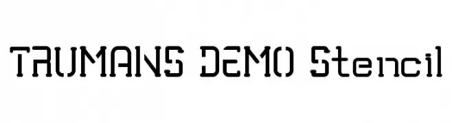
A bold, industrial stencil font with geometric shapes and high legibility.
![TRUMANS DEMO Stencil font caratteri gratis]() Scaricare 47 Downloads@WebFont
Scaricare 47 Downloads@WebFont -
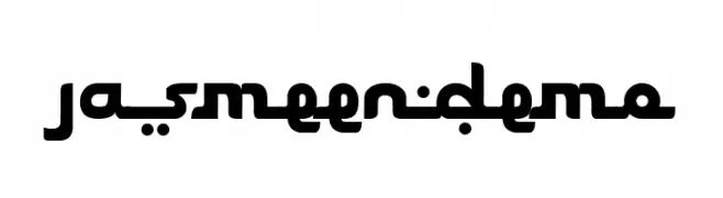
( Fonts by Ketapel Creative - Personal-use only. For commercial use please contact owner. )
A bold, modern font with geometric and rounded characters.
![Jasmeen_demo font caratteri gratis]() Scaricare 47 Downloads@WebFont
Scaricare 47 Downloads@WebFont -
( Fonts by StringLabs - stringlabscreative.com - Personal-use only. For commercial use please contact owner. )
A playful, bold, and rounded font with a hand-drawn feel.
![Sandy Kids font caratteri gratis]() Scaricare 47 Downloads@WebFont
Scaricare 47 Downloads@WebFont -
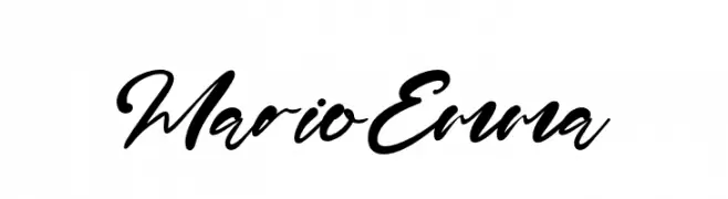
( Fonts by Kong Font - fontkong.com - Personal-use only. For commercial use please contact owner. )
A bold, cursive script font with a fluid, handwritten style.
![MarioEmma font caratteri gratis]() Scaricare 47 Downloads@WebFont
Scaricare 47 Downloads@WebFont -
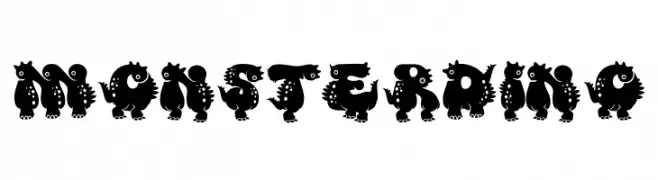
( Fonts by Edy Wiyono )
A playful, monster-themed font with bold, cartoonish characters.
![Monster DIno font caratteri gratis]() Scaricare 47 Downloads@WebFont
Scaricare 47 Downloads@WebFont


Quali sono i font più popolari adesso?
Poppins, Roboto, Montserrat, Open Sans e Lato sono molto usati per le forme pulite e l'ampia applicabilità — dall'identità di marca alle landing page e ai poster.
Quali font si usano spesso nei loghi?
Le sans serif geometriche (es. Poppins, famiglie in stile Gotham) sono scelte comuni per un branding pulito e scalabile. Per un tocco personale restano valide script e stili manoscritti. Abbina un display deciso per i titoli a un corpo testo neutro per riconoscibilità ed equilibrio.
Ogni quanto si aggiorna la lista?
Con regolarità, in base ai download e all'attività reale. Torna spesso per scoprire in anticipo le nuove preferite.
💡 Consiglio: aggiungi ai preferiti — le tendenze cambiano in fretta e i font top di oggi possono ispirare il rebranding di domani.