Benvenuto nelle Font Più Popolari — dove popolarità e qualità si incontrano. Qui trovi i font più scaricati e usati dell'anno. Se cerchi scelte sicure per logo, web o social, inizia da qui.
Ogni font top si distingue per equilibrio, leggibilità e versatilità. Troverai sans serif moderne, script eleganti, serif vintage e display minimalisti.
-
( Fonts by Woodcutter )
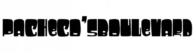
A bold, blocky font with a strong and impactful design.
 Scaricare 47 Downloads@WebFont
 -
( Fonts by Vladimir Nikolic - www.creativefabrica.com/designer/vladimirnikolic/ - Personal-use only. For commercial use please contact owner. )
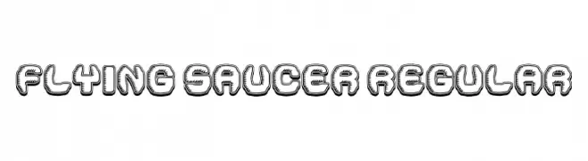
A playful, 3D bubble-like font with retro comic book aesthetics.
![Flying Saucer Regular font caratteri gratis]() Scaricare 47 Downloads@WebFont
Scaricare 47 Downloads@WebFont -
( Fonts by Claudia Kills - Personal-use only. For commercial use please contact owner. )
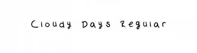
A playful handwritten font with irregular strokes and a casual feel.
![Cloudy Days Regular font caratteri gratis]() Scaricare 47 Downloads@WebFont
Scaricare 47 Downloads@WebFont -
( Fonts by Letterara - Thomas Aradea - Personal-use only. For commercial use please contact owner. )
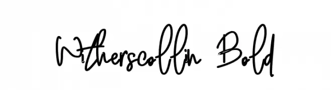
A lively, handwritten font with dynamic strokes and playful character.
![Witherscollin Bold font caratteri gratis]() Scaricare 47 Downloads@WebFont
Scaricare 47 Downloads@WebFont -
( Fonts by Hugefonts - Personal-use only. For commercial use please contact owner. )
A dynamic, cursive script font with fluid strokes and high contrast.
![Fatigod font caratteri gratis]() Scaricare 47 Downloads@WebFont
Scaricare 47 Downloads@WebFont -
( Fonts by Royaltype - Darwinoo - Personal-use only. For commercial use please contact owner. )
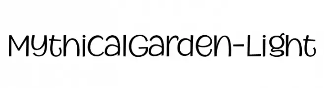
A whimsical, handwritten-style font with playful and rounded characters.
![MythicalGarden-Light font caratteri gratis]() Scaricare 47 Downloads@WebFont
Scaricare 47 Downloads@WebFont -
( Fonts by TypeType Foundry )
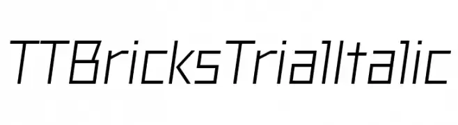
A modern, geometric italic font with clean lines and sharp angles.
![TT Bricks Trial Italic font caratteri gratis]() Scaricare 47 Downloads@WebFont
Scaricare 47 Downloads@WebFont -
( Fonts by Denny Subagja - Personal-use only. For commercial use please contact owner. )
A graceful script font with flowing, interconnected letters and a modern classic appeal.
![Gemblo font caratteri gratis]() Scaricare 47 Downloads@WebFont
Scaricare 47 Downloads@WebFont -
( Fonts by Rantautype - Yudi Pratama Chandra - Personal-use only. For commercial use please contact owner. )
A flowing cursive font with elegant, connected characters.
![Thea Amelia font caratteri gratis]() Scaricare 47 Downloads@WebFont
Scaricare 47 Downloads@WebFont -
( Fonts by Edric Studio - Personal-use only. For commercial use please contact owner. )
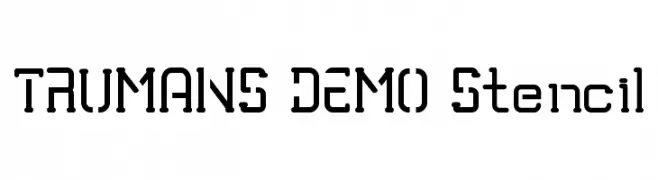
A bold, industrial stencil font with geometric shapes and high legibility.
![TRUMANS DEMO Stencil font caratteri gratis]() Scaricare 47 Downloads@WebFont
Scaricare 47 Downloads@WebFont -
( Fonts by Ketapel Creative - Personal-use only. For commercial use please contact owner. )
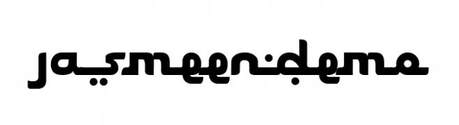
A bold, modern font with geometric and rounded characters.
![Jasmeen_demo font caratteri gratis]() Scaricare 47 Downloads@WebFont
Scaricare 47 Downloads@WebFont -
( Fonts by StringLabs - stringlabscreative.com - Personal-use only. For commercial use please contact owner. )
A playful, bold, and rounded font with a hand-drawn feel.
![Sandy Kids font caratteri gratis]() Scaricare 47 Downloads@WebFont
Scaricare 47 Downloads@WebFont -
( Fonts by Kong Font - fontkong.com - Personal-use only. For commercial use please contact owner. )
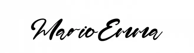
A bold, cursive script font with a fluid, handwritten style.
![MarioEmma font caratteri gratis]() Scaricare 47 Downloads@WebFont
Scaricare 47 Downloads@WebFont -
( Fonts by Edy Wiyono )
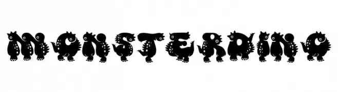
A playful, monster-themed font with bold, cartoonish characters.
![Monster DIno font caratteri gratis]() Scaricare 47 Downloads@WebFont
Scaricare 47 Downloads@WebFont -
( Fonts by Bearytype - Dian Hadi - Personal-use only. For commercial use please contact owner. )
A playful, whimsical script font with heart embellishments and bold strokes.
![miss you font caratteri gratis]() Scaricare 47 Downloads@WebFont
Scaricare 47 Downloads@WebFont -
( Fonts by Perspectype Studio - Personal-use only. For commercial use please contact owner. )
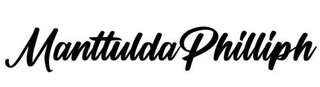
A bold, expressive script font with fluid, dynamic strokes and high contrast.
![Manttulda Philliph font caratteri gratis]() Scaricare 47 Downloads@WebFont
Scaricare 47 Downloads@WebFont -
( Fonts by Sancrea Studio - Ade Santani - Personal-use only. For commercial use please contact owner. )
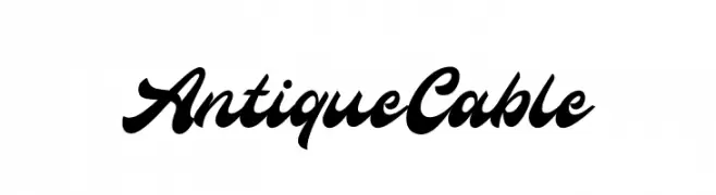
A bold, flowing script font with elegant, interconnected characters.
![Antique Cable font caratteri gratis]() Scaricare 47 Downloads@WebFont
Scaricare 47 Downloads@WebFont -
( Fonts by Vunira Design - Personal-use only. For commercial use please contact owner. )
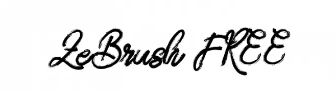
A dynamic brush script font with fluid, expressive strokes.
![ZeBrush FREE font caratteri gratis]() Scaricare 47 Downloads@WebFont
Scaricare 47 Downloads@WebFont -
( Fonts by Syaf Rizal - Khurasan - Personal-use only. For commercial use please contact owner. )
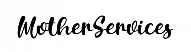
A bold, flowing script font with elegant, interconnected characters.
![Mother Services font caratteri gratis]() Scaricare 47 Downloads@WebFont
Scaricare 47 Downloads@WebFont -
( Fonts by Mocha Frappuccino - Personal-use only. For commercial use please contact owner. )
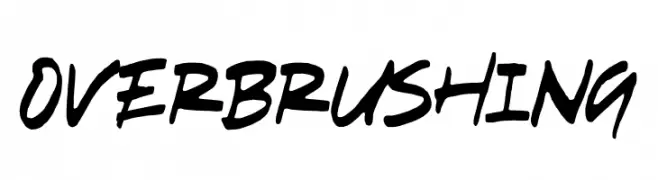
Bold brush-style script font with dynamic strokes.
![Overbrushing font caratteri gratis]() Scaricare 47 Downloads@WebFont
Scaricare 47 Downloads@WebFont -
( Fonts by Almarkhatype - Abdul Malik Wisnu - Personal-use only. For commercial use please contact owner. )
An elegant, flowing script font with a handwritten style.
![Sindenetta font caratteri gratis]() Scaricare 47 Downloads@WebFont
Scaricare 47 Downloads@WebFont -
( Fonts by Perspectype Studio - Personal-use only. For commercial use please contact owner. )
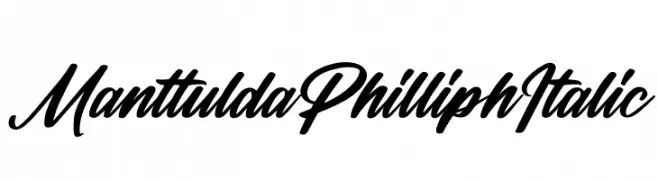
A dynamic, flowing script font with elegant, connected letterforms.
![Manttulda Philliph Italic font caratteri gratis]() Scaricare 47 Downloads@WebFont
Scaricare 47 Downloads@WebFont -
( Fonts by Sutrisno Al Rasyid - Personal-use only. For commercial use please contact owner. )
A delicate, elegant script font with flowing, interconnected characters.
![Charles Bridge Regular font caratteri gratis]() Scaricare 47 Downloads@WebFont
Scaricare 47 Downloads@WebFont -
( Fonts by ingoFonts - Ingo Zimmermann - Personal-use only. For commercial use please contact owner. )
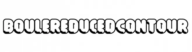
A bold, playful font with thick outlines and rounded, bubbly characters.
![Boule Reduced Contour font caratteri gratis]() Scaricare 47 Downloads@WebFont
Scaricare 47 Downloads@WebFont -
( Fonts by Daniel Zadorozny - www.iconian.com - Personal-use only. For commercial use please contact owner. )
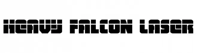
A bold, geometric font with a futuristic and modern aesthetic.
![Heavy Falcon Laser font caratteri gratis]() Scaricare 47 Downloads@WebFont
Scaricare 47 Downloads@WebFont -
( Fonts by Syaf Rizal - Khurasan - Personal-use only. For commercial use please contact owner. )
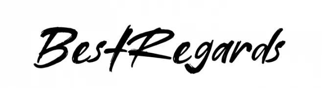
A bold, expressive script font with a handwritten, brush-like style.
![Best Regards font caratteri gratis]() Scaricare 47 Downloads@WebFont
Scaricare 47 Downloads@WebFont -
( Fonts by Woodcutter Manero - www.woodcutter.es - Personal-use only. For commercial use please contact owner. )
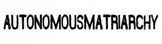
Distressed, hand-drawn display font with rough, sketchy strokes.
![Autonomous Matriarchy font caratteri gratis]() Scaricare 47 Downloads@WebFont
Scaricare 47 Downloads@WebFont -
( Fonts by Ardi Santoso - Personal-use only. For commercial use please contact owner. )
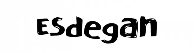
A bold, playful font with a hand-drawn, distressed look.
![Esdegan font caratteri gratis]() Scaricare 47 Downloads@WebFont
Scaricare 47 Downloads@WebFont -
( Fonts by Analogous Studio - Muhammad Ilham - Personal-use only. For commercial use please contact owner. )
A modern, elegant script font with a dynamic slant and smooth curves.
![mahony font caratteri gratis]() Scaricare 47 Downloads@WebFont
Scaricare 47 Downloads@WebFont -
( Fonts by Shara Weber - Personal-use only. For commercial use please contact owner. )
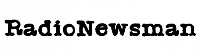
A bold, distressed font with a vintage typewriter style.
![Radio Newsman font caratteri gratis]() Scaricare 47 Downloads@WebFont
Scaricare 47 Downloads@WebFont -
( Fonts by Kong Font - fontkong.com - Personal-use only. For commercial use please contact owner. )
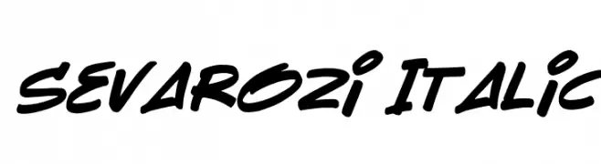
A bold, italic font with smooth curves and a dynamic, modern style.
![Sevarozi Italic font caratteri gratis]() Scaricare 47 Downloads@WebFont
Scaricare 47 Downloads@WebFont -
( Fonts by Brittney Murphy Design - Brittney Murphy - Personal-use only. For commercial use please contact owner. )
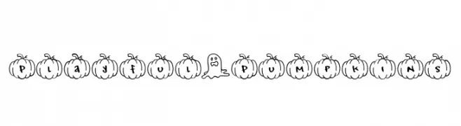
A playful, pumpkin-themed font with a hand-drawn, cartoonish style.
![Playful*Pumpkins font caratteri gratis]() Scaricare 47 Downloads@WebFont
Scaricare 47 Downloads@WebFont -
( Fonts by Iconian Fonts - Daniel Zadorozny - Personal-use only. For commercial use please contact owner. )
A bold, italic, and futuristic font with angular, geometric characters.
![Flight Corps Title Italic font caratteri gratis]() Scaricare 47 Downloads@WebFont
Scaricare 47 Downloads@WebFont -
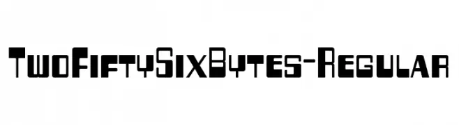
( Fonts by Typodermic Fonts - Raymond Larabie - Personal-use only. For commercial use please contact owner. )
A bold, geometric font with a modern, digital aesthetic.
![TwoFiftySixBytes-Regular font caratteri gratis]() Scaricare 47 Downloads@WebFont
Scaricare 47 Downloads@WebFont -
( Fonts by twinletter )
A bold, playful font with thick, rounded characters and a bubbly appearance.
![CIROYATrial-Regular font caratteri gratis]() Scaricare 47 Downloads@WebFont
Scaricare 47 Downloads@WebFont


Quali sono i font più popolari adesso?
Poppins, Roboto, Montserrat, Open Sans e Lato sono molto usati per le forme pulite e l'ampia applicabilità — dall'identità di marca alle landing page e ai poster.
Quali font si usano spesso nei loghi?
Le sans serif geometriche (es. Poppins, famiglie in stile Gotham) sono scelte comuni per un branding pulito e scalabile. Per un tocco personale restano valide script e stili manoscritti. Abbina un display deciso per i titoli a un corpo testo neutro per riconoscibilità ed equilibrio.
Ogni quanto si aggiorna la lista?
Con regolarità, in base ai download e all'attività reale. Torna spesso per scoprire in anticipo le nuove preferite.
💡 Consiglio: aggiungi ai preferiti — le tendenze cambiano in fretta e i font top di oggi possono ispirare il rebranding di domani.