Benvenuto nelle Font Più Popolari — dove popolarità e qualità si incontrano. Qui trovi i font più scaricati e usati dell'anno. Se cerchi scelte sicure per logo, web o social, inizia da qui.
Ogni font top si distingue per equilibrio, leggibilità e versatilità. Troverai sans serif moderne, script eleganti, serif vintage e display minimalisti.
-
( Copyright (c) 2011, Andreu Balius (http://www.typerepublic.com) )
A modern-vintage serif font with elegant curves and balanced weight.
 Scaricare 1354 Downloads@WebFont
 -
![Emma 65 font caratteri gratis]() Scaricare 1354 Downloads@WebFont
Scaricare 1354 Downloads@WebFont -
( Fonts by Graham Meade - GemFonts )
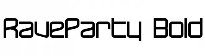
A bold, geometric font with a futuristic and modern design.
![RaveParty Bold font caratteri gratis]() Scaricare 1354 Downloads@WebFont
Scaricare 1354 Downloads@WebFont -
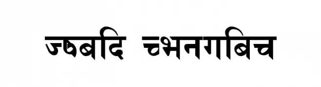
![Himalb Regular font caratteri gratis]() Scaricare 1354 Downloads@WebFont
Scaricare 1354 Downloads@WebFont -
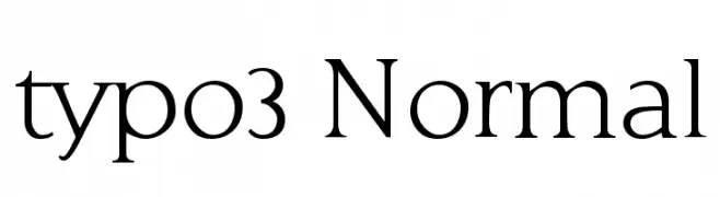
![typo3 Normal font caratteri gratis]() Scaricare 1354 Downloads@WebFont
Scaricare 1354 Downloads@WebFont -
( Fonts by www.junkohanhero.com )
A bold, distressed font with a grunge aesthetic and textured appearance.
![60sekuntia font caratteri gratis]() Scaricare 1354 Downloads@WebFont
Scaricare 1354 Downloads@WebFont -
( Fonts by zulkhairilettering - Zulkhairi M Saleh - Personal-use only. For commercial use please contact owner. )
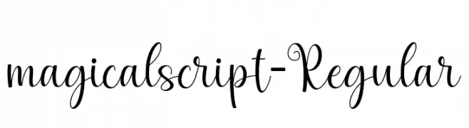
A whimsical, cursive font with elegant loops and swirls.
![magicalscript-Regular font caratteri gratis]() Scaricare 1353 Downloads@WebFont
Scaricare 1353 Downloads@WebFont -
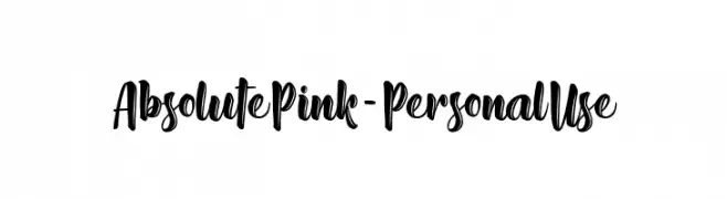
![Absolute Pink - Personal Use font caratteri gratis]() Scaricare 1353 Downloads@WebFont
Scaricare 1353 Downloads@WebFont -
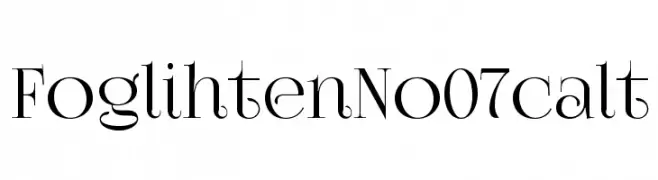
( gluk - Grzegorz l - www.glukfonts.pl )
An elegant serif font with high contrast and sophisticated curves.
![FoglihtenNo07calt font caratteri gratis]() Scaricare 1353 Downloads@WebFont
Scaricare 1353 Downloads@WebFont -
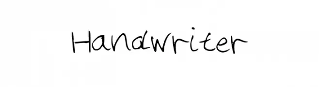
( www.leodsen.com )
A casual, handwritten font with a warm, personal touch.
![Handwriter font caratteri gratis]() Scaricare 1353 Downloads@WebFont
Scaricare 1353 Downloads@WebFont -
( Copyright (c) 2011 Alejandro Paul (sudtipos@sudtipos.com) )
An elegant script font with intricate swashes and flowing lines.
![MissFajardose-Regular font caratteri gratis]() Scaricare 1353 Downloads@WebFont
Scaricare 1353 Downloads@WebFont -
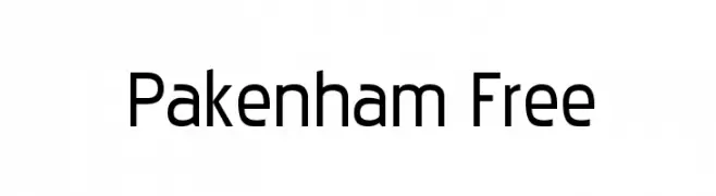
![Pakenham Free font caratteri gratis]() Scaricare 1353 Downloads@WebFont
Scaricare 1353 Downloads@WebFont -
( Fonts by Manfred Klein. Free for private and charity use. Free for commercial with donation to organizations )
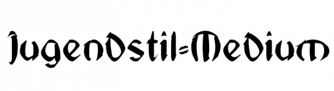
A bold, artistic font with flowing, organic forms inspired by Art Nouveau.
![Jugendstil-Medium font caratteri gratis]() Scaricare 1353 Downloads@WebFont
Scaricare 1353 Downloads@WebFont -
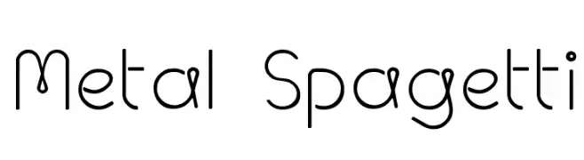
![Metal Spagetti font caratteri gratis]() Scaricare 1353 Downloads@WebFont
Scaricare 1353 Downloads@WebFont -
( Fonts by Apostrophic Lab )
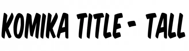
A bold, playful font with tall, narrow, and slightly slanted characters.
![Komika Title - Tall font caratteri gratis]() Scaricare 1353 Downloads@WebFont
Scaricare 1353 Downloads@WebFont -
![VTCKomixationSCBold font caratteri gratis]() Scaricare 1353 Downloads@WebFont
Scaricare 1353 Downloads@WebFont -
![Type2 font caratteri gratis]() Scaricare 1353 Downloads@WebFont
Scaricare 1353 Downloads@WebFont -
![Premi font caratteri gratis]() Scaricare 1353 Downloads@WebFont
Scaricare 1353 Downloads@WebFont -
( Fonts by Fenny Wiryani - Personal-use only. For commercial use please contact owner. )
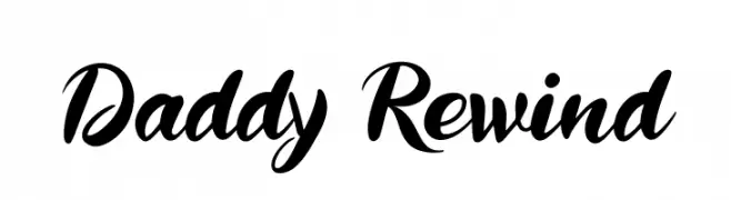
A dynamic and flowing script font with elegant, cursive letterforms.
![Daddy Rewind font caratteri gratis]() Scaricare 1352 Downloads@WebFont
Scaricare 1352 Downloads@WebFont -
( Fonts by Noah Type )
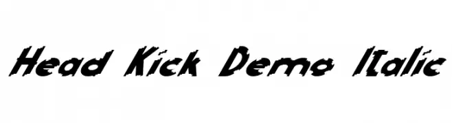
A bold, italic font with sharp, angular edges and dynamic style.
![Head Kick Demo Italic font caratteri gratis]() Scaricare 1352 Downloads@WebFont
Scaricare 1352 Downloads@WebFont -
( Iconian Fonts - Daniel Zadorozny - www.iconian.com )
A bold, semi-italic font with a dynamic and modern style.
![Americorps Semi-Italic font caratteri gratis]() Scaricare 1352 Downloads@WebFont
Scaricare 1352 Downloads@WebFont -
( Copyright (c) 2015, Cadson Demak (info@cadsondemak.com) )
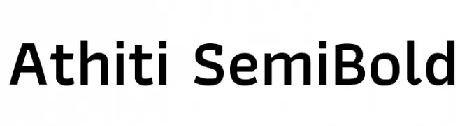
A clean, modern sans-serif font with a semi-bold weight and medium contrast.
![Athiti SemiBold font caratteri gratis]() Scaricare 1352 Downloads@WebFont
Scaricare 1352 Downloads@WebFont -
![1938 STeMPEL font caratteri gratis]() Scaricare 1352 Downloads@WebFont
Scaricare 1352 Downloads@WebFont -
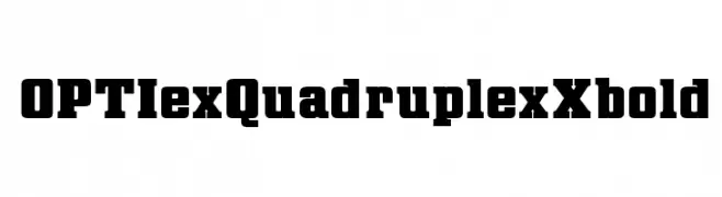
( Fonts by Castcraft Software - OPTI Fonts Archive - opti.netii.net - Personal-use only. For commercial use please contact owner. )
A bold, slab serif font with a strong, geometric design.
![OPTIexQuadruplexXbold font caratteri gratis]() Scaricare 1352 Downloads@WebFont
Scaricare 1352 Downloads@WebFont -
Caratteri di krraaa. For commercial use please contact the owner.
( Fonts by Lukas Krakora - Free for personal use )
A vintage typewriter-style font with a textured, elegant appearance.
![ELEGANT TYPEWRITER font caratteri gratis]() Scaricare 1352 Downloads@WebFont
Scaricare 1352 Downloads@WebFont -
( Font by Jayvee D. Enaguas - grandchaos9000.deviantart.com )
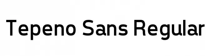
A modern, clean sans-serif font with geometric letterforms.
![Tepeno Sans Regular font caratteri gratis]() Scaricare 1352 Downloads@WebFont
Scaricare 1352 Downloads@WebFont -
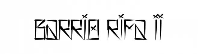
( Free for personal use - www.facebook.com/rs.desiign )
A bold, angular font with a graffiti-inspired, edgy design.
![Barrio Rifa II font caratteri gratis]() Scaricare 1352 Downloads@WebFont
Scaricare 1352 Downloads@WebFont -
( Fonts by Denise Bentulan - douxiegirl.com. Personal-use only. For commercial use please contact owner. )
A playful, handwritten font with a continuous, cursive-like style.
![Soymilk font caratteri gratis]() Scaricare 1352 Downloads@WebFont
Scaricare 1352 Downloads@WebFont -
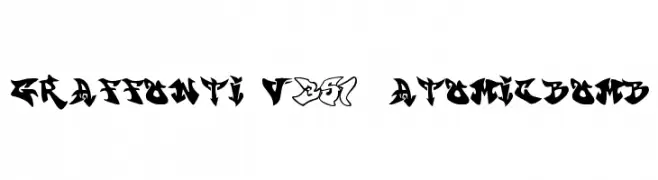
![graffonti v351 atomicbomb font caratteri gratis]() Scaricare 1352 Downloads@WebFont
Scaricare 1352 Downloads@WebFont -
![Sling Bold font caratteri gratis]() Scaricare 1352 Downloads@WebFont
Scaricare 1352 Downloads@WebFont -
( Fonts by Cumberland Fontworks - http://www222.pair.com/sjohn/fonts.htm - S. John Ross )
A playful, hand-drawn font with a whimsical and informal style.
![Always Joking font caratteri gratis]() Scaricare 1352 Downloads@WebFont
Scaricare 1352 Downloads@WebFont -
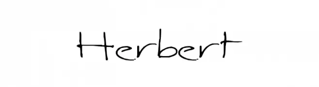
( Fonts by Uddi Uddi )
A casual, handwritten font with free-flowing strokes and uneven spacing.
![Herbert font caratteri gratis]() Scaricare 1352 Downloads@WebFont
Scaricare 1352 Downloads@WebFont -
( Fonts by MADType )
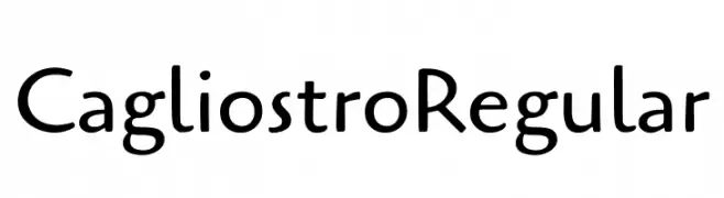
A modern, geometric font with a warm, approachable style.
![Cagliostro Regular font caratteri gratis]() Scaricare 1351 Downloads@WebFont
Scaricare 1351 Downloads@WebFont -
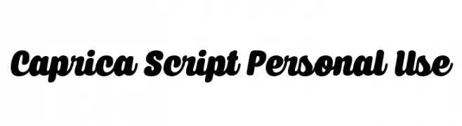
( Måns Grebäck - www.mansgreback.com )
A bold, flowing script font with smooth, connected letters and a friendly appearance.
![Caprica Script Personal Use font caratteri gratis]() Scaricare 1351 Downloads@WebFont
Scaricare 1351 Downloads@WebFont -
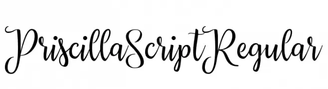
( Fonts by ianmikraz.com - Personal-use only. For commercial use please contact owner. )
An elegant script font with flowing, interconnected characters and ornate flourishes.
![Priscilla Script Regular font caratteri gratis]() Scaricare 1351 Downloads@WebFont
Scaricare 1351 Downloads@WebFont


Quali sono i font più popolari adesso?
Poppins, Roboto, Montserrat, Open Sans e Lato sono molto usati per le forme pulite e l'ampia applicabilità — dall'identità di marca alle landing page e ai poster.
Quali font si usano spesso nei loghi?
Le sans serif geometriche (es. Poppins, famiglie in stile Gotham) sono scelte comuni per un branding pulito e scalabile. Per un tocco personale restano valide script e stili manoscritti. Abbina un display deciso per i titoli a un corpo testo neutro per riconoscibilità ed equilibrio.
Ogni quanto si aggiorna la lista?
Con regolarità, in base ai download e all'attività reale. Torna spesso per scoprire in anticipo le nuove preferite.
💡 Consiglio: aggiungi ai preferiti — le tendenze cambiano in fretta e i font top di oggi possono ispirare il rebranding di domani.