Benvenuto nelle Font Più Popolari — dove popolarità e qualità si incontrano. Qui trovi i font più scaricati e usati dell'anno. Se cerchi scelte sicure per logo, web o social, inizia da qui.
Ogni font top si distingue per equilibrio, leggibilità e versatilità. Troverai sans serif moderne, script eleganti, serif vintage e display minimalisti.
-
( Fonts by Akifatype Studio - Personal-use only. For commercial use please contact owner. )
An elegant, cursive script font with flowing, interconnected strokes.
 Scaricare 47 Downloads@WebFont
 -
( Fonts by Green Adventure Studio - Ardi Parwito - Personal-use only. For commercial use please contact owner. )
A bold, handwritten script font with dynamic and fluid strokes.
![Brontoseno font caratteri gratis]() Scaricare 47 Downloads@WebFont
Scaricare 47 Downloads@WebFont -
( Fonts by Inermedia Studio - Personal-use only. For commercial use please contact owner. )
A playful, whimsical font with flowing strokes and artistic flair.
![Break Fly font caratteri gratis]() Scaricare 47 Downloads@WebFont
Scaricare 47 Downloads@WebFont -
( Fonts by Kurnia Setyadi - Personal-use only. For commercial use please contact owner. )
A bold, playful script font with rounded, flowing characters.
![Brancho font caratteri gratis]() Scaricare 47 Downloads@WebFont
Scaricare 47 Downloads@WebFont -
( Fonts by Letterfand.Studio - Yusuf Afandi - Personal-use only. For commercial use please contact owner. )
A cursive, handwritten font with elegant curves and artistic flourishes.
![Brihtania font caratteri gratis]() Scaricare 47 Downloads@WebFont
Scaricare 47 Downloads@WebFont -
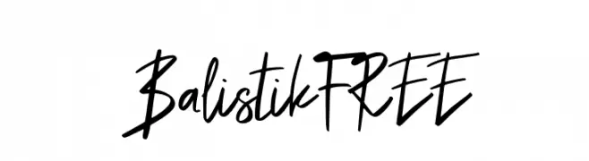
( Fonts by Vunira Design - Personal-use only. For commercial use please contact owner. )
A bold, expressive handwritten font with dynamic strokes and a modern flair.
![BalistikFREE font caratteri gratis]() Scaricare 47 Downloads@WebFont
Scaricare 47 Downloads@WebFont -
( Fonts by Kong Font - fontkong.com - Personal-use only. For commercial use please contact owner. )
An elegant and decorative font with elaborate swashes and flourishes.
![Battalion Commander Swash font caratteri gratis]() Scaricare 47 Downloads@WebFont
Scaricare 47 Downloads@WebFont -
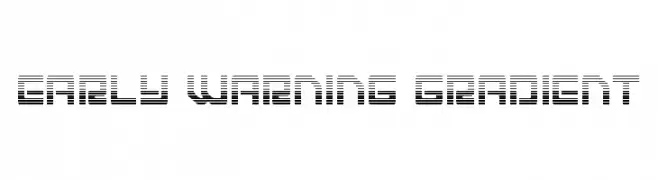
( Fonts by Daniel Zadorozny - www.iconian.com - Personal-use only. For commercial use please contact owner. )
A futuristic font with a gradient effect created by parallel horizontal lines.
![Early Warning Gradient font caratteri gratis]() Scaricare 47 Downloads@WebFont
Scaricare 47 Downloads@WebFont -
( Fonts by Vladimir Nikolic - www.creativefabrica.com/designer/vladimirnikolic/ - Personal-use only. For commercial use please contact owner. )
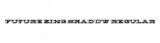
A bold, decorative font with a three-dimensional shadow effect and geometric structure.
![Future Zing Shadow Regular font caratteri gratis]() Scaricare 47 Downloads@WebFont
Scaricare 47 Downloads@WebFont -
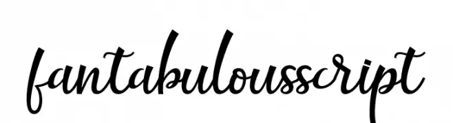
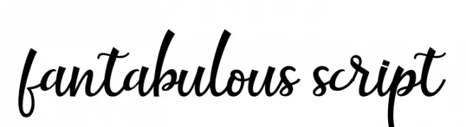
( Fonts by Akifatype Studio - Personal-use only. For commercial use please contact owner. )
A graceful script font with flowing, connected strokes and elegant flourishes.
![fantabulous script font caratteri gratis]() Scaricare 47 Downloads@WebFont
Scaricare 47 Downloads@WebFont -
( Fonts by Haksen Studio - Sarwo Edhi Prayitno - Personal-use only. For commercial use please contact owner. )
A lively and expressive handwritten font with fluid, dynamic strokes.
![Coding Sign - Personal Use font caratteri gratis]() Scaricare 47 Downloads@WebFont
Scaricare 47 Downloads@WebFont -
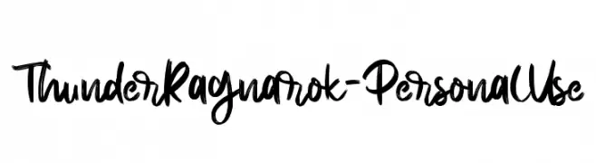
( Fonts by Letterara - Thomas Aradea - Personal-use only. For commercial use please contact owner. )
A bold, expressive brush script font with dynamic, fluid strokes.
![Thunder Ragnarok - Personal Use font caratteri gratis]() Scaricare 47 Downloads@WebFont
Scaricare 47 Downloads@WebFont -
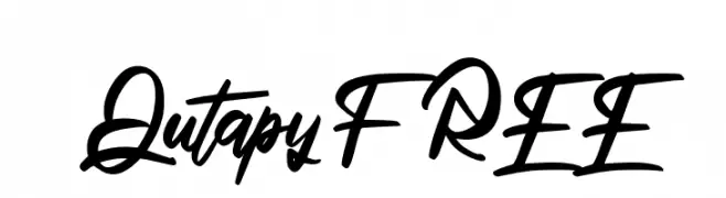
( Fonts by Vunira Design - Personal-use only. For commercial use please contact owner. )
A dynamic and expressive script font with fluid, connected letterforms.
![QutapyFREE font caratteri gratis]() Scaricare 47 Downloads@WebFont
Scaricare 47 Downloads@WebFont -
( Fonts by Wahyu Eka Prasetya - wepfont.com - Personal-use only. For commercial use please contact owner. )
A bold, expressive handwritten font with a dynamic, brush-like texture.
![GUERRA font caratteri gratis]() Scaricare 47 Downloads@WebFont
Scaricare 47 Downloads@WebFont -
( Fonts by Annisa Afni )
Casual handwritten font with rounded, playful forms.
![Fortunis font caratteri gratis]() Scaricare 47 Downloads@WebFont
Scaricare 47 Downloads@WebFont -
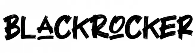
( Fonts by Letterara - Thomas Aradea - Personal-use only. For commercial use please contact owner. )
A bold, brushstroke-style font with a dynamic, hand-drawn appearance.
![Black Rocker font caratteri gratis]() Scaricare 47 Downloads@WebFont
Scaricare 47 Downloads@WebFont -
( Fonts by Rangkai Aksara - Personal-use only. For commercial use please contact owner. )
A playful, informal handwritten font with smooth, flowing curves.
![Relaxing font caratteri gratis]() Scaricare 47 Downloads@WebFont
Scaricare 47 Downloads@WebFont -
( Fonts by Markus Schröppel - Personal-use only. For commercial use please contact owner. )
A pixelated, retro-style font with a digital, geometric appearance.
![LLPixel font caratteri gratis]() Scaricare 47 Downloads@WebFont
Scaricare 47 Downloads@WebFont -
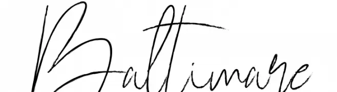
( Fonts by Jadatype - Jada Akbal - Personal-use only. For commercial use please contact owner. )
A fluid and elegant handwritten font with dynamic, flowing letterforms.
![Baltimare font caratteri gratis]() Scaricare 47 Downloads@WebFont
Scaricare 47 Downloads@WebFont -
( Fonts by ToniStudio - Fatoni Nurman - Personal-use only. For commercial use please contact owner. )
An elegant script font with fluid, cursive strokes and ornate details.
![Monitha font caratteri gratis]() Scaricare 47 Downloads@WebFont
Scaricare 47 Downloads@WebFont -
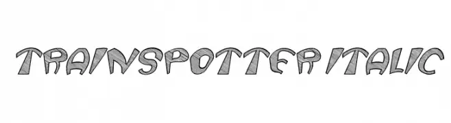
( Fonts by Vladimir Nikolic - www.creativefabrica.com/designer/vladimirnikolic/ - Personal-use only. For commercial use please contact owner. )
A bold, italic font with a sketch-like texture and dynamic style.
![Trainspotter Italic font caratteri gratis]() Scaricare 47 Downloads@WebFont
Scaricare 47 Downloads@WebFont -
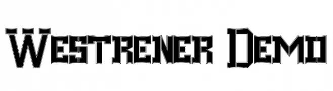
( Fonts by Edric Studio - Personal-use only. For commercial use please contact owner. )
A bold, Western-inspired font with sharp angles and thick strokes.
![Westrener Demo font caratteri gratis]() Scaricare 47 Downloads@WebFont
Scaricare 47 Downloads@WebFont -
( Fonts by Yumna Family - yumna Type - Personal-use only. For commercial use please contact owner. )
An elegant, flowing script font with ornate uppercase and smooth lowercase letters.
![Haymie font caratteri gratis]() Scaricare 47 Downloads@WebFont
Scaricare 47 Downloads@WebFont -
( Fonts by Allouse Studio - Personal-use only. For commercial use please contact owner. )
A playful, handwritten script font with dynamic and fluid characters.
![Thinna Bell font caratteri gratis]() Scaricare 47 Downloads@WebFont
Scaricare 47 Downloads@WebFont -
( Fonts by Fred Cre - Personal-use only. For commercial use please contact owner. )
A geometric, modern font with a digital, blocky style.
![YELLOWCRE font caratteri gratis]() Scaricare 47 Downloads@WebFont
Scaricare 47 Downloads@WebFont -
( Fonts by Inermedia Studio - Personal-use only. For commercial use please contact owner. )
A playful, bold handwritten font with a whimsical style.
![Magaic In Love font caratteri gratis]() Scaricare 47 Downloads@WebFont
Scaricare 47 Downloads@WebFont -
( Fonts by Jetsmax Studio - Khairil Anwar - Personal-use only. For commercial use please contact owner. )
A whimsical, artistic font with flowing, cursive-like strokes and playful loops.
![Amulman font caratteri gratis]() Scaricare 47 Downloads@WebFont
Scaricare 47 Downloads@WebFont -
( Fonts by Niskala Huruf - Personal-use only. For commercial use please contact owner. )
A playful, rounded font with a bubbly, cartoonish style.
![Friendly Smiley Regular font caratteri gratis]() Scaricare 47 Downloads@WebFont
Scaricare 47 Downloads@WebFont -
( Fonts by Vladimir Nikolic - www.creativefabrica.com/designer/vladimirnikolic/ - Personal-use only. For commercial use please contact owner. )
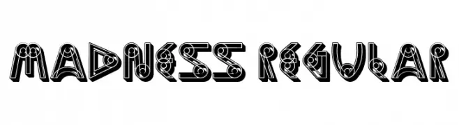
A bold, decorative font with a three-dimensional, geometric design.
![Madness Regular font caratteri gratis]() Scaricare 47 Downloads@WebFont
Scaricare 47 Downloads@WebFont -
( Fonts by Rohmat Sidiq Mustaqim - Personal-use only. For commercial use please contact owner. )
A bold, geometric font with an industrial and mechanical style.
![SENTHIR font caratteri gratis]() Scaricare 47 Downloads@WebFont
Scaricare 47 Downloads@WebFont -
( Noto is a trademark of Google Inc. Noto fonts are open source. All Noto fonts are published under the SIL Open Font License, Version 1.1 )
A condensed, extra bold serif font with high contrast and a modern classic style.
![Noto Serif Armenian Condensed ExtraBold font caratteri gratis]() Scaricare 47 Downloads@WebFont
Scaricare 47 Downloads@WebFont -
( Fonts by InspiraType )
Casual handwritten script with smooth, flowing strokes and slight slant.
![Dethars FREE font caratteri gratis]() Scaricare 47 Downloads@WebFont
Scaricare 47 Downloads@WebFont -
( Fonts by Allouse Studio - Personal-use only. For commercial use please contact owner. )
A dynamic, artistic font blending handwritten and display styles.
![Pathway Artistry font caratteri gratis]() Scaricare 47 Downloads@WebFont
Scaricare 47 Downloads@WebFont -
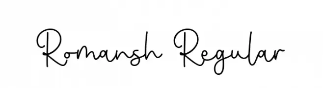
( Fonts by Brithos Type - Personal-use only. For commercial use please contact owner. )
A playful and elegant handwritten font with fluid, connected letterforms.
![Romansh Regular font caratteri gratis]() Scaricare 47 Downloads@WebFont
Scaricare 47 Downloads@WebFont -
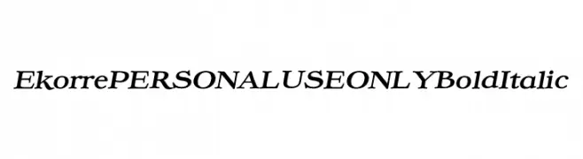
( Fonts by Mans Greback - Personal-use only. For commercial use please contact owner. )
A bold, italic serif font with a classic and elegant style.
![Ekorre PERSONAL USE ONLY Bold Italic font caratteri gratis]() Scaricare 47 Downloads@WebFont
Scaricare 47 Downloads@WebFont


Quali sono i font più popolari adesso?
Poppins, Roboto, Montserrat, Open Sans e Lato sono molto usati per le forme pulite e l'ampia applicabilità — dall'identità di marca alle landing page e ai poster.
Quali font si usano spesso nei loghi?
Le sans serif geometriche (es. Poppins, famiglie in stile Gotham) sono scelte comuni per un branding pulito e scalabile. Per un tocco personale restano valide script e stili manoscritti. Abbina un display deciso per i titoli a un corpo testo neutro per riconoscibilità ed equilibrio.
Ogni quanto si aggiorna la lista?
Con regolarità, in base ai download e all'attività reale. Torna spesso per scoprire in anticipo le nuove preferite.
💡 Consiglio: aggiungi ai preferiti — le tendenze cambiano in fretta e i font top di oggi possono ispirare il rebranding di domani.