Benvenuto nelle Font Più Popolari — dove popolarità e qualità si incontrano. Qui trovi i font più scaricati e usati dell'anno. Se cerchi scelte sicure per logo, web o social, inizia da qui.
Ogni font top si distingue per equilibrio, leggibilità e versatilità. Troverai sans serif moderne, script eleganti, serif vintage e display minimalisti.
-
( Fonts by Vladimir Nikolic - www.creativefabrica.com/designer/vladimirnikolic/ - Personal-use only. For commercial use please contact owner. )
A bold, playful font with a mechanical, decorative style.
 Scaricare 44 Downloads@WebFont
 -
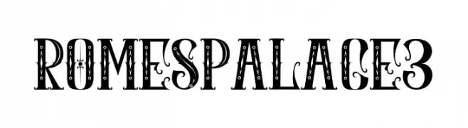
( Fonts by Ibram Syah - Personal-use only. For commercial use please contact owner. )
An ornate, decorative font with vintage flair and intricate details.
![ROMES PALACE3 font caratteri gratis]() Scaricare 44 Downloads@WebFont
Scaricare 44 Downloads@WebFont -
( Fonts by M 150 - Personal-use only. For commercial use please contact owner. )
A bold, playful font with rounded, egg-like shapes and consistent stroke width.
![SimpleEggsFont font caratteri gratis]() Scaricare 44 Downloads@WebFont
Scaricare 44 Downloads@WebFont -
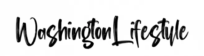
( Fonts by Perspectype Studio - Personal-use only. For commercial use please contact owner. )
A bold, brush-style font with dynamic, hand-painted strokes.
![Washington Lifestyle font caratteri gratis]() Scaricare 44 Downloads@WebFont
Scaricare 44 Downloads@WebFont -
( Fonts by Rafael Tezako - Personal-use only. For commercial use please contact owner. )
A bold, abstract font with a fantasy-inspired design and intricate details.
![Al Bhed font caratteri gratis]() Scaricare 44 Downloads@WebFont
Scaricare 44 Downloads@WebFont -
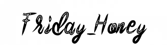
( Fonts by SSI.Scraps - Syukur Setiyadi - Personal-use only. For commercial use please contact owner. )
A playful script font with decorative polka dot accents and dynamic strokes.
![Friday_Honey font caratteri gratis]() Scaricare 44 Downloads@WebFont
Scaricare 44 Downloads@WebFont -
( Fonts by Teweka - Tuanku Muhammad Iqbal - Personal-use only. For commercial use please contact owner. )
An elegant script font with flowing, interconnected letters and graceful flourishes.
![phoenix font caratteri gratis]() Scaricare 44 Downloads@WebFont
Scaricare 44 Downloads@WebFont -
( Fonts by Hoperative )
A playful, star-adorned font with bold, rounded characters.
![Unique Unicorn display font caratteri gratis]() Scaricare 44 Downloads@WebFont
Scaricare 44 Downloads@WebFont -
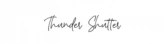
( Fonts by AminMario - Amin Mario - Personal-use only. For commercial use please contact owner. )
A modern, handwritten-style font with elegant, flowing strokes.
![Thunder Shutter font caratteri gratis]() Scaricare 44 Downloads@WebFont
Scaricare 44 Downloads@WebFont -
( Fonts by Andrian Maulana - Personal-use only. For commercial use please contact owner. )
A bold, dynamic script font with expressive, cursive letterforms.
![inet2 font caratteri gratis]() Scaricare 44 Downloads@WebFont
Scaricare 44 Downloads@WebFont -
( Fonts by Shaped Fonts - Philip Trautmann - Personal-use only. For commercial use please contact owner. )
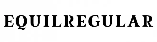
A bold and impactful font with strong, thick strokes and sharp edges.
![equil Regular font caratteri gratis]() Scaricare 44 Downloads@WebFont
Scaricare 44 Downloads@WebFont -
( Fonts by Your Own Font - Ellinor Rapp - Personal-use only. For commercial use please contact owner. )
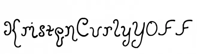
A whimsical, curly font with a playful hand-drawn style.
![KristenCurlyYOFF font caratteri gratis]() Scaricare 44 Downloads@WebFont
Scaricare 44 Downloads@WebFont -
( Fonts by Frank Baranowski, Germany. - Personal-use only. For commercial use please contact owner. )
A bold, fragmented font with a dynamic and edgy appearance.
![Destroya Bold font caratteri gratis]() Scaricare 44 Downloads@WebFont
Scaricare 44 Downloads@WebFont -
( Fonts by Letteralle Studios - Annas Yahya - Personal-use only. For commercial use please contact owner. )
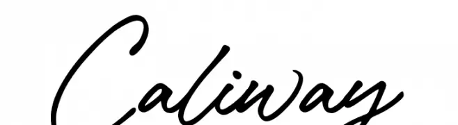
A fluid and elegant script font with a handwritten calligraphy style.
![Caliway font caratteri gratis]() Scaricare 44 Downloads@WebFont
Scaricare 44 Downloads@WebFont -
( Fonts by Rafantype Studio - Ahmad Saiful Mutohhar - Personal-use only. For commercial use please contact owner. )
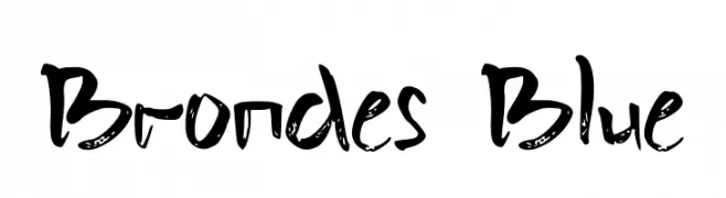
A bold, handwritten font with a brush-like texture and dynamic style.
![Brondes Blue font caratteri gratis]() Scaricare 44 Downloads@WebFont
Scaricare 44 Downloads@WebFont -
( Fonts by belovestudio - Abdul Manan - Personal-use only. For commercial use please contact owner. )
A cursive, handwritten-style font with elegant, flowing strokes.
![malika font caratteri gratis]() Scaricare 44 Downloads@WebFont
Scaricare 44 Downloads@WebFont -
( Fonts by douglas vitkauskas - Personal-use only. For commercial use please contact owner. )
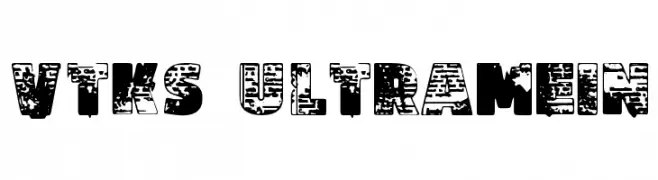
A bold, distressed font with a grunge, urban aesthetic.
![Vtks Ultramein font caratteri gratis]() Scaricare 44 Downloads@WebFont
Scaricare 44 Downloads@WebFont -
( Fonts by Daniel Zadorozny - www.iconian.com - Personal-use only. For commercial use please contact owner. )
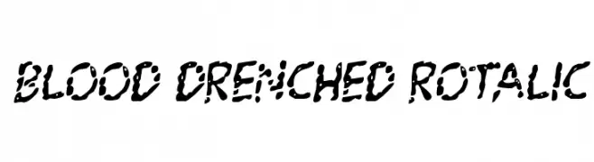
A bold, chaotic font with a dripping, splattered appearance, perfect for horror themes.
![Blood Drenched Rotalic font caratteri gratis]() Scaricare 44 Downloads@WebFont
Scaricare 44 Downloads@WebFont -
( Fonts by Iconian Fonts - Daniel Zadorozny - Personal-use only. For commercial use please contact owner. )
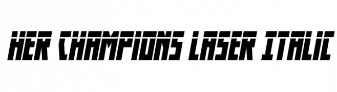
A bold, italic font with sharp angles and a futuristic style.
![Her Champions Laser Italic font caratteri gratis]() Scaricare 44 Downloads@WebFont
Scaricare 44 Downloads@WebFont -
( Fonts by sronstudio - Yusron Billah - Personal-use only. For commercial use please contact owner. )
A bold, playful handwritten font with fluid strokes and a casual style.
![Hippotamia font caratteri gratis]() Scaricare 44 Downloads@WebFont
Scaricare 44 Downloads@WebFont -
( Fonts by Iconian Fonts - Daniel Zadorozny - Personal-use only. For commercial use please contact owner. )
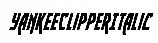
A bold, italicized font with sharp angles and high contrast.
![Yankee Clipper Italic font caratteri gratis]() Scaricare 44 Downloads@WebFont
Scaricare 44 Downloads@WebFont -
( Fonts by Kong Font - fontkong.com - Personal-use only. For commercial use please contact owner. )
A flowing, elegant script with delicate swashes and a calligraphic feel.
![CallestaSwash font caratteri gratis]() Scaricare 44 Downloads@WebFont
Scaricare 44 Downloads@WebFont -
( Fonts by Daniel Zadorozny - www.iconian.com - Personal-use only. For commercial use please contact owner. )
A bold, angular font with a futuristic and geometric style.
![Emerald Beacon Leftalic font caratteri gratis]() Scaricare 44 Downloads@WebFont
Scaricare 44 Downloads@WebFont -
( Fonts by Irfan Hidayat - Personal-use only. For commercial use please contact owner. )
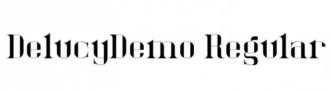
A bold, high-contrast serif font with sharp serifs and elegant style.
![DelucyDemo-Regular font caratteri gratis]() Scaricare 44 Downloads@WebFont
Scaricare 44 Downloads@WebFont -
( Fonts by Maulana Creative - Gilang Maulana - Personal-use only. For commercial use please contact owner. )
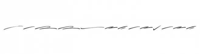
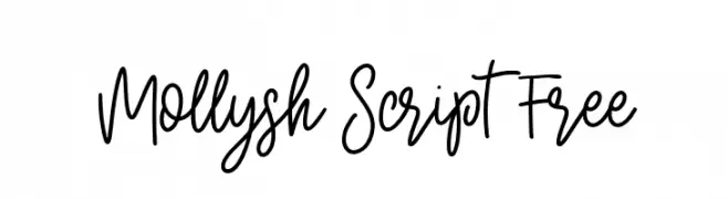
A lively and flowing script font with elegant curves and moderate stroke thickness.
![Mollysh Script Free font caratteri gratis]() Scaricare 44 Downloads@WebFont
Scaricare 44 Downloads@WebFont -
( Fonts by Youssef Habchi - Personal-use only. For commercial use please contact owner. )
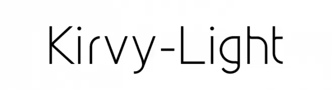
A modern, geometric sans-serif font with a clean and minimalistic design.
![Kirvy-Light font caratteri gratis]() Scaricare 44 Downloads@WebFont
Scaricare 44 Downloads@WebFont -
( Fonts by Vladimir Nikolic - www.creativefabrica.com/designer/vladimirnikolic/ - Personal-use only. For commercial use please contact owner. )
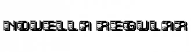
A bold, decorative font with a unique striped pattern and high contrast.
![Novella Regular font caratteri gratis]() Scaricare 44 Downloads@WebFont
Scaricare 44 Downloads@WebFont -
( Fonts by Vladimir Nikolic - www.creativefabrica.com/designer/vladimirnikolic/ - Personal-use only. For commercial use please contact owner. )
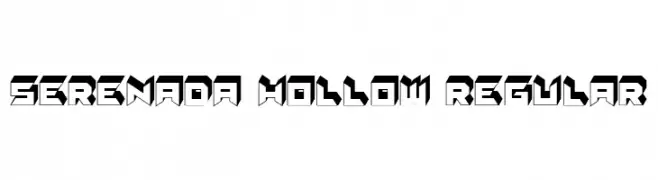
A bold, geometric font with a hollow, 3D effect and sharp, angular design.
![Serenada Hollow Regular font caratteri gratis]() Scaricare 44 Downloads@WebFont
Scaricare 44 Downloads@WebFont -
( Fonts by Konstantine Studio - Personal-use only. For commercial use please contact owner. )
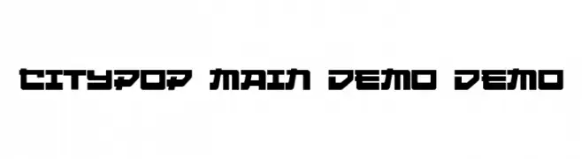
A bold, geometric font with a futuristic and modern style.
![Citypop Main DEMO DEMO font caratteri gratis]() Scaricare 44 Downloads@WebFont
Scaricare 44 Downloads@WebFont -
( Fonts by Soft Creative - Personal-use only. For commercial use please contact owner. )
An elegant script font with flowing, cursive letters and high contrast strokes.
![Willgets font caratteri gratis]() Scaricare 44 Downloads@WebFont
Scaricare 44 Downloads@WebFont -
( Fonts by Wondoo - Personal-use only. For commercial use please contact owner. )
A playful, handwritten font with dynamic strokes and a casual style.
![Lightsky for personal use font caratteri gratis]() Scaricare 44 Downloads@WebFont
Scaricare 44 Downloads@WebFont -
( Fonts by Daniel Zadorozny - www.iconian.com - Personal-use only. For commercial use please contact owner. )
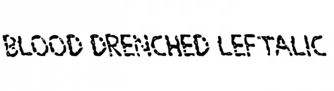
A bold, dripping liquid-style font perfect for horror themes.
![Blood Drenched Leftalic font caratteri gratis]() Scaricare 44 Downloads@WebFont
Scaricare 44 Downloads@WebFont -
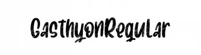
( Fonts by Creatype Studio - Rian Rahardi - Personal-use only. For commercial use please contact owner. )
A bold, textured font with a vintage, hand-painted look.
![Gasthyon Regular font caratteri gratis]() Scaricare 44 Downloads@WebFont
Scaricare 44 Downloads@WebFont -
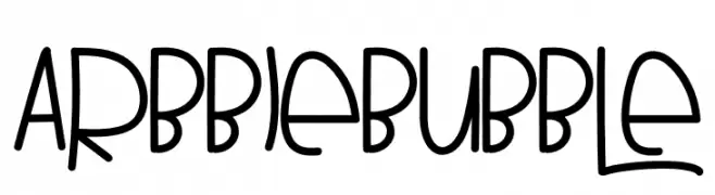
( Fonts by K_IN Studio - Personal-use only. For commercial use please contact owner. )
A playful, bubble-like font with a hand-drawn, whimsical style.
![ARBBIE BUBBLE font caratteri gratis]() Scaricare 44 Downloads@WebFont
Scaricare 44 Downloads@WebFont -
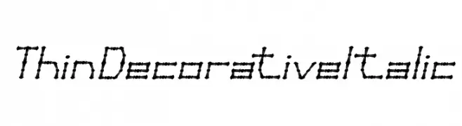
( Fonts by weknow - Wino S Kadir - Personal-use only. For commercial use please contact owner. )
A thin, decorative italic font with intricate, interconnected segments.
![Thin Decorative Italic font caratteri gratis]() Scaricare 44 Downloads@WebFont
Scaricare 44 Downloads@WebFont


Quali sono i font più popolari adesso?
Poppins, Roboto, Montserrat, Open Sans e Lato sono molto usati per le forme pulite e l'ampia applicabilità — dall'identità di marca alle landing page e ai poster.
Quali font si usano spesso nei loghi?
Le sans serif geometriche (es. Poppins, famiglie in stile Gotham) sono scelte comuni per un branding pulito e scalabile. Per un tocco personale restano valide script e stili manoscritti. Abbina un display deciso per i titoli a un corpo testo neutro per riconoscibilità ed equilibrio.
Ogni quanto si aggiorna la lista?
Con regolarità, in base ai download e all'attività reale. Torna spesso per scoprire in anticipo le nuove preferite.
💡 Consiglio: aggiungi ai preferiti — le tendenze cambiano in fretta e i font top di oggi possono ispirare il rebranding di domani.