Benvenuto nelle Font Più Popolari — dove popolarità e qualità si incontrano. Qui trovi i font più scaricati e usati dell'anno. Se cerchi scelte sicure per logo, web o social, inizia da qui.
Ogni font top si distingue per equilibrio, leggibilità e versatilità. Troverai sans serif moderne, script eleganti, serif vintage e display minimalisti.
-
( Fonts by Scratchones )
Tall, whimsical handwritten script with playful curves.
 Scaricare 47 Downloads@WebFont
 -
( Fonts by Vladimir Nikolic - www.creativefabrica.com/designer/vladimirnikolic/ - Personal-use only. For commercial use please contact owner. )
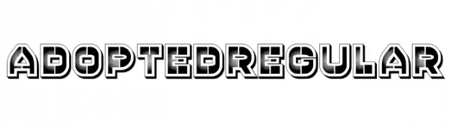
A bold, three-dimensional font with a gradient fill and sharp edges.
![Adopted Regular font caratteri gratis]() Scaricare 47 Downloads@WebFont
Scaricare 47 Downloads@WebFont -
( Fonts by Sigit Nur Wicaksono - Personal-use only. For commercial use please contact owner. )
A modern, minimalist font with smooth, rounded edges and consistent stroke width.
![cofley extralight font caratteri gratis]() Scaricare 47 Downloads@WebFont
Scaricare 47 Downloads@WebFont -
( Fonts by Greentrik6789 - Tri Kuncoro - Personal-use only. For commercial use please contact owner. )
A modern, geometric font with rounded edges and a tubular design.
![STARTER Bold font caratteri gratis]() Scaricare 47 Downloads@WebFont
Scaricare 47 Downloads@WebFont -
( Fonts by Pidco Art - Hindro Cholis - Personal-use only. For commercial use please contact owner. )
A playful handwritten font with a casual and friendly style.
![KattyLove font caratteri gratis]() Scaricare 47 Downloads@WebFont
Scaricare 47 Downloads@WebFont -
( Fonts by weknow - Wino S Kadir - Personal-use only. For commercial use please contact owner. )
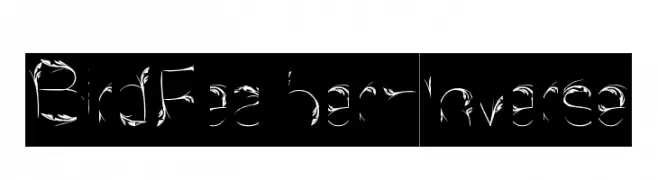
A decorative font with feather-like embellishments on each character.
![Bird Feather-Inverse font caratteri gratis]() Scaricare 47 Downloads@WebFont
Scaricare 47 Downloads@WebFont -
( Fonts by Achmad Yani )
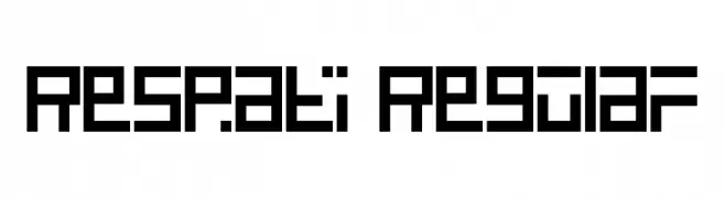
A geometric, blocky font with a modern, digital aesthetic.
![Respati Regular font caratteri gratis]() Scaricare 47 Downloads@WebFont
Scaricare 47 Downloads@WebFont -
( Fonts by Origin Type )
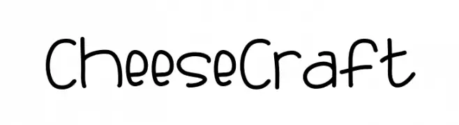
Playful, hand-drawn sans-serif font with rounded, informal characters.
![Cheese Craft font caratteri gratis]() Scaricare 47 Downloads@WebFont
Scaricare 47 Downloads@WebFont -
( Fonts by Greentrik6789 - Tri Kuncoro - Personal-use only. For commercial use please contact owner. )
A modern, hollow, geometric font with outlined letterforms.
![STARTER Hollow font caratteri gratis]() Scaricare 47 Downloads@WebFont
Scaricare 47 Downloads@WebFont -
( Fonts by Inermedia Studio - Personal-use only. For commercial use please contact owner. )
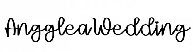
A playful and elegant handwritten font with a charming, personal touch.
![Angglea Wedding font caratteri gratis]() Scaricare 47 Downloads@WebFont
Scaricare 47 Downloads@WebFont -
( Fonts by Runsell Studio - Personal-use only. For commercial use please contact owner. )
A bold, cursive script font with dynamic, flowing strokes.
![Wildstreet font caratteri gratis]() Scaricare 47 Downloads@WebFont
Scaricare 47 Downloads@WebFont -
( Fonts by Uusimaa Type Foundry Incorporated (fictitious) - Stephen Bird - Personal-use only. For commercial use please contact owner. )
A bold, geometric font with sharp, angular lines and high contrast.
![shardikka font caratteri gratis]() Scaricare 47 Downloads@WebFont
Scaricare 47 Downloads@WebFont -
( Fonts by Vunira Design - Personal-use only. For commercial use please contact owner. )
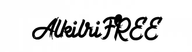
A bold, expressive brush script font with dynamic strokes.
![AlkilriFREE font caratteri gratis]() Scaricare 47 Downloads@WebFont
Scaricare 47 Downloads@WebFont -
( Fonts by AEN Creative Studio - Agung Eko Nugroho - Personal-use only. For commercial use please contact owner. )
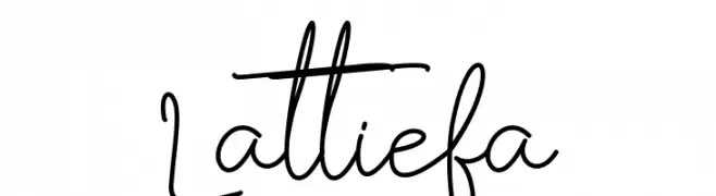
A playful, casual handwritten font with fluid, connected strokes.
![Lattiefa font caratteri gratis]() Scaricare 47 Downloads@WebFont
Scaricare 47 Downloads@WebFont -
( Fonts by Iconian Fonts - Daniel Zadorozny - Personal-use only. For commercial use please contact owner. )
A bold, italicized font with sharp, angular edges and a vintage flair.
![Gentleman Caller Italic font caratteri gratis]() Scaricare 47 Downloads@WebFont
Scaricare 47 Downloads@WebFont -
( Fonts by Peter Wiegel - www.peter-wiegel.de - Personal-use only. For commercial use please contact owner. )
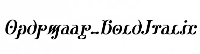
A bold, italicized decorative font with high contrast and pronounced serifs.
![Ondrwaax-BoldItalic font caratteri gratis]() Scaricare 47 Downloads@WebFont
Scaricare 47 Downloads@WebFont -
( Fonts by Maulana Creative - Gilang Maulana - Personal-use only. For commercial use please contact owner. )
A dynamic and elegant script font with fluid, cursive strokes.
![Diettersen Free Regular font caratteri gratis]() Scaricare 47 Downloads@WebFont
Scaricare 47 Downloads@WebFont -
( Fonts by Thor Christopher Arisland - Personal-use only. For commercial use please contact owner. )
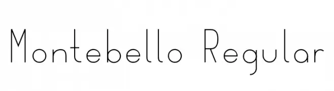
A clean, minimalist font with thin, uniform strokes and a modern aesthetic.
![Montebello Regular font caratteri gratis]() Scaricare 47 Downloads@WebFont
Scaricare 47 Downloads@WebFont -
( Fonts by Typodermic Fonts - Raymond Larabie - Personal-use only. For commercial use please contact owner. )
A bold, condensed font with tight spacing and strong visual impact.
![SteelfishEb-Regular font caratteri gratis]() Scaricare 47 Downloads@WebFont
Scaricare 47 Downloads@WebFont -
( Fonts by ingoFonts - Ingo Zimmermann - Personal-use only. For commercial use please contact owner. )
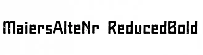
A bold, distressed font with a vintage, handcrafted look.
![Maiers Alte Nr.8 Reduced Bold font caratteri gratis]() Scaricare 47 Downloads@WebFont
Scaricare 47 Downloads@WebFont -
( Fonts by Daniel Zadorozny - www.iconian.com - Personal-use only. For commercial use please contact owner. )
A bold, semi-italic font with a geometric, angular design.
![American Grain Semi-Italic font caratteri gratis]() Scaricare 47 Downloads@WebFont
Scaricare 47 Downloads@WebFont -
( Fonts by AZ Std - Muh Aswar - Personal-use only. For commercial use please contact owner. )
An elegant and flowing script font with intricate loops and swirls.
![Lovely Ampersand font caratteri gratis]() Scaricare 47 Downloads@WebFont
Scaricare 47 Downloads@WebFont -
( Fonts by Toto - Personal-use only. For commercial use please contact owner. )
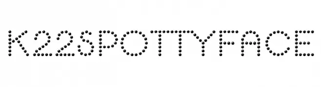
A playful, dotted font with a modern and decorative style.
![K22 Spotty Face font caratteri gratis]() Scaricare 47 Downloads@WebFont
Scaricare 47 Downloads@WebFont -
( Fonts by fsuarez913 )
![Super Croissant Regular font caratteri gratis]() Scaricare 47 Downloads@WebFont
Scaricare 47 Downloads@WebFont -
( Fonts by Daniel Zadorozny - www.iconian.com - Personal-use only. For commercial use please contact owner. )
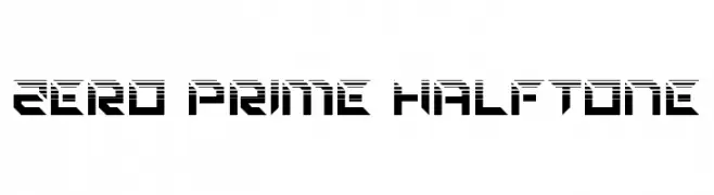
A bold, futuristic font with a halftone effect and geometric design.
![Zero Prime Halftone font caratteri gratis]() Scaricare 47 Downloads@WebFont
Scaricare 47 Downloads@WebFont -
( Fonts by Daniel Zadorozny - www.iconian.com - Personal-use only. For commercial use please contact owner. )
A bold, italic font with sharp, angular lines and a futuristic style.
![Final Front Super-Italic font caratteri gratis]() Scaricare 47 Downloads@WebFont
Scaricare 47 Downloads@WebFont -
( Fonts by Iconian Fonts - Daniel Zadorozny - Personal-use only. For commercial use please contact owner. )
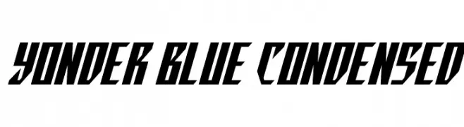
A bold, angular, and condensed font with a modern, edgy style.
![Yonder Blue Condensed font caratteri gratis]() Scaricare 47 Downloads@WebFont
Scaricare 47 Downloads@WebFont -
( Fonts by Iconian Fonts - Daniel Zadorozny - Personal-use only. For commercial use please contact owner. )
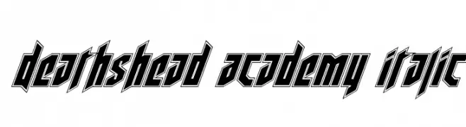
A bold, angular, and italicized font with a dynamic, futuristic style.
![Deathshead Academy Italic font caratteri gratis]() Scaricare 47 Downloads@WebFont
Scaricare 47 Downloads@WebFont -
( Fonts by Inermedia Studio - Personal-use only. For commercial use please contact owner. )
An elegant, flowing script font with graceful loops and ornate uppercase letters.
![Vidiya font caratteri gratis]() Scaricare 47 Downloads@WebFont
Scaricare 47 Downloads@WebFont -
( Fonts by Thor Christopher Arisland - Personal-use only. For commercial use please contact owner. )
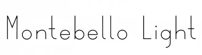
A thin, elegant font with a modern and minimalist design.
![Montebello Light font caratteri gratis]() Scaricare 47 Downloads@WebFont
Scaricare 47 Downloads@WebFont -
( Fonts by AV Type - Aldo Vesely - Personal-use only. For commercial use please contact owner. )
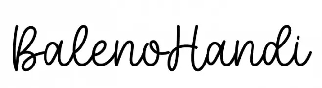
A playful and flowing script font with a natural handwritten style.
![Baleno Handi font caratteri gratis]() Scaricare 47 Downloads@WebFont
Scaricare 47 Downloads@WebFont -
( Fonts by Masanis Studio - Naufal Anis - Personal-use only. For commercial use please contact owner. )
A playful and elegant script font with flowing, cursive letters and a hand-drawn appearance.
![Earcy Night font caratteri gratis]() Scaricare 47 Downloads@WebFont
Scaricare 47 Downloads@WebFont -
( Fonts by Almarkhatype - Abdul Malik Wisnu - Personal-use only. For commercial use please contact owner. )
A bold slab serif font with strong, block-like serifs and consistent stroke width.
![Schein Slab font caratteri gratis]() Scaricare 47 Downloads@WebFont
Scaricare 47 Downloads@WebFont -
( Iconian Fonts - Daniel Zadorozny - www.iconian.com )
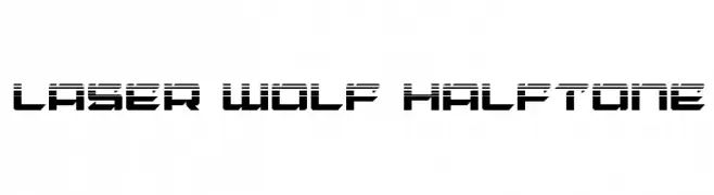
A futuristic, geometric font with a halftone pattern and bold, angular design.
![Laser Wolf Halftone font caratteri gratis]() Scaricare 47 Downloads@WebFont
Scaricare 47 Downloads@WebFont -
( PlumbobsandHolosprites - Flore Creations - plumbobsandholosprites.tumblr.com )
A bold, hand-drawn font with a playful, informal style.
![BlockinBasic font caratteri gratis]() Scaricare 47 Downloads@WebFont
Scaricare 47 Downloads@WebFont


Quali sono i font più popolari adesso?
Poppins, Roboto, Montserrat, Open Sans e Lato sono molto usati per le forme pulite e l'ampia applicabilità — dall'identità di marca alle landing page e ai poster.
Quali font si usano spesso nei loghi?
Le sans serif geometriche (es. Poppins, famiglie in stile Gotham) sono scelte comuni per un branding pulito e scalabile. Per un tocco personale restano valide script e stili manoscritti. Abbina un display deciso per i titoli a un corpo testo neutro per riconoscibilità ed equilibrio.
Ogni quanto si aggiorna la lista?
Con regolarità, in base ai download e all'attività reale. Torna spesso per scoprire in anticipo le nuove preferite.
💡 Consiglio: aggiungi ai preferiti — le tendenze cambiano in fretta e i font top di oggi possono ispirare il rebranding di domani.