Benvenuto nelle Font Più Popolari — dove popolarità e qualità si incontrano. Qui trovi i font più scaricati e usati dell'anno. Se cerchi scelte sicure per logo, web o social, inizia da qui.
Ogni font top si distingue per equilibrio, leggibilità e versatilità. Troverai sans serif moderne, script eleganti, serif vintage e display minimalisti.
-
( Personal-use only. For commercial use please contact owner. )
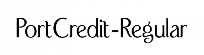
A modern and elegant font with elongated letterforms and subtle curves.
 Scaricare 360 Downloads@WebFont
 -
( Fonts by Vable studio )
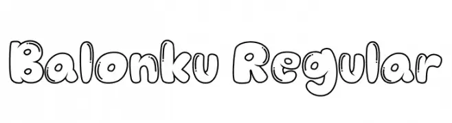
A playful, balloon-like font with a bubbly, outlined design.
![Balonku Regular font caratteri gratis]() Scaricare 360 Downloads@WebFont
Scaricare 360 Downloads@WebFont -
( Fonts by Andrew Hart - dirt2.com )
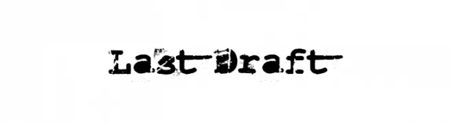
A distressed, bold typewriter-style font with a vintage, grunge aesthetic.
![Last Draft font caratteri gratis]() Scaricare 360 Downloads@WebFont
Scaricare 360 Downloads@WebFont -
![Orion Esperanto Kursiva font caratteri gratis]() Scaricare 360 Downloads
Scaricare 360 Downloads -
( Fonts by Hanoded )
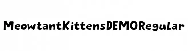
A playful, hand-drawn font with cat-themed characters and a whimsical style.
![Meowtant Kittens DEMO Regular font caratteri gratis]() Scaricare 360 Downloads@WebFont
Scaricare 360 Downloads@WebFont -
-
( Fonts by Utopiafonts )
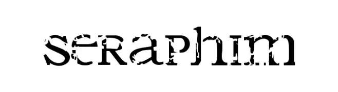
A bold, distressed font with a grunge, vintage aesthetic.
![Seraphim font caratteri gratis]() Scaricare 360 Downloads@WebFont
Scaricare 360 Downloads@WebFont -
( Free for a personal use. For a commercial use please visit www.kevinandamanda.com )
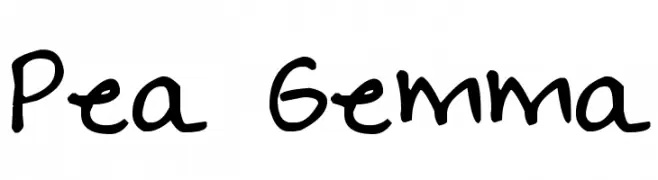
A casual, handwritten font with a playful and informal style.
![Pea Gemma font caratteri gratis]() Scaricare 360 Downloads@WebFont
Scaricare 360 Downloads@WebFont -
( Fonts by Cristiano Sobral - Personal-use only. For commercial use please contact owner. )
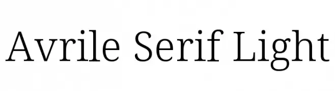
A classic serif font with elegant, light strokes and refined serifs.
![Avrile Serif Light font caratteri gratis]() Scaricare 360 Downloads@WebFont
Scaricare 360 Downloads@WebFont -
( Fonts by www.feorag.com )
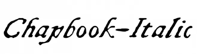
A classic, cursive font with elegant, calligraphic influences and dynamic stroke contrast.
![Chapbook-Italic font caratteri gratis]() Scaricare 360 Downloads@WebFont
Scaricare 360 Downloads@WebFont -
( www.zeichenblick.de )
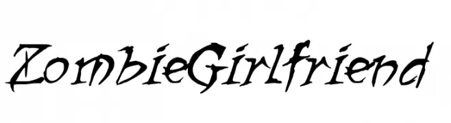
A chaotic, edgy font with jagged, irregular strokes and dynamic flow.
![ZombieGirlfriend font caratteri gratis]() Scaricare 360 Downloads@WebFont
Scaricare 360 Downloads@WebFont
Quali sono i font più popolari adesso?
Poppins, Roboto, Montserrat, Open Sans e Lato sono molto usati per le forme pulite e l'ampia applicabilità — dall'identità di marca alle landing page e ai poster.
Quali font si usano spesso nei loghi?
Le sans serif geometriche (es. Poppins, famiglie in stile Gotham) sono scelte comuni per un branding pulito e scalabile. Per un tocco personale restano valide script e stili manoscritti. Abbina un display deciso per i titoli a un corpo testo neutro per riconoscibilità ed equilibrio.
Ogni quanto si aggiorna la lista?
Con regolarità, in base ai download e all'attività reale. Torna spesso per scoprire in anticipo le nuove preferite.
💡 Consiglio: aggiungi ai preferiti — le tendenze cambiano in fretta e i font top di oggi possono ispirare il rebranding di domani.