Benvenuto nelle Font Più Popolari — dove popolarità e qualità si incontrano. Qui trovi i font più scaricati e usati dell'anno. Se cerchi scelte sicure per logo, web o social, inizia da qui.
Ogni font top si distingue per equilibrio, leggibilità e versatilità. Troverai sans serif moderne, script eleganti, serif vintage e display minimalisti.
-
( Fonts by GFR Creative - Personal-use only. For commercial use please contact owner. )
A bold, textured script font with a hand-painted appearance.
 Scaricare 46 Downloads@WebFont
 -
( Fonts by Inermedia Studio - Personal-use only. For commercial use please contact owner. )
An elegant script font with intricate swashes and flowing characters.
![Amytha font caratteri gratis]() Scaricare 46 Downloads@WebFont
Scaricare 46 Downloads@WebFont -
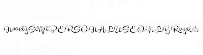
( Fonts by Mans Greback - Personal-use only. For commercial use please contact owner. )
A decorative script font with elegant, flowing lines and intricate loops.
![Novety Script PERSONAL USE ONLY Regular font caratteri gratis]() Scaricare 46 Downloads@WebFont
Scaricare 46 Downloads@WebFont -
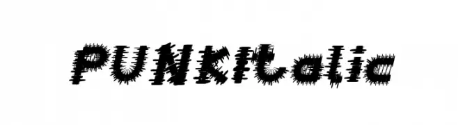
( Fonts by weknow - Wino S Kadir - Personal-use only. For commercial use please contact owner. )
A bold, jagged, and italicized font with a punk aesthetic.
![PUNK Italic font caratteri gratis]() Scaricare 46 Downloads@WebFont
Scaricare 46 Downloads@WebFont -
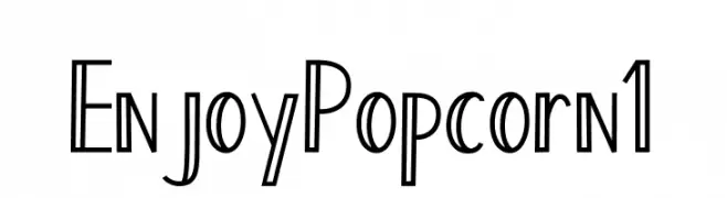
( Fonts by AV Type - Aldo Vesely - Personal-use only. For commercial use please contact owner. )
A playful, hand-drawn font with tall, narrow characters and a whimsical style.
![Enjoy Popcorn 1 font caratteri gratis]() Scaricare 46 Downloads@WebFont
Scaricare 46 Downloads@WebFont -
( Fonts by Wahyu Eka Prasetya - wepfont.com - Personal-use only. For commercial use please contact owner. )
A bold, textured, hand-drawn font with a playful and artistic style.
![ERETAN font caratteri gratis]() Scaricare 46 Downloads@WebFont
Scaricare 46 Downloads@WebFont -
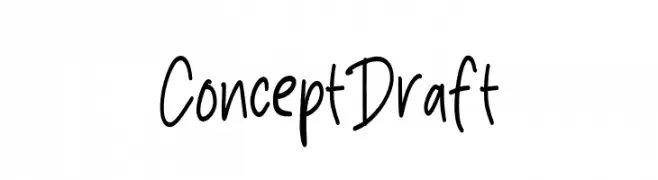
( Fonts by Mans Greback - www.mansgreback.com - Personal-use only. For commercial use please contact owner. )
A playful, casual handwritten font with smooth, flowing lines.
![Concept Draft font caratteri gratis]() Scaricare 46 Downloads@WebFont
Scaricare 46 Downloads@WebFont -
( Fonts by Integritype Studio )
Bold, hand-lettered script with casual, flowing strokes.
![Jarchook font caratteri gratis]() Scaricare 46 Downloads@WebFont
Scaricare 46 Downloads@WebFont -
( Fonts by PutraCetol Studio - www.putracetol.com - Personal-use only. For commercial use please contact owner. )
An elegant script font with intricate swashes and flowing, interconnected letters.
![Grimscy font caratteri gratis]() Scaricare 46 Downloads@WebFont
Scaricare 46 Downloads@WebFont -
( Fonts by Xerographer Fonts - Max Infeld - Personal-use only. For commercial use please contact owner. )
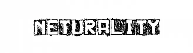
A bold, hand-drawn font with a textured, sketch-like appearance.
![Neturality font caratteri gratis]() Scaricare 46 Downloads@WebFont
Scaricare 46 Downloads@WebFont -
( Fonts by Typotopia Studio - Personal-use only. For commercial use please contact owner. )
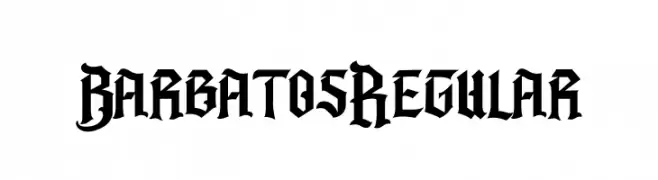
A bold, Gothic-style font with sharp, angular lines and pointed serifs.
![Barbatos Regular font caratteri gratis]() Scaricare 46 Downloads@WebFont
Scaricare 46 Downloads@WebFont -
( Fonts by madeDeduk )
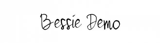
A whimsical, handwritten font with tall, narrow, and irregular letterforms.
![Bessie Demo font caratteri gratis]() Scaricare 46 Downloads@WebFont
Scaricare 46 Downloads@WebFont -
( Fonts by Vladimir Nikolic - www.creativefabrica.com/designer/vladimirnikolic/ - Personal-use only. For commercial use please contact owner. )
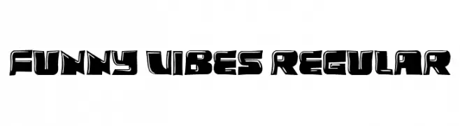
A playful, bold font with thick, blocky letters and a whimsical, hand-drawn feel.
![Funny Vibes Regular font caratteri gratis]() Scaricare 46 Downloads@WebFont
Scaricare 46 Downloads@WebFont -
( Fonts by Omotu Studio - Ibnu Utomo - Personal-use only. For commercial use please contact owner. )
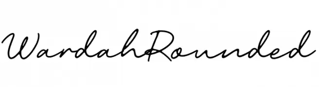
A smooth, flowing script font with elegant, connected letters.
![Wardah Rounded font caratteri gratis]() Scaricare 46 Downloads@WebFont
Scaricare 46 Downloads@WebFont -
( Fonts by Atjcloth Studio - Hanif Syahputra - Personal-use only. For commercial use please contact owner. )
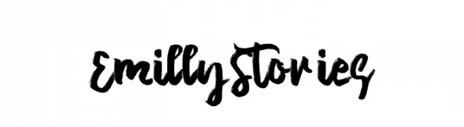
A bold, brush-style font with dynamic, hand-painted strokes.
![Emilly Stories font caratteri gratis]() Scaricare 46 Downloads@WebFont
Scaricare 46 Downloads@WebFont -
( Fonts by Pizzadude - Jakob Fischer - Personal-use only. For commercial use please contact owner. )
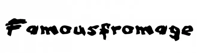
A bold, brush-style font with an energetic and handcrafted appearance.
![Famous fromage font caratteri gratis]() Scaricare 46 Downloads@WebFont
Scaricare 46 Downloads@WebFont -
( Fonts by Scarlett - Personal-use only. For commercial use please contact owner. )
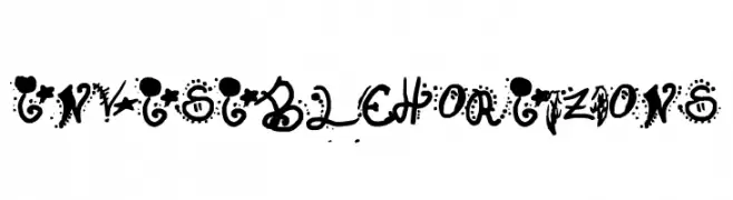
A bold, decorative font with playful embellishments and dynamic style.
![Invisible Horizons font caratteri gratis]() Scaricare 46 Downloads@WebFont
Scaricare 46 Downloads@WebFont -
( Fonts by Mans Greback - www.mansgreback.com - Personal-use only. For commercial use please contact owner. )
A sophisticated serif typeface with modern elegance and high contrast.
![Archer Gage Demo font caratteri gratis]() Scaricare 46 Downloads@WebFont
Scaricare 46 Downloads@WebFont -
( Fonts by www.freesvgdesigns.com )
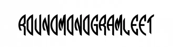
A bold, geometric font with a monogram style, featuring sharp angles and a modern look.
![Round_Monogram_Left font caratteri gratis]() Scaricare 46 Downloads@WebFont
Scaricare 46 Downloads@WebFont -
( Fonts by Daniel Zadorozny - www.iconian.com - Personal-use only. For commercial use please contact owner. )
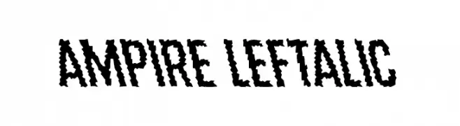
A bold, jagged, and dynamic font with a distressed style.
![Ampire Leftalic font caratteri gratis]() Scaricare 46 Downloads@WebFont
Scaricare 46 Downloads@WebFont -
( Fonts by Vladimir Nikolic - www.creativefabrica.com/designer/vladimirnikolic/ - Personal-use only. For commercial use please contact owner. )
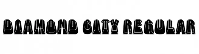
A bold, 3D geometric font with high contrast and a futuristic style.
![Diamond City Regular font caratteri gratis]() Scaricare 46 Downloads@WebFont
Scaricare 46 Downloads@WebFont -
( Fonts by Blue Studio09 - Personal-use only. For commercial use please contact owner. )
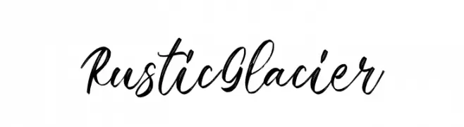
A cursive, handwritten font with elegant, flowing strokes.
![Rustic Glacier font caratteri gratis]() Scaricare 46 Downloads@WebFont
Scaricare 46 Downloads@WebFont -
( Fonts by Erik Studio - Personal-use only. For commercial use please contact owner. )
A whimsical and elegant script font with fluid letterforms and dynamic strokes.
![Dream Only font caratteri gratis]() Scaricare 46 Downloads@WebFont
Scaricare 46 Downloads@WebFont -
( Fonts by Gassstype - Anang Fibriyanto - www.gassstype.com - Personal-use only. For commercial use please contact owner. )
A bold, hand-painted style font with dynamic, irregular strokes.
![Silent Forest font caratteri gratis]() Scaricare 46 Downloads@WebFont
Scaricare 46 Downloads@WebFont -
( Fonts by Pineungtype Missinklab - Personal-use only. For commercial use please contact owner. )
An elegant, high-contrast script font with flowing, ornate letterforms.
![Alusinta Brenob font caratteri gratis]() Scaricare 46 Downloads@WebFont
Scaricare 46 Downloads@WebFont -
( Fonts by Scratchones )
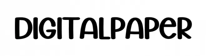
Rounded, playful sans-serif with a handwritten feel.
![Digital Paper font caratteri gratis]() Scaricare 46 Downloads@WebFont
Scaricare 46 Downloads@WebFont -
( Fonts by Faldy Kudo - Personal-use only. For commercial use please contact owner. )
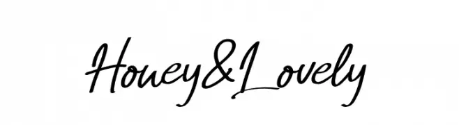
A lively, cursive handwritten font with smooth, flowing strokes.
![Honey&Lovely font caratteri gratis]() Scaricare 46 Downloads@WebFont
Scaricare 46 Downloads@WebFont -
( Fonts by Kong Font - Personal-use only. For commercial use please contact owner. )
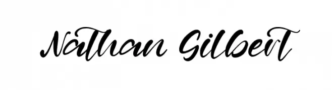
A flowing, cursive font with elegant, sweeping strokes and a sophisticated appearance.
![Nathan Gilbert font caratteri gratis]() Scaricare 46 Downloads@WebFont
Scaricare 46 Downloads@WebFont -
( Fonts by Omotu Studio - Ibnu Utomo - Personal-use only. For commercial use please contact owner. )
A bold, energetic handwritten font with expressive strokes.
![Huge_DEMO font caratteri gratis]() Scaricare 46 Downloads@WebFont
Scaricare 46 Downloads@WebFont -
( Fonts by Vladimir Nikolic - Personal-use only. For commercial use please contact owner. )
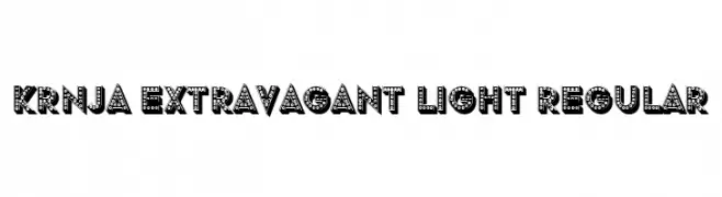
A bold, decorative font with a 3D effect and dotted interiors, perfect for dramatic designs.
![Krnja Extravagant Light Regular font caratteri gratis]() Scaricare 46 Downloads@WebFont
Scaricare 46 Downloads@WebFont -
( Fonts by Zulfikar Ali - Personal-use only. For commercial use please contact owner. )
A high-contrast, elegant typeface with dynamic serifs and a modern flair.
![SINGGELPARENTTYPEFACE-Regular font caratteri gratis]() Scaricare 46 Downloads@WebFont
Scaricare 46 Downloads@WebFont -
( Fonts by Scratch Design - Studio 41 - Personal-use only. For commercial use please contact owner. )
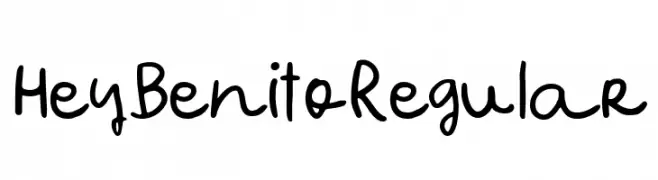
A playful, handwritten font with a casual and friendly style.
![Hey Benito Regular font caratteri gratis]() Scaricare 46 Downloads@WebFont
Scaricare 46 Downloads@WebFont -
( Fonts by Iconian Fonts - Daniel Zadorozny - Personal-use only. For commercial use please contact owner. )
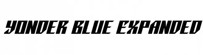
A bold, angular font with a futuristic and dynamic style.
![Yonder Blue Expanded font caratteri gratis]() Scaricare 46 Downloads@WebFont
Scaricare 46 Downloads@WebFont -
( Fonts by Supersemar Letter - Arief Tri Sulistiyono - Personal-use only. For commercial use please contact owner. )
A modern, geometric font with elongated, narrow letterforms and consistent stroke width.
![Aquarilla font caratteri gratis]() Scaricare 46 Downloads@WebFont
Scaricare 46 Downloads@WebFont -
( Fonts by Vunira Design - Personal-use only. For commercial use please contact owner. )
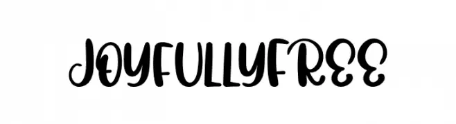
A playful, bold script font with smooth, flowing curves and thick strokes.
![JoyfullyFREE font caratteri gratis]() Scaricare 46 Downloads@WebFont
Scaricare 46 Downloads@WebFont


Quali sono i font più popolari adesso?
Poppins, Roboto, Montserrat, Open Sans e Lato sono molto usati per le forme pulite e l'ampia applicabilità — dall'identità di marca alle landing page e ai poster.
Quali font si usano spesso nei loghi?
Le sans serif geometriche (es. Poppins, famiglie in stile Gotham) sono scelte comuni per un branding pulito e scalabile. Per un tocco personale restano valide script e stili manoscritti. Abbina un display deciso per i titoli a un corpo testo neutro per riconoscibilità ed equilibrio.
Ogni quanto si aggiorna la lista?
Con regolarità, in base ai download e all'attività reale. Torna spesso per scoprire in anticipo le nuove preferite.
💡 Consiglio: aggiungi ai preferiti — le tendenze cambiano in fretta e i font top di oggi possono ispirare il rebranding di domani.