Benvenuto nelle Font Più Popolari — dove popolarità e qualità si incontrano. Qui trovi i font più scaricati e usati dell'anno. Se cerchi scelte sicure per logo, web o social, inizia da qui.
Ogni font top si distingue per equilibrio, leggibilità e versatilità. Troverai sans serif moderne, script eleganti, serif vintage e display minimalisti.
-
( Fonts by Inermedia Studio - Personal-use only. For commercial use please contact owner. )
A playful, cursive font with a handcrafted, artistic style.
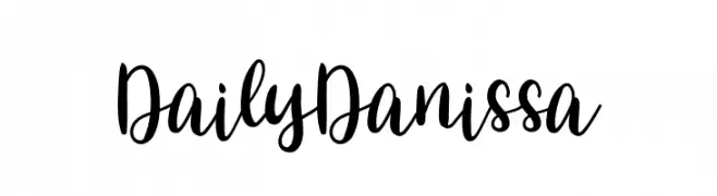 Scaricare 45 Downloads@WebFont
 -
( Fonts by Letterena Studios - letterena.com - Personal-use only. For commercial use please contact owner. )
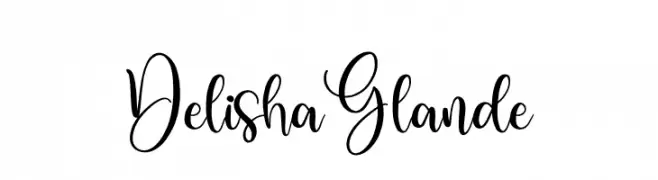
A modern, elegant script font with flowing, graceful strokes.
![Delisha Glande font caratteri gratis]() Scaricare 45 Downloads@WebFont
Scaricare 45 Downloads@WebFont -
( Fonts by PutraCetol Studio - www.putracetol.com - Personal-use only. For commercial use please contact owner. )
An elegant, flowing script font with a natural handwriting style.
![Attaira font caratteri gratis]() Scaricare 45 Downloads@WebFont
Scaricare 45 Downloads@WebFont -
( Fonts by Vunira Design - Personal-use only. For commercial use please contact owner. )
A bold, expressive script font with fluid, dynamic strokes.
![AlyaFREE font caratteri gratis]() Scaricare 45 Downloads@WebFont
Scaricare 45 Downloads@WebFont -
( Fonts by Yahhya Anas - Personal-use only. For commercial use please contact owner. )
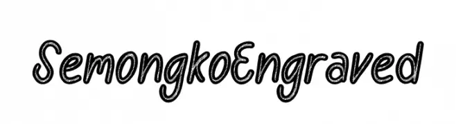
A playful, hand-drawn font with an engraved texture and rounded, slightly irregular characters.
![Semongko Engraved font caratteri gratis]() Scaricare 45 Downloads@WebFont
Scaricare 45 Downloads@WebFont -
( Fonts by Abby Manuel - Personal-use only. For commercial use please contact owner. )
An elegant, flowing script font with a sophisticated, handwritten style.
![Sabrina font caratteri gratis]() Scaricare 45 Downloads@WebFont
Scaricare 45 Downloads@WebFont -
( Fonts by Almarkhatype - Abdul Malik Wisnu - Personal-use only. For commercial use please contact owner. )
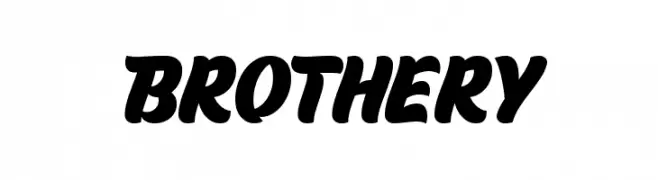
A bold, dynamic script font with smooth, flowing strokes and a lively appearance.
![Brothery font caratteri gratis]() Scaricare 45 Downloads@WebFont
Scaricare 45 Downloads@WebFont -
( Fonts by Tudor Banciu - Personal-use only. For commercial use please contact owner. )
A bold, modern font with a mix of solid and striped patterns for a striking visual impact.
![Hipstravaganza-Demo font caratteri gratis]() Scaricare 45 Downloads@WebFont
Scaricare 45 Downloads@WebFont -
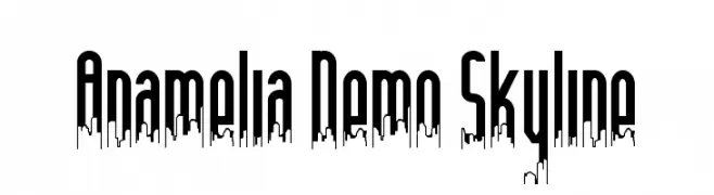
( Fonts by Edric Studio - Personal-use only. For commercial use please contact owner. )
A modern, decorative font with a city skyline motif integrated into tall, narrow letterforms.
![Anamelia Demo Skyline font caratteri gratis]() Scaricare 45 Downloads@WebFont
Scaricare 45 Downloads@WebFont -
( Fonts by Amru ID - Personal-use only. For commercial use please contact owner. )
A bold, slab serif font with a vintage yet modern appeal.
![Ekim Mezunu font caratteri gratis]() Scaricare 45 Downloads@WebFont
Scaricare 45 Downloads@WebFont -
( Fonts by Letterhend Studio - Hendry Juanda - Personal-use only. For commercial use please contact owner. )
A flowing, cursive font with elegant, sweeping strokes and a handwritten appearance.
![Maritosca DEMO-Regular font caratteri gratis]() Scaricare 45 Downloads@WebFont
Scaricare 45 Downloads@WebFont -
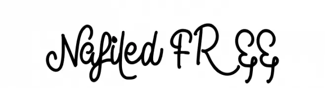
( Fonts by Riki - Personal-use only. For commercial use please contact owner. )
A playful, hand-drawn script font with flowing curves and loops.
![Nafiled FREE font caratteri gratis]() Scaricare 45 Downloads@WebFont
Scaricare 45 Downloads@WebFont -
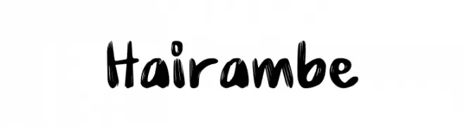
( Fonts by Rometheme Studio - Yahdi Kumala - Personal-use only. For commercial use please contact owner. )
A bold, brush-style font with dynamic, hand-drawn strokes.
![Hairambe font caratteri gratis]() Scaricare 45 Downloads@WebFont
Scaricare 45 Downloads@WebFont -
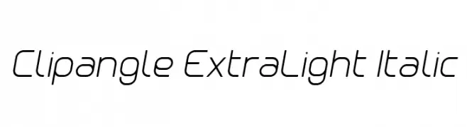
( Fonts by Yves Michel - Personal-use only. For commercial use please contact owner. )
A sleek, modern sans-serif font with an extra-light italic style.
![Clipangle ExtraLight Italic font caratteri gratis]() Scaricare 45 Downloads@WebFont
Scaricare 45 Downloads@WebFont -
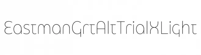
( Fonts by Zetafonts - Personal-use only. For commercial use please contact owner. )
A sleek, modern font with thin, elongated characters and a minimalist aesthetic.
![Eastman Grt Alt Trial XLight font caratteri gratis]() Scaricare 45 Downloads@WebFont
Scaricare 45 Downloads@WebFont -
( Fonts by setyaisiam _type - Personal-use only. For commercial use please contact owner. )
A bold, artistic font with calligraphic influences and dynamic letterforms.
![Zulfiqar font caratteri gratis]() Scaricare 45 Downloads@WebFont
Scaricare 45 Downloads@WebFont -
( Fonts by Khurasan - Syaf Rizal - Personal-use only. For commercial use please contact owner. )
A playful, bold font with rounded, thick strokes and a hand-drawn feel.
![Netigen font caratteri gratis]() Scaricare 45 Downloads@WebFont
Scaricare 45 Downloads@WebFont -
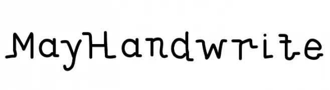
( alleytimes - www.alleytimes.net )
A playful handwritten font with a quirky, casual style.
![MayHandwrite font caratteri gratis]() Scaricare 45 Downloads@WebFont
Scaricare 45 Downloads@WebFont -
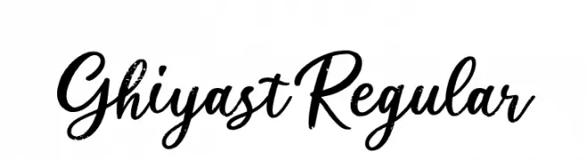
( Fonts by Creatype Studio - Rian Rahardi - Personal-use only. For commercial use please contact owner. )
A dynamic and expressive script font with fluid, cursive letterforms.
![Ghiyast Regular font caratteri gratis]() Scaricare 45 Downloads@WebFont
Scaricare 45 Downloads@WebFont -
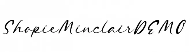
( Fonts by Letterhend Studio - Hendry Juanda - Personal-use only. For commercial use please contact owner. )
A fluid and elegant script font with smooth, flowing lines and a slight slant.
![ShopieMinclairDEMO font caratteri gratis]() Scaricare 45 Downloads@WebFont
Scaricare 45 Downloads@WebFont -
( Fonts by Sancrea Studio - Ade Santani - Personal-use only. For commercial use please contact owner. )
Expressive script with bold swashes and ornate flourishes.
![Sadwell Swashes font caratteri gratis]() Scaricare 45 Downloads@WebFont
Scaricare 45 Downloads@WebFont -
( Fonts by weknow - Wino S Kadir - Personal-use only. For commercial use please contact owner. )
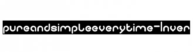
A playful, rounded font with consistent thickness and smooth curves.
![pure and simple everytime-Inver font caratteri gratis]() Scaricare 45 Downloads@WebFont
Scaricare 45 Downloads@WebFont -
( Fonts by Jetsmax.com - Personal-use only. For commercial use please contact owner. )
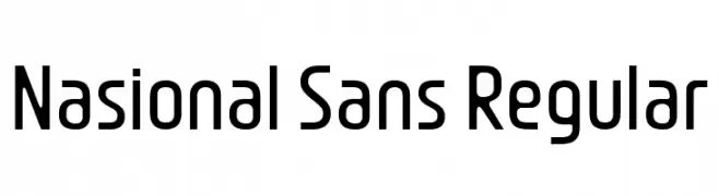
A modern, geometric sans-serif font with consistent stroke width and clear character distinction.
![Nasional Sans Regular font caratteri gratis]() Scaricare 45 Downloads@WebFont
Scaricare 45 Downloads@WebFont -
( Fonts by Hugefonts - Personal-use only. For commercial use please contact owner. )
A lively, flowing script font with elegant cursive letterforms and dynamic contrast.
![bagelad font caratteri gratis]() Scaricare 45 Downloads@WebFont
Scaricare 45 Downloads@WebFont -
( Fonts by LetterStock - Guguh Gumantoro - Personal-use only. For commercial use please contact owner. )
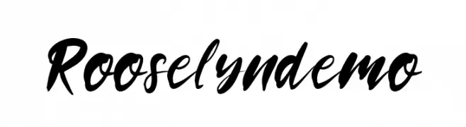
A bold, expressive script font with a brush-like texture and dynamic style.
![Rooselyndemo font caratteri gratis]() Scaricare 45 Downloads@WebFont
Scaricare 45 Downloads@WebFont -
( Fonts by Sendika Vidiyantoro - Personal-use only. For commercial use please contact owner. )
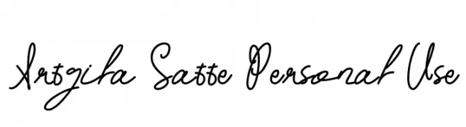
An elegant, flowing script font with a cursive, handwritten style.
![Artgila Satte Personal Use font caratteri gratis]() Scaricare 45 Downloads@WebFont
Scaricare 45 Downloads@WebFont -
( Fonts by Letterion - Yoyon Pujiyono - Personal-use only. For commercial use please contact owner. )
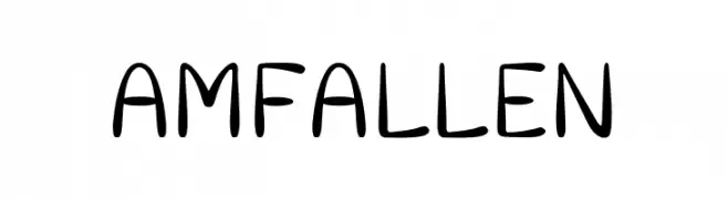
A playful, handwritten font with rounded edges and a casual style.
![Amfallen font caratteri gratis]() Scaricare 45 Downloads@WebFont
Scaricare 45 Downloads@WebFont -
( Fonts by Balpirick - Personal-use only. For commercial use please contact owner. )
A lively, handwritten font with fluid strokes and a playful style.
![Herodance font caratteri gratis]() Scaricare 45 Downloads@WebFont
Scaricare 45 Downloads@WebFont -
( Fonts by Letterhend Studio - Hendry Juanda - Personal-use only. For commercial use please contact owner. )
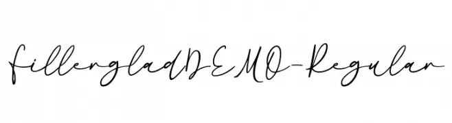
A graceful, handwritten cursive font with thin, elegant strokes.
![Fillerglad DEMO-Regular font caratteri gratis]() Scaricare 45 Downloads@WebFont
Scaricare 45 Downloads@WebFont -
( Fonts by Iconian Fonts - Daniel Zadorozny - Personal-use only. For commercial use please contact owner. )
A bold, condensed font with high contrast and sharp edges, perfect for impactful headlines.
![Grendel's Mother font caratteri gratis]() Scaricare 45 Downloads@WebFont
Scaricare 45 Downloads@WebFont -
( Fonts by Typotopia Studio - Personal-use only. For commercial use please contact owner. )
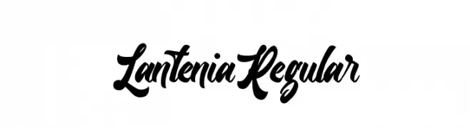
A bold, flowing script font with elegant curves and expressive characters.
![Lantenia Regular font caratteri gratis]() Scaricare 45 Downloads@WebFont
Scaricare 45 Downloads@WebFont -
( Fonts by Alpaprana - Personal-use only. For commercial use please contact owner. )
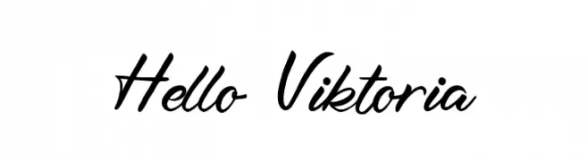
A lively, cursive font with fluid, connected strokes and a handwritten feel.
![Hello Viktoria font caratteri gratis]() Scaricare 45 Downloads@WebFont
Scaricare 45 Downloads@WebFont -
( Fonts by Jujun Gag - Personal-use only. For commercial use please contact owner. )
A bold, expressive handwritten font with a brush-like style.
![Wishmerry font caratteri gratis]() Scaricare 45 Downloads@WebFont
Scaricare 45 Downloads@WebFont -
( Fonts by Kateeng Ciu - Personal-use only. For commercial use please contact owner. )
A graceful and elegant script font with flowing, cursive letterforms and ornate flourishes.
![Mothers Day font caratteri gratis]() Scaricare 45 Downloads@WebFont
Scaricare 45 Downloads@WebFont -
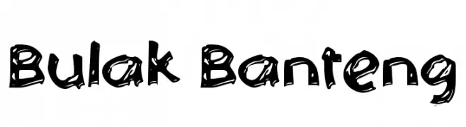
( Fonts by Wahyu Eka Prasetya - wepfont.com - Personal-use only. For commercial use please contact owner. )
A playful, hand-drawn font with a bold, cartoonish style.
![Bulak Banteng font caratteri gratis]() Scaricare 45 Downloads@WebFont
Scaricare 45 Downloads@WebFont


Quali sono i font più popolari adesso?
Poppins, Roboto, Montserrat, Open Sans e Lato sono molto usati per le forme pulite e l'ampia applicabilità — dall'identità di marca alle landing page e ai poster.
Quali font si usano spesso nei loghi?
Le sans serif geometriche (es. Poppins, famiglie in stile Gotham) sono scelte comuni per un branding pulito e scalabile. Per un tocco personale restano valide script e stili manoscritti. Abbina un display deciso per i titoli a un corpo testo neutro per riconoscibilità ed equilibrio.
Ogni quanto si aggiorna la lista?
Con regolarità, in base ai download e all'attività reale. Torna spesso per scoprire in anticipo le nuove preferite.
💡 Consiglio: aggiungi ai preferiti — le tendenze cambiano in fretta e i font top di oggi possono ispirare il rebranding di domani.