Benvenuto nelle Font Più Popolari — dove popolarità e qualità si incontrano. Qui trovi i font più scaricati e usati dell'anno. Se cerchi scelte sicure per logo, web o social, inizia da qui.
Ogni font top si distingue per equilibrio, leggibilità e versatilità. Troverai sans serif moderne, script eleganti, serif vintage e display minimalisti.
-
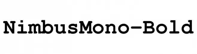
( Fonts by URW++ - Personal-use only. For commercial use please contact owner. )
A bold, monospaced slab serif font with uniform character width.
 Scaricare 357 Downloads@WebFont
 -
( Fonts by a Neale Davidson - www.pixelsagas.com. Personal-use only. For commercial use please contact owner. )
A bold, geometric font with a modern, industrial style.
![Red World font caratteri gratis]() Scaricare 357 Downloads@WebFont
Scaricare 357 Downloads@WebFont -
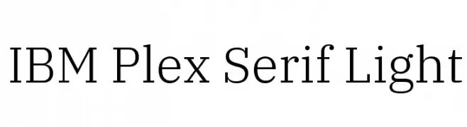
( Copyright © 2017 IBM Corp. with Reserved Font Name "Plex" )
A modern serif font with a light weight, offering elegance and readability.
![IBM Plex Serif Light font caratteri gratis]() Scaricare 357 Downloads@WebFont
Scaricare 357 Downloads@WebFont -
![trasher 2 font caratteri gratis]() Scaricare 357 Downloads@WebFont
Scaricare 357 Downloads@WebFont -
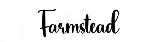
( Fonts by Scratchones )
Playful handwritten script font.
![Farmstead font caratteri gratis]() Scaricare 357 Downloads@WebFont
Scaricare 357 Downloads@WebFont -
-
( Fonts by Khurasan )
A playful, bold font with a hand-drawn, whimsical style.
![Something Maker font caratteri gratis]() Scaricare 357 Downloads@WebFont
Scaricare 357 Downloads@WebFont -
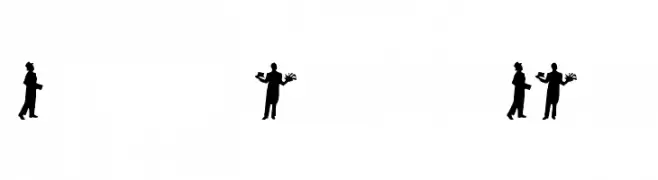
( Fonts by Emerald City Fontwerks - Steven J. Lundeen - www.speakeasy.org/~ecf/ )
Silhouette-based decorative font with theatrical character poses.
![curtain call font caratteri gratis]() Scaricare 357 Downloads@WebFont
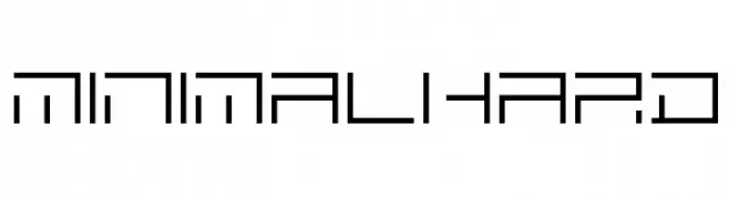
Scaricare 357 Downloads@WebFont -
![MINIMALHARD font caratteri gratis]() Scaricare 357 Downloads@WebFont
Scaricare 357 Downloads@WebFont -
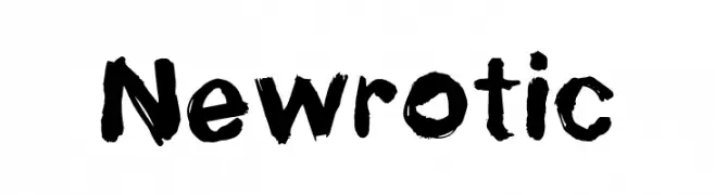
( Fonts by William Jeovah de Medeiros )
A bold, hand-painted style font with a rough, textured appearance.
![Newrotic font caratteri gratis]() Scaricare 357 Downloads@WebFont
Scaricare 357 Downloads@WebFont -
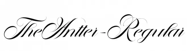
( Fonts by Mustakim - - Personal-use only. For commercial use please contact owner. )
An elegant script font with flowing, interconnected characters and high contrast strokes.
![TheAntter-Regular font caratteri gratis]() Scaricare 357 Downloads@WebFont
Scaricare 357 Downloads@WebFont


Quali sono i font più popolari adesso?
Poppins, Roboto, Montserrat, Open Sans e Lato sono molto usati per le forme pulite e l'ampia applicabilità — dall'identità di marca alle landing page e ai poster.
Quali font si usano spesso nei loghi?
Le sans serif geometriche (es. Poppins, famiglie in stile Gotham) sono scelte comuni per un branding pulito e scalabile. Per un tocco personale restano valide script e stili manoscritti. Abbina un display deciso per i titoli a un corpo testo neutro per riconoscibilità ed equilibrio.
Ogni quanto si aggiorna la lista?
Con regolarità, in base ai download e all'attività reale. Torna spesso per scoprire in anticipo le nuove preferite.
💡 Consiglio: aggiungi ai preferiti — le tendenze cambiano in fretta e i font top di oggi possono ispirare il rebranding di domani.