Benvenuto nelle Font Più Popolari — dove popolarità e qualità si incontrano. Qui trovi i font più scaricati e usati dell'anno. Se cerchi scelte sicure per logo, web o social, inizia da qui.
Ogni font top si distingue per equilibrio, leggibilità e versatilità. Troverai sans serif moderne, script eleganti, serif vintage e display minimalisti.
-
( Fonts by Small Voice Studio - smallvoice.studio/typefaces - Personal-use only. For commercial use please contact owner. )
A bold, monospaced typewriter-style font with slab serif elements.
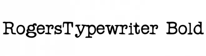 Scaricare 355 Downloads@WebFont
 -
( Fonts by Typodermic Fonts )
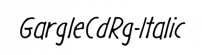
A casual, handwritten-style font with a slight slant and smooth, flowing lines.
![GargleCdRg-Italic font caratteri gratis]() Scaricare 355 Downloads@WebFont
Scaricare 355 Downloads@WebFont -
( Please check the owner website: http://www.billie.grosse.is-a-geek.com )
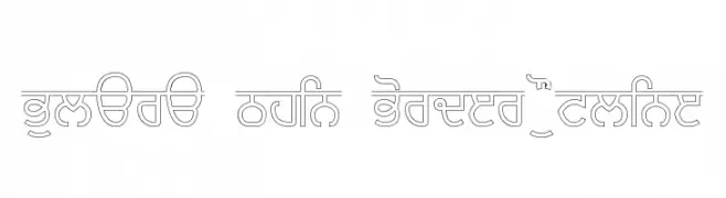
A modern outline font with thin borders and geometric precision.
![Bulara Thin Border Outline font caratteri gratis]() Scaricare 355 Downloads@WebFont
Scaricare 355 Downloads@WebFont -
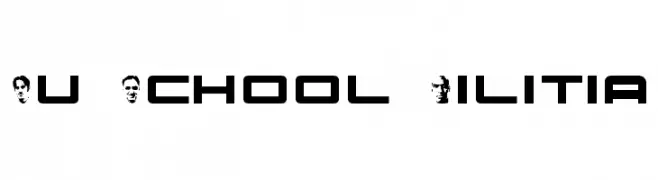
![Nu School Militia font caratteri gratis]() Scaricare 355 Downloads@WebFont
Scaricare 355 Downloads@WebFont -
( Fonts by Daniel Zadorozny - www.iconian.com - Free for personal use )
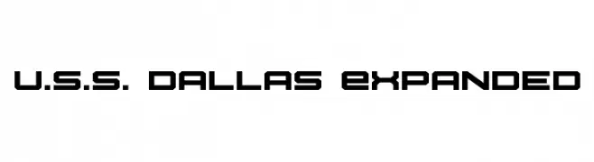
A bold, geometric font with a futuristic and technical style.
![U.S.S. Dallas Expanded font caratteri gratis]() Scaricare 355 Downloads@WebFont
Scaricare 355 Downloads@WebFont -
-
( Fonts by Tursun Sultan - Personal-use only. For commercial use please contact owner. )
A bold serif typeface with strong, authoritative strokes and sharp serifs.
![UKIJ Tuz Basma Bold font caratteri gratis]() Scaricare 355 Downloads@WebFont
Scaricare 355 Downloads@WebFont -
( Fonts by Jadatype )
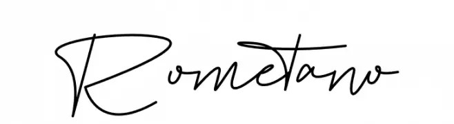
A modern, elegant handwritten font with fluid, continuous strokes.
![Rometano font caratteri gratis]() Scaricare 355 Downloads@WebFont
Scaricare 355 Downloads@WebFont -
( Fonts by Wahyu Eka Prasetya - wepfont.com - Personal-use only. For commercial use please contact owner. )
A lively, cursive font with fluid strokes and a handwritten charm.
![Easy Sticky font caratteri gratis]() Scaricare 355 Downloads@WebFont
Scaricare 355 Downloads@WebFont -
( Fonts by allsuperfont.com - Personal-use only. For commercial use please contact owner. )
A bold, chunky font with rounded edges and a playful style.
![Super Rocky font caratteri gratis]() Scaricare 355 Downloads@WebFont
Scaricare 355 Downloads@WebFont -
![KR Weather Dings font caratteri gratis]() Scaricare 355 Downloads@WebFont
Scaricare 355 Downloads@WebFont


Quali sono i font più popolari adesso?
Poppins, Roboto, Montserrat, Open Sans e Lato sono molto usati per le forme pulite e l'ampia applicabilità — dall'identità di marca alle landing page e ai poster.
Quali font si usano spesso nei loghi?
Le sans serif geometriche (es. Poppins, famiglie in stile Gotham) sono scelte comuni per un branding pulito e scalabile. Per un tocco personale restano valide script e stili manoscritti. Abbina un display deciso per i titoli a un corpo testo neutro per riconoscibilità ed equilibrio.
Ogni quanto si aggiorna la lista?
Con regolarità, in base ai download e all'attività reale. Torna spesso per scoprire in anticipo le nuove preferite.
💡 Consiglio: aggiungi ai preferiti — le tendenze cambiano in fretta e i font top di oggi possono ispirare il rebranding di domani.