Benvenuto nelle Font Più Popolari — dove popolarità e qualità si incontrano. Qui trovi i font più scaricati e usati dell'anno. Se cerchi scelte sicure per logo, web o social, inizia da qui.
Ogni font top si distingue per equilibrio, leggibilità e versatilità. Troverai sans serif moderne, script eleganti, serif vintage e display minimalisti.
-
( Fonts by a Nick Polyarush - alteran-x.deviantart.com . Personal-use only. For commercial use please contact owner. )
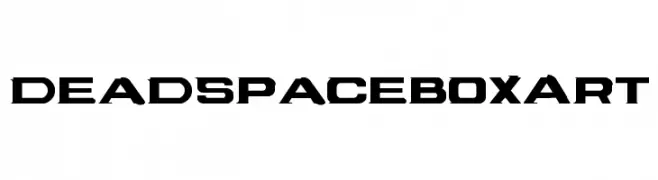
A bold, futuristic font with angular, geometric characters.
 Scaricare 354 Downloads@WebFont
 -
( Free for a personal use. For a commercial use please visit www.kevinandamanda.com )
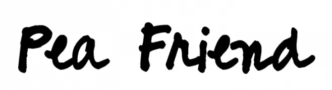
A bold, handwritten font with a playful and casual style.
![Pea Friend font caratteri gratis]() Scaricare 354 Downloads@WebFont
Scaricare 354 Downloads@WebFont -
( Fonts by Astro Studios - www.astrostudios.com - Personal-use only. For commercial use please contact owner. )
A geometric, futuristic font with bold, angular shapes and an inline style.
![DubtronicInline font caratteri gratis]() Scaricare 354 Downloads@WebFont
Scaricare 354 Downloads@WebFont -
( Fonts by Daniel Zadorozny - www.iconian.com )
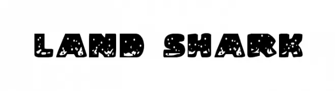
A bold, playful font with a splashy, textured design.
![Land Shark font caratteri gratis]() Scaricare 353 Downloads@WebFont
Scaricare 353 Downloads@WebFont -
( Fonts by ShyFonts )
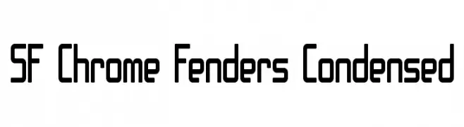
A modern, geometric, and condensed font with bold strokes and rounded edges.
![SF Chrome Fenders Condensed font caratteri gratis]() Scaricare 353 Downloads@WebFont
Scaricare 353 Downloads@WebFont -
-
( Haris Prawoto - graphicriver.net/user/selawe/portfolio )
A playful, handwritten font with smooth, flowing strokes and a casual style.
![Sweety font caratteri gratis]() Scaricare 353 Downloads@WebFont
Scaricare 353 Downloads@WebFont -
( Fonts by Apostrophic Lab )
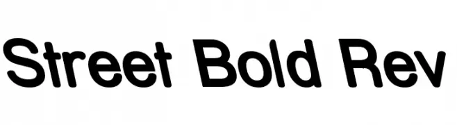
A bold, rounded font with a modern and friendly style.
![Street Bold Rev font caratteri gratis]() Scaricare 353 Downloads@WebFont
Scaricare 353 Downloads@WebFont -
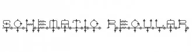
![schematic Regular font caratteri gratis]() Scaricare 353 Downloads@WebFont
Scaricare 353 Downloads@WebFont -
( Fonts by Nick's Fonts )
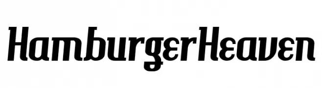
A bold, dynamic font with a modern slant and strong visual impact.
![HamburgerHeaven font caratteri gratis]() Scaricare 353 Downloads@WebFont
Scaricare 353 Downloads@WebFont -
( Fonts by Stefie Justprince )
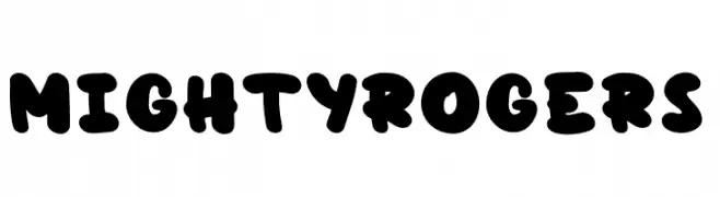
A bold, rounded font with a playful and energetic style.
![MightyRogers font caratteri gratis]() Scaricare 353 Downloads@WebFont
Scaricare 353 Downloads@WebFont


Quali sono i font più popolari adesso?
Poppins, Roboto, Montserrat, Open Sans e Lato sono molto usati per le forme pulite e l'ampia applicabilità — dall'identità di marca alle landing page e ai poster.
Quali font si usano spesso nei loghi?
Le sans serif geometriche (es. Poppins, famiglie in stile Gotham) sono scelte comuni per un branding pulito e scalabile. Per un tocco personale restano valide script e stili manoscritti. Abbina un display deciso per i titoli a un corpo testo neutro per riconoscibilità ed equilibrio.
Ogni quanto si aggiorna la lista?
Con regolarità, in base ai download e all'attività reale. Torna spesso per scoprire in anticipo le nuove preferite.
💡 Consiglio: aggiungi ai preferiti — le tendenze cambiano in fretta e i font top di oggi possono ispirare il rebranding di domani.