Benvenuto nelle Font Più Popolari — dove popolarità e qualità si incontrano. Qui trovi i font più scaricati e usati dell'anno. Se cerchi scelte sicure per logo, web o social, inizia da qui.
Ogni font top si distingue per equilibrio, leggibilità e versatilità. Troverai sans serif moderne, script eleganti, serif vintage e display minimalisti.
-
 Scaricare 1322 Downloads@WebFont
 -
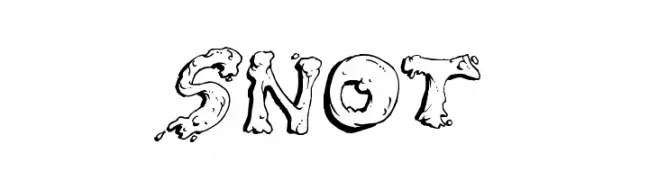
( Fonts by Rob Dobi - Toxic Type - www.dobi.nu )
A playful, blob-like font with a whimsical and cartoonish style.
![Snot font caratteri gratis]() Scaricare 1322 Downloads@WebFont
Scaricare 1322 Downloads@WebFont -
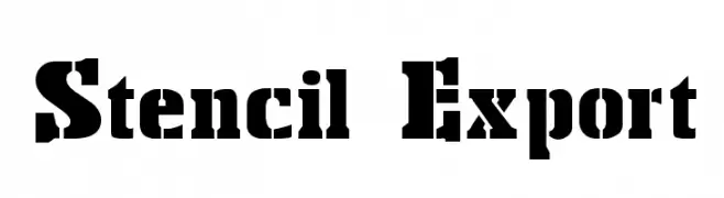
![Stencil Export font caratteri gratis]() Scaricare 1322 Downloads@WebFont
Scaricare 1322 Downloads@WebFont -
( Fonts by wep )
A playful, bold handwritten font with rounded, slightly irregular letters.
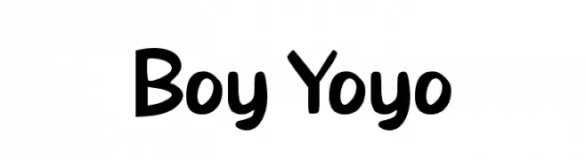
![Boy Yoyo font caratteri gratis]() Scaricare 1321 Downloads@WebFont
Scaricare 1321 Downloads@WebFont -
( Typodermic Fonts - Ray Larabie - www.typodermicfonts.com/ )
A bold, modern font with clean lines and strong visual impact.
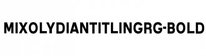
![MixolydianTitlingRg-Bold font caratteri gratis]() Scaricare 1321 Downloads@WebFont
Scaricare 1321 Downloads@WebFont -
( Fonts by a Max Infeld - XEROGRAPHER FONTS - xerographer.blogspot.com . Personal-use only. For commercial use please contact owner. )
A playful, hand-drawn font with a casual and artistic style.
![IndieSellout font caratteri gratis]() Scaricare 1321 Downloads@WebFont
Scaricare 1321 Downloads@WebFont -
![DupuyBALloon-Italic Italic font caratteri gratis]() Scaricare 1321 Downloads@WebFont
Scaricare 1321 Downloads@WebFont -
( Google Web Fonts )
A sleek, modern, light italic font with smooth strokes and tight spacing.
![Ubuntu Light Italic font caratteri gratis]() Scaricare 1321 Downloads@WebFont
Scaricare 1321 Downloads@WebFont -
![carbono font caratteri gratis]() Scaricare 1321 Downloads@WebFont
Scaricare 1321 Downloads@WebFont -
( Fonts by www.fontalicious.com )
A futuristic and geometric font with bold, rounded letterforms.
![Freshbot font caratteri gratis]() Scaricare 1321 Downloads@WebFont
Scaricare 1321 Downloads@WebFont -
( Fonts by Andrew McCluskey - nalgames.com. Personal-use only. For commercial use please contact owner. )
A bold, geometric stencil font with an industrial feel.
![Valiant font caratteri gratis]() Scaricare 1321 Downloads@WebFont
Scaricare 1321 Downloads@WebFont -
( Fonts by www.haroldsfonts.com )
A bold, decorative font with a dynamic echo effect.
![Echo font caratteri gratis]() Scaricare 1321 Downloads@WebFont
Scaricare 1321 Downloads@WebFont -
( Fonts by Altsys Metamorphosis )
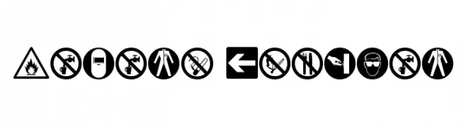
Bold, geometric hazard and safety pictogram set.
![Hazard Regular font caratteri gratis]() Scaricare 1321 Downloads@WebFont
Scaricare 1321 Downloads@WebFont -
( Fonts by wepfont - Wahyu Eka Prasetya - Personal-use only. For commercial use please contact owner. )
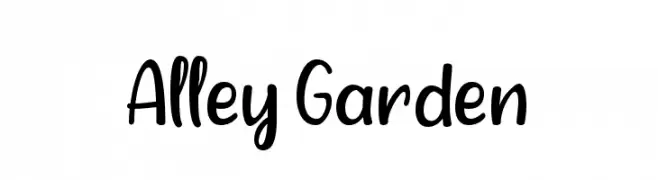
A playful, handwritten font with a casual and friendly style.
![Alley Garden font caratteri gratis]() Scaricare 1320 Downloads@WebFont
Scaricare 1320 Downloads@WebFont -
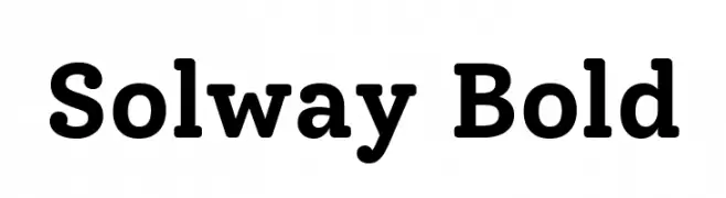
( Copyright 2018 The Solway Project Authors (https://github.com/googlefonts/solway) )
A bold slab serif font with strong, thick strokes and a modern yet traditional appeal.
![Solway Bold font caratteri gratis]() Scaricare 1320 Downloads@WebFont
Scaricare 1320 Downloads@WebFont -
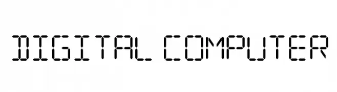
![Digital Computer font caratteri gratis]() Scaricare 1320 Downloads@WebFont
Scaricare 1320 Downloads@WebFont -
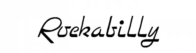
![Rockabilly font caratteri gratis]() Scaricare 1320 Downloads@WebFont
Scaricare 1320 Downloads@WebFont -
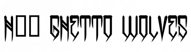
( Fonts by www.legacyofdefeat.com )
A bold, angular font with an urban, edgy style.
![H74 Ghetto Wolves font caratteri gratis]() Scaricare 1320 Downloads@WebFont
Scaricare 1320 Downloads@WebFont -
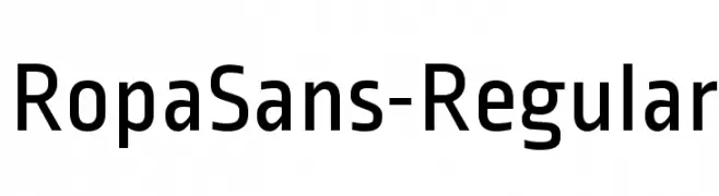
( Copyright (c) 2011, Botjo Nikoltchev (post@carrois.com www.carrois.com) )
A modern, clean sans-serif font with a geometric structure.
![RopaSans-Regular font caratteri gratis]() Scaricare 1320 Downloads@WebFont
Scaricare 1320 Downloads@WebFont -
![AGA Granada :1F'7] V2 font caratteri gratis]() Scaricare 1320 Downloads@WebFont
Scaricare 1320 Downloads@WebFont -
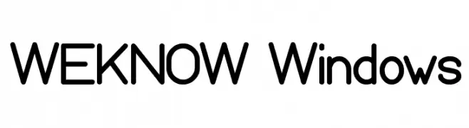
( Fonts by weknow - Wino S Kadir )
A modern, rounded sans-serif font with clean lines and high legibility.
![WEKNOW Windows font caratteri gratis]() Scaricare 1320 Downloads@WebFont
Scaricare 1320 Downloads@WebFont -
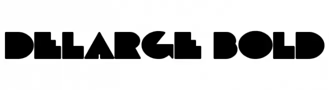
![DeLarge Bold font caratteri gratis]() Scaricare 1320 Downloads@WebFont
Scaricare 1320 Downloads@WebFont -
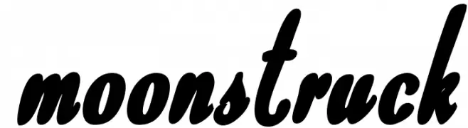
![Moonstruck font caratteri gratis]() Scaricare 1320 Downloads@WebFont
Scaricare 1320 Downloads@WebFont -
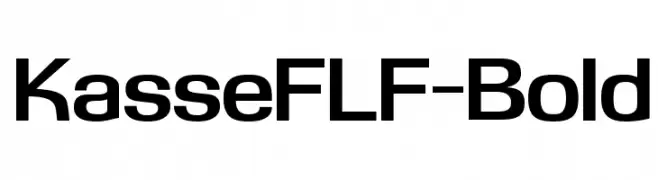
( Fonts by Casady & Greene )
A bold, modern sans-serif font with a geometric structure and clean lines.
![KasseFLF-Bold font caratteri gratis]() Scaricare 1320 Downloads@WebFont
Scaricare 1320 Downloads@WebFont -
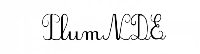
![PlumNDE font caratteri gratis]() Scaricare 1320 Downloads@WebFont
Scaricare 1320 Downloads@WebFont -
( Fonts by Grzegorz l - www.glukfonts.pl )
A bold, high-contrast serif font with a dramatic and elegant style.
![spinweradC Bold font caratteri gratis]() Scaricare 1320 Downloads@WebFont
Scaricare 1320 Downloads@WebFont -
( Fonts by Apostrophic Lab )
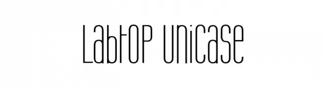
A tall, narrow, and modern unicase font with consistent stroke width.
![Labtop Unicase font caratteri gratis]() Scaricare 1320 Downloads@WebFont
Scaricare 1320 Downloads@WebFont -
![Lansbury font caratteri gratis]() Scaricare 1320 Downloads@WebFont
Scaricare 1320 Downloads@WebFont -
![101! In My Pocket font caratteri gratis]() Scaricare 1320 Downloads@WebFont
Scaricare 1320 Downloads@WebFont -
( Fonts by Steve Cloutier - www.cloutierfontes.ca )
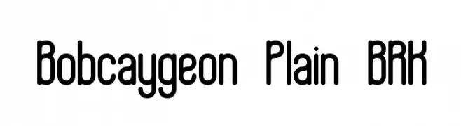
A modern, rounded font with a clean and approachable design.
![Bobcaygeon Plain BRK font caratteri gratis]() Scaricare 1320 Downloads@WebFont
Scaricare 1320 Downloads@WebFont -
( Fonts by huawei.com - Personal-use only. For commercial use please contact owner. )
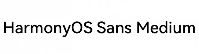
A modern, geometric sans-serif font with uniform stroke widths.
![HarmonyOS Sans Medium font caratteri gratis]() Scaricare 1319 Downloads@WebFont
Scaricare 1319 Downloads@WebFont -
( Fonts by MJType )
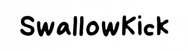
A playful, bold font with rounded, thick strokes and a whimsical touch.
![Swallow Kick font caratteri gratis]() Scaricare 1319 Downloads@WebFont
Scaricare 1319 Downloads@WebFont -
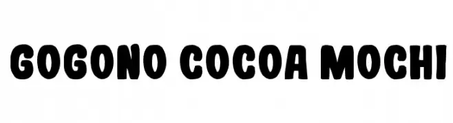
![Gogono Cocoa Mochi font caratteri gratis]() Scaricare 1319 Downloads@WebFont
Scaricare 1319 Downloads@WebFont -
( Fonts by a Emily Spadoni - http://creativemarket.com/emilyspadoni/. Personal-use only. For commercial use please contact owner. )
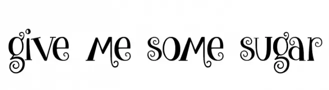
A whimsical and playful font with curvy lines and decorative swirls.
![give me some sugar font caratteri gratis]() Scaricare 1319 Downloads@WebFont
Scaricare 1319 Downloads@WebFont -
![Patapon font caratteri gratis]() Scaricare 1319 Downloads@WebFont
Scaricare 1319 Downloads@WebFont


![AGA Granada :1F'7] V2 font caratteri gratis](https://d144mzi0q5mijx.cloudfront.net/img/A/G/AGA-Granada-1F7-V2.webp)


Quali sono i font più popolari adesso?
Poppins, Roboto, Montserrat, Open Sans e Lato sono molto usati per le forme pulite e l'ampia applicabilità — dall'identità di marca alle landing page e ai poster.
Quali font si usano spesso nei loghi?
Le sans serif geometriche (es. Poppins, famiglie in stile Gotham) sono scelte comuni per un branding pulito e scalabile. Per un tocco personale restano valide script e stili manoscritti. Abbina un display deciso per i titoli a un corpo testo neutro per riconoscibilità ed equilibrio.
Ogni quanto si aggiorna la lista?
Con regolarità, in base ai download e all'attività reale. Torna spesso per scoprire in anticipo le nuove preferite.
💡 Consiglio: aggiungi ai preferiti — le tendenze cambiano in fretta e i font top di oggi possono ispirare il rebranding di domani.