Benvenuto nelle Font Più Popolari — dove popolarità e qualità si incontrano. Qui trovi i font più scaricati e usati dell'anno. Se cerchi scelte sicure per logo, web o social, inizia da qui.
Ogni font top si distingue per equilibrio, leggibilità e versatilità. Troverai sans serif moderne, script eleganti, serif vintage e display minimalisti.
-
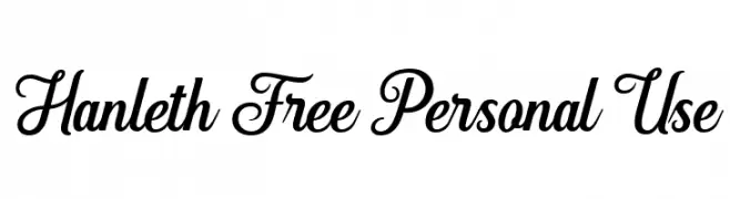
( Fonts by Andhi Yulianto - Personal-use only. For commercial use please contact owner. )
A stylish and elegant script font with flowing, connected letterforms.
 Scaricare 350 Downloads@WebFont
 -
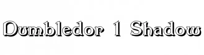
( Fonts by Graham Meade - GemFonts )
A bold, shadowed serif font with a dramatic and elegant style.
![Dumbledor 1 Shadow font caratteri gratis]() Scaricare 350 Downloads@WebFont
Scaricare 350 Downloads@WebFont -
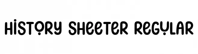
( Fonts by Niskala Huruf )
A playful, rounded font with bold, smooth curves and a modern-retro vibe.
![History Sheeter Regular font caratteri gratis]() Scaricare 350 Downloads@WebFont
Scaricare 350 Downloads@WebFont -
( imagex - www.imagex-fonts.com )
A bold, geometric font with strong, angular lines and a modern aesthetic.
![Prezident font caratteri gratis]() Scaricare 350 Downloads@WebFont
Scaricare 350 Downloads@WebFont -
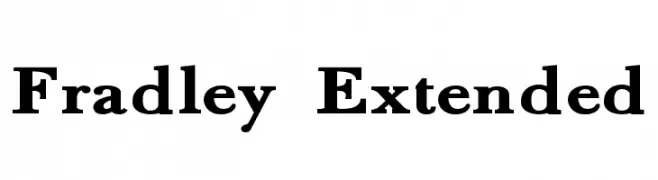
( Roger White - web.archive.org/web/20120416090521/www.rogersfonts.org.uk/ )
A classic serif font with bold, elegant serifs and a modern touch.
![Fradley Extended font caratteri gratis]() Scaricare 350 Downloads@WebFont
Scaricare 350 Downloads@WebFont -
-
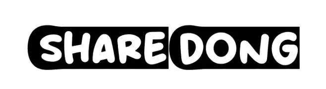
( Fonts by Khurasan )
A playful, bold font with rounded, bubble-like characters.
![Share Dong font caratteri gratis]() Scaricare 350 Downloads@WebFont
Scaricare 350 Downloads@WebFont -
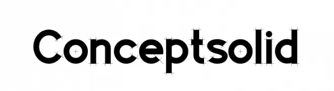
![Concept solid font caratteri gratis]() Scaricare 350 Downloads@WebFont
Scaricare 350 Downloads@WebFont -
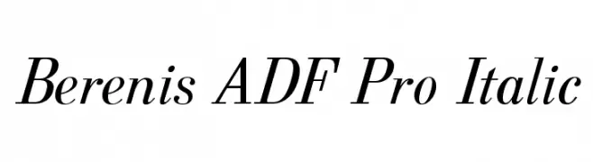
( Fonts by Arkandis Digital Foundry )
A classic serif typeface with an elegant italic style and refined serifs.
![Berenis ADF Pro Italic font caratteri gratis]() Scaricare 350 Downloads@WebFont
Scaricare 350 Downloads@WebFont -
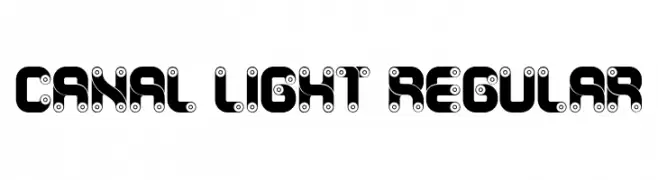
( Fonts by Vladimir Nikolic )
A bold, mechanical font with a unique industrial design.
![Canal Light Regular font caratteri gratis]() Scaricare 350 Downloads@WebFont
Scaricare 350 Downloads@WebFont -
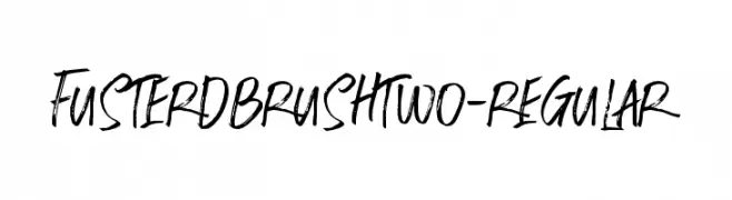
( Fonts by ijemrockart - https://creativemarket.com/ijemrockart - Personal-use only. For commercial use please contact owner. )
A dynamic, brush-style font with expressive, hand-drawn strokes.
![FusterdBrushTwo-Regular font caratteri gratis]() Scaricare 350 Downloads@WebFont
Scaricare 350 Downloads@WebFont

Quali sono i font più popolari adesso?
Poppins, Roboto, Montserrat, Open Sans e Lato sono molto usati per le forme pulite e l'ampia applicabilità — dall'identità di marca alle landing page e ai poster.
Quali font si usano spesso nei loghi?
Le sans serif geometriche (es. Poppins, famiglie in stile Gotham) sono scelte comuni per un branding pulito e scalabile. Per un tocco personale restano valide script e stili manoscritti. Abbina un display deciso per i titoli a un corpo testo neutro per riconoscibilità ed equilibrio.
Ogni quanto si aggiorna la lista?
Con regolarità, in base ai download e all'attività reale. Torna spesso per scoprire in anticipo le nuove preferite.
💡 Consiglio: aggiungi ai preferiti — le tendenze cambiano in fretta e i font top di oggi possono ispirare il rebranding di domani.