Benvenuto nelle Font Più Popolari — dove popolarità e qualità si incontrano. Qui trovi i font più scaricati e usati dell'anno. Se cerchi scelte sicure per logo, web o social, inizia da qui.
Ogni font top si distingue per equilibrio, leggibilità e versatilità. Troverai sans serif moderne, script eleganti, serif vintage e display minimalisti.
-
( Fonts by Typodermic Fonts - Raymond Larabie - Personal-use only. For commercial use please contact owner. )
A bold, geometric font with a condensed, modern style.
 Scaricare 45 Downloads@WebFont
 -
( Fonts by Grigoriy Sviridov - Personal-use only. For commercial use please contact owner. )
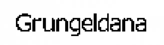
A bold, pixelated font with a retro digital aesthetic.
![Grungeldana font caratteri gratis]() Scaricare 45 Downloads@WebFont
Scaricare 45 Downloads@WebFont -
( Fonts by Iconian Fonts - Daniel Zadorozny - Personal-use only. For commercial use please contact owner. )
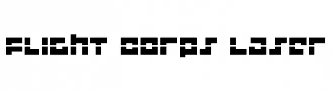
A bold, futuristic font with geometric, block-like characters and a sci-fi aesthetic.
![Flight Corps Laser font caratteri gratis]() Scaricare 45 Downloads@WebFont
Scaricare 45 Downloads@WebFont -
( Fonts by Iconian Fonts - Daniel Zadorozny - Personal-use only. For commercial use please contact owner. )
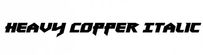
A bold, angular, and italicized font with a futuristic style.
![Heavy Copper Italic font caratteri gratis]() Scaricare 45 Downloads@WebFont
Scaricare 45 Downloads@WebFont -
( Fonts by SushiHueDesign - Personal-use only. For commercial use please contact owner. )
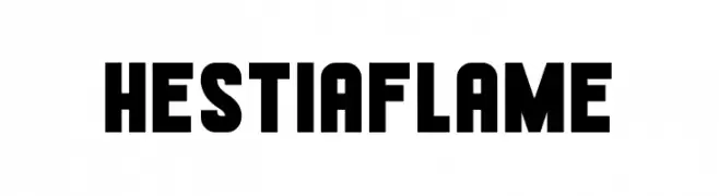
A bold, geometric font with strong, uniform strokes and a commanding presence.
![Hestia Flame font caratteri gratis]() Scaricare 45 Downloads@WebFont
Scaricare 45 Downloads@WebFont -
( Fonts by Vladimir Nikolic - Personal-use only. For commercial use please contact owner. )
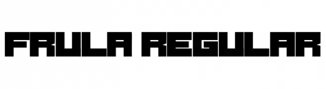
A bold, geometric font with a modern, futuristic style.
![Frula Regular font caratteri gratis]() Scaricare 45 Downloads@WebFont
Scaricare 45 Downloads@WebFont -
( Fonts by weknow - Wino S Kadir - Personal-use only. For commercial use please contact owner. )
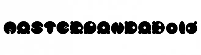
A bold, playful font with rounded, bubble-like characters and circular cutouts.
![MASTER PANDA Bold font caratteri gratis]() Scaricare 45 Downloads@WebFont
Scaricare 45 Downloads@WebFont -
( Fonts by Woodcutter )
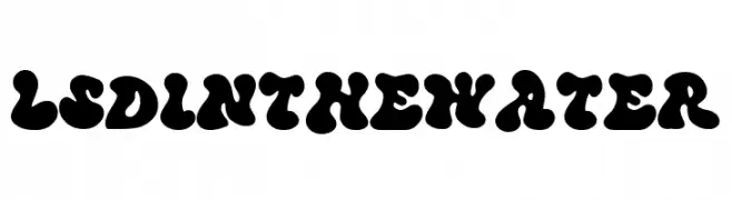
A bold, playful font with rounded, bubbly characters and a retro vibe.
![LSD in the Water font caratteri gratis]() Scaricare 45 Downloads@WebFont
Scaricare 45 Downloads@WebFont -
( Fonts by Darrell Flood - Personal-use only. For commercial use please contact owner. )
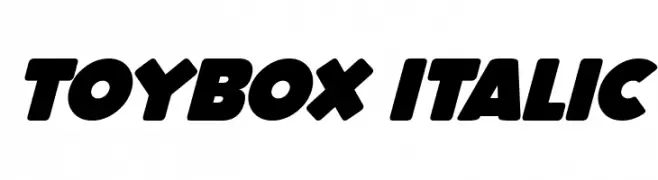
A bold, playful italic font with rounded strokes and dynamic slant.
![ToyBox Italic font caratteri gratis]() Scaricare 45 Downloads@WebFont
Scaricare 45 Downloads@WebFont -
( Fonts by Rvandtype - Randi Irvan - Personal-use only. For commercial use please contact owner. )
A playful and casual script font with a handwritten style.
![HeyYours font caratteri gratis]() Scaricare 45 Downloads@WebFont
Scaricare 45 Downloads@WebFont -
( Fonts by Gassstype )
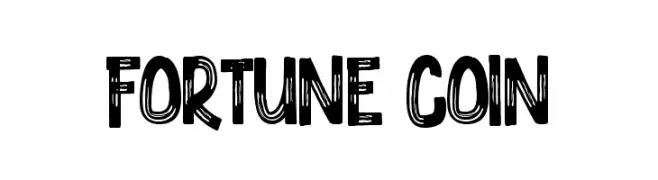
A bold, hand-drawn font with textured, sketch-like details.
![Fortune Coin font caratteri gratis]() Scaricare 45 Downloads@WebFont
Scaricare 45 Downloads@WebFont -
( Fonts by Kong Font - Personal-use only. For commercial use please contact owner. )
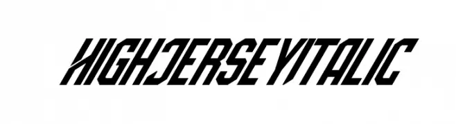
A bold, italicized font with a dynamic, angular style.
![High Jersey Italic font caratteri gratis]() Scaricare 45 Downloads@WebFont
Scaricare 45 Downloads@WebFont -
( Fonts by Trf - TRF Fonts - Personal-use only. For commercial use please contact owner. )
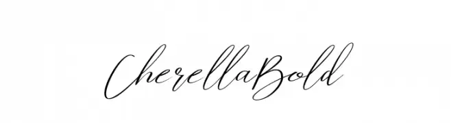
An elegant, cursive font with intricate loops and swirls.
![Cherella Bold font caratteri gratis]() Scaricare 45 Downloads@WebFont
Scaricare 45 Downloads@WebFont -
( Fonts by Daniel Zadorozny - www.iconian.com - Personal-use only. For commercial use please contact owner. )
A bold, geometric font with a strong visual impact and uniform width.
![Zirconian font caratteri gratis]() Scaricare 45 Downloads@WebFont
Scaricare 45 Downloads@WebFont -
( Fonts by Vladimir Nikolic - www.creativefabrica.com/designer/vladimirnikolic/ - Personal-use only. For commercial use please contact owner. )
A bold, geometric font with a modern, three-dimensional style.
![In Resin Light Regular font caratteri gratis]() Scaricare 45 Downloads@WebFont
Scaricare 45 Downloads@WebFont -
( Fonts by Perspectype Studio - Personal-use only. For commercial use please contact owner. )
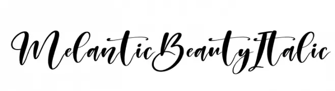
An elegant, flowing script font with a dynamic, italic style.
![Melantic Beauty Italic font caratteri gratis]() Scaricare 45 Downloads@WebFont
Scaricare 45 Downloads@WebFont -
( Fonts by imagex - Personal-use only. For commercial use please contact owner. )
A bold, shadowy font with irregular, dramatic strokes.
![Shadow of the deads Under font caratteri gratis]() Scaricare 45 Downloads@WebFont
Scaricare 45 Downloads@WebFont -
( Fonts by vilogsign - Nur Kholis - Personal-use only. For commercial use please contact owner. )
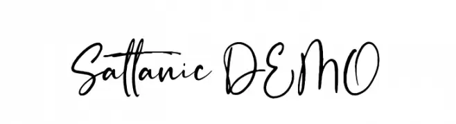
A dynamic and expressive handwritten font with fluid strokes and playful curves.
![Sattanic DEMO font caratteri gratis]() Scaricare 45 Downloads@WebFont
Scaricare 45 Downloads@WebFont -
( Fonts by Aaron Amar - Personal-use only. For commercial use please contact owner. )
A bold, elongated serif font with a dramatic, vintage-inspired style.
![Furgatorio Regular font caratteri gratis]() Scaricare 45 Downloads@WebFont
Scaricare 45 Downloads@WebFont -
( Fonts by Kara L - Personal-use only. For commercial use please contact owner. )
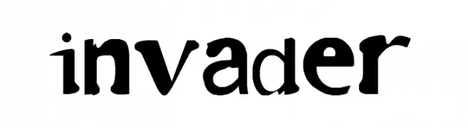
A bold, playful font with whimsical and artistic character shapes.
![invader font caratteri gratis]() Scaricare 45 Downloads@WebFont
Scaricare 45 Downloads@WebFont -
( Fonts by Typodermic Fonts - Raymond Larabie - Personal-use only. For commercial use please contact owner. )
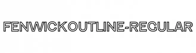
A bold, outlined font with a modern and geometric style.
![FenwickOutline-Regular font caratteri gratis]() Scaricare 45 Downloads@WebFont
Scaricare 45 Downloads@WebFont -
( Fonts by Abhishek Junghare - Personal-use only. For commercial use please contact owner. )
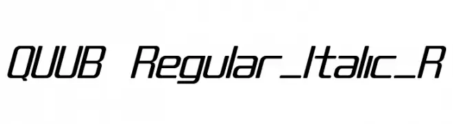
A modern, italicized font with rounded edges and consistent line thickness.
![QUUB Regular_Italic_R font caratteri gratis]() Scaricare 45 Downloads@WebFont
Scaricare 45 Downloads@WebFont -
( Fonts by Bearytype - Dian Hadi - Personal-use only. For commercial use please contact owner. )
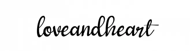
A playful and elegant script font with flowing, connected letters.
![loveandheart font caratteri gratis]() Scaricare 45 Downloads@WebFont
Scaricare 45 Downloads@WebFont -
( Fonts by DumadiStyle - Toni Dzulham - Personal-use only. For commercial use please contact owner. )
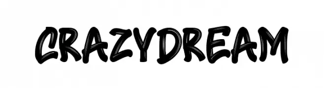
A bold, playful font with a brush-like, hand-drawn style.
![Crazy Dream font caratteri gratis]() Scaricare 45 Downloads@WebFont
Scaricare 45 Downloads@WebFont -
( Fonts by Ryan Erbir - Personal-use only. For commercial use please contact owner. )
A bold, geometric font with a modern and assertive style.
![Kebo Irengku font caratteri gratis]() Scaricare 45 Downloads@WebFont
Scaricare 45 Downloads@WebFont -
( Fonts by Kara L - Personal-use only. For commercial use please contact owner. )
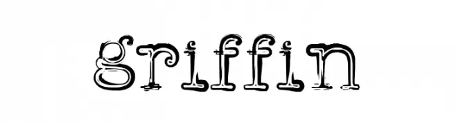
A whimsical, hand-drawn font with bold, uneven strokes and a playful style.
![griffin font caratteri gratis]() Scaricare 45 Downloads@WebFont
Scaricare 45 Downloads@WebFont -
( Fonts by Kong Font - fontkong.com - Personal-use only. For commercial use please contact owner. )
A dynamic, handwritten-style font with elegant curves and expressive strokes.
![Shayne font caratteri gratis]() Scaricare 45 Downloads@WebFont
Scaricare 45 Downloads@WebFont -
( Fonts by Woodcutter Manero - www.woodcutter.es - Personal-use only. For commercial use please contact owner. )
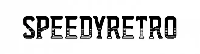
Bold, retro display font with horizontal line shading and condensed, geometric forms.
![Speedy Retro font caratteri gratis]() Scaricare 45 Downloads@WebFont
Scaricare 45 Downloads@WebFont -
( Fonts by Edric Studio - Personal-use only. For commercial use please contact owner. )
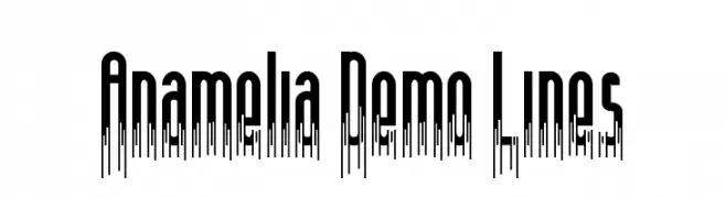
A decorative font with elongated, dripping vertical lines for a dynamic look.
![Anamelia Demo Lines font caratteri gratis]() Scaricare 45 Downloads@WebFont
Scaricare 45 Downloads@WebFont -
( Fonts by Mans Greback - Personal-use only. For commercial use please contact owner. )
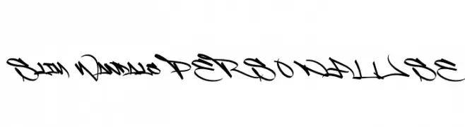
A bold, graffiti-inspired font with sharp angles and sweeping lines.
![Slim Wandals PERSONAL USE font caratteri gratis]() Scaricare 45 Downloads@WebFont
Scaricare 45 Downloads@WebFont -
( Fonts by HastaType - Salman Mashudi - Personal-use only. For commercial use please contact owner. )
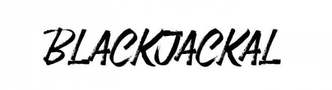
A bold, brush-style script font with a dynamic and artistic flair.
![Black Jackal font caratteri gratis]() Scaricare 45 Downloads@WebFont
Scaricare 45 Downloads@WebFont -
( Fonts by Tigadestd - Doli Harahap - Personal-use only. For commercial use please contact owner. )
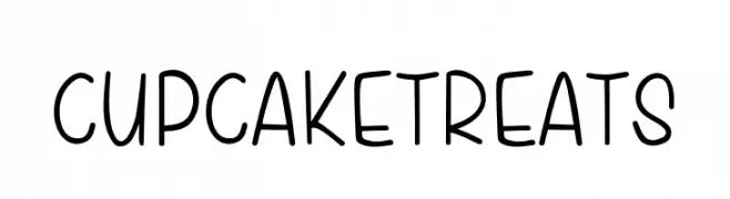
A playful handwritten font with rounded edges and a casual style.
![Cupcake Treats font caratteri gratis]() Scaricare 45 Downloads@WebFont
Scaricare 45 Downloads@WebFont -
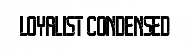
( Fonts by Vladimir Nikolic - Personal-use only. For commercial use please contact owner. )
A bold, geometric, and condensed font with a modern, edgy style.
![Loyalist Condensed font caratteri gratis]() Scaricare 45 Downloads@WebFont
Scaricare 45 Downloads@WebFont -
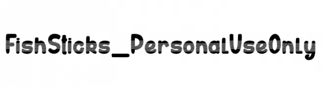
( Fonts by dcoxy - Greg Medina - Personal-use only. For commercial use please contact owner. )
A playful, bold font with a retro halftone pattern and rounded characters.
![Fish Sticks_PersonalUseOnly font caratteri gratis]() Scaricare 45 Downloads@WebFont
Scaricare 45 Downloads@WebFont -
( Fonts by Analogous Studio - Muhammad Ilham - Personal-use only. For commercial use please contact owner. )
An elegant, high-contrast script font with flowing, cursive strokes.
![handlove font caratteri gratis]() Scaricare 45 Downloads@WebFont
Scaricare 45 Downloads@WebFont


Quali sono i font più popolari adesso?
Poppins, Roboto, Montserrat, Open Sans e Lato sono molto usati per le forme pulite e l'ampia applicabilità — dall'identità di marca alle landing page e ai poster.
Quali font si usano spesso nei loghi?
Le sans serif geometriche (es. Poppins, famiglie in stile Gotham) sono scelte comuni per un branding pulito e scalabile. Per un tocco personale restano valide script e stili manoscritti. Abbina un display deciso per i titoli a un corpo testo neutro per riconoscibilità ed equilibrio.
Ogni quanto si aggiorna la lista?
Con regolarità, in base ai download e all'attività reale. Torna spesso per scoprire in anticipo le nuove preferite.
💡 Consiglio: aggiungi ai preferiti — le tendenze cambiano in fretta e i font top di oggi possono ispirare il rebranding di domani.