Benvenuto nelle Font Più Popolari — dove popolarità e qualità si incontrano. Qui trovi i font più scaricati e usati dell'anno. Se cerchi scelte sicure per logo, web o social, inizia da qui.
Ogni font top si distingue per equilibrio, leggibilità e versatilità. Troverai sans serif moderne, script eleganti, serif vintage e display minimalisti.
-
( Fonts by Daniel Zadorozny - www.iconian.com - Personal-use only. For commercial use please contact owner. )
A bold, geometric, and italicized font with hexagonal character shapes, ideal for modern and tech-inspired designs.
 Scaricare 40 Downloads@WebFont
 -
( Fonts by Nico Muslib - Personal-use only. For commercial use please contact owner. )
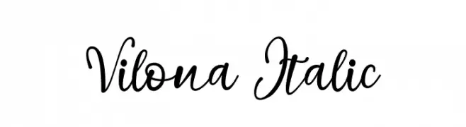
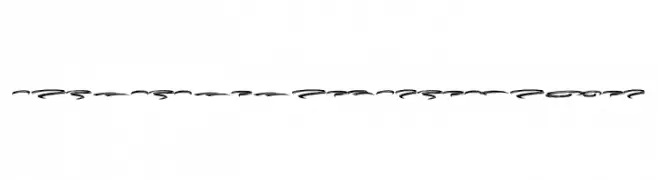
A flowing, cursive script font with elegant, sweeping strokes.
![Vilona Italic font caratteri gratis]() Scaricare 40 Downloads@WebFont
Scaricare 40 Downloads@WebFont -
( Fonts by Qkila - Quentin Aquila - Personal-use only. For commercial use please contact owner. )
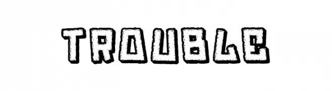
A bold, playful, hand-drawn font with a cartoonish style.
![Trouble font caratteri gratis]() Scaricare 40 Downloads@WebFont
Scaricare 40 Downloads@WebFont -
( Fonts by Woodcutter Manero - www.woodcutter.es - Personal-use only. For commercial use please contact owner. )
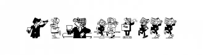
Playful, bold serif font inspired by vintage comic strips.
![Andy Capp font caratteri gratis]() Scaricare 40 Downloads@WebFont
Scaricare 40 Downloads@WebFont -
( Fonts by Danik Janandi - Personal-use only. For commercial use please contact owner. )
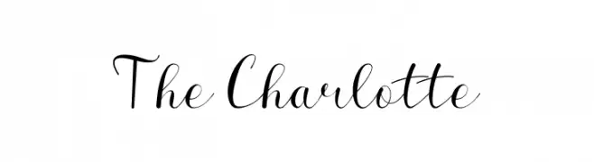
An elegant script font with flowing cursive letters and ornate flourishes.
![The Charlotte font caratteri gratis]() Scaricare 40 Downloads@WebFont
Scaricare 40 Downloads@WebFont -
( Fonts by Iconian Fonts - Daniel Zadorozny - Personal-use only. For commercial use please contact owner. )
A modern, condensed italic font with a sleek and angular design.
![Spy Agency Condensed Italic font caratteri gratis]() Scaricare 40 Downloads@WebFont
Scaricare 40 Downloads@WebFont -
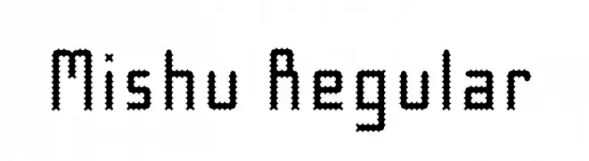
( Fonts by Mishu Baba - Personal-use only. For commercial use please contact owner. )
A decorative, pixelated font with jagged edges and a digital aesthetic.
![Mishu Regular font caratteri gratis]() Scaricare 40 Downloads@WebFont
Scaricare 40 Downloads@WebFont -
( Fonts by Subectype & Orenari - Rangga Subekti & Ari - Personal-use only. For commercial use please contact owner. )
A playful, rounded font with a youthful and energetic vibe.
![Kiddy Times font caratteri gratis]() Scaricare 40 Downloads@WebFont
Scaricare 40 Downloads@WebFont -
( Fonts by weknow - Wino S Kadir - Personal-use only. For commercial use please contact owner. )
A hollow, geometric font with sharp angles and a futuristic style.
![THE TRAINING ARTIST-Hollow-Inve font caratteri gratis]() Scaricare 40 Downloads@WebFont
Scaricare 40 Downloads@WebFont -
( Fonts by Iconian Fonts - Daniel Zadorozny - Personal-use only. For commercial use please contact owner. )
Bold, geometric font with a strong, three-dimensional effect.
![Spy Agency College font caratteri gratis]() Scaricare 40 Downloads@WebFont
Scaricare 40 Downloads@WebFont -
( Fonts by Letterena Studios )
Elegant, handwritten script with thin, flowing lines.
![Higthesta font caratteri gratis]() Scaricare 40 Downloads@WebFont
Scaricare 40 Downloads@WebFont -
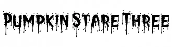
( Fonts by PutraCetol Studio )
Dripping, horror-themed decorative display font.
![Pumpkin Stare Three font caratteri gratis]() Scaricare 40 Downloads@WebFont
Scaricare 40 Downloads@WebFont -
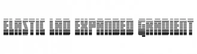
( Fonts by Daniel Zadorozny - www.iconian.com - Personal-use only. For commercial use please contact owner. )
A bold, expanded font with a gradient line effect for a modern look.
![Elastic Lad Expanded Gradient font caratteri gratis]() Scaricare 40 Downloads@WebFont
Scaricare 40 Downloads@WebFont -
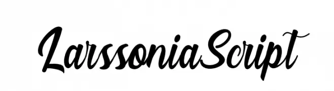
( Fonts by Analogous Studio - Muhammad Ilham - Personal-use only. For commercial use please contact owner. )
A flowing, cursive script font with elegant, interconnected characters.
![LarssoniaScript font caratteri gratis]() Scaricare 40 Downloads@WebFont
Scaricare 40 Downloads@WebFont -
( Fonts by Mans Greback - Personal-use only. For commercial use please contact owner. )
An artistic, swash-style font with flowing, decorative curves.
![Dark Crow Swash PERSONAL USE font caratteri gratis]() Scaricare 40 Downloads@WebFont
Scaricare 40 Downloads@WebFont -
( Fonts by Tychitype - Afif alhabsi - Personal-use only. For commercial use please contact owner. )
A playful, casual handwritten font with smooth, flowing lines.
![Princesset font caratteri gratis]() Scaricare 40 Downloads@WebFont
Scaricare 40 Downloads@WebFont -
( Fonts by twinletter - Rozikan - Personal-use only. For commercial use please contact owner. )
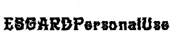
A bold, gothic-inspired font with sharp, angular edges and dramatic serifs.
![ESGARD Personal Use font caratteri gratis]() Scaricare 40 Downloads@WebFont
Scaricare 40 Downloads@WebFont -
( Fonts by Jamaluddin - Personal-use only. For commercial use please contact owner. )
An elegant script font with intricate swirls and decorative flourishes.
![Gloretha font caratteri gratis]() Scaricare 40 Downloads@WebFont
Scaricare 40 Downloads@WebFont -
( Fonts by Typefar - Farul Arjianto - Personal-use only. For commercial use please contact owner. )
A bold, expressive handwritten font with dynamic, fluid strokes.
![LilyWhite font caratteri gratis]() Scaricare 40 Downloads@WebFont
Scaricare 40 Downloads@WebFont -
( Fonts by Mans Greback - www.mansgreback.com - Personal-use only. For commercial use please contact owner. )
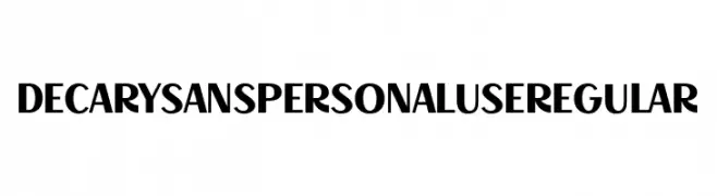
A bold, modern font with high contrast and a strong presence.
![Decary Sans PERSONAL USE Regular font caratteri gratis]() Scaricare 40 Downloads@WebFont
Scaricare 40 Downloads@WebFont -
( Fonts by Iconian Fonts - Daniel Zadorozny - Personal-use only. For commercial use please contact owner. )
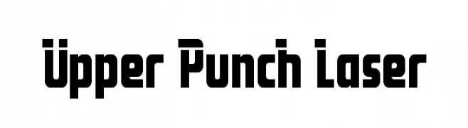
A bold, geometric font with strong, blocky characters and high contrast.
![Upper Punch Laser font caratteri gratis]() Scaricare 40 Downloads@WebFont
Scaricare 40 Downloads@WebFont -
( Fonts by Khaiuns - Personal-use only. For commercial use please contact owner. )
A flowing, cursive script with elegant loops and swashes.
![Appenzell font caratteri gratis]() Scaricare 40 Downloads@WebFont
Scaricare 40 Downloads@WebFont -
( Fonts by Weape Studio - Wahyu Andi - Personal-use only. For commercial use please contact owner. )
A bold, handwritten font with smooth curves and a playful, dynamic style.
![Ngopie font caratteri gratis]() Scaricare 40 Downloads@WebFont
Scaricare 40 Downloads@WebFont -
( Fonts by deFharo - Fernando Haro - Personal-use only. For commercial use please contact owner. )
A tall, narrow, and modern font with a sleek, geometric design.
![Ubicada font caratteri gratis]() Scaricare 40 Downloads@WebFont
Scaricare 40 Downloads@WebFont -
( Fonts by Letterafa Studio - Ahmad Afandi - Personal-use only. For commercial use please contact owner. )
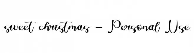
A playful and elegant script font with a modern, handwritten style.
![sweet christmas - Personal Use font caratteri gratis]() Scaricare 40 Downloads@WebFont
Scaricare 40 Downloads@WebFont -
( Fonts by Sketype Studio - Anjar Prasetio - Personal-use only. For commercial use please contact owner. )
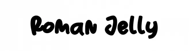
A playful, bold, and hand-drawn font with a bubbly style.
![Roman Jelly font caratteri gratis]() Scaricare 40 Downloads@WebFont
Scaricare 40 Downloads@WebFont -
( Fonts by Vunira Design - Personal-use only. For commercial use please contact owner. )
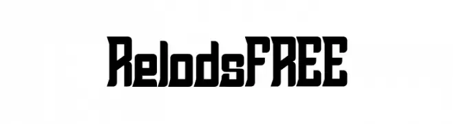
A bold, geometric font with a modern and futuristic style.
![RelodsFREE font caratteri gratis]() Scaricare 40 Downloads@WebFont
Scaricare 40 Downloads@WebFont -
( Fonts by Almarkhatype - Abdul Malik Wisnu - Personal-use only. For commercial use please contact owner. )
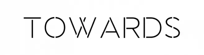
A sleek, geometric font with clean lines and a modern aesthetic.
![Towards font caratteri gratis]() Scaricare 40 Downloads@WebFont
Scaricare 40 Downloads@WebFont -
( Fonts by Locomotype - Arwan Sutanto - Personal-use only. For commercial use please contact owner. )
A playful and casual handwritten font with fluid, whimsical strokes.
![Romantick font caratteri gratis]() Scaricare 40 Downloads@WebFont
Scaricare 40 Downloads@WebFont -
( Fonts by Mans Greback - www.mansgreback.com - Personal-use only. For commercial use please contact owner. )
A casual, handwritten font with fluid strokes and a natural, dynamic appearance.
![Letter Book font caratteri gratis]() Scaricare 40 Downloads@WebFont
Scaricare 40 Downloads@WebFont -
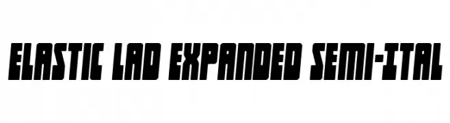
( Fonts by Daniel Zadorozny - www.iconian.com - Personal-use only. For commercial use please contact owner. )
A bold, expanded font with a semi-italic slant, perfect for impactful designs.
![Elastic Lad Expanded Semi-Ital font caratteri gratis]() Scaricare 40 Downloads@WebFont
Scaricare 40 Downloads@WebFont -
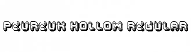
( Fonts by Vladimir Nikolic - www.creativefabrica.com/designer/vladimirnikolic/ - Personal-use only. For commercial use please contact owner. )
A bold, decorative font with hollow interiors and intricate detailing.
![Peureux Hollow Regular font caratteri gratis]() Scaricare 40 Downloads@WebFont
Scaricare 40 Downloads@WebFont -
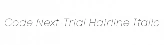
( Fonts by Fontfabric - Svetoslav Simov - Personal-use only. For commercial use please contact owner. )
A sleek, modern hairline italic font with elegant curves and clean spacing.
![Code Next-Trial Hairline Italic font caratteri gratis]() Scaricare 40 Downloads@WebFont
Scaricare 40 Downloads@WebFont -
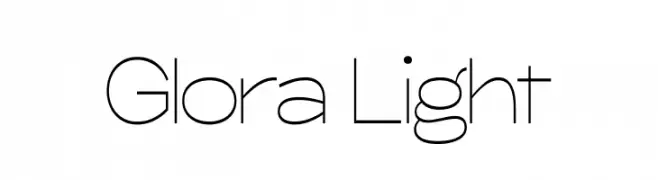
( Fonts by Khaiuns - Personal-use only. For commercial use please contact owner. )
A sleek, modern font with thin, elongated characters and a minimalist aesthetic.
![Glora Light font caratteri gratis]() Scaricare 40 Downloads@WebFont
Scaricare 40 Downloads@WebFont -
( Fonts by Letterative Studio - Personal-use only. For commercial use please contact owner. )
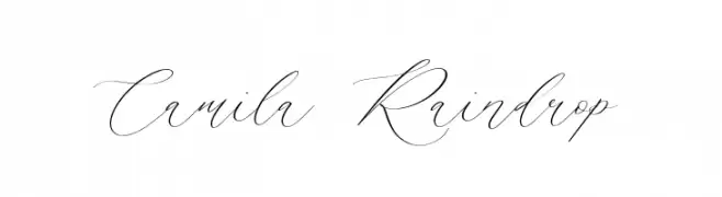
A graceful, cursive script font with elegant, flowing lines and high contrast.
![Camila Raindrop font caratteri gratis]() Scaricare 40 Downloads@WebFont
Scaricare 40 Downloads@WebFont


Quali sono i font più popolari adesso?
Poppins, Roboto, Montserrat, Open Sans e Lato sono molto usati per le forme pulite e l'ampia applicabilità — dall'identità di marca alle landing page e ai poster.
Quali font si usano spesso nei loghi?
Le sans serif geometriche (es. Poppins, famiglie in stile Gotham) sono scelte comuni per un branding pulito e scalabile. Per un tocco personale restano valide script e stili manoscritti. Abbina un display deciso per i titoli a un corpo testo neutro per riconoscibilità ed equilibrio.
Ogni quanto si aggiorna la lista?
Con regolarità, in base ai download e all'attività reale. Torna spesso per scoprire in anticipo le nuove preferite.
💡 Consiglio: aggiungi ai preferiti — le tendenze cambiano in fretta e i font top di oggi possono ispirare il rebranding di domani.