Benvenuto nelle Font Più Popolari — dove popolarità e qualità si incontrano. Qui trovi i font più scaricati e usati dell'anno. Se cerchi scelte sicure per logo, web o social, inizia da qui.
Ogni font top si distingue per equilibrio, leggibilità e versatilità. Troverai sans serif moderne, script eleganti, serif vintage e display minimalisti.
-
 Scaricare 348 Downloads@WebFont
 -
( Fonts by wep )
A playful, bold font with a chunky, hand-drawn style.
![Bobby Donut font caratteri gratis]() Scaricare 348 Downloads@WebFont
Scaricare 348 Downloads@WebFont -
( Fonts by Ben Nathan )
A bold, playful font with wavy, dynamic characters and a whimsical style.
![BN-FishEye font caratteri gratis]() Scaricare 348 Downloads@WebFont
Scaricare 348 Downloads@WebFont -
![Marchesa font caratteri gratis]() Scaricare 348 Downloads@WebFont
Scaricare 348 Downloads@WebFont -
( Free for non-commercial use. www.johnmartz.com )
A modern, angular font with a futuristic and edgy design.
![Maple Serum font caratteri gratis]() Scaricare 348 Downloads@WebFont
Scaricare 348 Downloads@WebFont -
-
( Fonts by Bearytype )
A playful, handwritten font with flowing, cursive-like strokes.
![Oneday font caratteri gratis]() Scaricare 348 Downloads@WebFont
Scaricare 348 Downloads@WebFont -
( Fonts by EssentialsStudio - Personal-use only. For commercial use please contact owner. )
A playful, whimsical font with tall, narrow characters and charming details.
![Almondlatte font caratteri gratis]() Scaricare 348 Downloads@WebFont
Scaricare 348 Downloads@WebFont -
( Fonts by Carrot Rope - typewhatyouloveandletitkillyou.tumblr.com. Personal-use only. For commercial use please contact owner. )
A bold, distressed font with a vintage and rugged appearance.
![Newside FP font caratteri gratis]() Scaricare 348 Downloads@WebFont
Scaricare 348 Downloads@WebFont -
( Fonts by Knackpack Studio - www.knackpack.studio - Personal-use only. For commercial use please contact owner. )
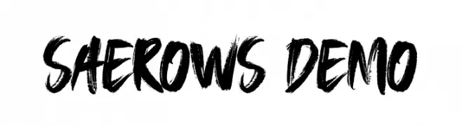
A bold, expressive brush-style font with a hand-painted appearance.
![SAEROWS - DEMO font caratteri gratis]() Scaricare 348 Downloads@WebFont
Scaricare 348 Downloads@WebFont -
( Fonts by EssentialsStudio - Personal-use only. For commercial use please contact owner. )
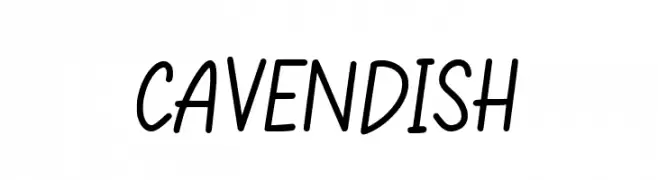
A playful, handwritten font with smooth, flowing lines and a casual style.
![CAVENDISH font caratteri gratis]() Scaricare 348 Downloads@WebFont
Scaricare 348 Downloads@WebFont


Quali sono i font più popolari adesso?
Poppins, Roboto, Montserrat, Open Sans e Lato sono molto usati per le forme pulite e l'ampia applicabilità — dall'identità di marca alle landing page e ai poster.
Quali font si usano spesso nei loghi?
Le sans serif geometriche (es. Poppins, famiglie in stile Gotham) sono scelte comuni per un branding pulito e scalabile. Per un tocco personale restano valide script e stili manoscritti. Abbina un display deciso per i titoli a un corpo testo neutro per riconoscibilità ed equilibrio.
Ogni quanto si aggiorna la lista?
Con regolarità, in base ai download e all'attività reale. Torna spesso per scoprire in anticipo le nuove preferite.
💡 Consiglio: aggiungi ai preferiti — le tendenze cambiano in fretta e i font top di oggi possono ispirare il rebranding di domani.