Benvenuto nelle Font Più Popolari — dove popolarità e qualità si incontrano. Qui trovi i font più scaricati e usati dell'anno. Se cerchi scelte sicure per logo, web o social, inizia da qui.
Ogni font top si distingue per equilibrio, leggibilità e versatilità. Troverai sans serif moderne, script eleganti, serif vintage e display minimalisti.
-
( Fonts by belovestudio - Abdul Manan - Personal-use only. For commercial use please contact owner. )
A modern, geometric font with sleek lines and a minimalist aesthetic.
 Scaricare 45 Downloads@WebFont
 -
( Fonts by Moreltype - Hermawan Hermawan - Personal-use only. For commercial use please contact owner. )
A playful, handwritten font with a casual and friendly style.
![Lotterdam font caratteri gratis]() Scaricare 45 Downloads@WebFont
Scaricare 45 Downloads@WebFont -
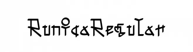
( Fonts by zone108.main.jp - Personal-use only. For commercial use please contact owner. )
A runic-inspired font with angular, geometric characters and a mystical, ancient feel.
![Runica Regular font caratteri gratis]() Scaricare 45 Downloads@WebFont
Scaricare 45 Downloads@WebFont -
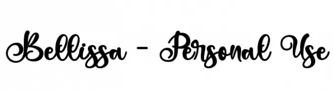
( Fonts by Letterara - Thomas Aradea - Personal-use only. For commercial use please contact owner. )
An elegant and flowing script font with intricate loops and swirls.
![Bellissa - Personal Use font caratteri gratis]() Scaricare 45 Downloads@WebFont
Scaricare 45 Downloads@WebFont -
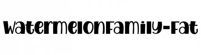
( Fonts by Royaltype - Darwinoo - Personal-use only. For commercial use please contact owner. )
A bold, playful font with exaggerated curves and a whimsical style.
![WatermelonFamily-Fat font caratteri gratis]() Scaricare 45 Downloads@WebFont
Scaricare 45 Downloads@WebFont -
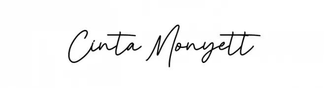
( Fonts by StringLabs - stringlabscreative.com - Personal-use only. For commercial use please contact owner. )
A cursive, handwritten-style font with smooth, connected letters.
![Cinta Monyett font caratteri gratis]() Scaricare 45 Downloads@WebFont
Scaricare 45 Downloads@WebFont -
( Fonts by weknow - Wino S Kadir - Personal-use only. For commercial use please contact owner. )
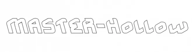
A bold, hollow, geometric font with a futuristic and angular design.
![MASTER-Hollow font caratteri gratis]() Scaricare 45 Downloads@WebFont
Scaricare 45 Downloads@WebFont -
( Fonts by LetterStock - Guguh Gumantoro - Personal-use only. For commercial use please contact owner. )
A tall, narrow font with a modern and elegant style.
![Cloudwick font caratteri gratis]() Scaricare 45 Downloads@WebFont
Scaricare 45 Downloads@WebFont -
( Fonts by StringLabs - stringlabscreative.com - Personal-use only. For commercial use please contact owner. )
An elegant, flowing script font with a modern, timeless appeal.
![Hunthers Dwayne font caratteri gratis]() Scaricare 45 Downloads@WebFont
Scaricare 45 Downloads@WebFont -
( Fonts by Woodcutter Manero - www.woodcutter.es - Personal-use only. For commercial use please contact owner. )
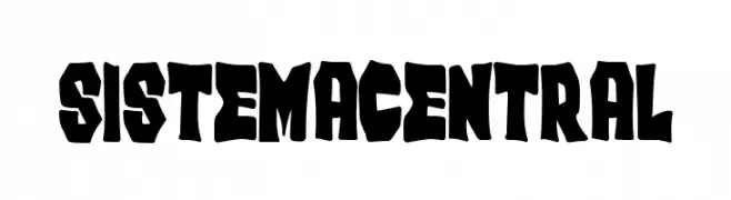
Bold, jagged, hand-crafted display font with irregular shapes.
![Sistema Central font caratteri gratis]() Scaricare 45 Downloads@WebFont
Scaricare 45 Downloads@WebFont -
( Fonts by Typodermic Fonts - Raymond Larabie - Personal-use only. For commercial use please contact owner. )
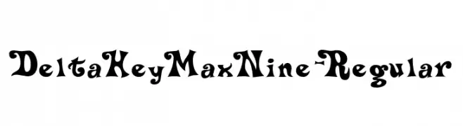
A bold, playful font with exaggerated serifs and whimsical curves.
![DeltaHeyMaxNine-Regular font caratteri gratis]() Scaricare 45 Downloads@WebFont
Scaricare 45 Downloads@WebFont -
( Fonts by Woodcutter )
A bold, rounded font with a playful, hand-drawn feel.
![Final Match font caratteri gratis]() Scaricare 45 Downloads@WebFont
Scaricare 45 Downloads@WebFont -
( Fonts by Woodcutter Manero - www.woodcutter.es - Personal-use only. For commercial use please contact owner. )
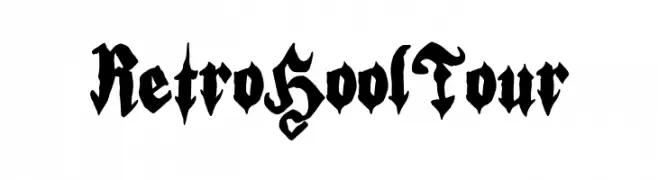
A bold, gothic blackletter-style font with dramatic, angular strokes.
![Retro Hool Tour font caratteri gratis]() Scaricare 45 Downloads@WebFont
Scaricare 45 Downloads@WebFont -
( Personal-use only. For commercial use please contact owner. )
Playful, bold bubble font with graffiti influences.
![Zeyko Crew font caratteri gratis]() Scaricare 45 Downloads@WebFont
Scaricare 45 Downloads@WebFont -
( Fonts by Edric Studio - Personal-use only. For commercial use please contact owner. )
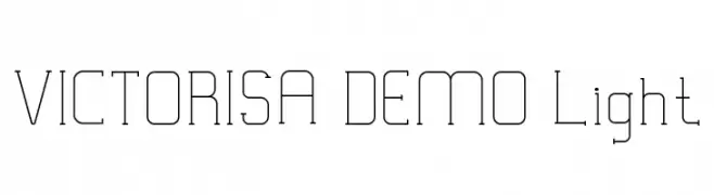
A modern, geometric font with thin lines and a minimalist aesthetic.
![VICTORISA DEMO Light font caratteri gratis]() Scaricare 45 Downloads@WebFont
Scaricare 45 Downloads@WebFont -
( Fonts by András Dénes - Personal-use only. For commercial use please contact owner. )
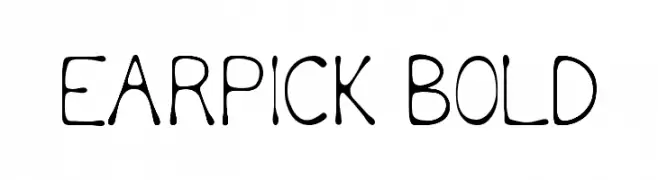
A playful, hand-drawn font with bold, rounded characters and a whimsical style.
![Earpick Bold font caratteri gratis]() Scaricare 45 Downloads@WebFont
Scaricare 45 Downloads@WebFont -
( Fonts by Colllab Studio - Personal-use only. For commercial use please contact owner. )
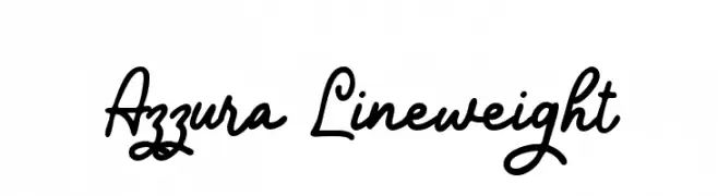
A lively and dynamic script font with fluid, cursive strokes.
![Azzura Lineweight font caratteri gratis]() Scaricare 45 Downloads@WebFont
Scaricare 45 Downloads@WebFont -
( Fonts by Darrell Flood - Personal-use only. For commercial use please contact owner. )
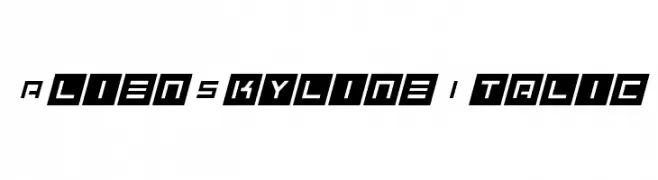
A futuristic, angular italic font with a sharp, geometric design.
![Alien Skyline Italic font caratteri gratis]() Scaricare 45 Downloads@WebFont
Scaricare 45 Downloads@WebFont -
( Fonts by Digital Typeface Studio - Eva Barabasne Olasz - Personal-use only. For commercial use please contact owner. )
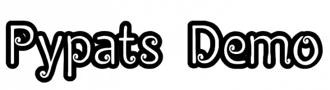
A playful, bold font with a unique outlined, three-dimensional style.
![Pypats Demo font caratteri gratis]() Scaricare 45 Downloads@WebFont
Scaricare 45 Downloads@WebFont -
( Fonts by Fachranheit - Fachrul Rozi - Personal-use only. For commercial use please contact owner. )
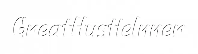
A dynamic script font with fluid, cursive strokes and a modern flair.
![GreatHustleInner font caratteri gratis]() Scaricare 45 Downloads@WebFont
Scaricare 45 Downloads@WebFont -
( Fonts by dcoxy - Greg Medina - Personal-use only. For commercial use please contact owner. )
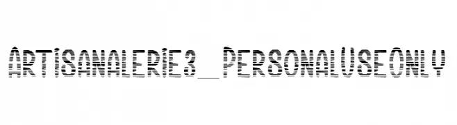
A modern, striped decorative font with geometric structure and clear legibility.
![Artisanalerie 3_PersonalUseOnly font caratteri gratis]() Scaricare 45 Downloads@WebFont
Scaricare 45 Downloads@WebFont -
( Iconian Fonts - Daniel Zadorozny - www.iconian.com )
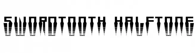
A bold, geometric font with a halftone pattern and sharp, angular lines.
![Swordtooth Halftone font caratteri gratis]() Scaricare 45 Downloads@WebFont
Scaricare 45 Downloads@WebFont -
( Fonts by Magique Fonts - Personal-use only. For commercial use please contact owner. )
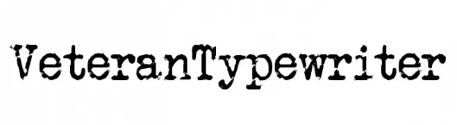
A rugged, vintage typewriter-style font with a distressed, aged appearance.
![Veteran Typewriter font caratteri gratis]() Scaricare 45 Downloads@WebFont
Scaricare 45 Downloads@WebFont -
( Fonts by Calligraphy Fonts )
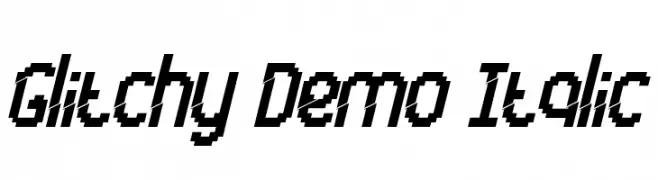
A pixelated, italic font with a digital, glitchy aesthetic.
![Glitchy Demo Italic font caratteri gratis]() Scaricare 45 Downloads@WebFont
Scaricare 45 Downloads@WebFont -
( Fonts by Ibram Syah - Personal-use only. For commercial use please contact owner. )
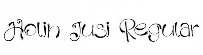
A whimsical and decorative font with elegant swirls and dynamic contrast.
![Holin Jusi Regular font caratteri gratis]() Scaricare 45 Downloads@WebFont
Scaricare 45 Downloads@WebFont -
( Fonts by Iconian Fonts - Daniel Zadorozny - Personal-use only. For commercial use please contact owner. )
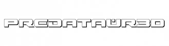
A bold, futuristic font with a three-dimensional effect and geometric design.
![Predataur 3D font caratteri gratis]() Scaricare 45 Downloads@WebFont
Scaricare 45 Downloads@WebFont -
( Fonts by Magistr - Personal-use only. For commercial use please contact owner. )
Ornamental dingbat font with spirograph shapes and bold rectangles.
![ASorion font caratteri gratis]() Scaricare 45 Downloads@WebFont
Scaricare 45 Downloads@WebFont -
( Fonts by Ryan Prasetya - Personal-use only. For commercial use please contact owner. )
A robust slab serif font with a modern yet classic appeal.
![Panhitra-Slab font caratteri gratis]() Scaricare 45 Downloads@WebFont
Scaricare 45 Downloads@WebFont -
( Fonts by Daniel Zadorozny - www.iconian.com - Personal-use only. For commercial use please contact owner. )
A bold, geometric stencil font with a dynamic, futuristic style.
![Force Commander Leftalic font caratteri gratis]() Scaricare 45 Downloads@WebFont
Scaricare 45 Downloads@WebFont -
( Fonts by Prioritype Co - Prio Nurokhim Aji - Personal-use only. For commercial use please contact owner. )
A bold, cursive script font with flowing, connected letterforms.
![Arkaedos font caratteri gratis]() Scaricare 45 Downloads@WebFont
Scaricare 45 Downloads@WebFont -
( Fonts by Typegoals Labs - Personal-use only. For commercial use please contact owner. )
A flowing, cursive font with elegant and sophisticated styling.
![Marchelly font caratteri gratis]() Scaricare 45 Downloads@WebFont
Scaricare 45 Downloads@WebFont -
( Fonts by TypeType Foundry )
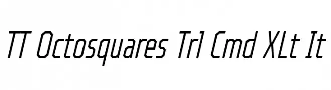
A modern, geometric, and italic font with a sleek, angular design.
![TT Octosquares Trl Cmd XLt It font caratteri gratis]() Scaricare 45 Downloads@WebFont
Scaricare 45 Downloads@WebFont -
( Personal-use only. For commercial use please contact owner. )
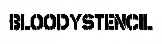
Bold, horror-themed stencil font with dripping, jagged edges.
![Bloody Stencil font caratteri gratis]() Scaricare 45 Downloads@WebFont
Scaricare 45 Downloads@WebFont -
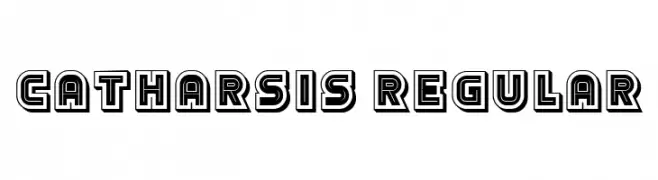
( Fonts by Vladimir Nikolic - www.creativefabrica.com/designer/vladimirnikolic/ - Personal-use only. For commercial use please contact owner. )
A bold, geometric font with a 3D effect and retro appeal.
![Catharsis Regular font caratteri gratis]() Scaricare 45 Downloads@WebFont
Scaricare 45 Downloads@WebFont -
( Fonts by K_IN Studio - Personal-use only. For commercial use please contact owner. )
An artistic, high-contrast font with elongated, narrow characters and a hand-drawn feel.
![Cryspo Shoop font caratteri gratis]() Scaricare 45 Downloads@WebFont
Scaricare 45 Downloads@WebFont


Quali sono i font più popolari adesso?
Poppins, Roboto, Montserrat, Open Sans e Lato sono molto usati per le forme pulite e l'ampia applicabilità — dall'identità di marca alle landing page e ai poster.
Quali font si usano spesso nei loghi?
Le sans serif geometriche (es. Poppins, famiglie in stile Gotham) sono scelte comuni per un branding pulito e scalabile. Per un tocco personale restano valide script e stili manoscritti. Abbina un display deciso per i titoli a un corpo testo neutro per riconoscibilità ed equilibrio.
Ogni quanto si aggiorna la lista?
Con regolarità, in base ai download e all'attività reale. Torna spesso per scoprire in anticipo le nuove preferite.
💡 Consiglio: aggiungi ai preferiti — le tendenze cambiano in fretta e i font top di oggi possono ispirare il rebranding di domani.