Benvenuto nelle Font Più Popolari — dove popolarità e qualità si incontrano. Qui trovi i font più scaricati e usati dell'anno. Se cerchi scelte sicure per logo, web o social, inizia da qui.
Ogni font top si distingue per equilibrio, leggibilità e versatilità. Troverai sans serif moderne, script eleganti, serif vintage e display minimalisti.
-
 Scaricare 346 Downloads@WebFont
 -
( Fonts by Clearlight Fonts - Brad Barham )
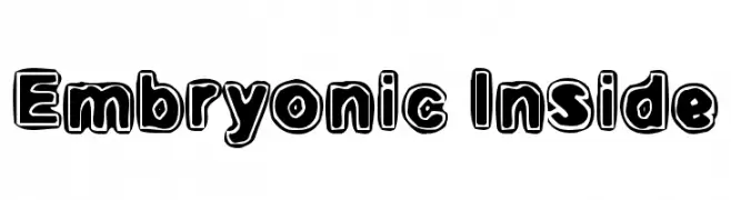
A bold, playful font with bubble-like outlines and a comic book style.
![Embryonic Inside font caratteri gratis]() Scaricare 346 Downloads@WebFont
Scaricare 346 Downloads@WebFont -
( Fonts by Docallisme HAS )
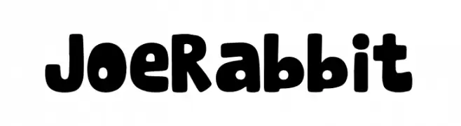
A playful, bold font with rounded, thick characters and a whimsical style.
![Joe Rabbit font caratteri gratis]() Scaricare 346 Downloads@WebFont
Scaricare 346 Downloads@WebFont -
( Fonts by Levi Szekeres - www.loremipsum.ro. Personal-use only. For commercial use please contact owner. )
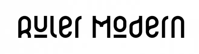
A modern, geometric font with bold, rounded characters.
![Ruler Modern font caratteri gratis]() Scaricare 346 Downloads@WebFont
Scaricare 346 Downloads@WebFont -
( Fonts by Spork Thug Typography - Josh Wilhelm - www.lifewithouttaffy.com/taffy/blog )
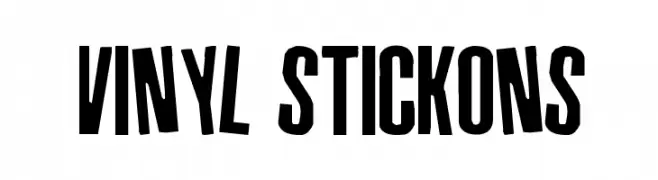
A bold, condensed uppercase font ideal for impactful headlines.
![Vinyl Stickons font caratteri gratis]() Scaricare 346 Downloads@WebFont
Scaricare 346 Downloads@WebFont -
-
( Fonts by Graham Meade - GemFonts )
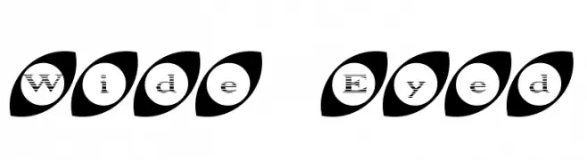
A playful font with characters enclosed in eye-shaped ovals, offering a whimsical and decorative style.
![Wide Eyed font caratteri gratis]() Scaricare 346 Downloads@WebFont
Scaricare 346 Downloads@WebFont -
( Fonts by www.houseoflime.com )
A playful, textured font with a flakey, distressed appearance.
![Kiddy Flakey font caratteri gratis]() Scaricare 346 Downloads@WebFont
Scaricare 346 Downloads@WebFont -
( FadeLine Std. - creativemarket.com/fadeline )
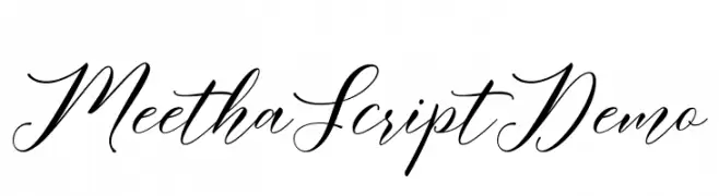
An elegant script font with flowing, interconnected letters and calligraphic style.
![MeethaScriptDemo font caratteri gratis]() Scaricare 346 Downloads@WebFont
Scaricare 346 Downloads@WebFont -
( Fonts by Dieter Steffmann )
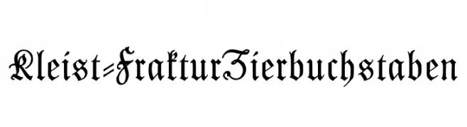
A classic blackletter font with ornate, gothic detailing and sharp, angular strokes.
![Kleist-FrakturZierbuchstaben font caratteri gratis]() Scaricare 346 Downloads@WebFont
Scaricare 346 Downloads@WebFont -
( Fonts by Letterhend Studio )
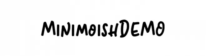
A playful, bold handwritten font with rounded letterforms and a casual style.
![MinimoishDEMO font caratteri gratis]() Scaricare 346 Downloads@WebFont
Scaricare 346 Downloads@WebFont

Quali sono i font più popolari adesso?
Poppins, Roboto, Montserrat, Open Sans e Lato sono molto usati per le forme pulite e l'ampia applicabilità — dall'identità di marca alle landing page e ai poster.
Quali font si usano spesso nei loghi?
Le sans serif geometriche (es. Poppins, famiglie in stile Gotham) sono scelte comuni per un branding pulito e scalabile. Per un tocco personale restano valide script e stili manoscritti. Abbina un display deciso per i titoli a un corpo testo neutro per riconoscibilità ed equilibrio.
Ogni quanto si aggiorna la lista?
Con regolarità, in base ai download e all'attività reale. Torna spesso per scoprire in anticipo le nuove preferite.
💡 Consiglio: aggiungi ai preferiti — le tendenze cambiano in fretta e i font top di oggi possono ispirare il rebranding di domani.