Benvenuto nelle Font Più Popolari — dove popolarità e qualità si incontrano. Qui trovi i font più scaricati e usati dell'anno. Se cerchi scelte sicure per logo, web o social, inizia da qui.
Ogni font top si distingue per equilibrio, leggibilità e versatilità. Troverai sans serif moderne, script eleganti, serif vintage e display minimalisti.
-
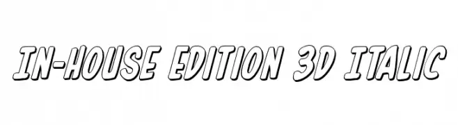
( Fonts by Daniel Zadorozny - www.iconian.com )
A bold, 3D italic font with outlined characters for a dynamic and playful look.
 Scaricare 344 Downloads@WebFont
 -
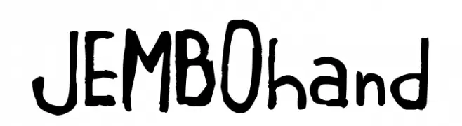
( Fonts by Michele Vannucchi MKT )
A playful, handwritten font with an informal and organic style.
![JEMBOhand font caratteri gratis]() Scaricare 344 Downloads@WebFont
Scaricare 344 Downloads@WebFont -
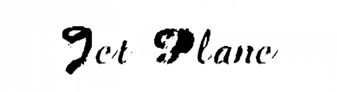
( Fonts by Mike Lecky - www.superfunk.com )
A bold, brush-style font with high contrast and dynamic strokes.
![Jet Plane font caratteri gratis]() Scaricare 344 Downloads@WebFont
Scaricare 344 Downloads@WebFont -
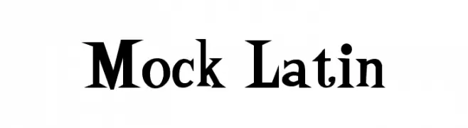
![Mock Latin font caratteri gratis]() Scaricare 344 Downloads@WebFont
Scaricare 344 Downloads@WebFont -
![KivunPi font caratteri gratis]() Scaricare 344 Downloads@WebFont
Scaricare 344 Downloads@WebFont -
-
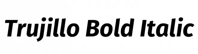
( Fonts by Fira Sans original fonts by bBox Type GmbH, Carrois Corporate GbR, & Edenspiekermann AG / Changes by Cristiano Sobral - Personal-use only. For commercial use please contact owner. )
A bold, italicized font with a modern and dynamic style.
![Trujillo Bold Italic font caratteri gratis]() Scaricare 344 Downloads@WebFont
Scaricare 344 Downloads@WebFont -
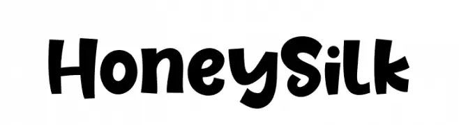
( Fonts by Khurasan )
A playful, bold, and rounded font with a whimsical style.
![Honey Silk font caratteri gratis]() Scaricare 344 Downloads@WebFont
Scaricare 344 Downloads@WebFont -
( Fonts by Bree Gorton )
A playful, wavy font with a hand-drawn, irregular style.
![Wiggly font caratteri gratis]() Scaricare 344 Downloads@WebFont
Scaricare 344 Downloads@WebFont -
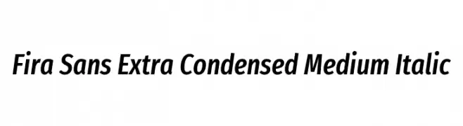
( Copyright (c) 2012-2015, The Mozilla Foundation and Telefonica S.A. )
A modern, extra-condensed sans-serif font with medium weight and italic style.
![Fira Sans Extra Condensed Medium Italic font caratteri gratis]() Scaricare 344 Downloads@WebFont
Scaricare 344 Downloads@WebFont -
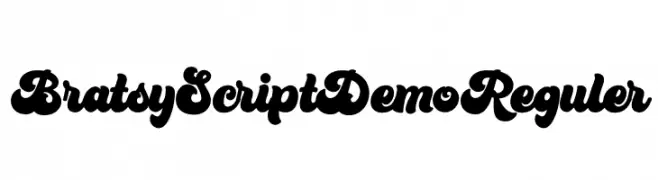
( Fonts by Figuree Studio - Icep Fadhil - Personal-use only. For commercial use please contact owner. )
A bold, playful script font with smooth, flowing characters.
![Bratsy Script Demo Reguler font caratteri gratis]() Scaricare 344 Downloads@WebFont
Scaricare 344 Downloads@WebFont

Quali sono i font più popolari adesso?
Poppins, Roboto, Montserrat, Open Sans e Lato sono molto usati per le forme pulite e l'ampia applicabilità — dall'identità di marca alle landing page e ai poster.
Quali font si usano spesso nei loghi?
Le sans serif geometriche (es. Poppins, famiglie in stile Gotham) sono scelte comuni per un branding pulito e scalabile. Per un tocco personale restano valide script e stili manoscritti. Abbina un display deciso per i titoli a un corpo testo neutro per riconoscibilità ed equilibrio.
Ogni quanto si aggiorna la lista?
Con regolarità, in base ai download e all'attività reale. Torna spesso per scoprire in anticipo le nuove preferite.
💡 Consiglio: aggiungi ai preferiti — le tendenze cambiano in fretta e i font top di oggi possono ispirare il rebranding di domani.